


Share to
WELCOME KIT MEDGRUPO 2026
By : MEDGRUPO

GRANDS PRIX DU DESIGN 19th edition
Distinctions
Discipline : Communication & Branding : People's Choice Award
Categories : Communication Design / Corporate Communication & Publishing : Gold certification
Brazil produces more medical professionals than almost any country in the world. Yet the moment a student enrolls in a residency preparation programme — one of the most defining transitions of their professional life — most institutions respond with an app notification and a login link.
MEDGRUPO decided to respond differently.
The Welcome Campaign was built on a single insight: enrollment is not a transaction. It is the beginning of a relationship that will last years, and the first physical touchpoint sets the emotional tone for everything that follows. Until the kit existed, MEDGRUPO's newly enrolled students had no official physical onboarding moment — their only connection to the brand before the first day of class was digital. The Welcome Kit was designed to close that gap.
At scale. 20,000 kits were produced and distributed across all 26 states and the Federal District of Brazil — making this one of the largest brand experience deployments in Brazilian medical education.
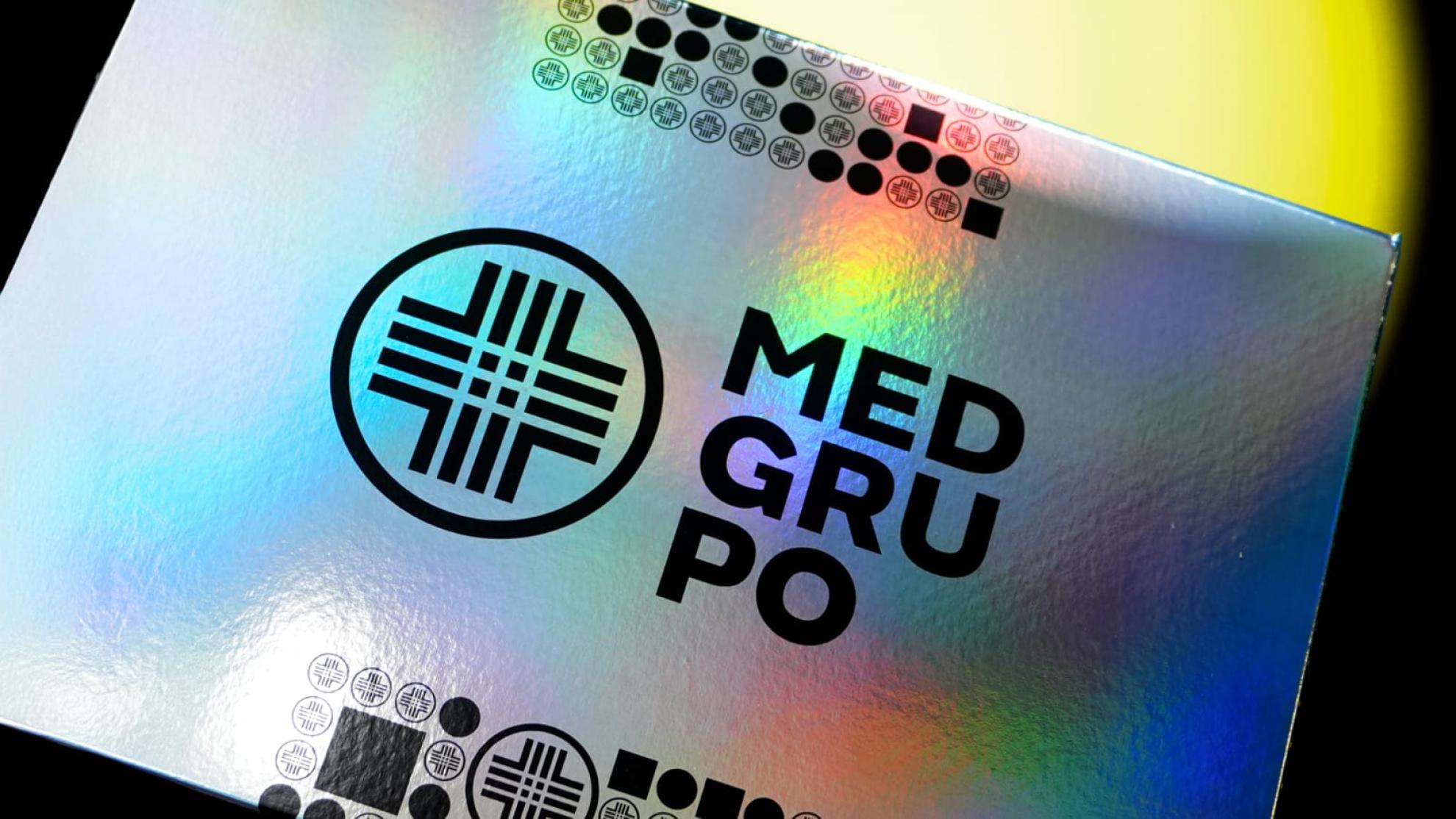
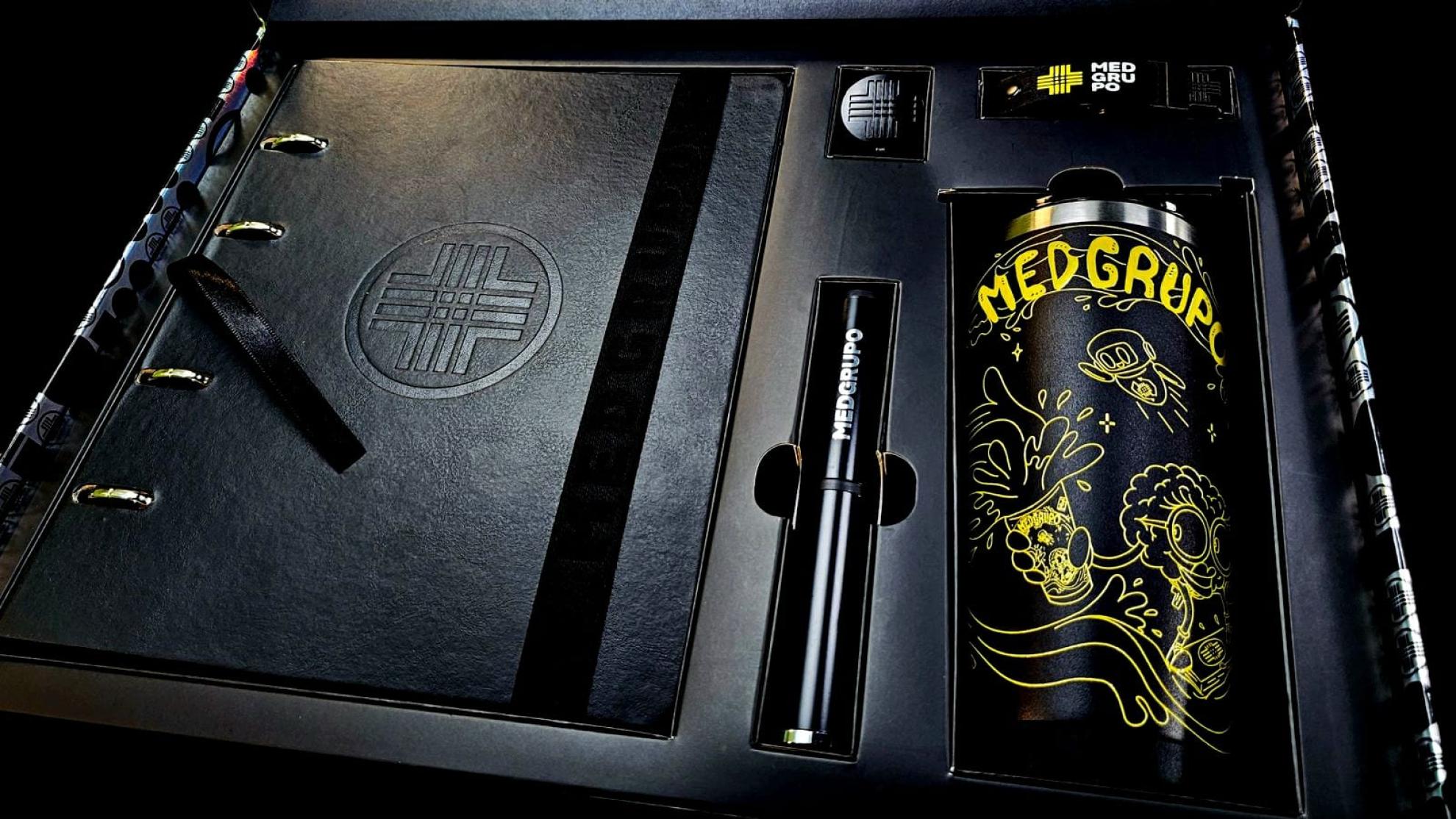
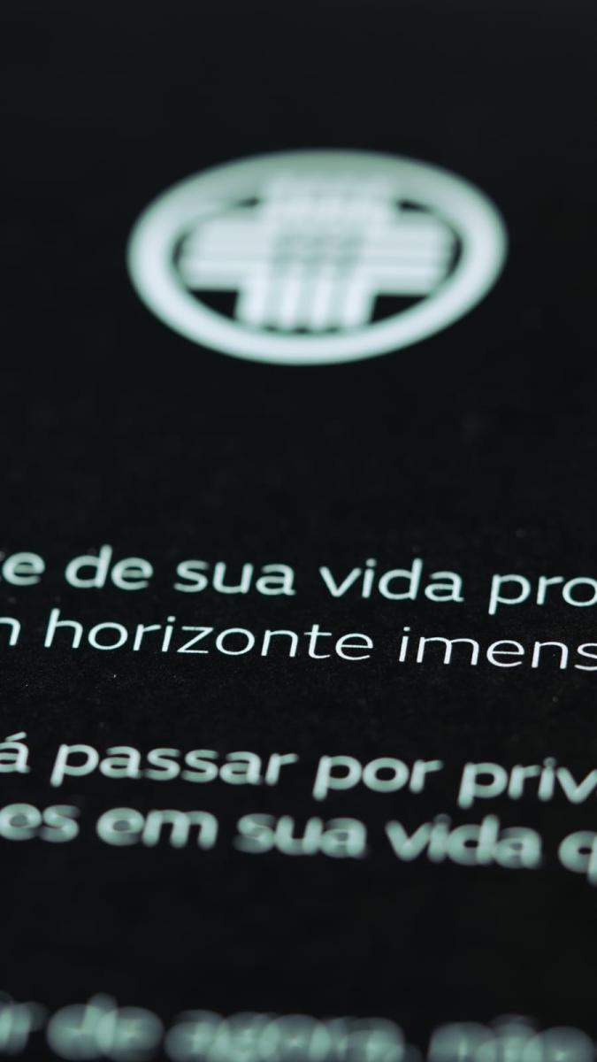
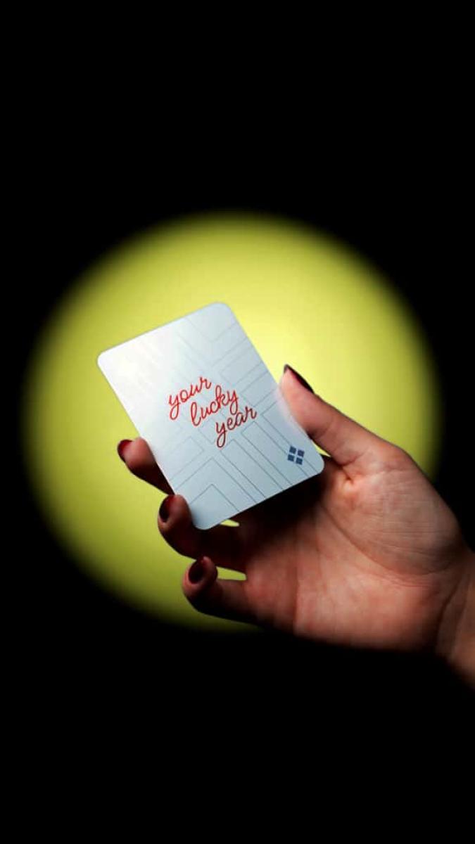
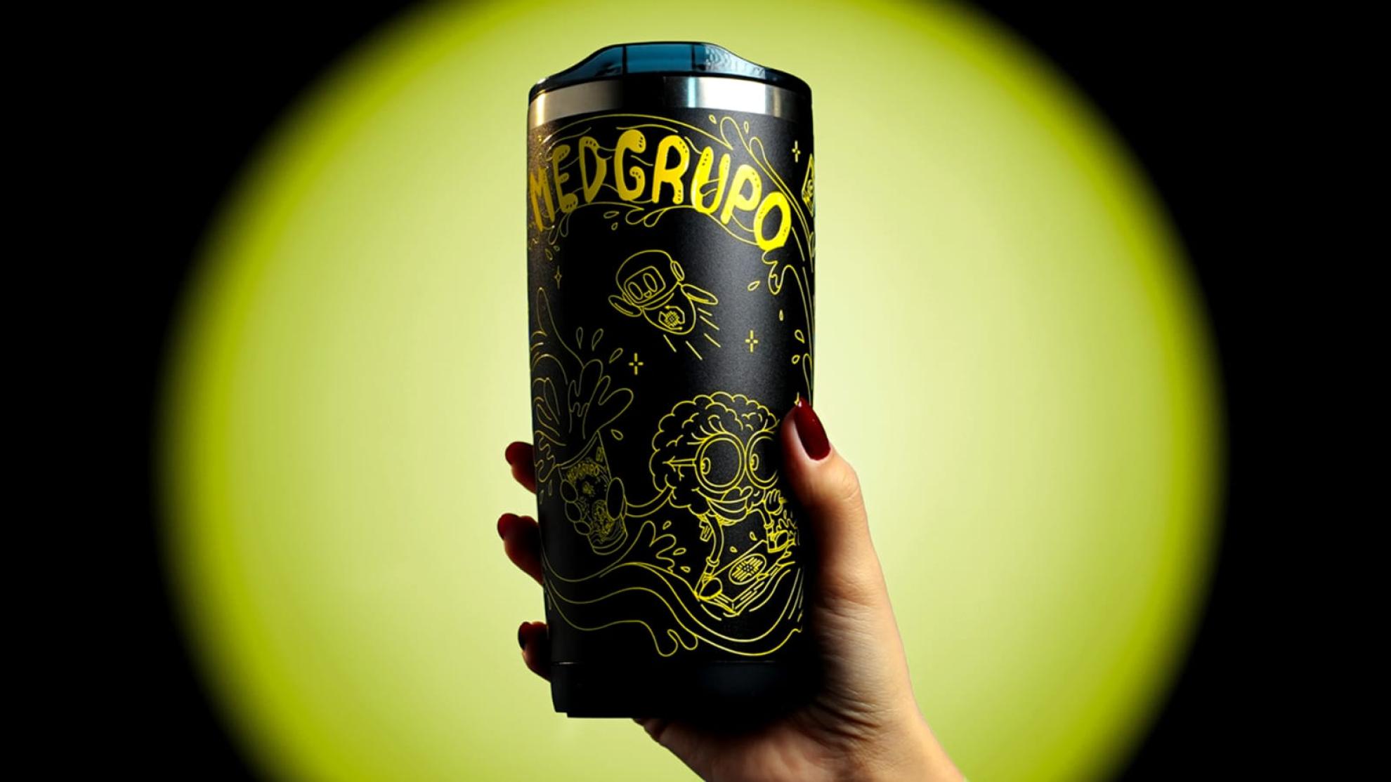
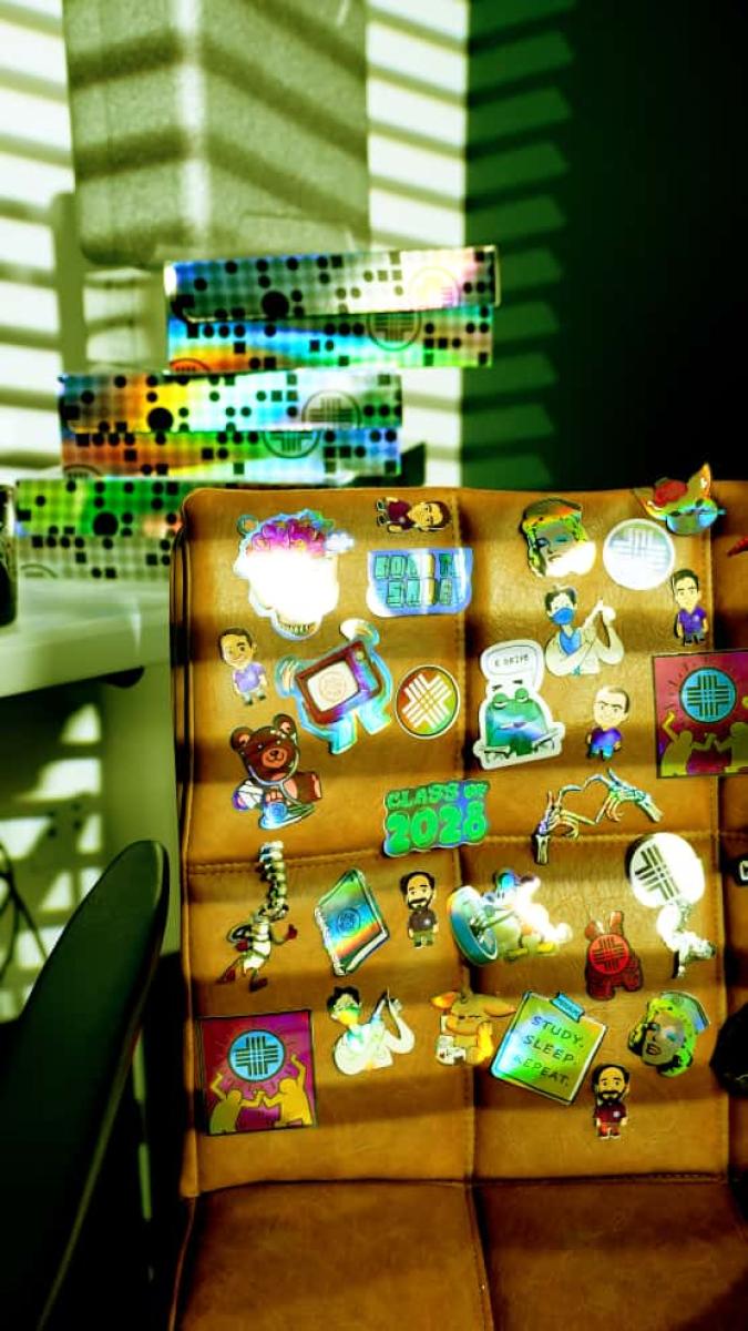
The kit arrives as a holographic rainbow box — the first signal that this is not standard corporate communication. Inside, students find a personal message from the founder before encountering any product. The sequential unboxing moves deliberately from inspiration to utility: a lucky amulet guiding deck card, a custom illustrated thermal cup with original artwork and the prismatic MEDGRUPO symbol, a leather-finish planner with silver hot stamping and illustrated educational content, an embossed roller clip, a branded lanyard with custom hardware, and metallic stickers — each designed to migrate into the student's daily environment and remain there throughout their training.
Every item was engineered for longevity, not novelty. The cup accompanies long study sessions. The planner structures the academic year. The lanyard travels to clinical rotations. Durability was not a manufacturing specification — it was a strategic decision: objects that persist in a student's life extend the brand's presence without media spend.
The aesthetic system is consistent across every touchpoint: deep black, MEDGRUPO yellow, premium finishes, custom typography. The identity does not decorate the objects — it is structural to them, debossed into leather, engraved into metal, illustrated around the cup's full circumference.
The initiative marks a deliberate strategic shift in how MEDGRUPO communicates: from product-focused messaging centred on enrollment logistics toward a brand-driven experience that establishes the institution as a long-term partner in each student's medical career — from the day they enroll to the day they practice.
Collaboration
Communication & Branding : MEDGRUPO