


Share to
Lunique, La maison de l'optique
By : Soleil communication de marque

GRANDS PRIX DU DESIGN 18th edition
Discipline : Communication & Branding
Categories : Brand Design / Logo Design : Gold certification
Categories : Environmental Design / Brand Universe : Gold certification
Lunique, La maison de l'optique is an eyewear store defined as a local business whose primary vocation is to serve a local clientele. The mandate was to create a new brand to replace an existing brand with significant brand equity in the region where it operates. It was intended to be more current and trendier to meet an immediate need while presenting a high level of quality, which could allow for the subsequent opening of other boutiques in a coherent and homogeneous manner. This brand was therefore supposed to support the possible development of a chain of eyewear stores.
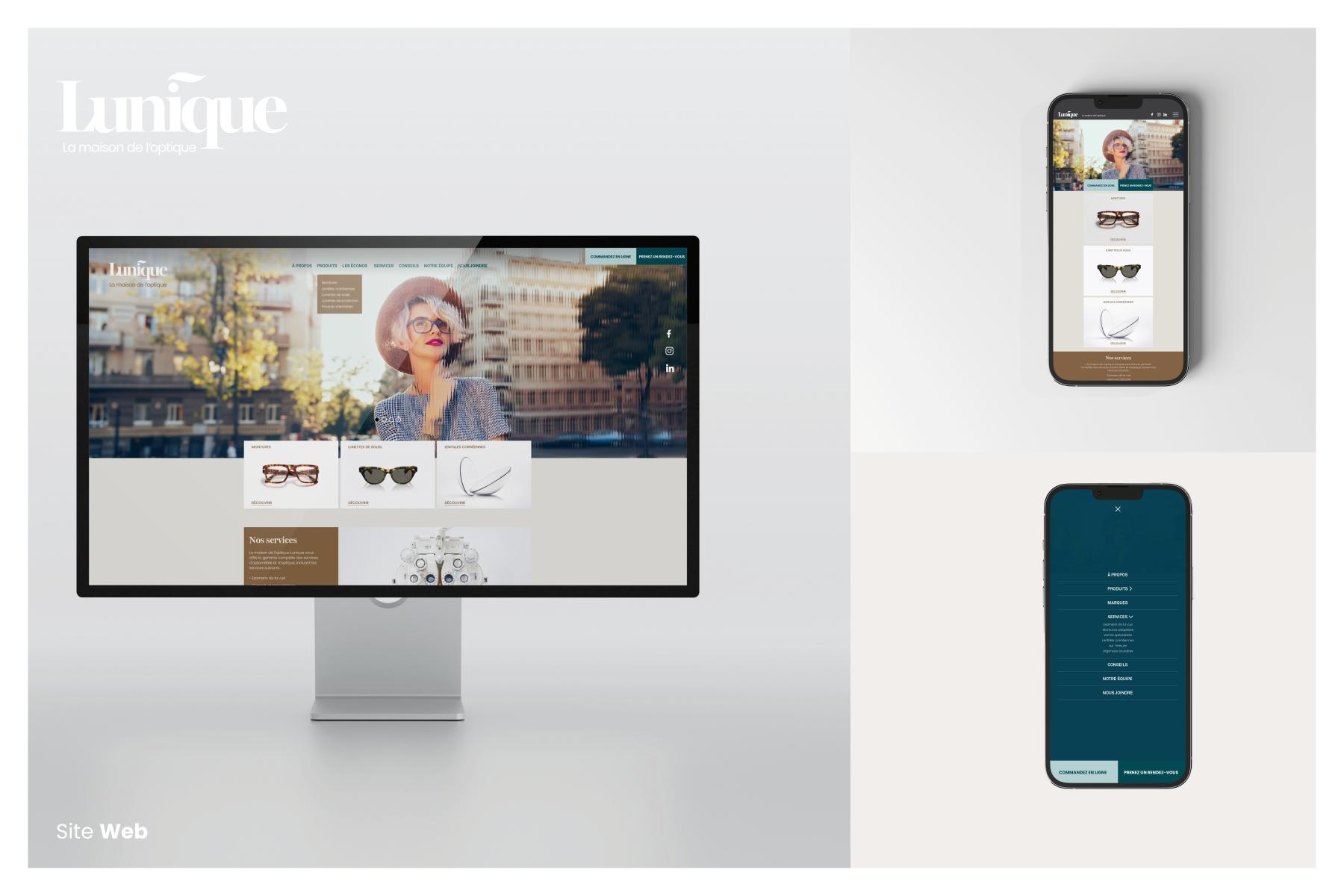
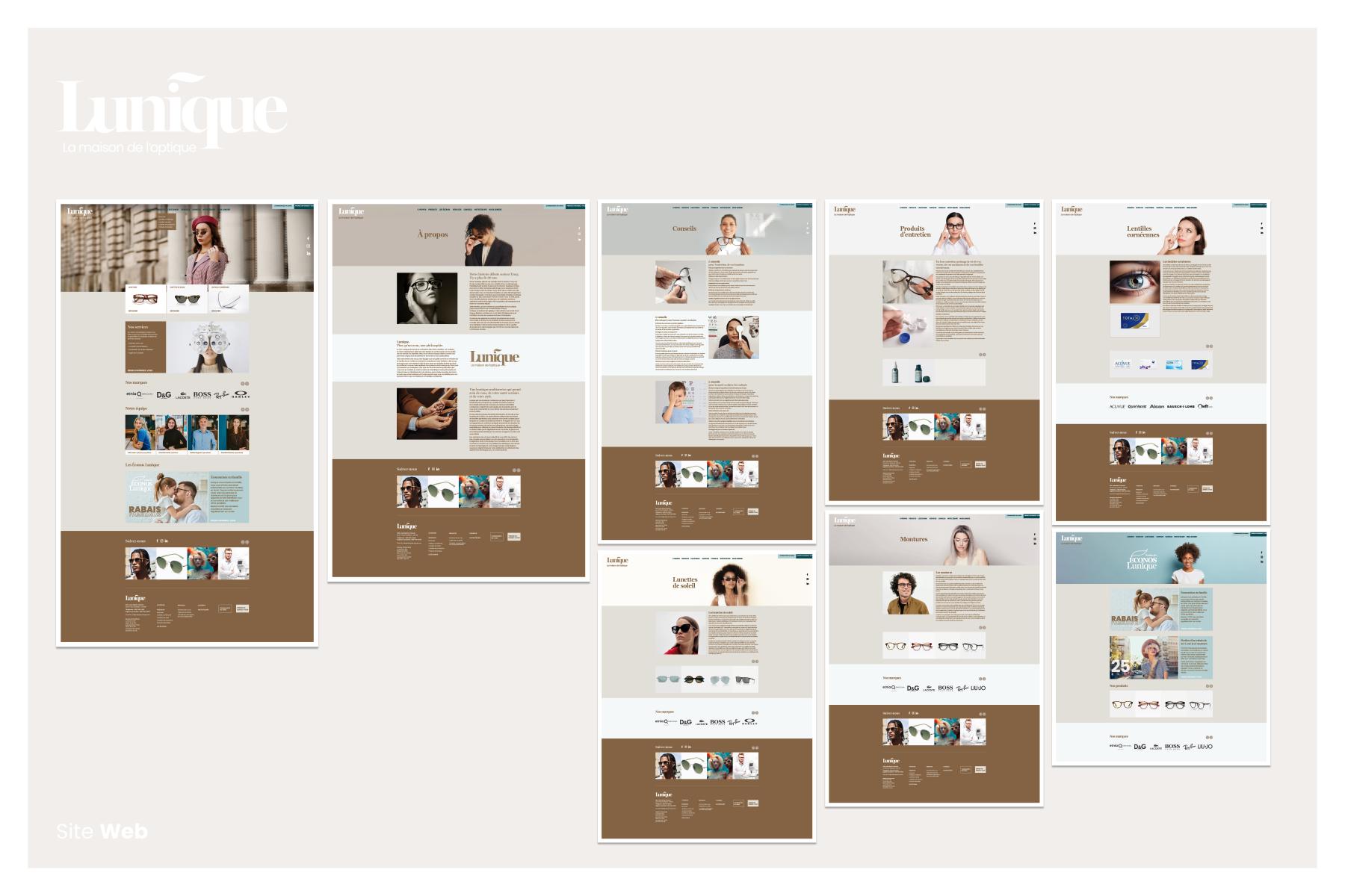
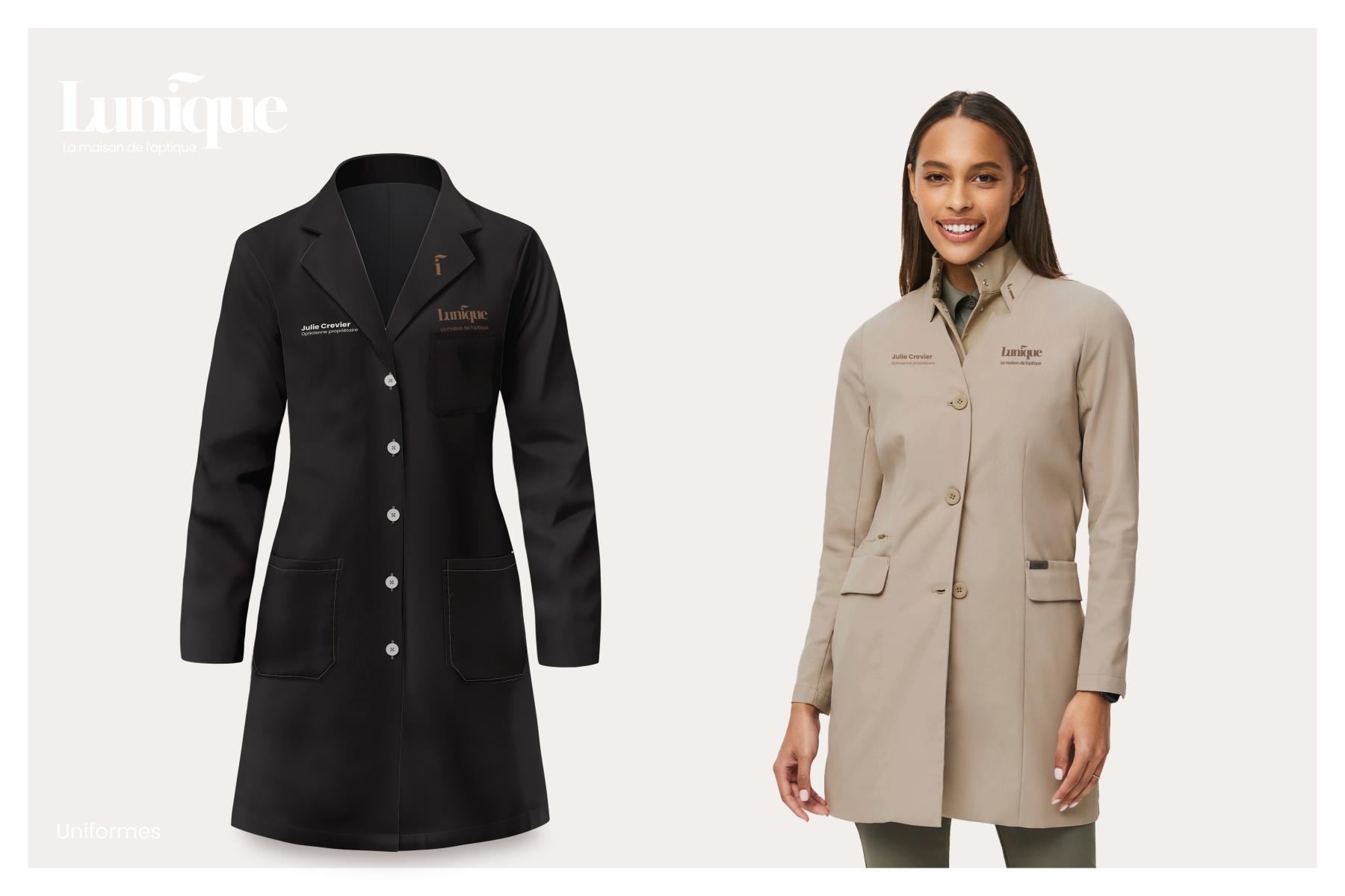
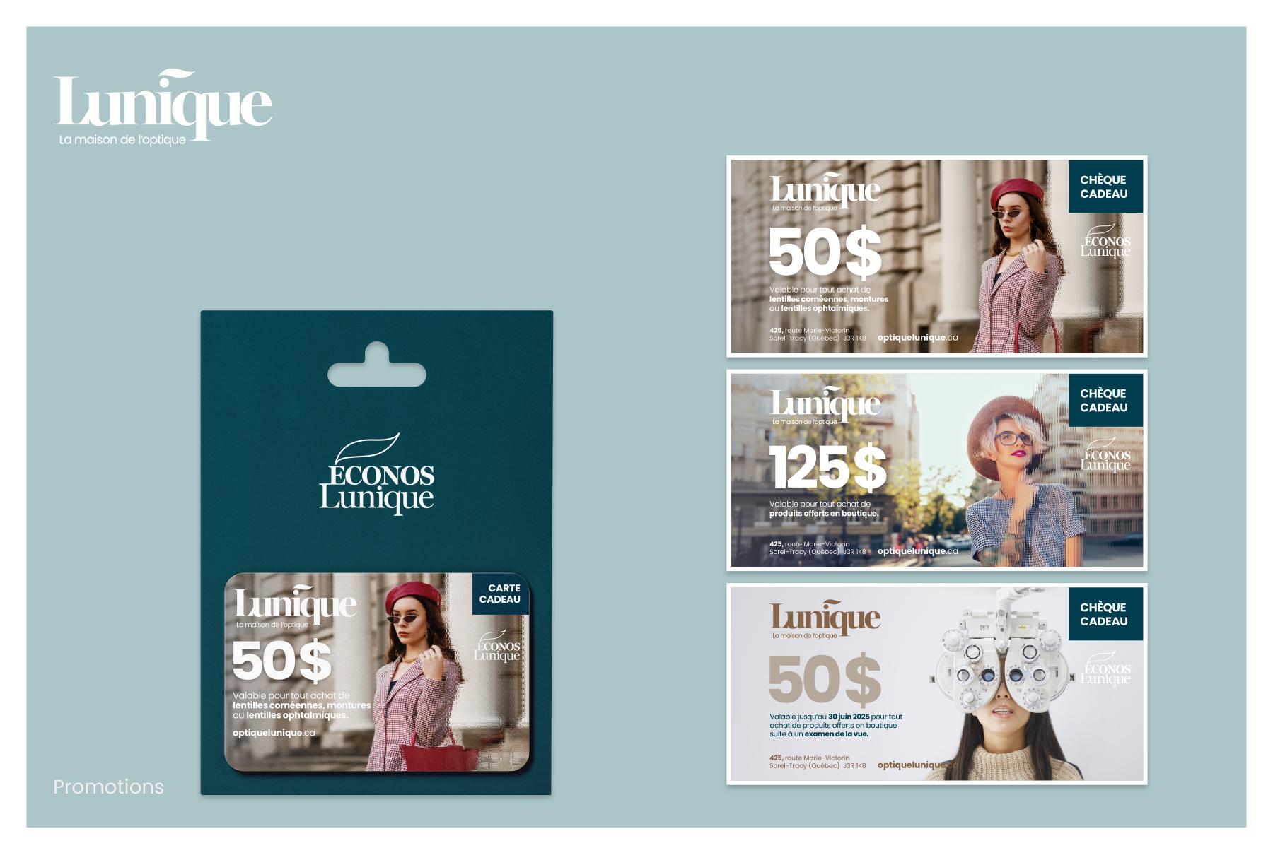
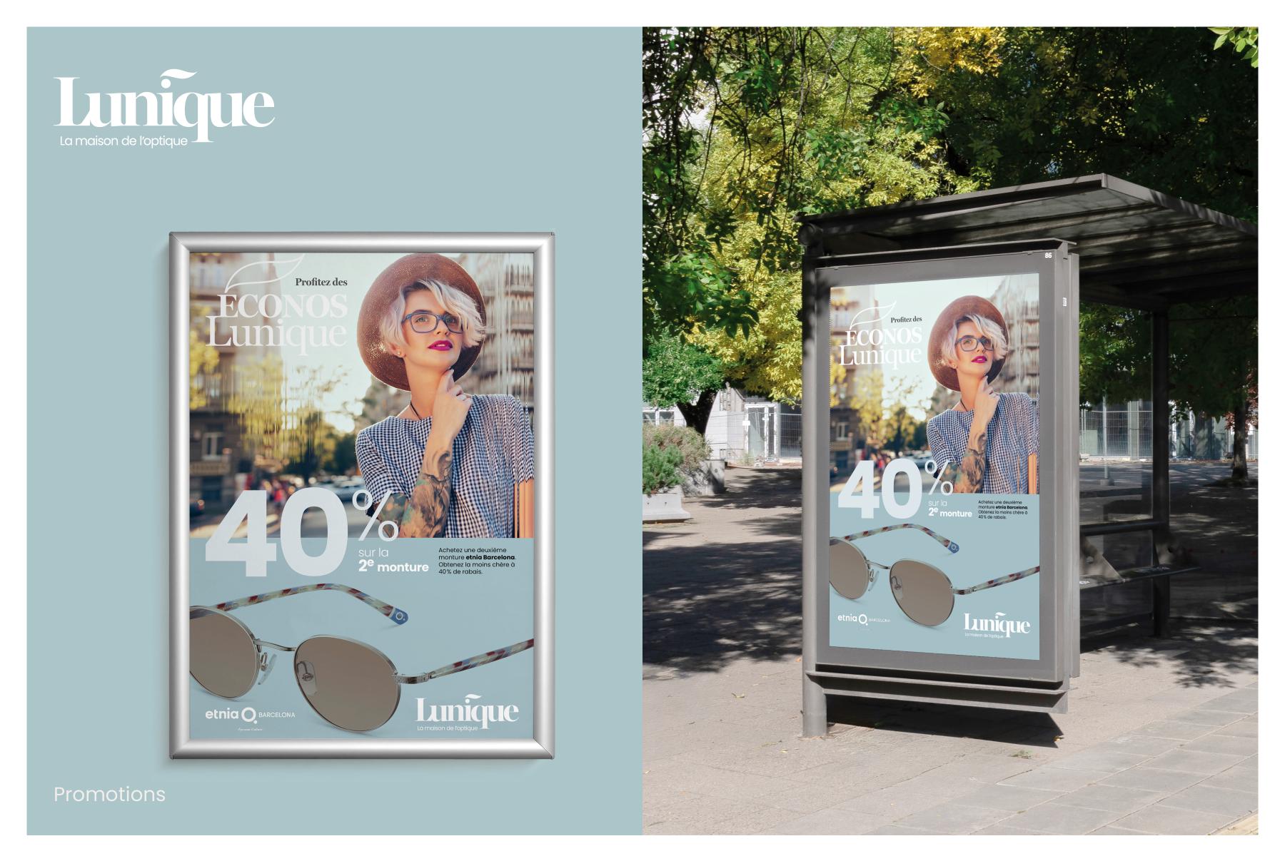
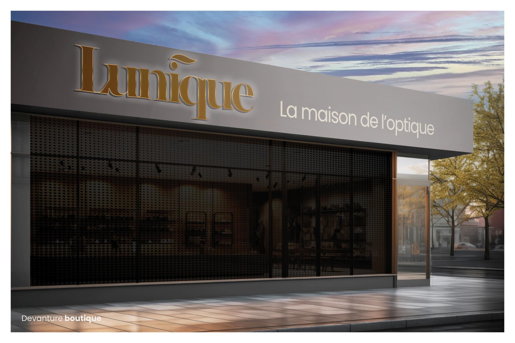
The mandate consisted of finding a name that would position the banner as well as developing its brand identity and components, then integrating it into utilitarian, advertising, promotional, web, and environmental elements such as the store's welcome area.
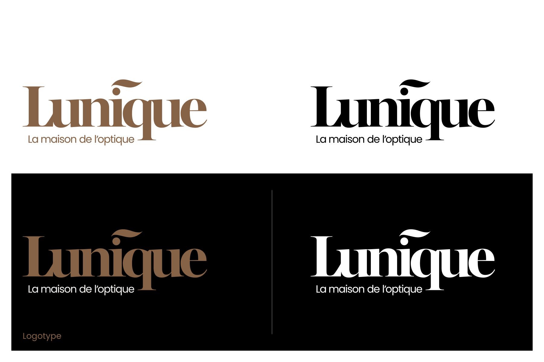
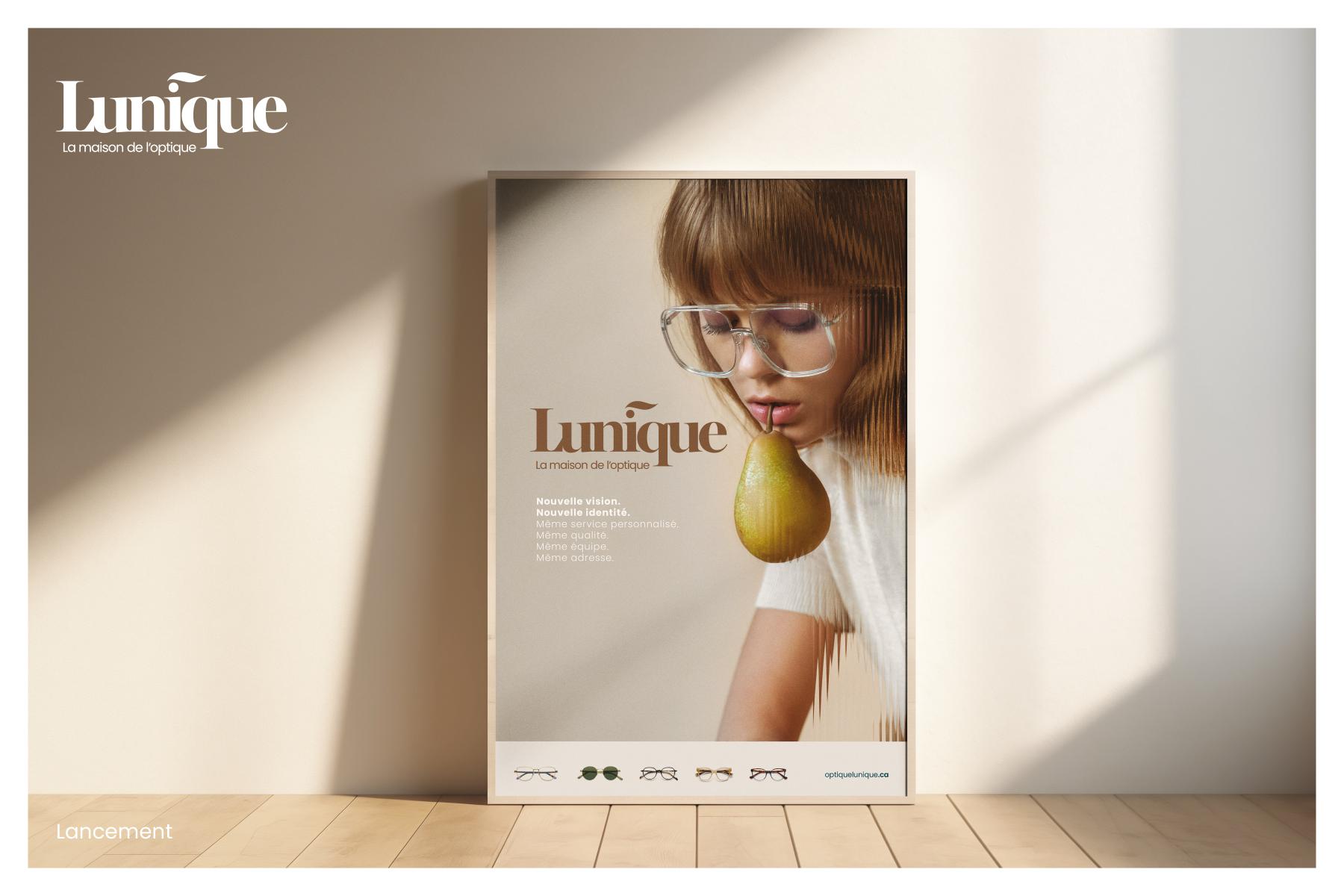
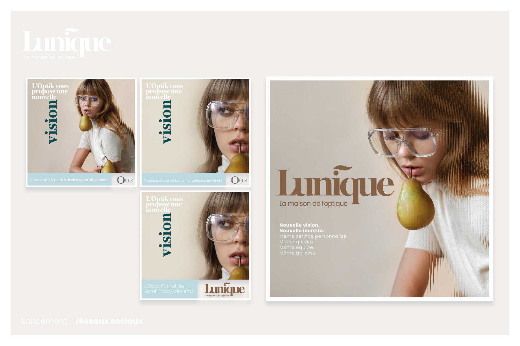
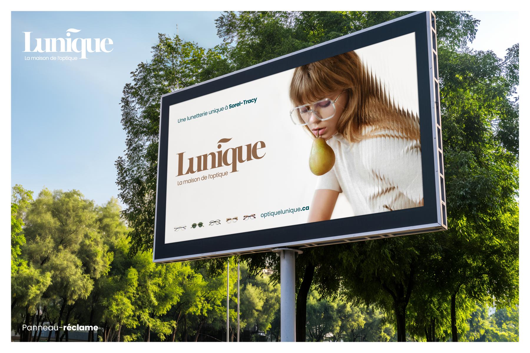
The brand Lunique is made up of the contraction of the words "lunettes" (glasses) and "unique". In its fundamental conception, this name represents the company's desire to stand out by the quality of its customer service. This way of providing service is viewed as the desire to treat each customer as a unique person, with particular needs and expectations.
This name also implies that the brand should present itself to its target market in a way that distinguishes it from its immediate competition. The intention here is not to fall into the trap of a generic brand representation that would tend to be confused with other businesses in the region.
The brand was designed with a spirit of differentiation and modernism while incorporating classic elements that will allow it to withstand the test of time.
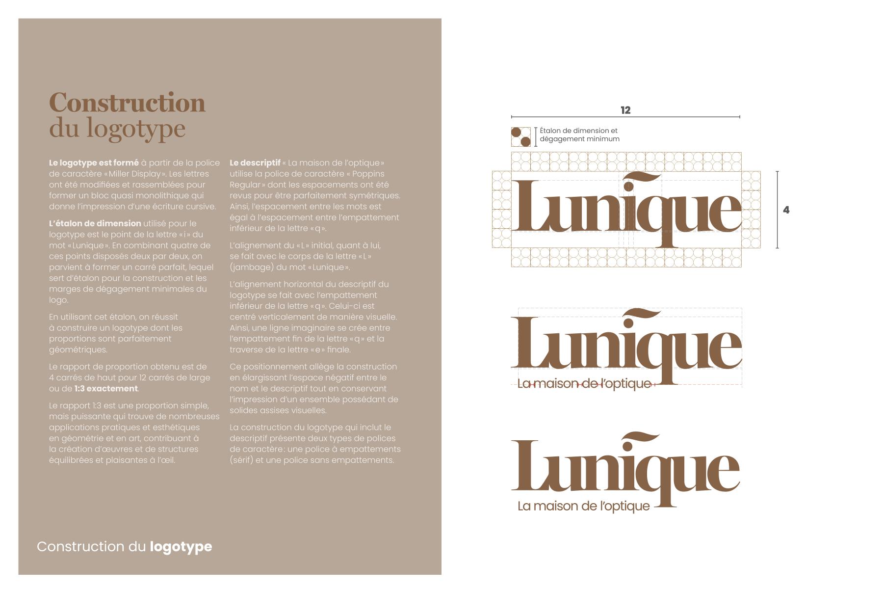
The logotype was first designed to be easily decodable given the particularism of the name. Readability was therefore treated as one of the fundamental criteria of graphic design.
Softness and warmth seen in a context of differentiation constituted the basis for the reflection that led to the brand's design in the aforementioned aspects.
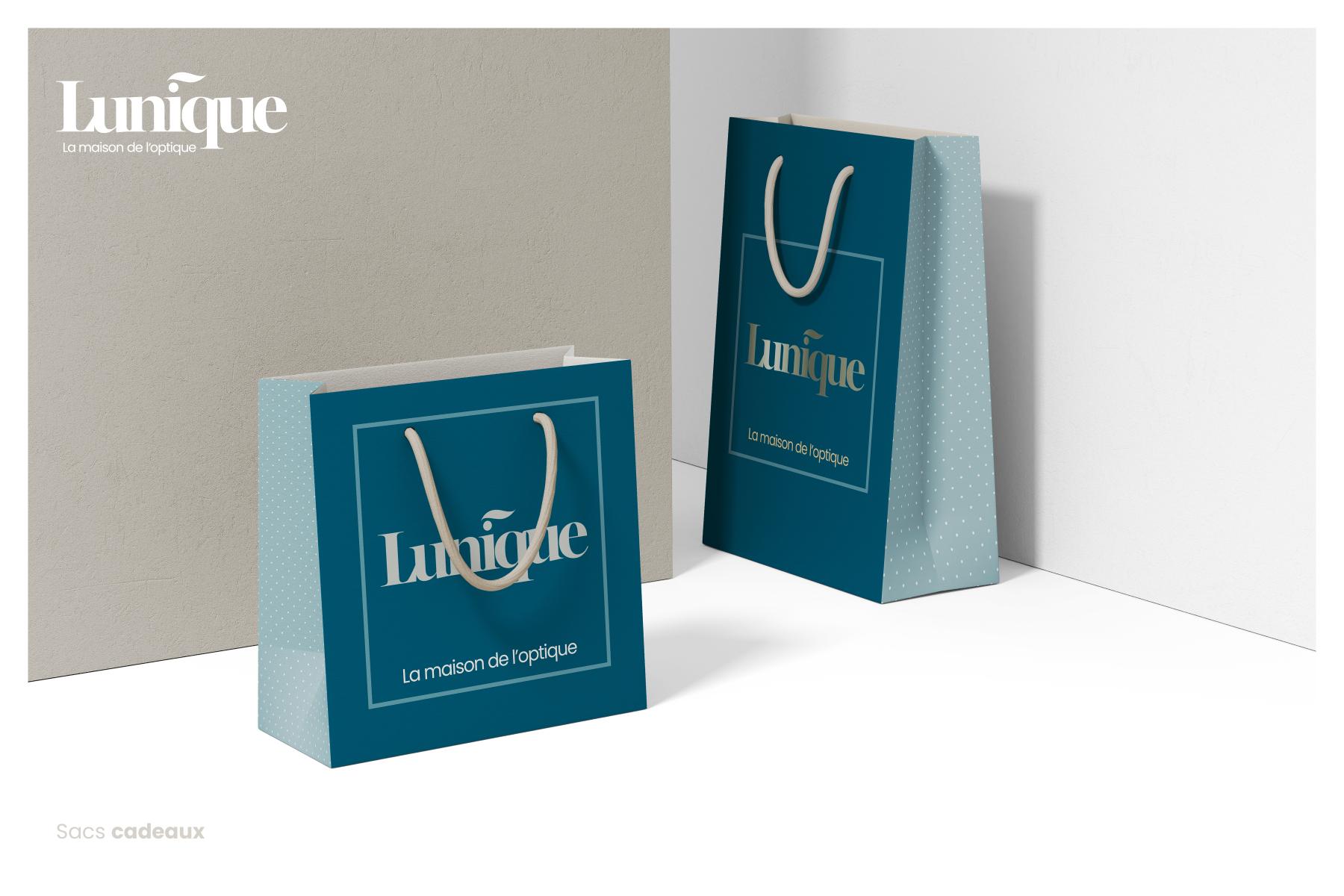
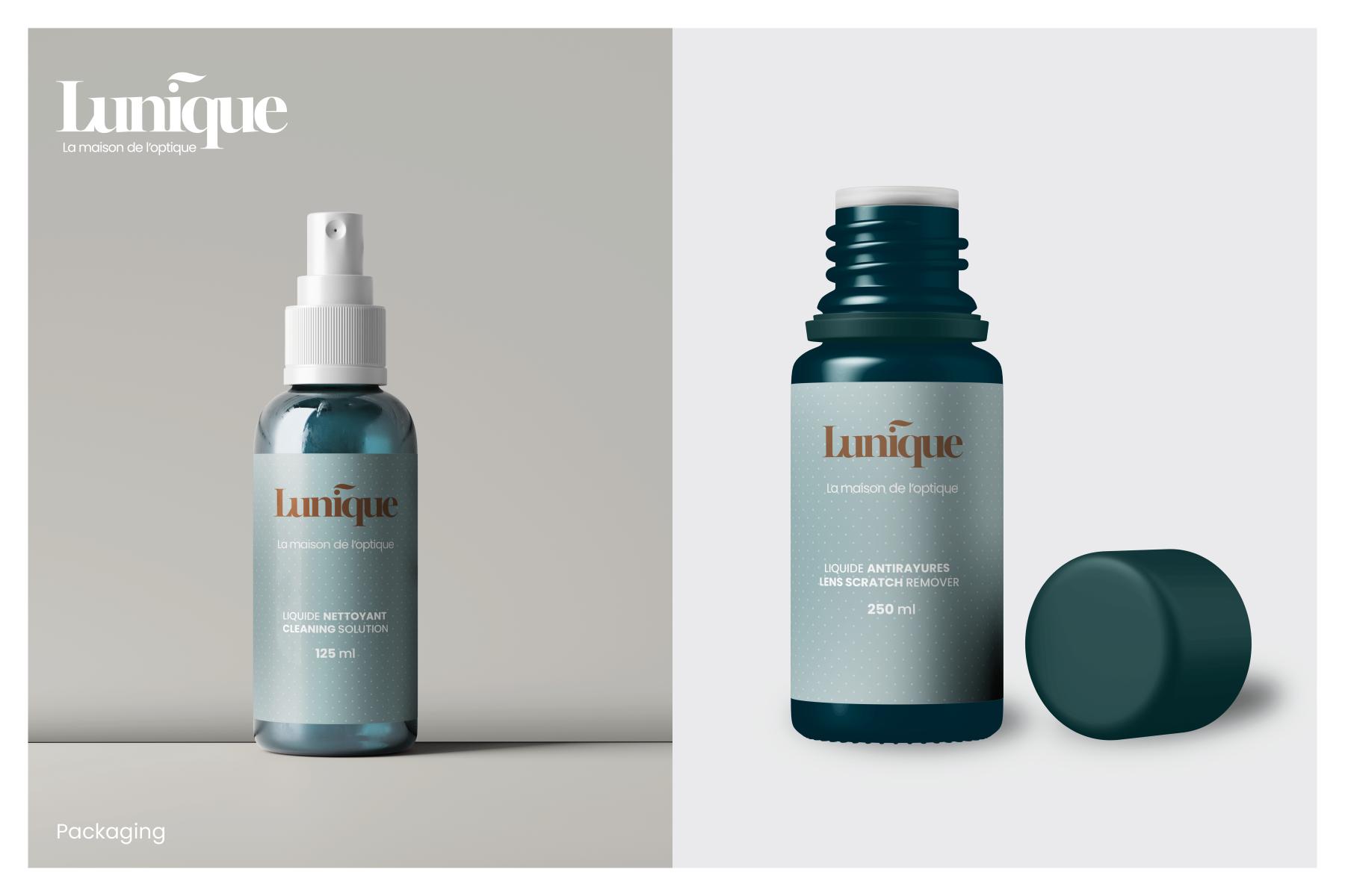
The main colors feature coppery and soft tones as well as a palette of greens from the former brand to maintain a link with the past and ease the transition to the new brand while preserving some of its brand equity.
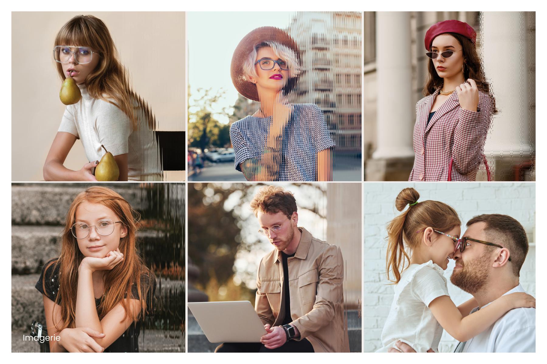
The photography features characters evolving in rather urban environments and employs glass effects that function to give a unique appearance to the images.
Through all of its constituent elements, the Lunique brand aims to create a cozy, warm, and enveloping atmosphere; a blend of tradition, elegance, and modernity generating an indescribable "fashion" effect combined with a sense of trust based on professionalism.
Collaboration
Communication & Branding : Soleil communication de marque
Photo credit