

Share to
COBS
By : Amanda Olfati, Max Lin, Serena Prosser

GRANDS PRIX DU DESIGN 19th edition
Distinctions
Discipline : Interior Design
Categories : Retail / Retail: Small & Medium (≤ 500 m² / ≤ 5,400 sq ft) : Silver certification
Fresh Baked Design
It takes the right ingredients to deliver a high-touch service experience in a small footprint.
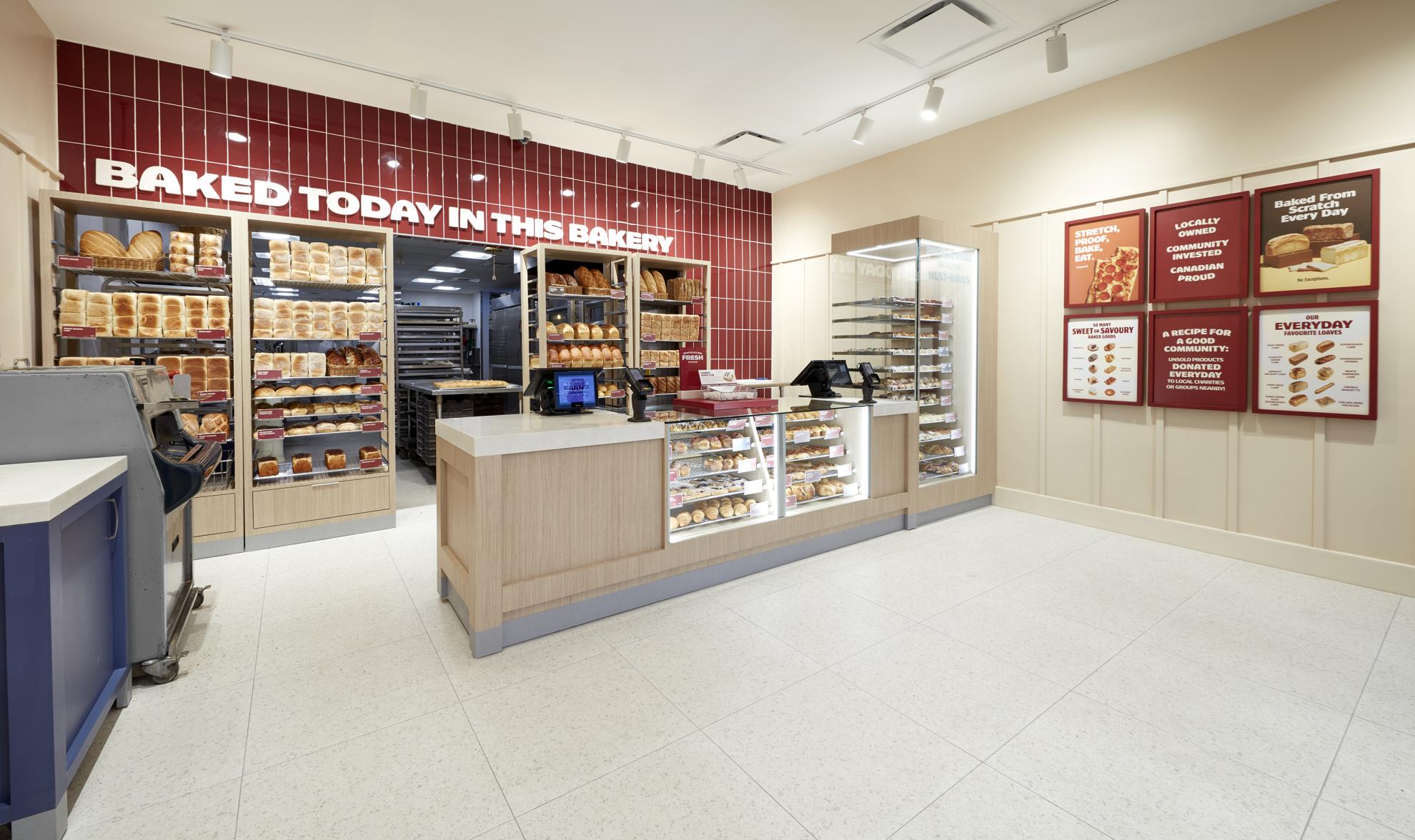
COBS has a winning recipe for success: every day, each location bakes its own goods from scratch on site. They passionately believe in this model because it means the quality of their product can’t be beat: you just can’t get bread, scones, and pastries this fresh from a centralized bakery. As a result, every location has a large back-of-house full of equipment, leaving a small storefront, where staff deliver a high-touch, full-service experience that’s also unbeatable. With a high volume of product to sell every day, our first challenge was to maximize the effectiveness of the space. The second was to amplify the brand’s promise of freshly baked goods, every day, on site.
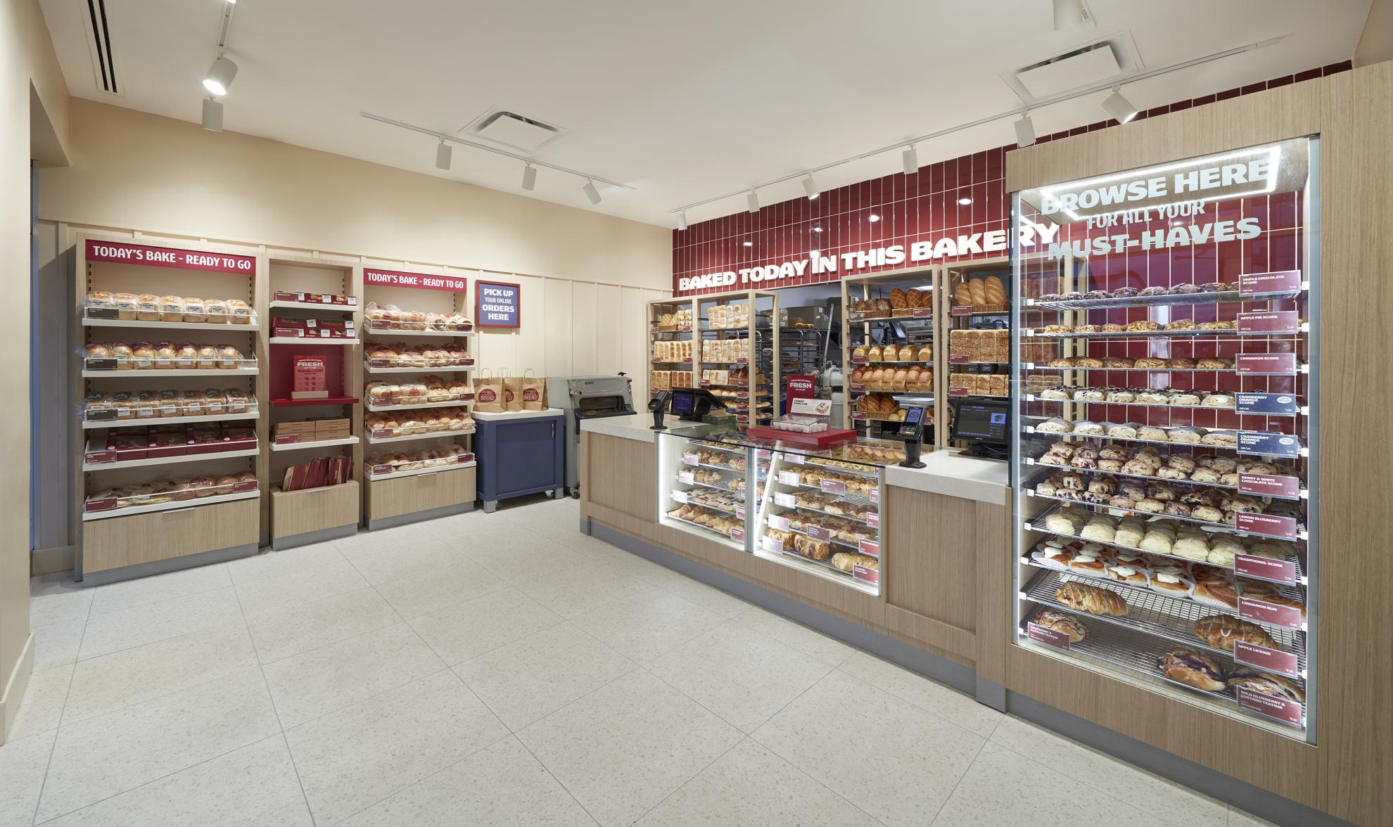
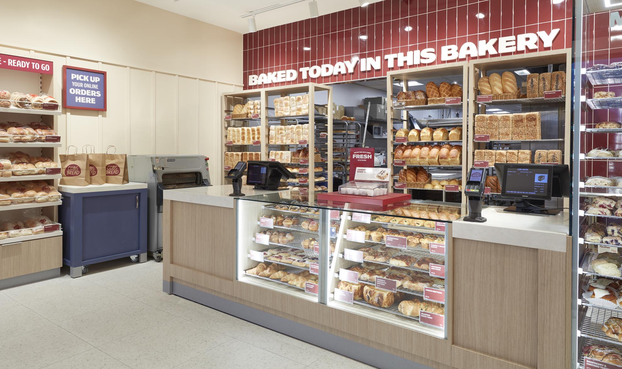
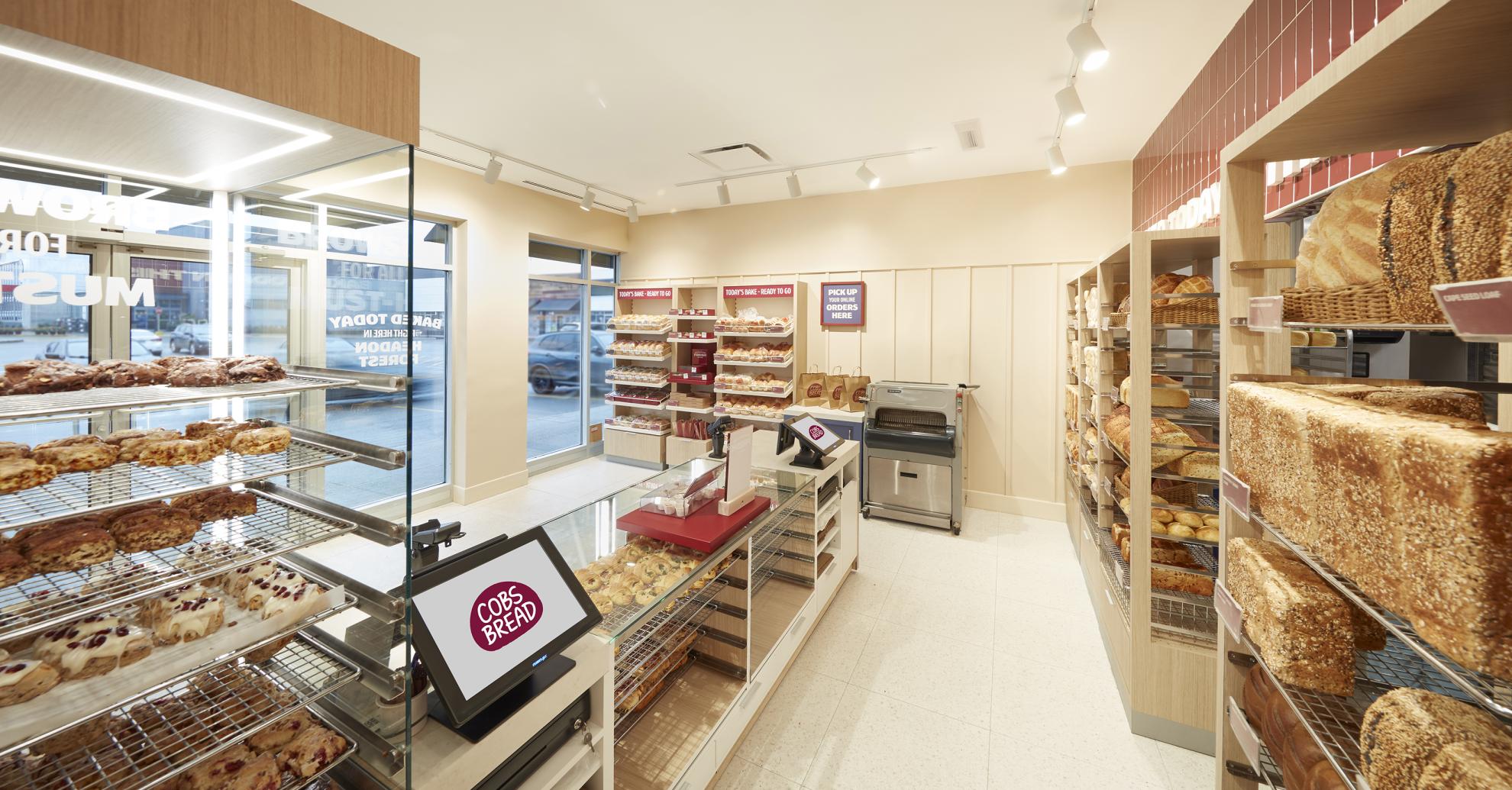
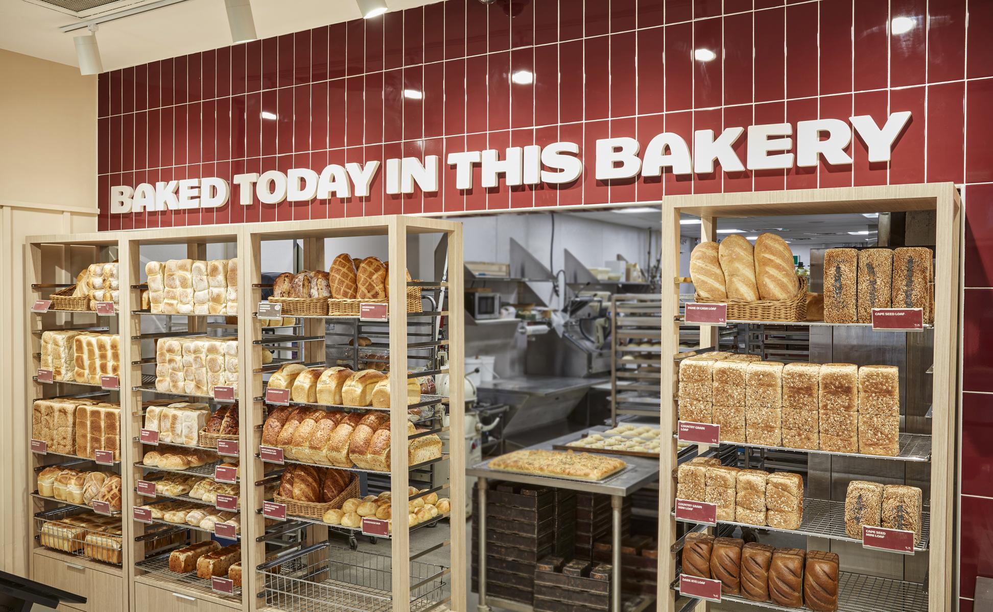
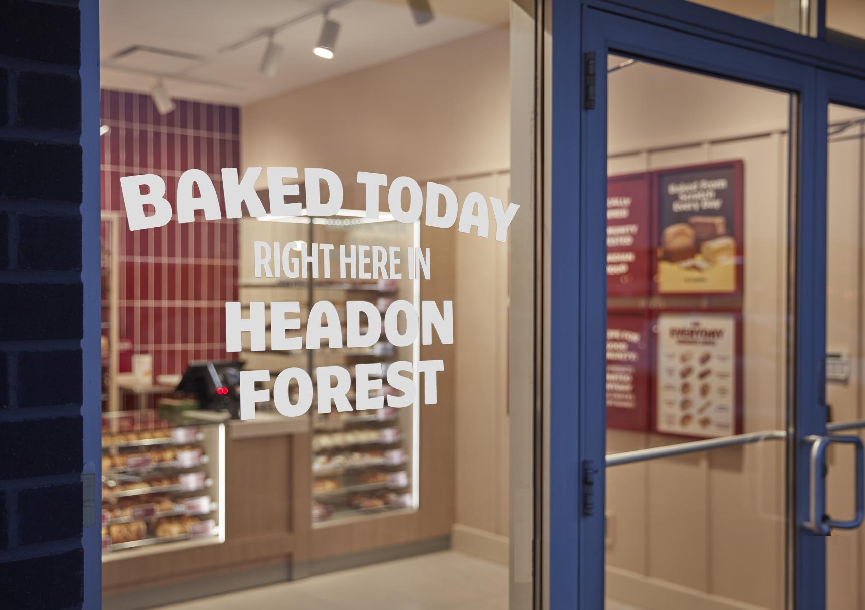
Telling customers that products are fresh is important, but seeing is believing. Our approach was to improve visibility and flow. We opened up the wall behind the counter, allowing a view of the bakers in action through shelves of freshly baked bread. This created spaciousness and improved workflow for staff who can more easily stock fresh items from behind. We added a prep table up front, allowing staff to complete tasks such as icing scones while still being visible and available for customers. We framed the bread wall with tile in the brand burgundy, a color that complements the toasted hue of their products. The rich backdrop is tagged with a simple message: BAKED TODAY IN THIS BAKERY.
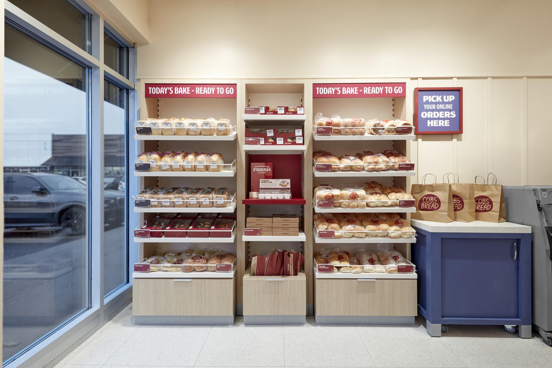
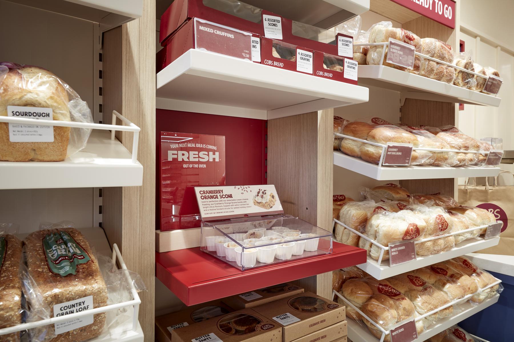
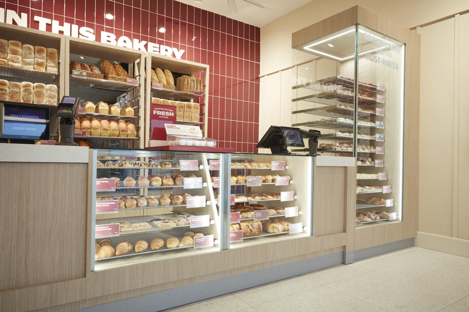
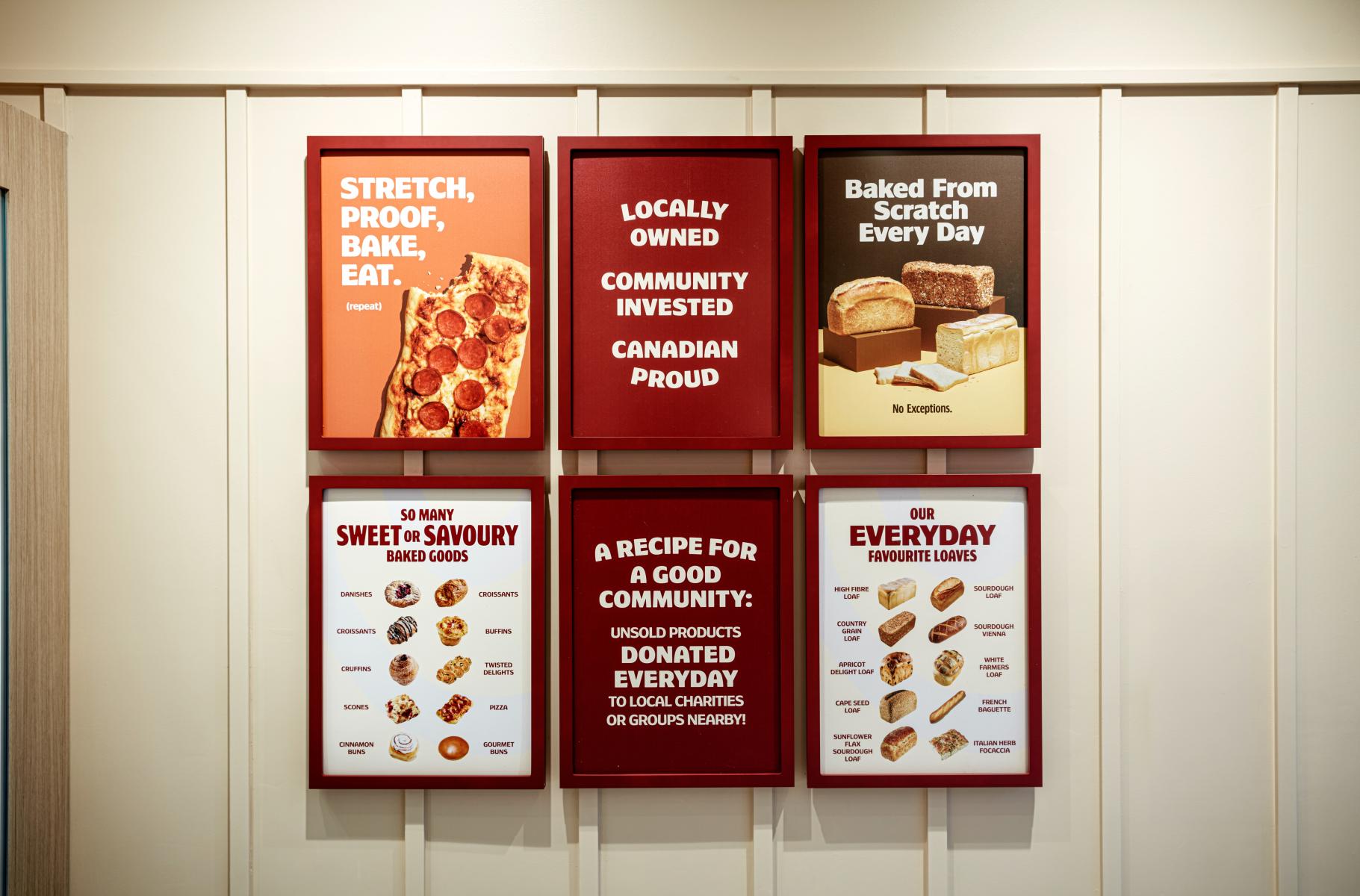
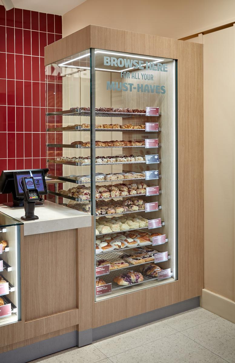
Visibility of the scones and pastries was also improved. In the old design, queueing customers blocked the view of under-the-counter display cases. We used height to our advantage, adding a tall glass tower on one side of the desk, ensuring the baked goods are elevated – literally – making them visible from anywhere, even the street. The grab-and-go area was enhanced with custom fixtures designed to show off the product. Shifting the service counter to one side created a clearer separation for those wanting full service and those quickly selecting popular items. And near the entrance, thoughtful graphics feature a menu board, storytelling about the brand’s community engagement, and placement for promotional content. The overall impact is an easier experience for both customers and front-of-house staff, while reinforcing the brand’s message of ultimate freshness.
Collaboration
Communication & Branding : Shikatani Lacroix Design