Jury-GRANDS PRIX DU DESIGN / Published on December 29, 2020
Share to
What prescient youthful memory relates to your present career?
I grew up close to a brick factory. Therefore, as a child, I had access to clay and often formed animals, oil lamps and figurines out of clay. The joy I found in forming objects out of formless material to inform that material has inspired and fascinated me all my life.

What are three basic rules you learned from your mentors?
■ Be humble
■ Listen
■ Be curious about this world of ours
What project launched your career?
As a very young designer at the famous Atelier Stankowski+Duschek in Stuttgart, Germany, I designed a logo for Germany’s bid for the Olympic Winter Games in 1992, and won. Being able to compete on the highest level was a breakthrough in confidence and the belief that if I work on a problem, I would find a solution.
Logo for Berchtesgaden, bidding city for the Olympic Winter Games 1992, Stuttgart, Germany, 1985.
Photo credit: Udo Schliemann.
The winning logo for the bid for the Olympic Winter Games in Germany in the city of Berchtesgaden.
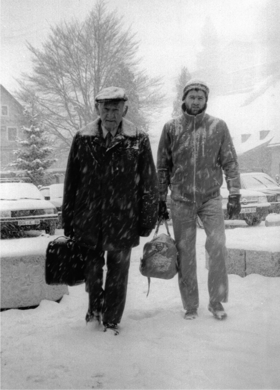 Stankowski_Schliemann, Berchtesgaden, Germany, 1985.
Crédit photo : Karl Duschek.
Anton Stankowski (left) and Udo Schliemann (right) arriving in Berchtesgaden in the German Alps to present to the Olympic Committee after winning the logo competition for the Germany’s bid for the Olympic Winter Games.
Do you listen to music while you work and what music is that?
I almost never listen to music when I work.
I like music, but not necessarily while I am working.
Do you work in PJs or three-piece suits?
I don’t work in a suit, but I also don’t like to work in my pyjamas. In my case, there has to be a certain attitude and routine in what I do. It starts with being ready, prepared and serious about your work.
What is your current design state of mind?
Despite being almost 40 years in the industry, I am always eager for the next job. To find a solution to a problem, to find a design that is unexpected still excites me.
What living designer/architect do you most admire?
I admire people who try to find new ways even if they have to go against the mainstream. We have to solve huge problems in this world. Creatives of all disciplines are specifically adapt to find solutions to these problems beyond a utilitarian or just cosmetic point of view. There are many designers who look for real solutions to our problems.
What past designer/architect inspires you the most?
One of the greatest designers, actually a true genius, was ANTON STANKOWSKI, who trained me and many others day by day without preference.
He was one of the first corporate designers in Germany, but also an artist of great reputation. For him, there is no difference between art and design, even so he was criticized for this position by many, but it worked for him.
Again there are many more, but I worked 16 years with him and witnessed his genius, his ethic and humanity.
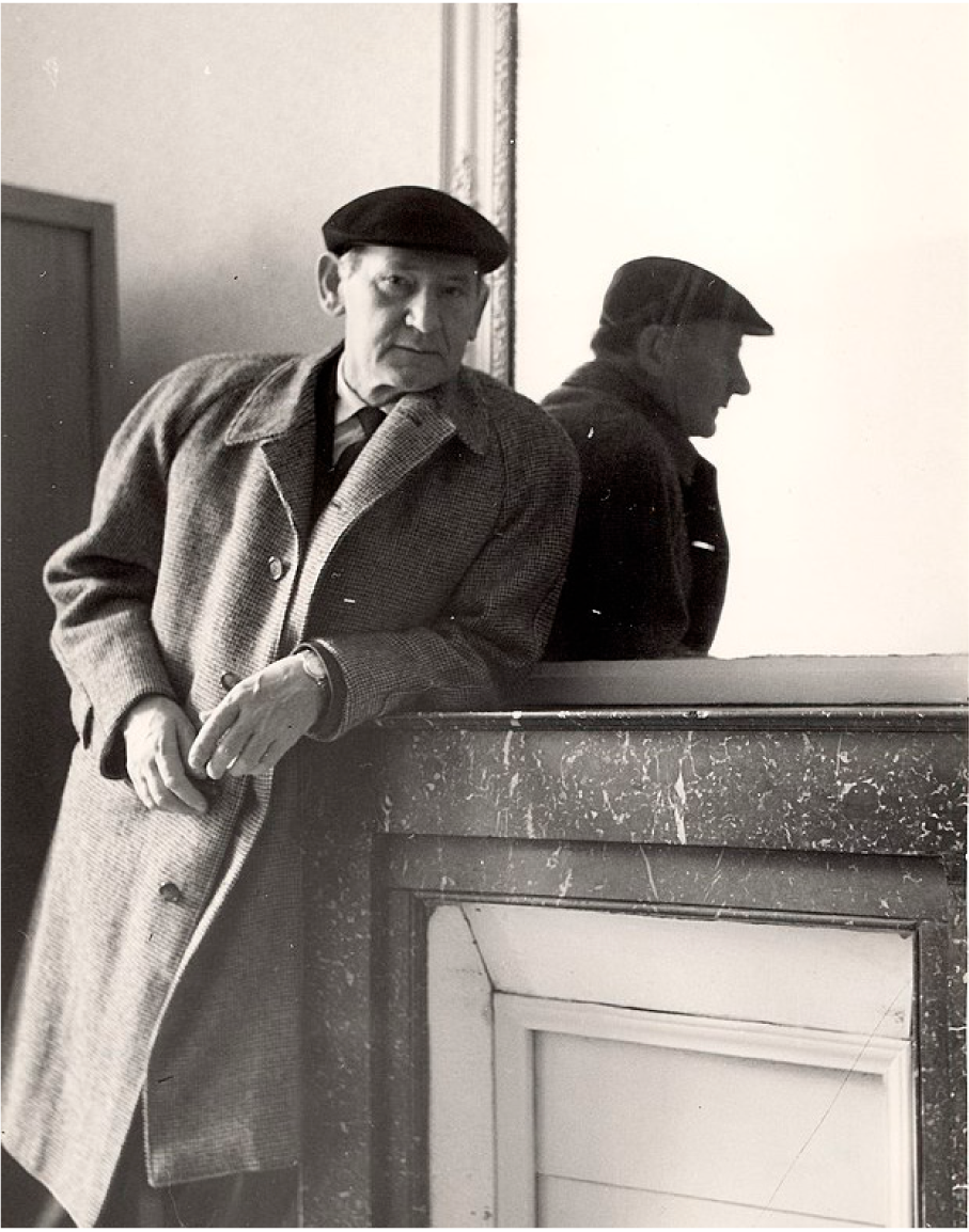 Anton Stankowski, CC BY 3.0, via Wikimedia Commons
What is your most marked design ability and or quality?
I had a career in Germany and I made my way in Canada as well. I started as a graphic designer in print and work now mostly as an experiential designer in environments, buildings, parks, etc. I received an excellent education and mentorship. I learned how to see, not only with the eyes, but through the eyes. My ability to listen and really understand the issues is a starting point for results. I see leadership as stewardship. It is not so much about specific skills, but to foster the next generation of designers to guide them and live by example.
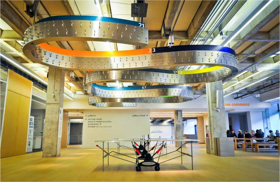 Weston Family Learning Centre, Toronto, Canada, 2012.
Photo Credit: Gerald Querubin.
Entro designed the way-finding and signage program in collaboration with HPA Architects for the Weston Family Learning Centre at the Art Gallery of Ontario. Oversized typography for easy navigation makes is easy for young students to find their way. A snake-like coat rack (by HPA) can be lowered to hang the coats and backpacks and then lifted up to create space underneath.

Toronto Financial District logo, Toronto, Canada, 2013.
Photo Credit : Udo Schliemann.
This brand represents the Financial District BIA in Downtown Toronto. The heart of the district is at the crossing of Bay and King St. Looking up at that crossing you see 4 banking towers. The logo represents this notion of 4 towers reaching into the sky. However, you not only see the lines of the towers but also the negative space of a star in-between. The colours signal that this is no longer an old boys club, but a very diverse group of professionals.
How would you like your designs to go down in history?
 |
It’s not easy to achieve exceptional results. But I want to be able to say that I tried to create something lasting and special. I have to be in peace with myself and my contribution to design. Fame is fleeting and not worth pursuing. |
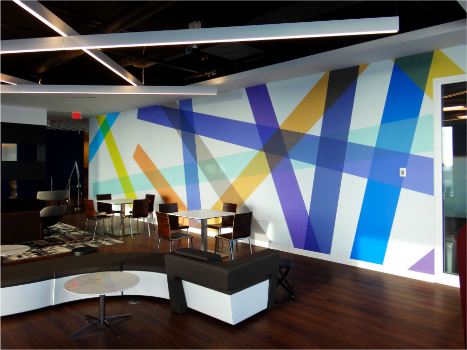
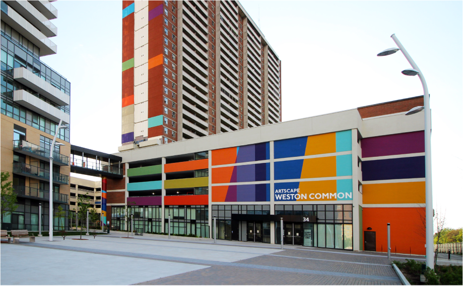
| Artscape Weston Common_2020, Toronto, Canada, 2020. Photo credit: Udo Schliemann. The Weston Common is a cultural hub developed by Artscape in Toronto’s West. What used to be a parking garage is now redesigned to become a welcoming and inviting community and cultural hub for everybody in this area. Colour is used extensively, because colour means life itself. However we used a fairly abstract pattern as it should be just a canvas to attract and identify not to force our thinking and style onto this neighbourhood. |
What peer quality do you most value?
To be curious about everything around them…
Which project is the epitome of your work?
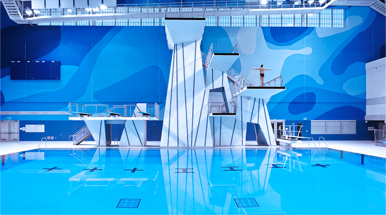
I hope that the epitome is still out there. However, the design for the Pan Am Aquatic Centre, a wall mural behind the diving tower is quite special.
How are your country of belonging’s values reflected in your work?

I am certainly influenced by the
design philosophy of clarity, simplicity, objectivity and humanization in design. I feel that these values are true no matter where you live.
Canadian Flag Installation 2018, Toronto, Canada, 2018.
Crédit photo : Udo Schliemann.
For Canada Day in 2018, I was commissioned to design a 3-dimensional Canadian Flag at an enormous scale. The flag, made out of 5000 red and white ribbons, was installed at a two-storey business lobby in downtown Toronto. Through the ventilation system, the ribbons move gently in the wind, almost like a real flag.
What always inspires you?
Instead of looking at magazines, Instagram pictures or Pinterest examples, I look for inspiration in art. If you look for inspiration in already designed products your mind is not free anymore to wander around to find new solutions. But art does not deliver readymades, instead art suggests new ways of seeing and understanding, questioning our world.
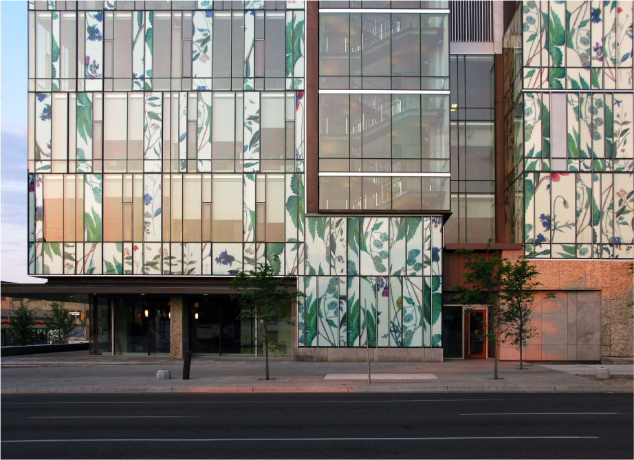 School of Pharmacy_U of Waterloo, Kitchener, Ontario, Canada, 2014.
Crédit photo : Udo Schliemann.
The University of Waterloo School of Pharmacy in Kitchener, Ont. is focused on medicine based on natural/flower ingredients. This idea of the school is visualized right on the curtain wall all around the building. By sourcing medicinal flowers and arranging them as film prints baked into two glass layers, the façade becomes expressionistic and interesting.
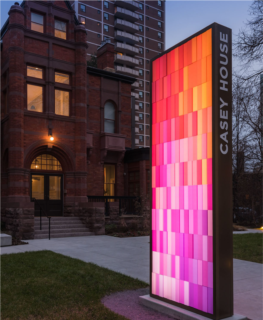 Casey House Pylon. Toronto, Canada, 2018.
Crédit photo : Gerald Querubin. Casey House is a HIV-hospice. The exceptional passionate care that nurses provide to HIV Aids patients is outstanding. Instead of having an institutional looking pylon to identify the place, I developed a concept that is based on the passion and warmth of the caregivers. A pylon completely made out of a grid of oblongs in red hues is expressing exactly that.
If a spell were to transform you into an object, by all means, what would you like to be, and why?
If that would happen, I would like to be a child. Seeing the world through the eyes of a child is a world full of wonders, mystery and joy.
What is your favorite place in the world?
Beside my wife and children.
What design or architecture project do you wish you would have thought of yourself?
Yes, there are many great solutions or clever combinations that we all would like to have thought about first. We would all like to create something exceptional like the Apple logo or an iconic building like the Guggenheim in Bilbao by Gehry.


However, what’s more important is to follow your path, keep going and enjoy the ride.
If you could host any three guests, past or alive, over for dinner, who would you choose and what would you dare serving?
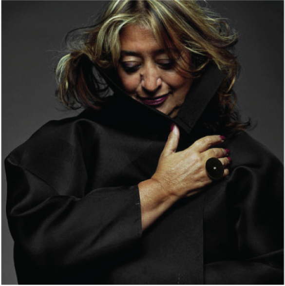
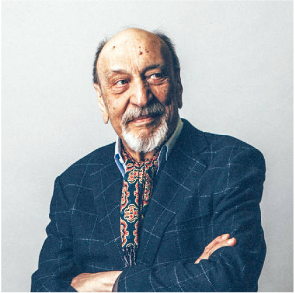
ZAHA HADID, MILTON GLASER and NELSON MANDELA.
 |
 |
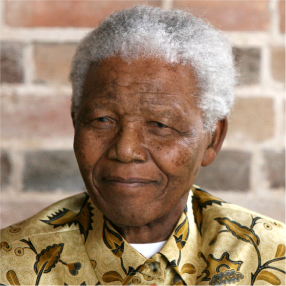 |
| Z. Hadid, source © zaha-hadid.com | M. Glaser, source © Catalina Kulczar | N. Mandela, source : Shutterstock |


