
Partagez sur
Haikou International Duty Free Reception Center
Par : aoe lead designer Qun Wen
GRANDS PRIX DU DESIGN – 15e édition
Discipline : Architecture
Catégories : Bâtiment public / Bâtiment culturel : Certification Or
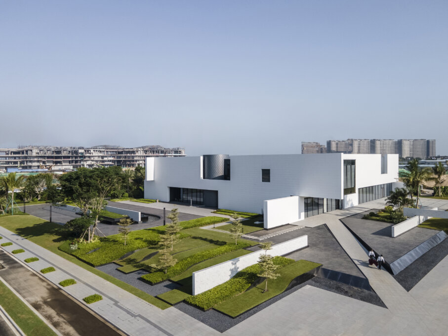
Architecture which has appeared in the Stone Age, it use the basic structure of wind to provide people with shelter from rain. On the basis of functionality, the pursuit of more spiritual soul is injected. The building is located in the Haikou Binhai New Area, it is not only a characteristic sales center also a modern art gallery. It is the gateway to the west coast city and the spiritual fortress of this area.
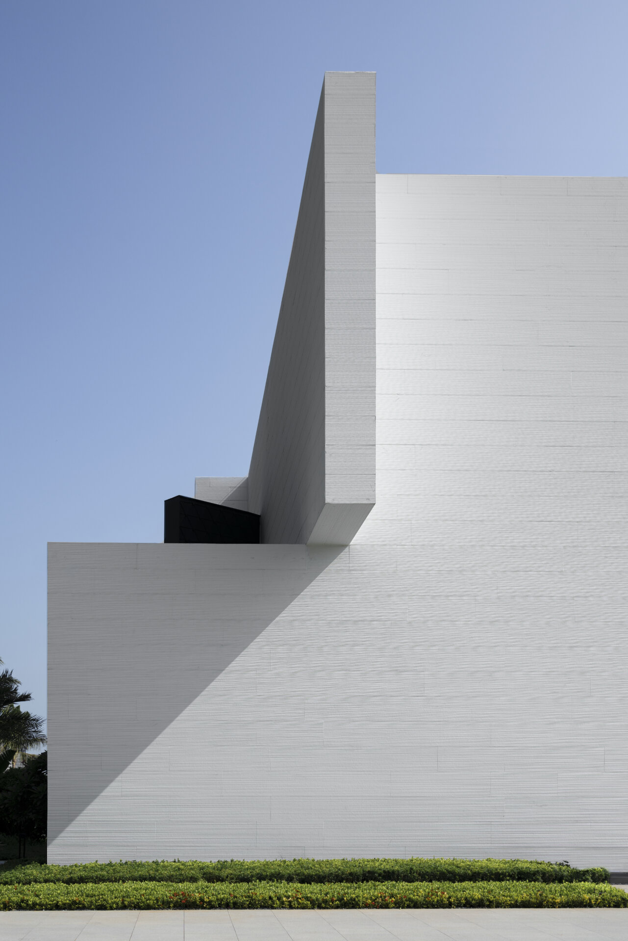
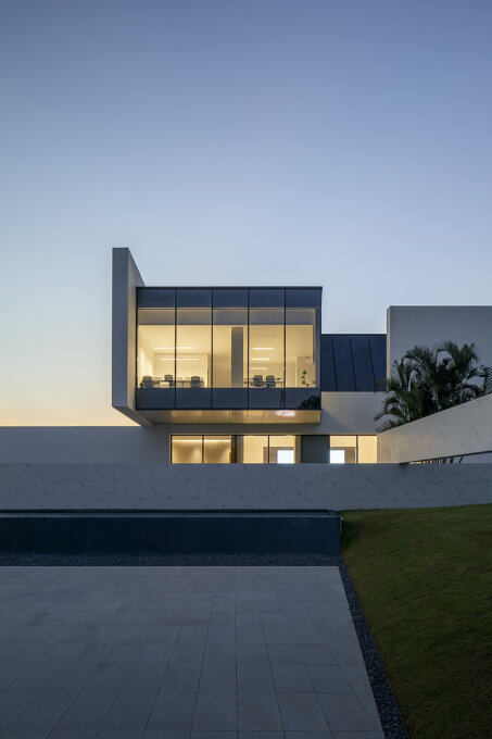
In the design, we use deconstructionist techniques to dismantle and reorganize the building wall, release the form and volume and then realize the infinite possibilities of space by interspersing the blocks. The integration of the style school abstracts and simplifies the architecture, to make it to an artistic element.
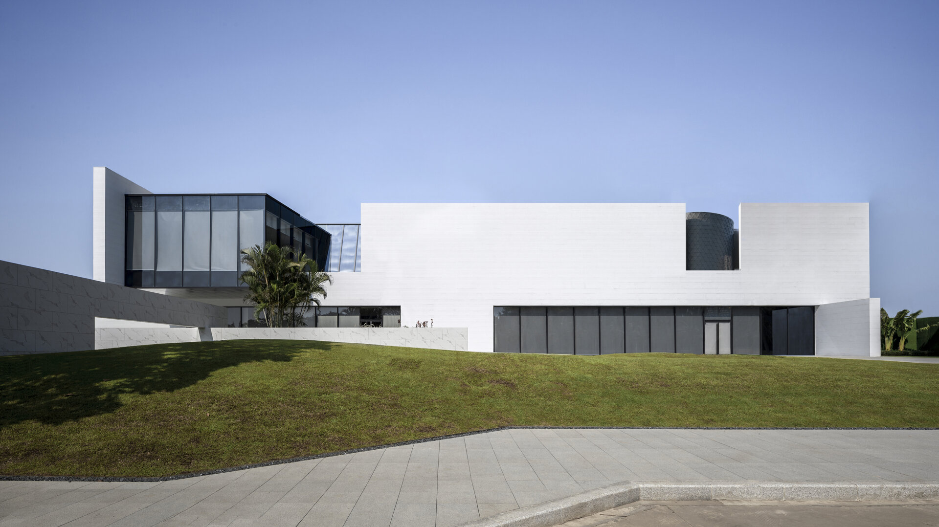
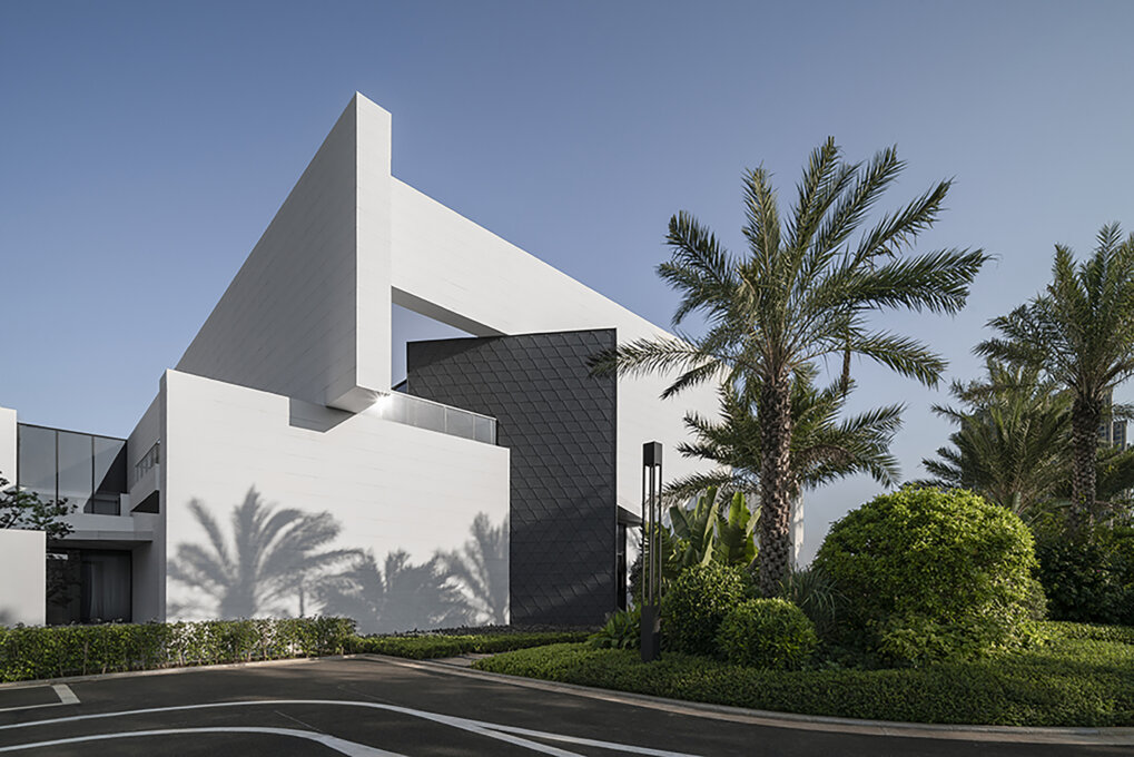
We increased the thickness of the outer wall to emphasize it and form a strong architectural symbol. At the same time, windows and platforms are inserted into the wall to open the covered building to the city, it also introduces urban events into the building and becomes a place for the public to create events.
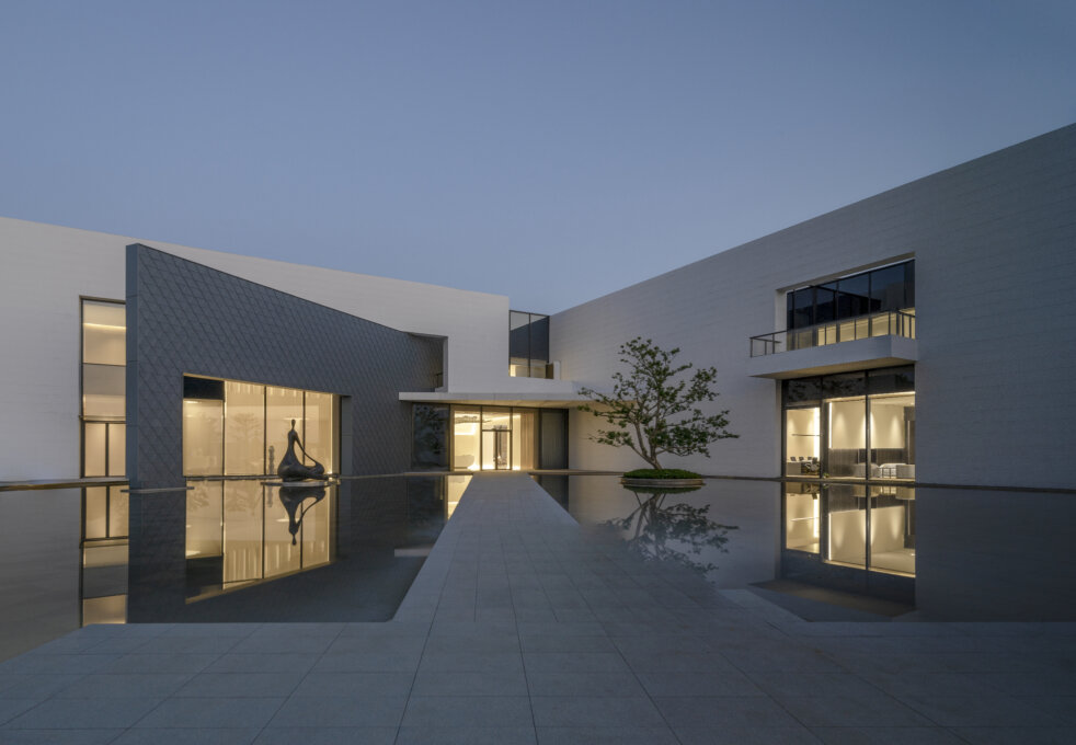
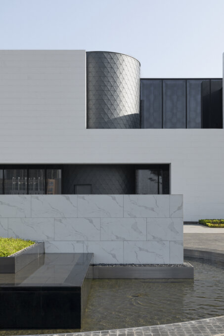
The addition of circular elements emphasizes the geometrical sense of the building more. The curved wall is displayed at the opening of the outer wall, and completely different materials are used to form a visual focus on the facade. The interior is also interspersed with blocks of different shapes, forming a rich and varied space.
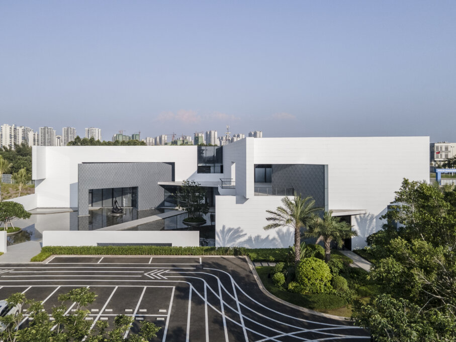
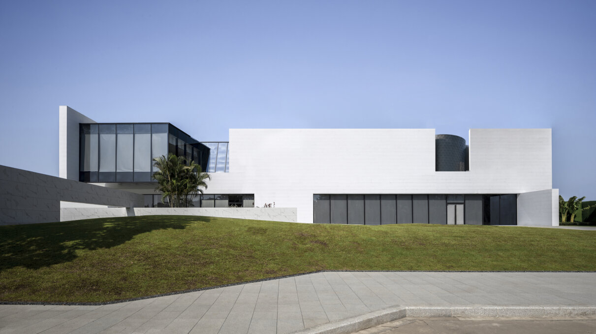
In the choice of facade color, we considered the city of Haikou's climate characteristics of warm and comfortable all year round and sufficient sunshine and chose white as the main color to make the building brighter and more refreshing visually. The large area of the white wall is like a pure canvas and the light and shadow are like pen and ink. Painting on the wall is like the blank in traditional Chinese painting.
For the material of the elevation use horizontal-grained panels and titanium-zinc panels are used as embellishments on the protruding walls and curved walls of the building. The white of the cross-grained board and the gray of the titanium-zinc board collide with each other, forming a strong contrast. The texture of the two materials is derived from the skin of the dried palm which makes the building more textured and echoes the surrounding natural environment.
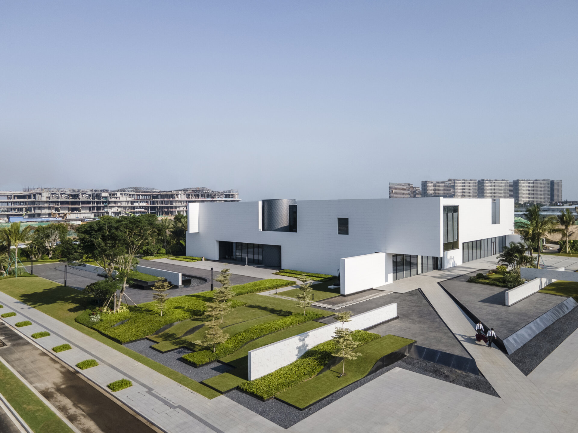
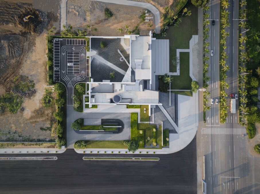
The project is functionally divided into two major areas, marketing area and investment promotion area. In order to achieve the relative independence of the two functional areas and the integrity of the building, we arranged the volume in an L shape. The marketing area is arranged along the main road and is more open. The negotiation area on the first floor uses a large area of glass, the space is bright and transparent and the interior scene is shown to the pedestrians. The good accessibility allows pedestrians to easily participate in the activities inside the building.
Compared with the marketing area, the overall investment zone is relatively closed to ensure the privacy of visitors. The function of the investment promotion part is developed along the city's secondary arterial road. On the side of the street interface, the real wall is used to isolate the noise and the view opens on the side facing the inner courtyard. Visitors enter the interior of the building through a cylinder of titanium-zinc plates. A terrace is set on the second floor to enjoy the view of the inner courtyard and the entire area.
Collaboration


