


Share to
Winterlong Brewing Co. Beer Can Labels
Discipline : Communication & Brand Design
Categories : Communication Design / Packaging creation : Platinum Winner
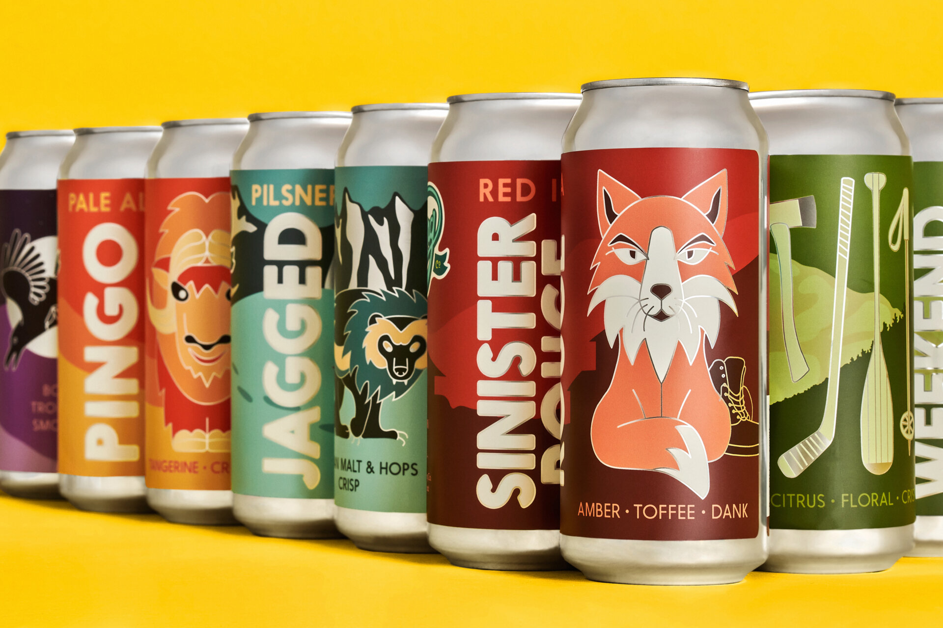
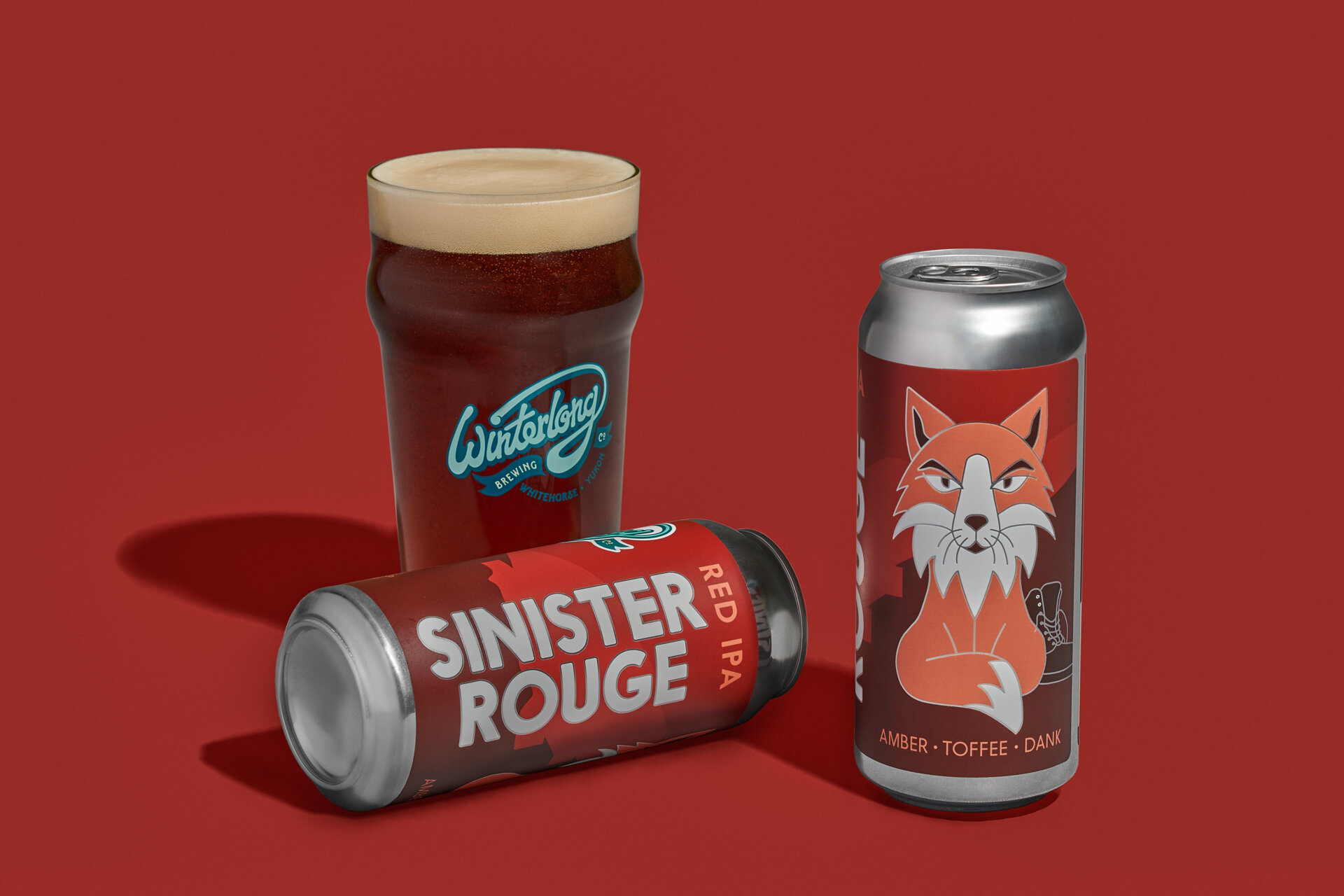
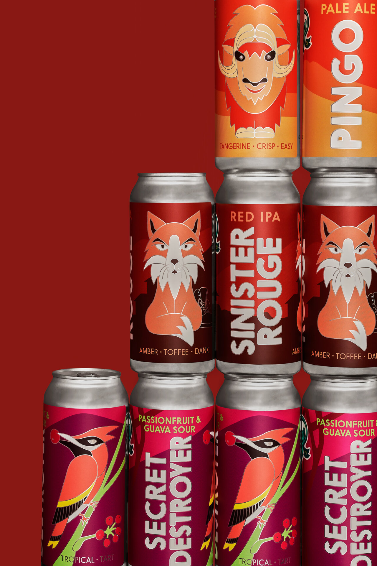
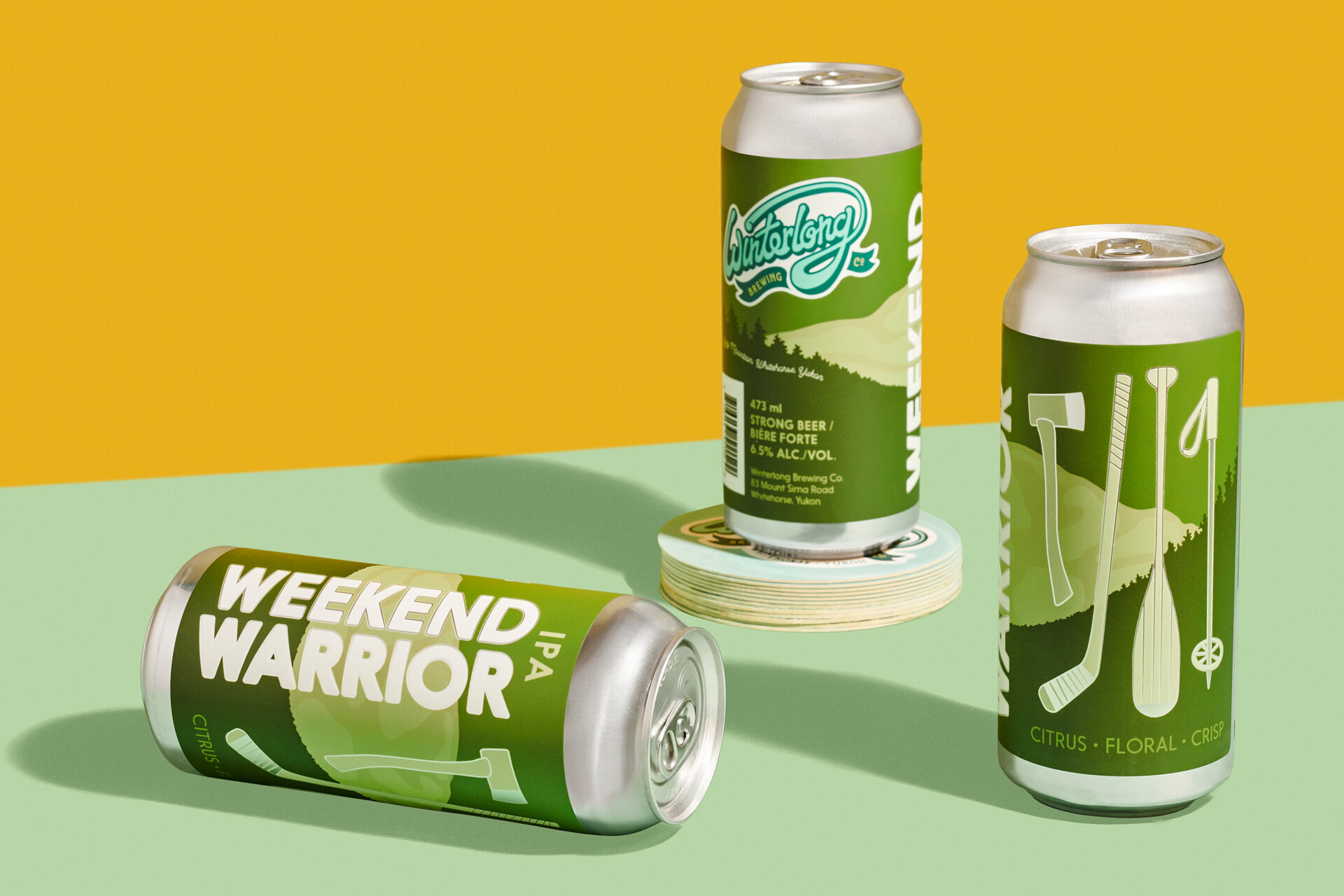
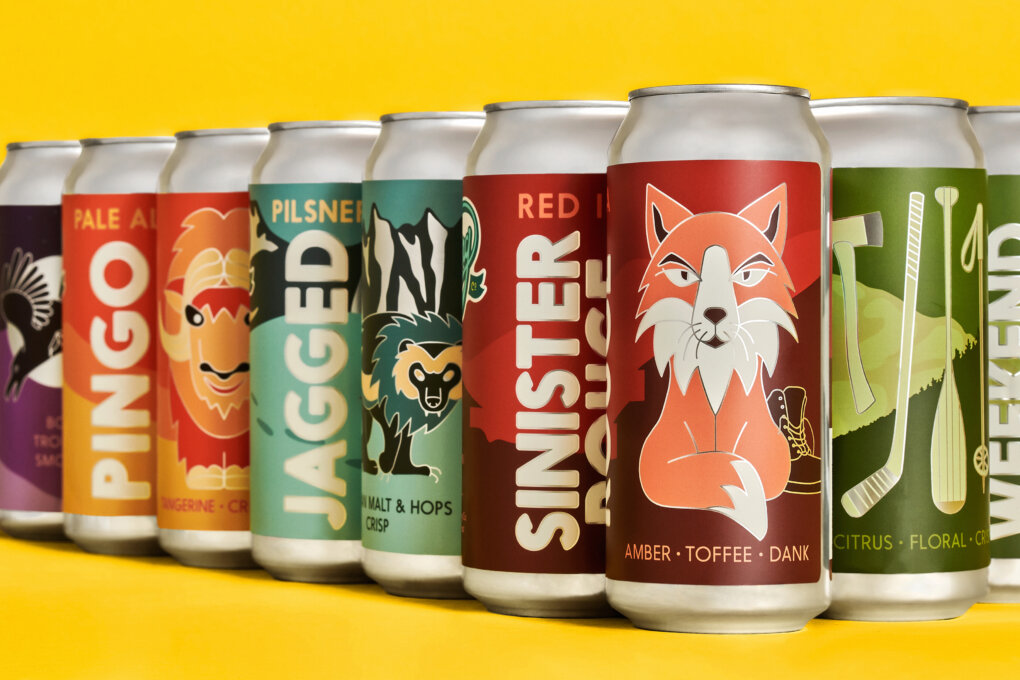
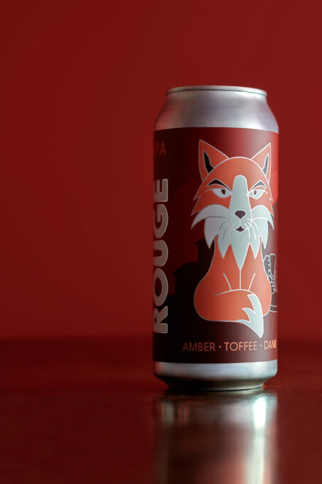
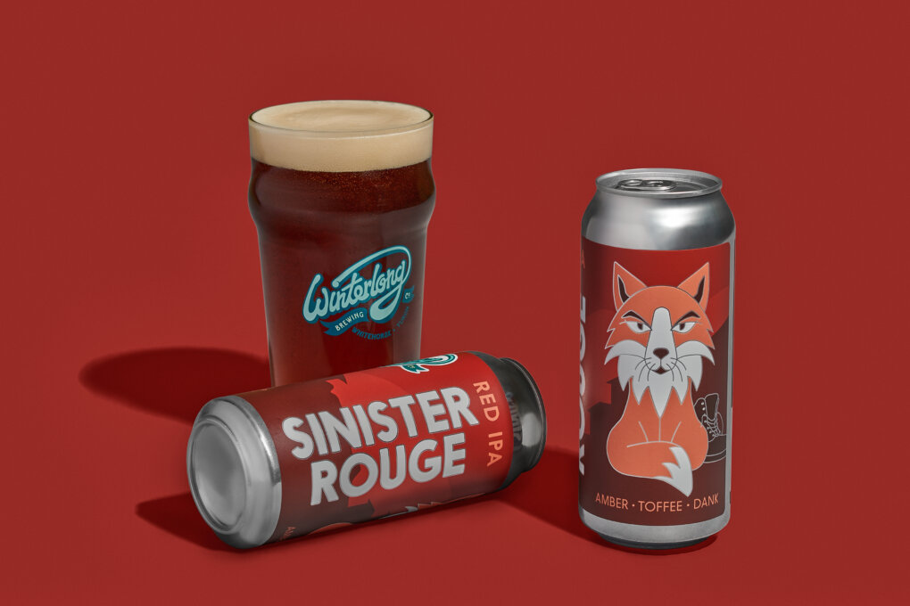
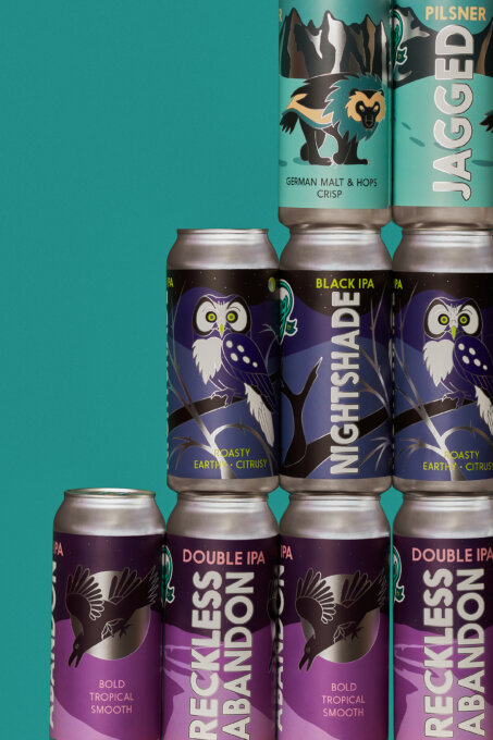
The Yukon has a problem. Glass cannot be recycled in the territory and ends up in the landfill, so Whitehorse’s Winterlong Brewing Co. opted to can their beer. New problem: how to cover the naked cans? Solution: a design system that is bold, bright and wild—like the beer, the landscape and the people who thrive here. Each can boasts bold typography and an illustration that is particularly meaningful to a local. For instance, Sinister Rouge features a sneaky red fox with a stolen boot. (Yukoners know not to leave their boots outside, least they get foxed away overnight.) Or Secret Destroyer, starring the cedar waxwing who gorge themselves on fermented berries and cannot fly for a little while thereafter. The typography and artwork are set over iconic Yukon landscapes of which the locals are fiercely proud. The saturated colours are enhanced by silver outlines, softening the impact of the blank aluminum can and unifying the family of labels, but more importantly, creating a unique tactile experience as the light dances around the edges. The launch of each new Winterlong beer is highly anticipated, with many Yukoners eager to get a hold of a can, not only to enjoy the delicious brew, but also to peel, stick and expand the collection of labels adorning their cabin walls, garages, and even snow machines.
Collaboration
Graphic Designer : Mary Binsted Designs