
Share to
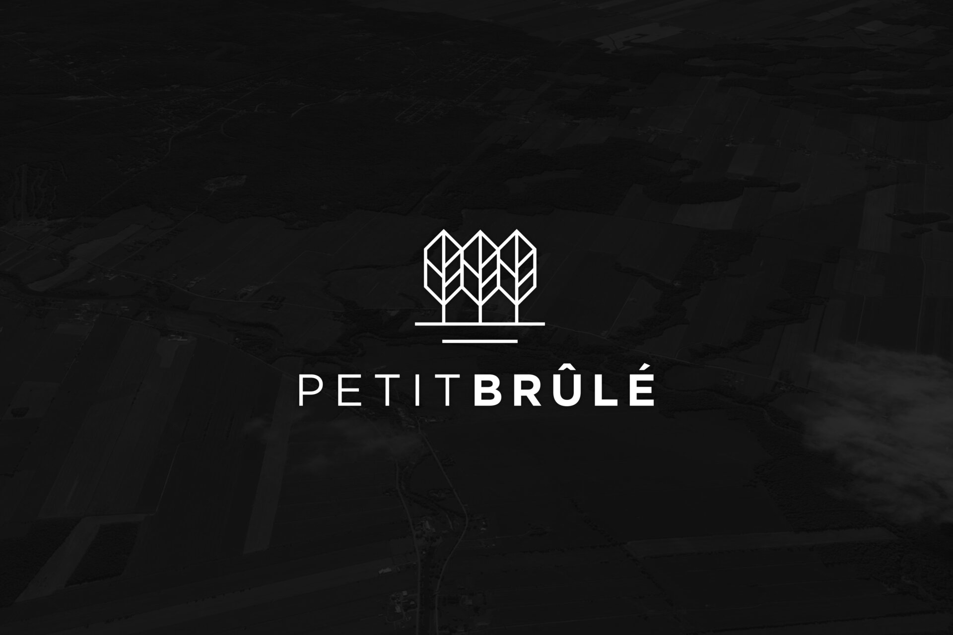
Petit Brûlé
By : Agence Braque

GRANDS PRIX DU DESIGN – 14th edition
Discipline : Communication & Brand Design : Grand Winner Int'l
Categories : Corporate Identity / Brand Image Creation
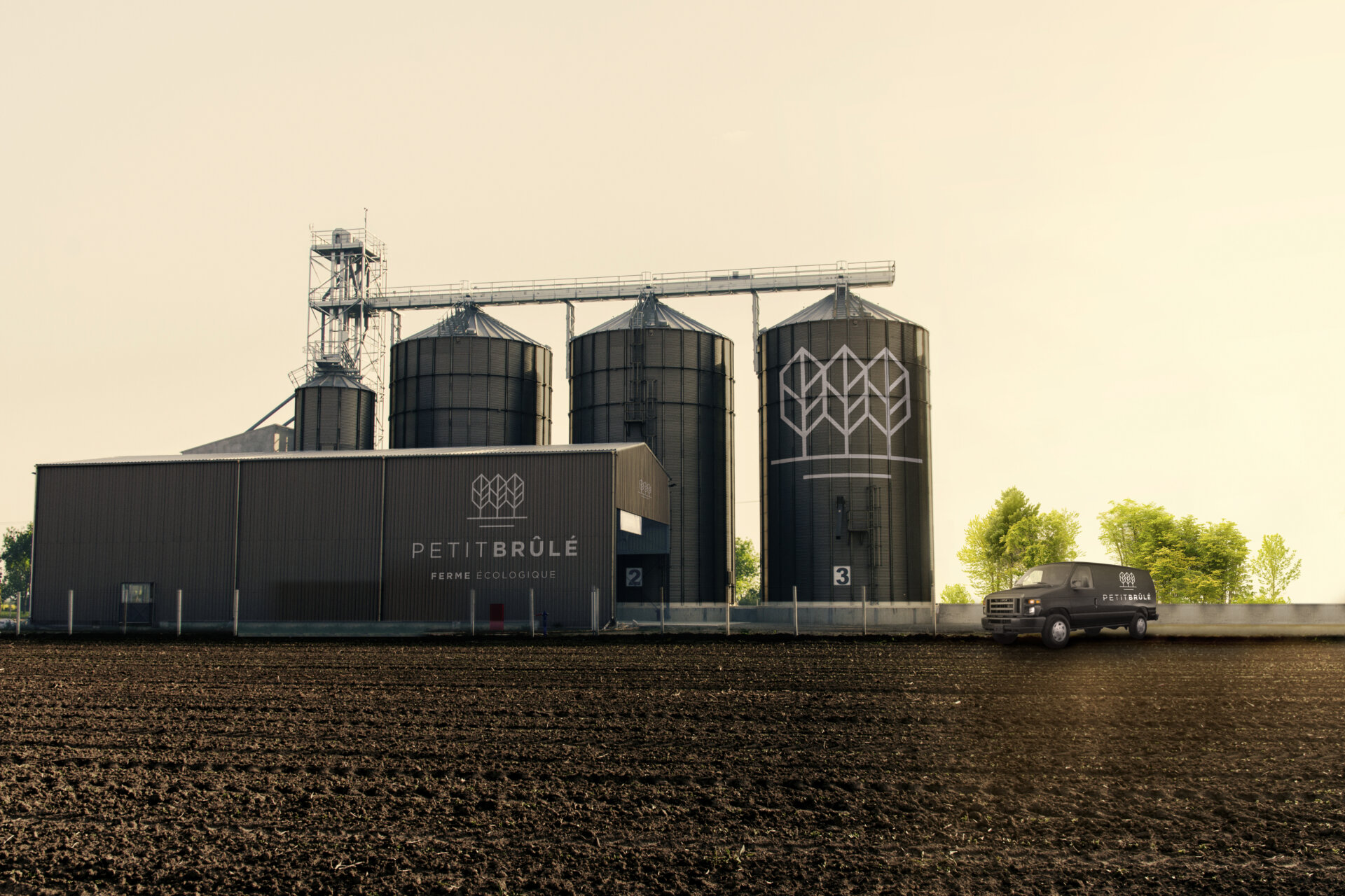
Petit Brûlé is a sustainable agroecological farming project developed by two young entrepreneurs from Rigaud, in the Montérégie region, on a country road of the same name. The farm offers its clients a wide variety of fresh and processed products, as well as the possibility of renting a plot of land so that everyone can grow their own food.
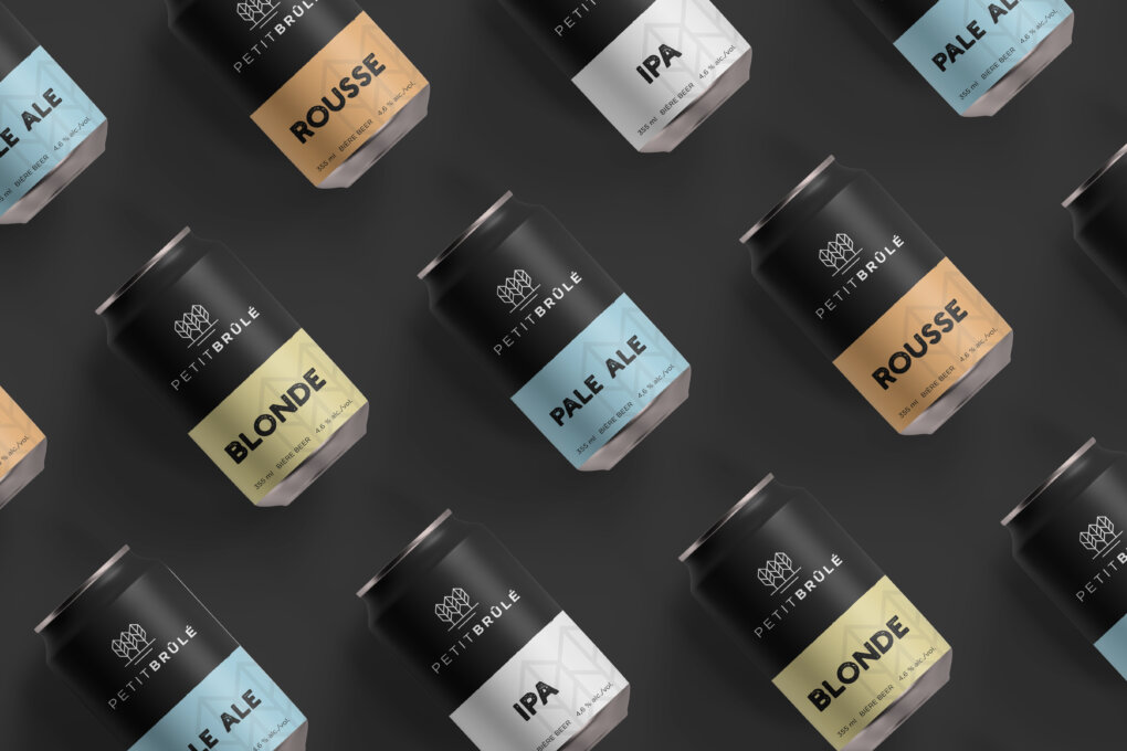
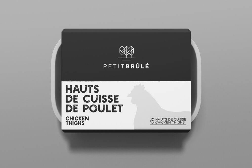
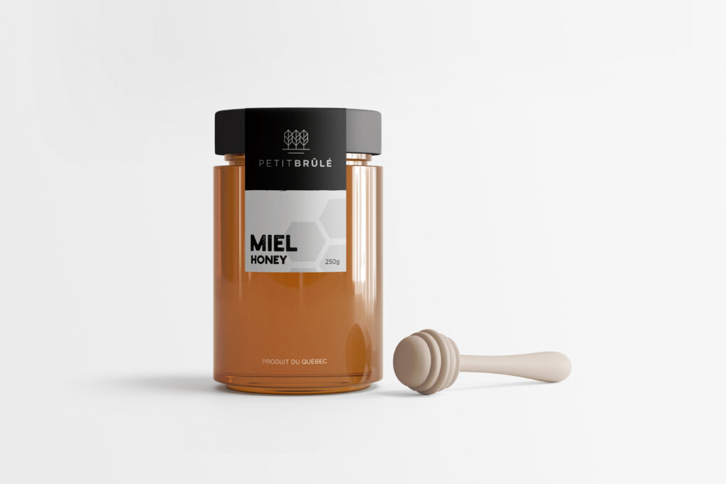
This mandate entailed two main challenges. First, to develop a unique identity that would allow Petit Brûlé to distinguish itself from all the other farms in the Montérégie region, nicknamed the "Garde-Manger du Québec, or Quebec’s Pantry ". In addition, the image had to be designed in such a way that it could appear on the full range of products manufactured and sold by the organization.
As for the visual identity, Braque opted for a clean, minimalist and trendy logo that conveys the organization's desire to modernize agricultural practices.
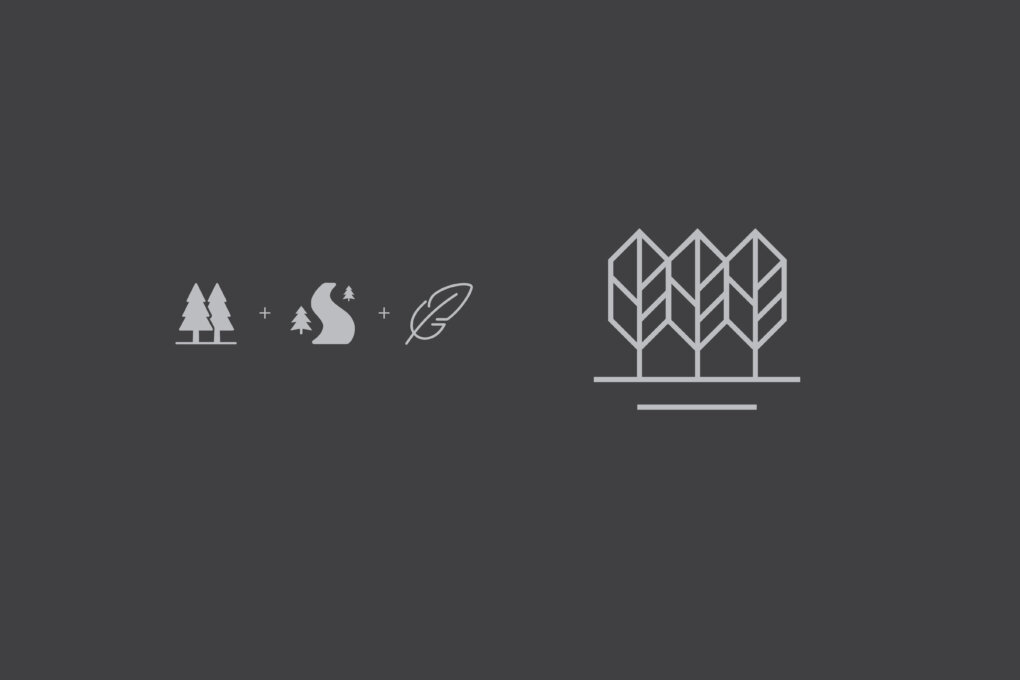
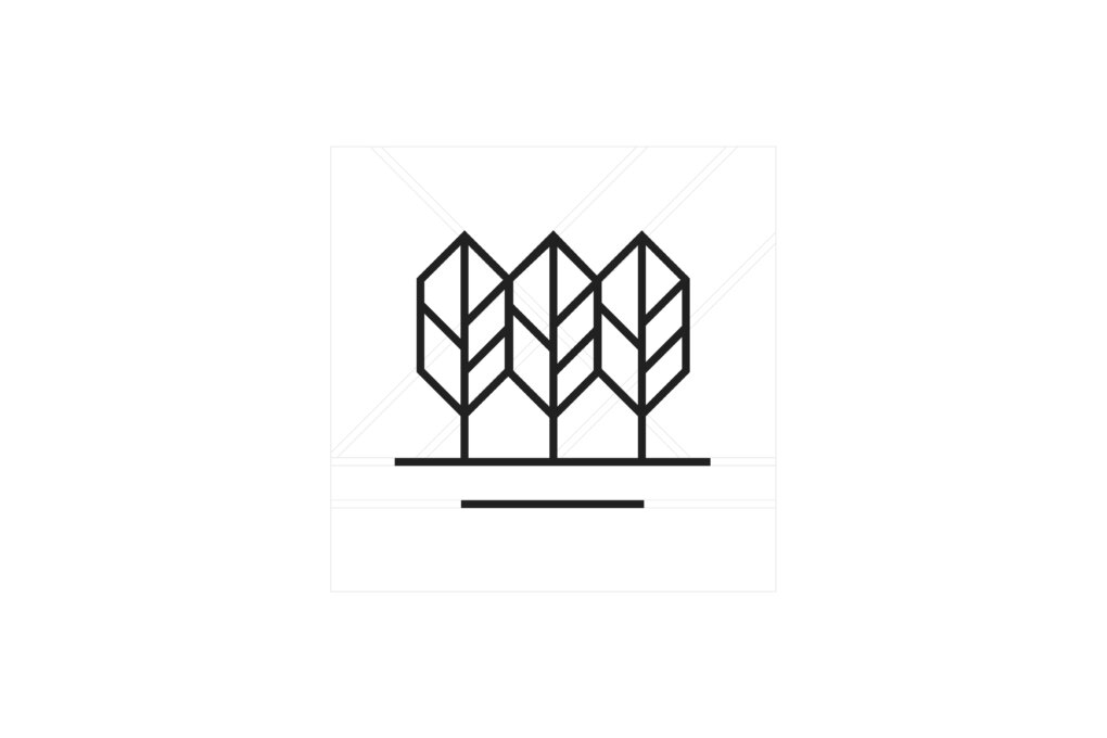
The logo also presents various elements characteristic of the farm's territory. It shows the Chemin du Petit-Brulé as well as trees whose shape is reminiscent of bird feathers, a nod to the fact that Rigaud is the ornithological capital of Quebec. Note that all the lines are perfectly equal, forming a harmonious and well-defined whole.