Share to
Image de marque | Ville d'Otterburn Park
By : Studio Pink

GRANDS PRIX DU DESIGN – 14th edition
Discipline : Communication & Brand Design
Categories : Corporate Identity / Logo Design : Bronze Certification
POSITIONING AND MEANING
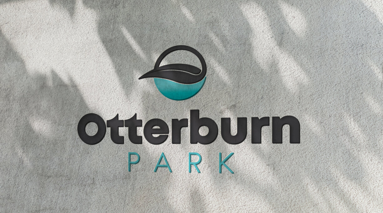
“Otterburn Park, your nature inspires me!”
The new slogan is interesting because it can be interpreted in many ways.
At first glance, we understand that we are talking about nature (environment, trees, river, woodland, mountains, etc.). Beyond that, we see that nature can be defined as everything that characterizes the city (quality of life, tranquility, security, trust, etc.).
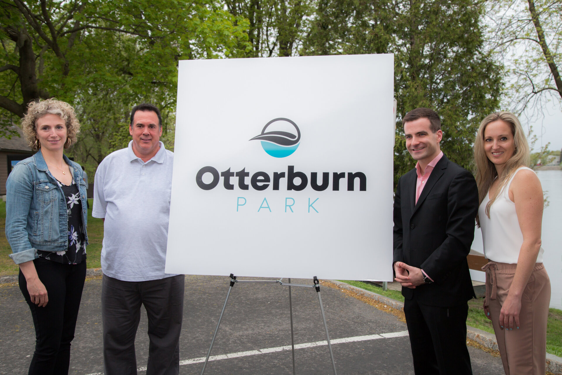
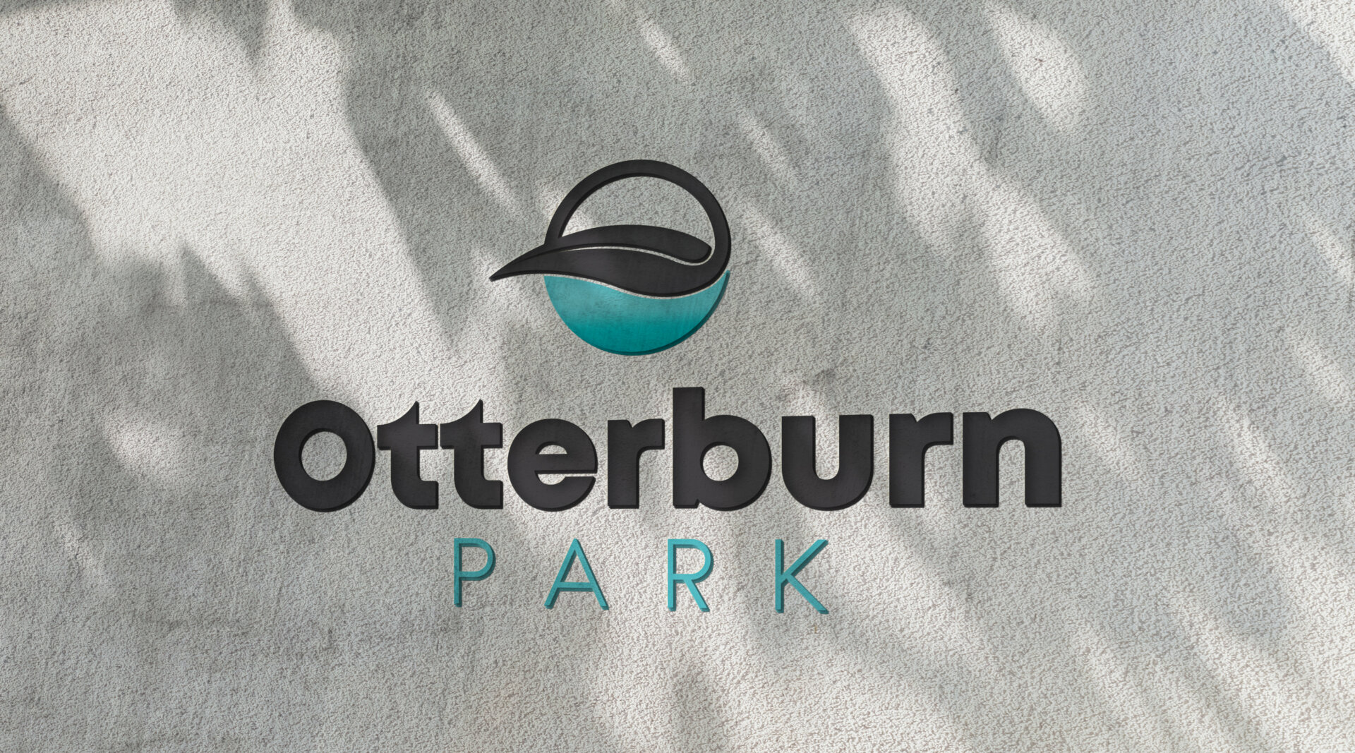
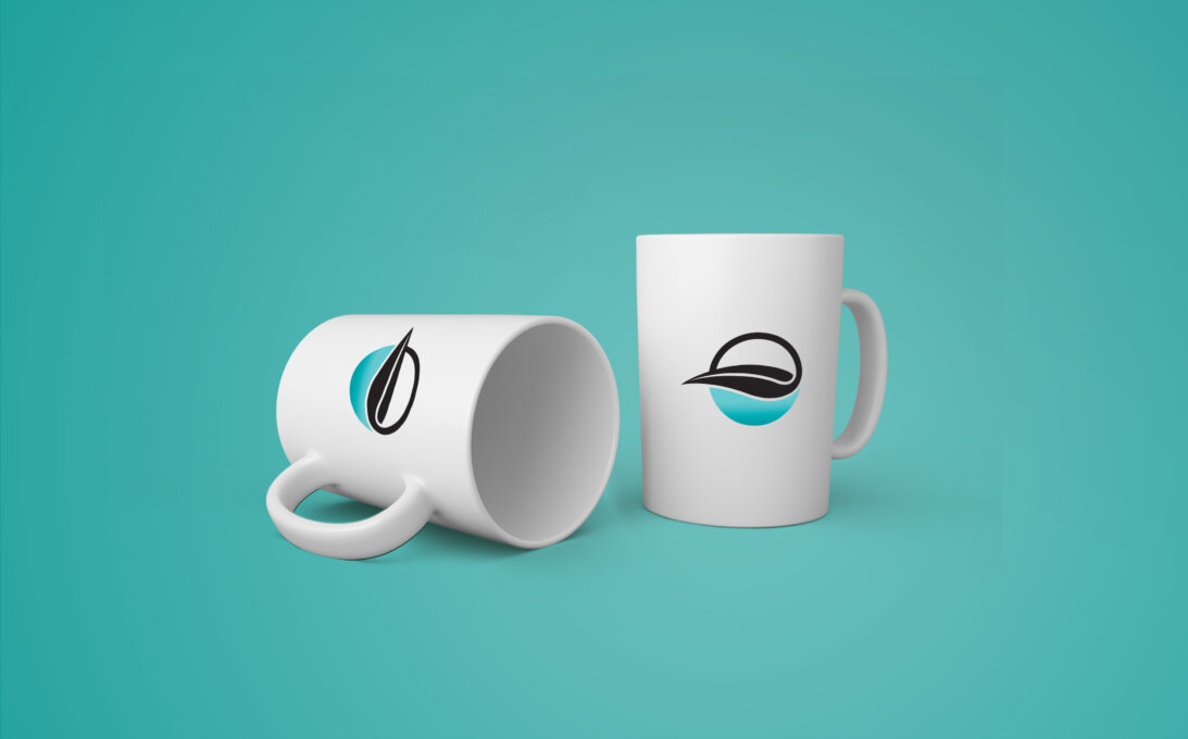
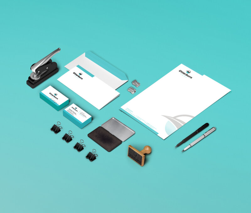
LOGO DESCRIPTION
We can easily see the logo's “nature” side from the river and the leaf. With the leaf representing the City through its height difference and omnipresent nature. The stem of the leaf subtly outlines a mountain. Observers can also see a brush or writer’s pen, which symbolizes the great presence of the arts in Otterburn Park. You can also see the “Chemin des Patriotes” that crosses the City and the tip of “Pointe-Valaine”. Even the historical side is represented in the positioning of the City (the leaf) with its tip pointing to the left. It thus gives the idea that the city is looking or moving to the future.
The colors chosen also have their symbolism. Blue, of course, is associated with water, but it also represents reliability, trust, and security. Shades of blue inspire calm, peace, and serenity, while black suggests discipline, power, sophistication, success, elegance, vitality, determination, strength, stability, and respect.
Collaboration
Designer graphique : Studio Pink