Get inspired
  • GRANDS PRIX DU DESIGN
  • Galas
  • Articles
  • News
  • eMagazine
  • Search
  • My account
  • FR

Share to

banca widiba rebranding

By : jekyll & hyde

GRANDS PRIX DU DESIGN – 14e édition

Discipline : Communication & Brand Design

Categories : Corporate Identity / Brand Image Update : Silver Certification

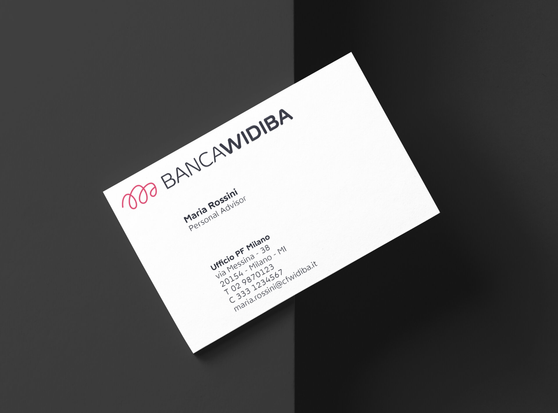
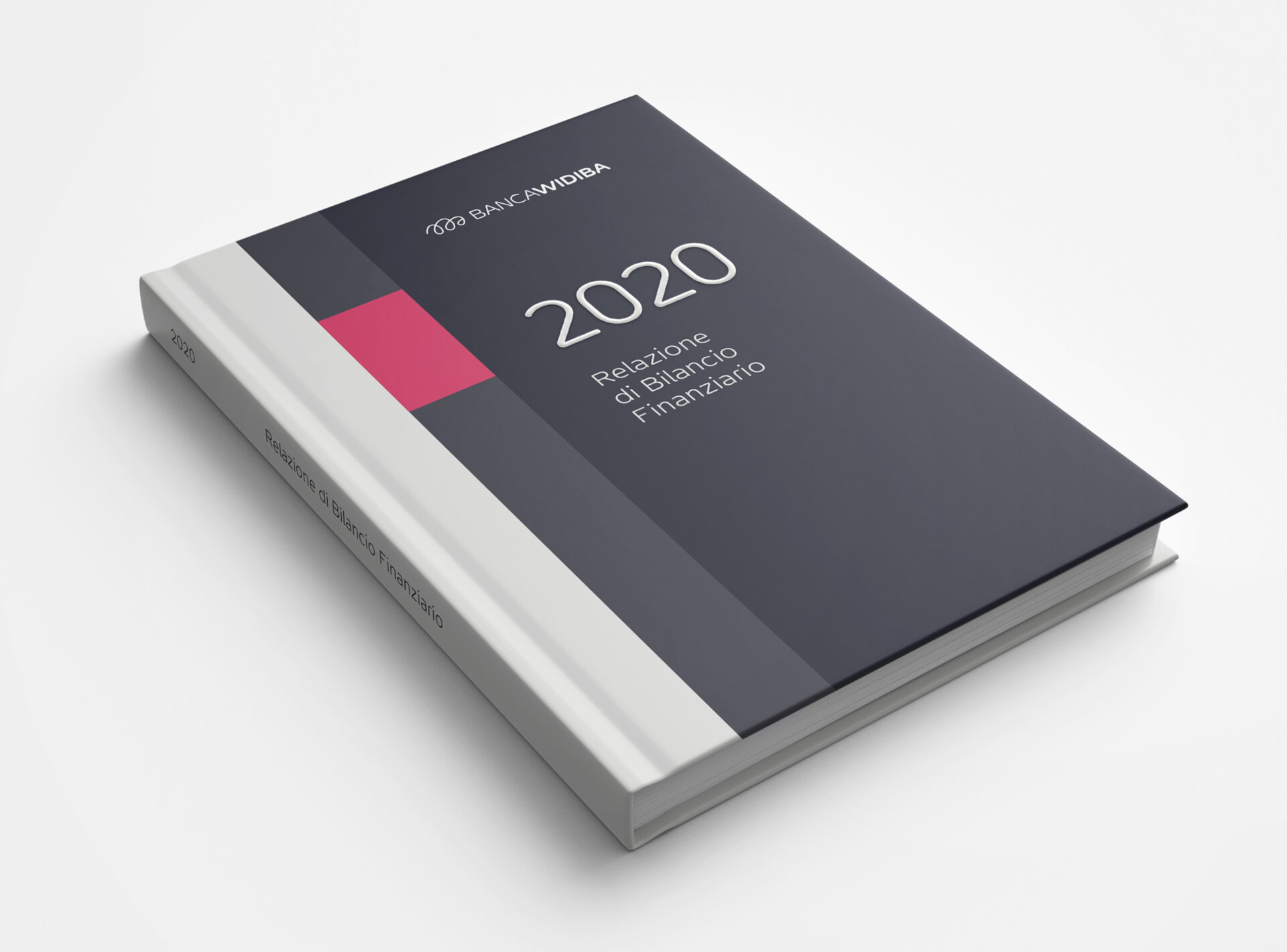
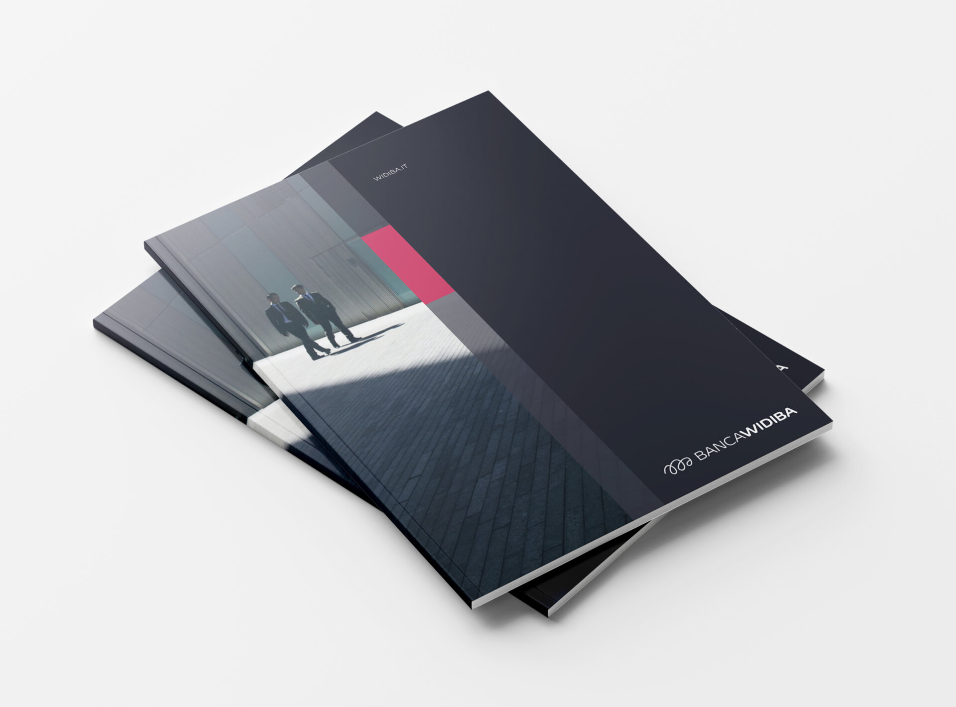
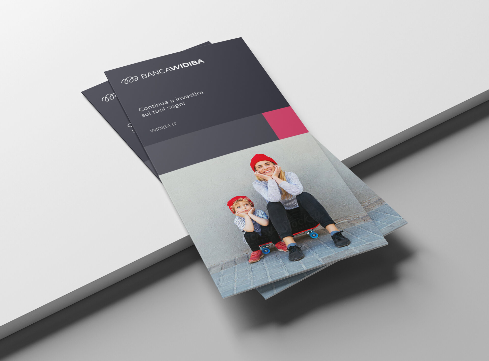
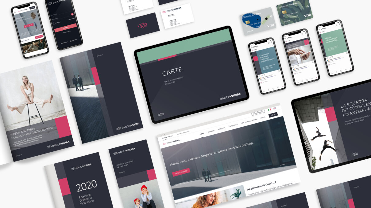
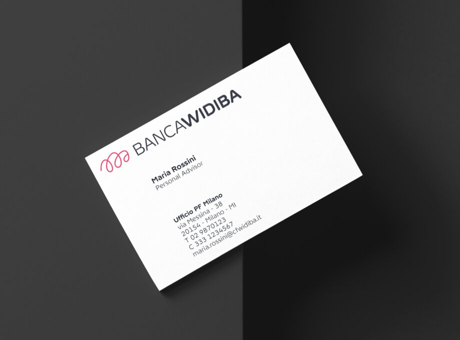
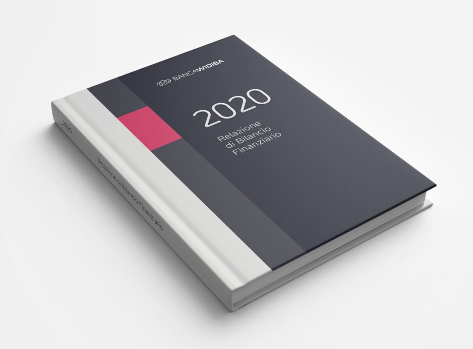
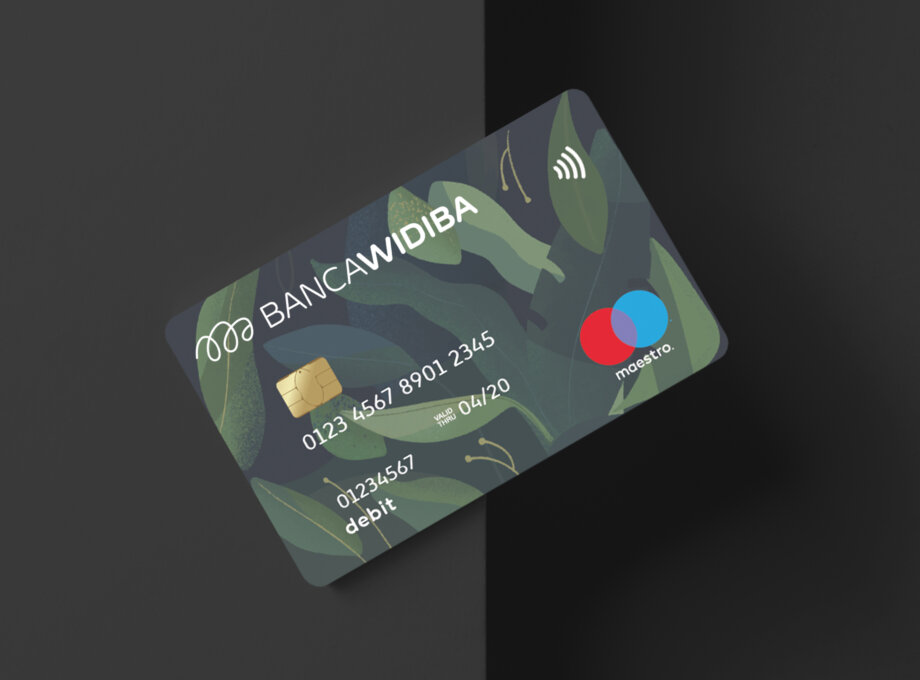
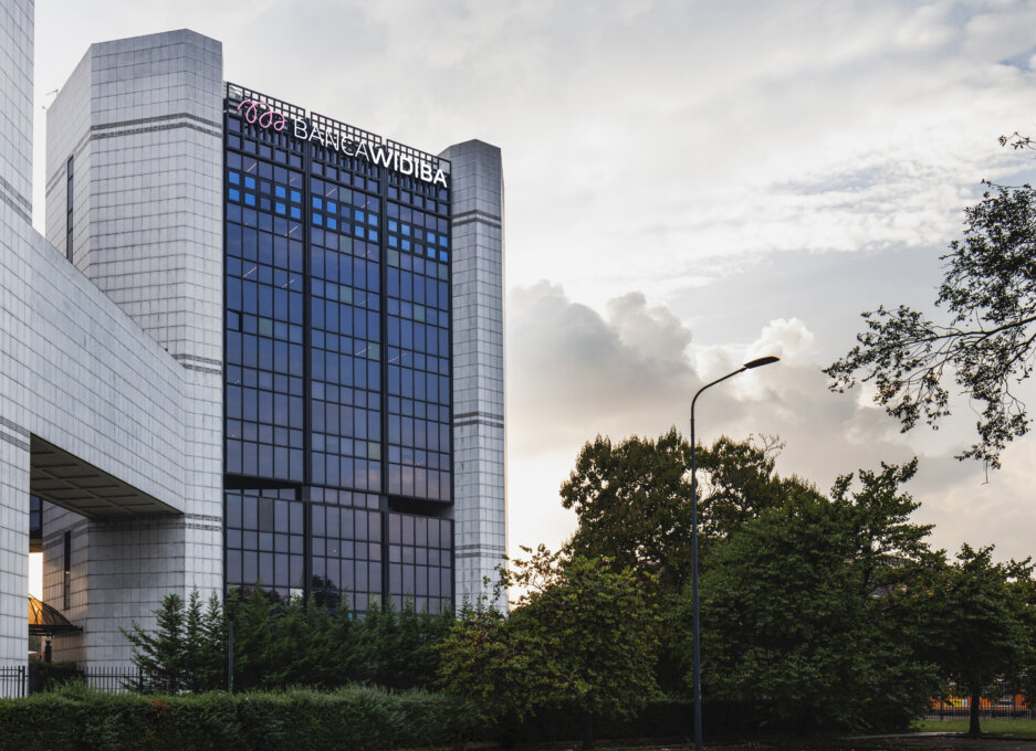
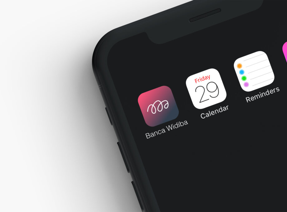
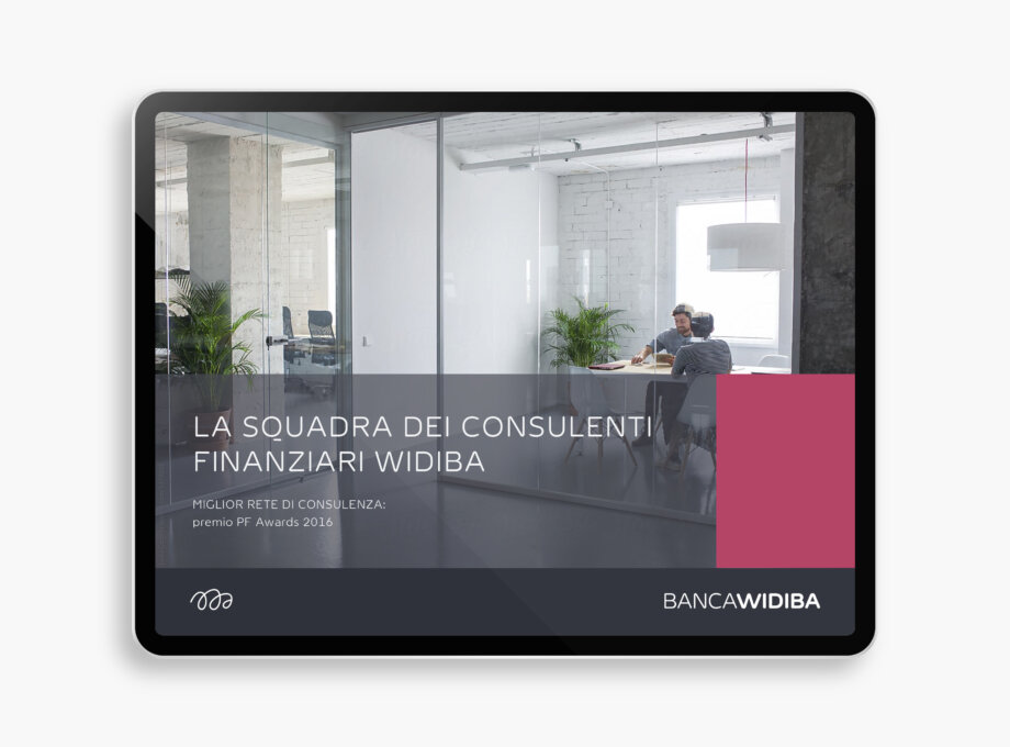
Banca Widiba has deeply changed during those years growing and strengthening its position on the market. The new brand signature is characterized by the re-design of the logo in a thinner version, the addition of the word “Banca” that together with the use of the all caps for the logotype is able to let it appear more authoritative and sophisticated. The new identity system is respectful of Widiba visual language that has been always defined by dynamism, organization and contemporaneity. The graphic format is a responsive system built by some rectangular shapes adapting to different medias.

The project in images

Photo credit : jekyll & hyde

Signage & Branding

Photo credit : jekyll & hyde

Signage & Branding

Photo credit : jekyll & hyde

Signage & Branding

Photo credit : jekyll & hyde

Signage & Branding

Photo credit : Neri Oddo

Signage & Branding

Photo credit : jekyll & hyde

Signage & Branding

Photo credit : jekyll & hyde

Signage & Branding

Photo credit : jekyll & hyde

Signage & Branding

Photo credit : jekyll & hyde

Signage & Branding

Photo credit : jekyll & hyde

Signage & Branding

Photo credit : jekyll & hyde

Signage & Branding

Stay tuned

Subscribe to the newsletter

INTÉRIEURS Magazine

Get the next issue

INT Magazine
  • INT Design

  • Events
  • Contests
  • Articles
  • News
  • Magazine

  • Subscription
  • Customer Portal
  • Virtual Magazine
  • Communication

  • Contact
  • About

  • Our Story
Facebook Pinterest
Instagram LinkedIn

© 2022 AGENCE PID. All rights reserved.