
Share to
The Capitol
By : Turner Fleischer
GRANDS PRIX DU DESIGN 19th edition
Distinctions
Discipline : Communication & Branding
Categories : Environmental Design / Signage, Wayfinding & Murals : Silver certification
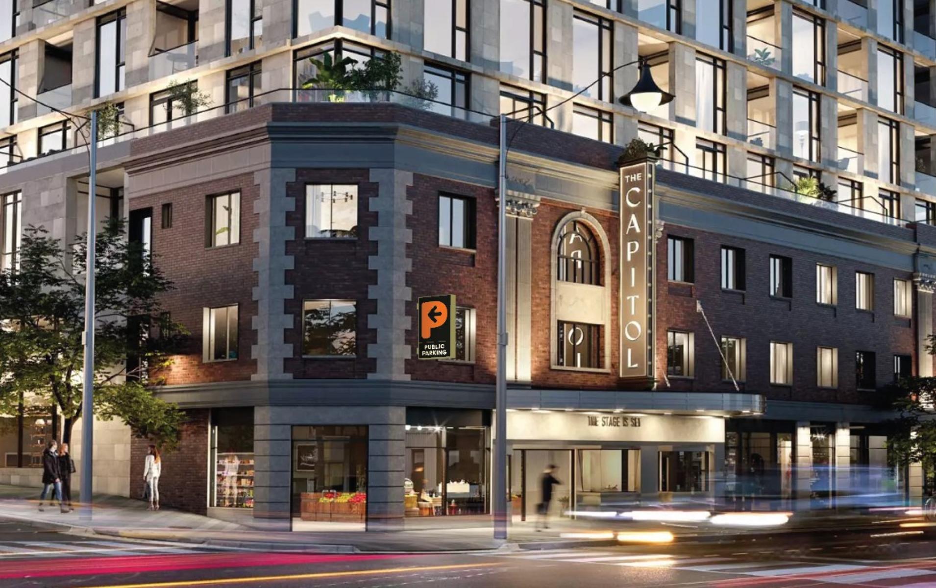
The Capitol, at Yonge and Castlefield in Toronto’s midtown, transforms the historic Capitol Theatre into a contemporary residential development, carrying forward over eight decades of cultural legacy into a new urban form. Originally opened in 1914 and designed by John McNee Jeffrey—a prominent Canadian architect and theatre designer—the 1,300-seat theatre was a defining entertainment destination in Toronto, serving generations until its closure in 1998. Today, the site is reimagined as a 14-storey residence, led by Design Architect Hariri Pontarini Architects, Interior Designer Studio Munge, with Signage and Wayfinding by Turner Fleischer’s Experiential Graphic Design team.
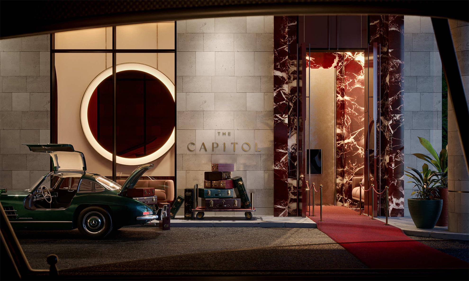
The design draws from the language of early 20th-century theatres, translating their elegance, hierarchy, and grandeur into a contemporary system of signage and wayfinding. Rather than replicating historical motifs, the approach abstracts key qualities such as material richness, contrast, and illumination to create a refined and consistent visual language. This language is carried across the full signage system, from exterior marquee and directional elements to heritage interpretation, retail and townhouse identification, interior amenity branding, suite numbering, egress signage, and parking wayfinding.
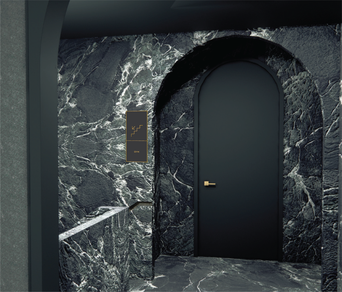
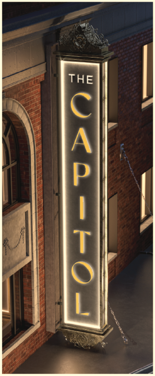
Material selection plays a central role. Brushed brass dimensional lettering, deep grey painted aluminum plaques, and brass-toned vinyl establish a restrained yet expressive palette. These elements are applied across interior and exterior conditions, ensuring continuity while responding to different environmental and functional requirements. Exterior signage, including a reimagined 17-foot marquee and vertical theatre sign, incorporates halo-lit detailing and durable automotive-grade finishes to reinforce visibility and presence along the active Yonge Street.
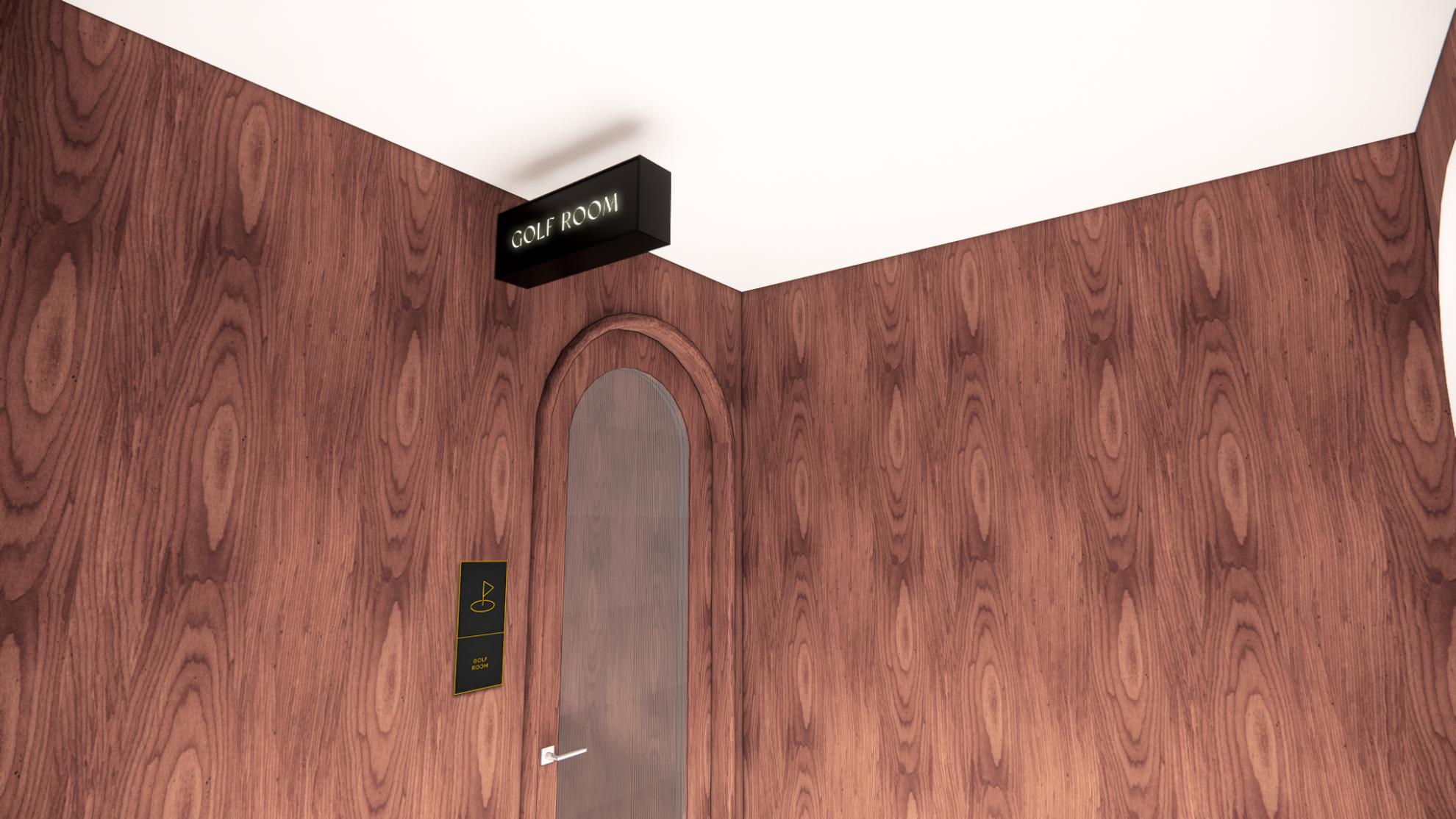
Typography is carefully structured to balance clarity and character. A hierarchy combining Gilmer for primary information and Classico for secondary details ensures legibility while reinforcing the project’s refined identity. This system is consistently applied across directories, room identification, parking graphics, and regulatory signage, creating a seamless user experience.
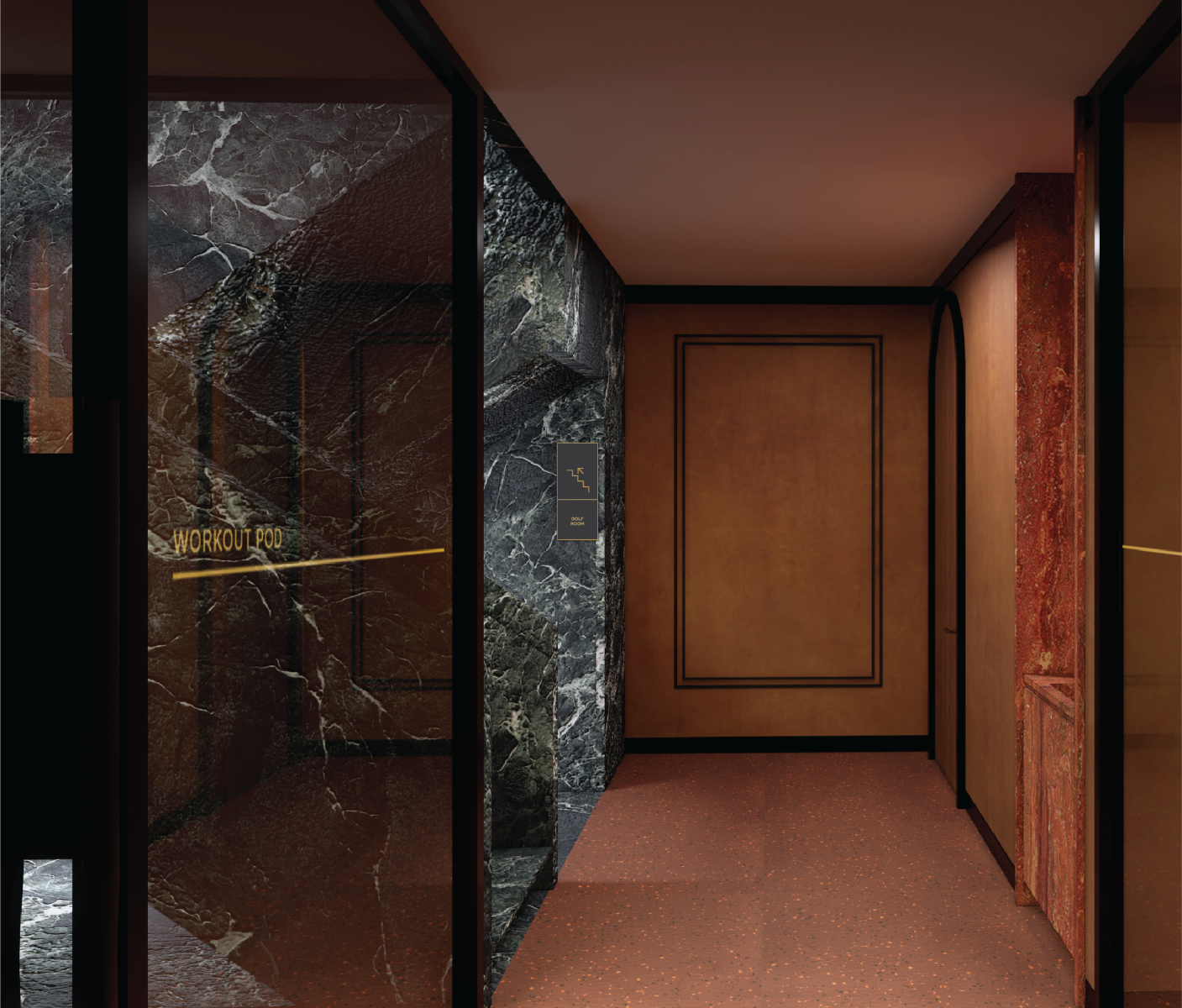
Wayfinding is designed to be intuitive and accessible. Clear sightlines, consistent placement, and high-contrast applications guide residents and visitors through the building with minimal reliance on instruction. Tactile lettering and braille are integrated throughout, supporting accessibility requirements while maintaining visual cohesion.
The signage and wayfinding extend beyond navigation to reinforce the building’s narrative. The result is a system that is both functional and expressive, embedding identity directly into the architecture.
The design draws from the language of early 20th-century theatres, translating their elegance, hierarchy, and grandeur into a contemporary system of signage and wayfinding. Rather than replicating historical motifs, the approach abstracts key qualities such as material richness, contrast, and illumination to create a refined and consistent visual language. This language is carried across the full signage system, from exterior marquee and directional elements to heritage interpretation, retail and townhouse identification, interior amenity branding, suite numbering, egress signage, and parking wayfinding.
Material selection plays a central role. Brushed brass dimensional lettering, deep grey painted aluminum plaques, and brass-toned vinyl establish a restrained yet expressive palette. These elements are applied across interior and exterior conditions, ensuring continuity while responding to different environmental and functional requirements. Exterior signage, including a reimagined 17-foot marquee and vertical theatre sign, incorporates halo-lit detailing and durable automotive-grade finishes to reinforce visibility and presence along the active Yonge Street.
Typography is carefully structured to balance clarity and character. A hierarchy combining Gilmer for primary information and Classico for secondary details ensures legibility while reinforcing the project’s refined identity. This system is consistently applied across directories, room identification, parking graphics, and regulatory signage, creating a seamless user experience.
Wayfinding is designed to be intuitive and accessible. Clear sightlines, consistent placement, and high-contrast applications guide residents and visitors through the building with minimal reliance on instruction. Tactile lettering and braille are integrated throughout, supporting accessibility requirements while maintaining visual cohesion.
The signage and wayfinding extend beyond navigation to reinforce the building’s narrative. The result is a system that is both functional and expressive, embedding identity directly into the architecture.
Collaboration
Communication & Branding : Turner Fleischer
Photo credit
Turner Fleischer