

Share to
Pavillon Enfant Soleil et Urgence de l'hôpital Fleurimont
By : Bélanger Design

GRANDS PRIX DU DESIGN 19th edition
Discipline : Architecture
Categories : Institutional, Civic & Education Building / Hospital & Healthcare Building : Gold certification
A Hospital That Speaks to Children
Located on the health campus of the Université de Sherbrooke, in a wooded area on the outskirts of Fleurimont, the new Centre Mère-Enfant et Urgence of the CH de Fleurimont presents itself as an ensemble of interlocking blocks, inspired by children's building toys. This bold architectural gesture, designed by Jodoin Lamarre Pratte, Yelle Maillé and Jubinville, profoundly shaped the wayfinding design thinking carried out by Bélanger Design: how can a hospital, from the very first steps inside, reassure a child and their family?
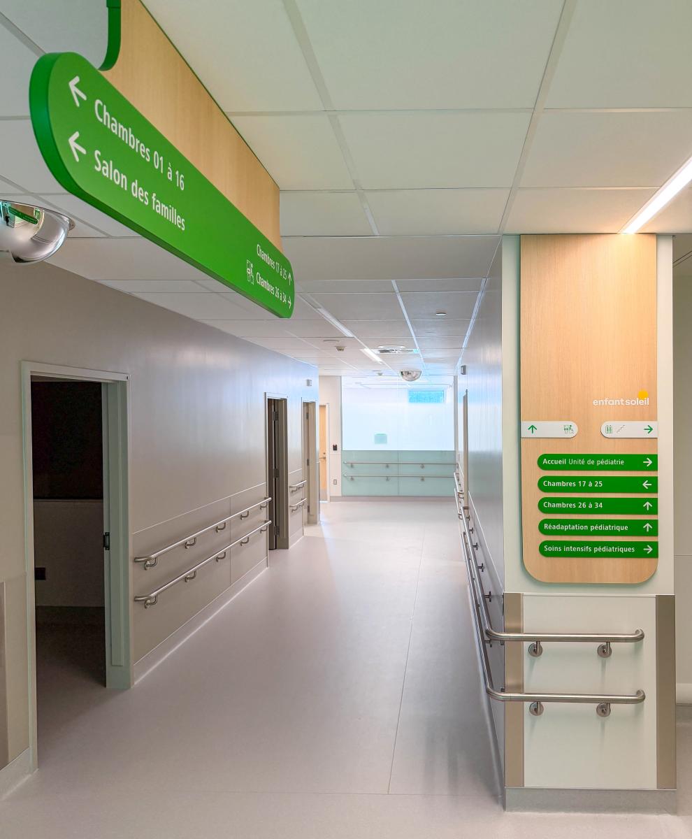
The building welcomes users with very different realities. For each of them, the hospital environment can generate stress and uncertainty. Signage is not limited to indicating a path — it actively participates in creating an atmosphere of trust, taking the edge off the medical context, and, for the youngest visitors, transforming a dreaded experience into a moment of discovery.
Illustration as a Language of Welcome
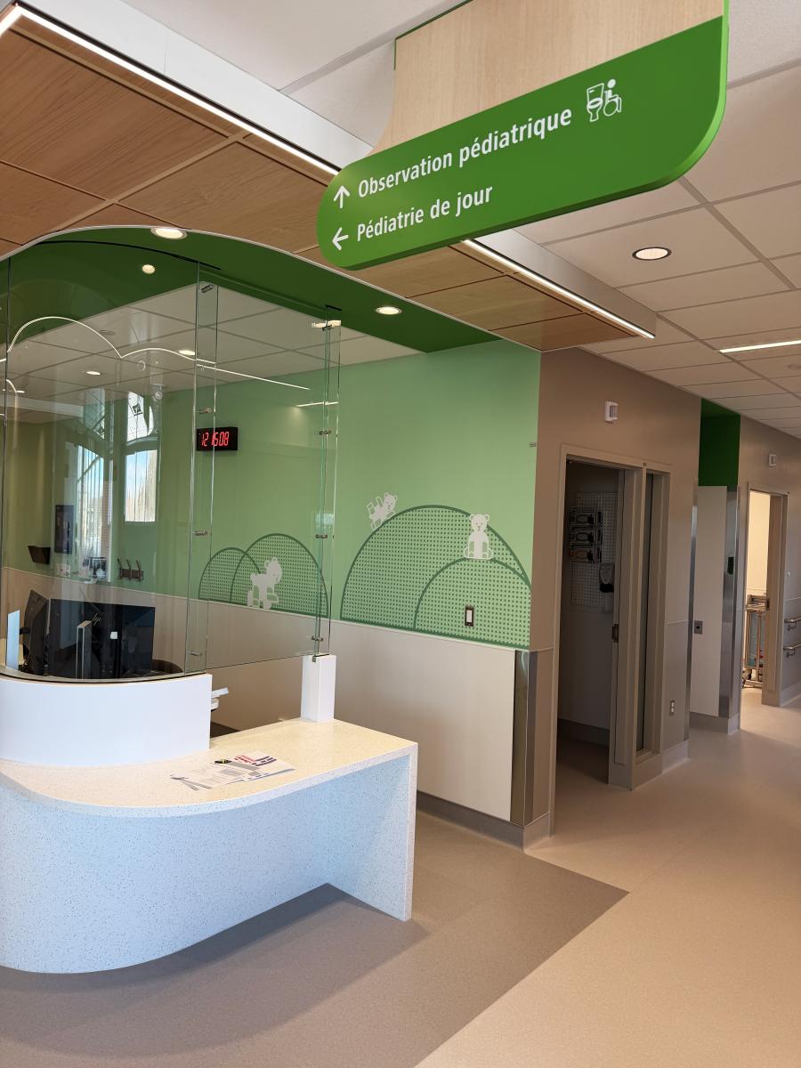
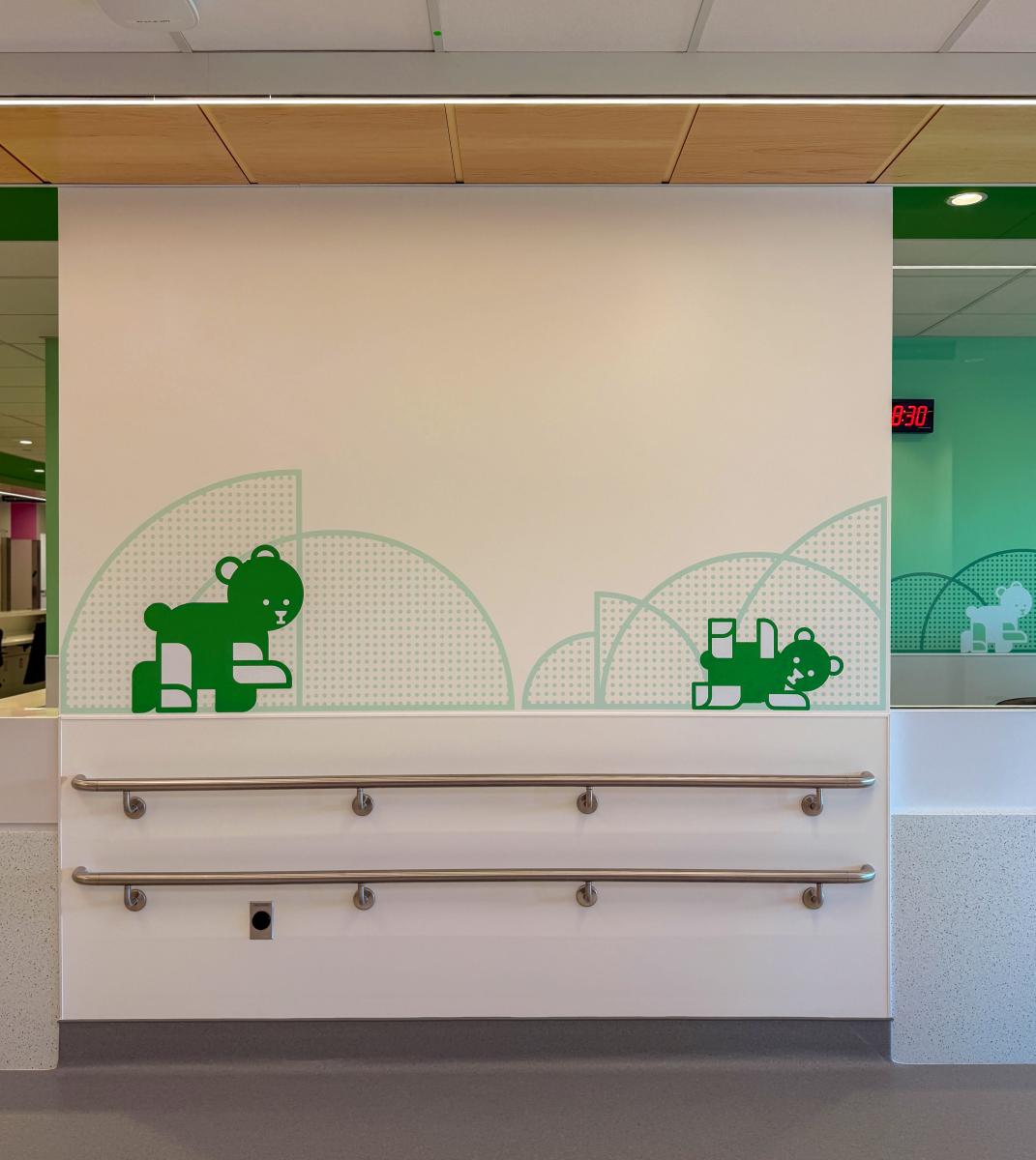
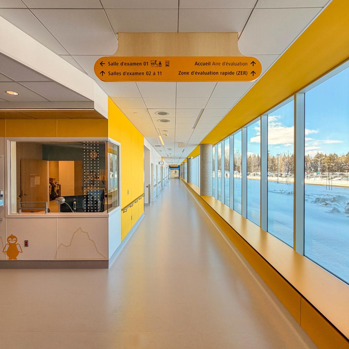
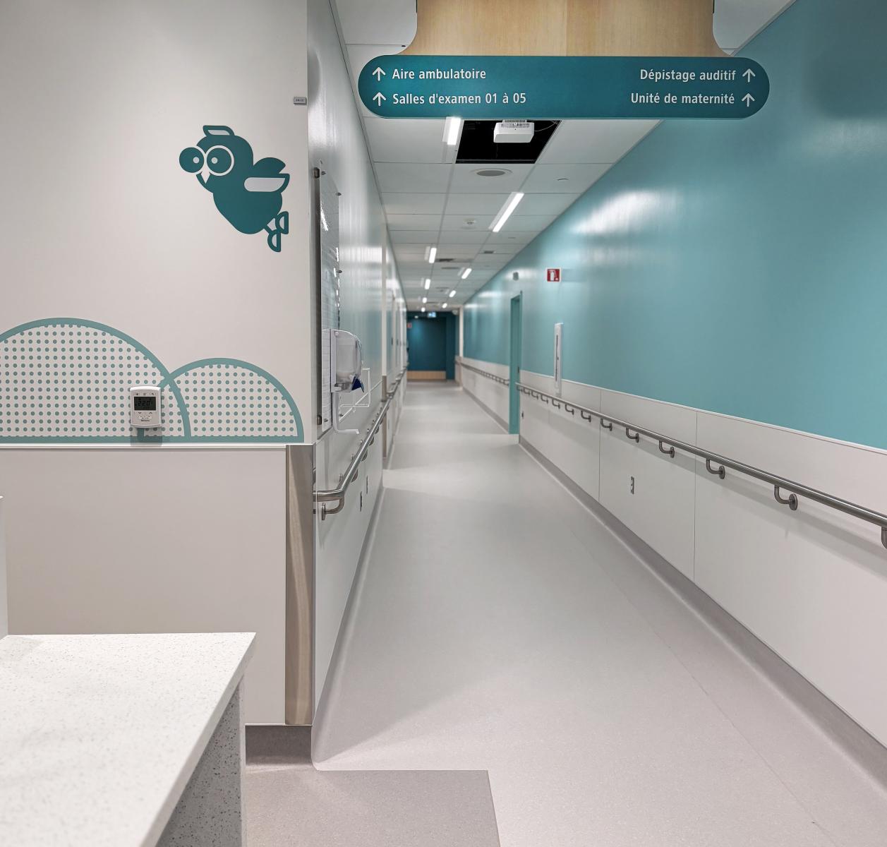
At the heart of the signage concept, illustration holds a central place. Conceived as a universal language, accessible to all ages and all backgrounds, it transcends the barriers of text and conventional pictograms. Where a directional sign might feel cold or abstract to a child, a narrative illustration creates an immediate emotional hook: it catches the eye, sparks curiosity, and invites the visitor to move forward.
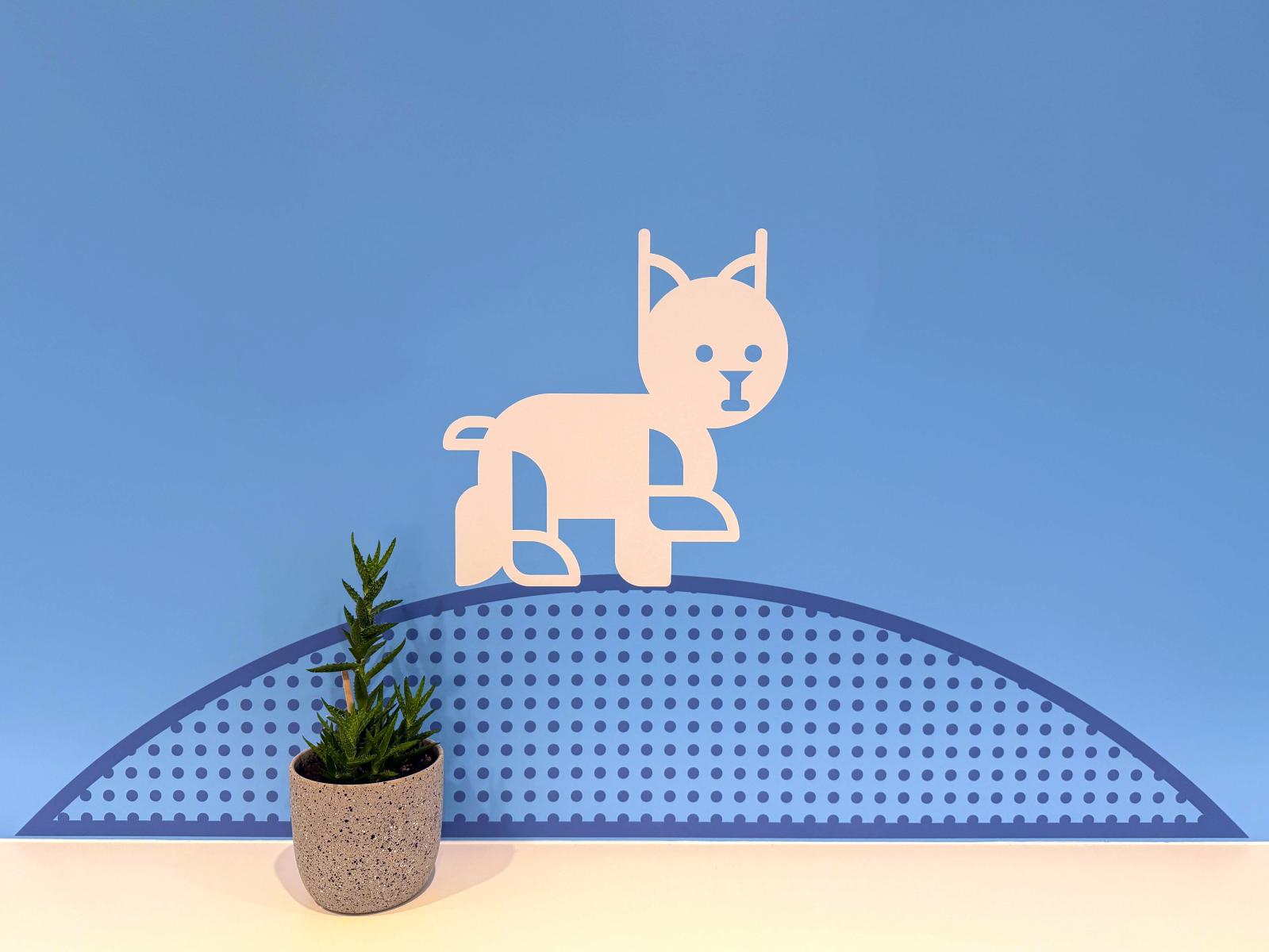
The illustrations designed for the CMEU are rooted in a thematic universe inspired by Quebec's wildlife, directly echoing the wooded environment surrounding the facility. Each animal emblem is developed into a family of illustrations that accompanies the user from the common circulation areas to the heart of each care unit.
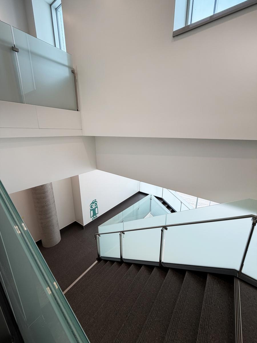
These visual families are not mere ornaments. Each animal is rendered in multiple poses and sizes — a monumental silhouette to mark the entrance of a unit, a more discreet figure to confirm that one is on the right path, a miniature detail at child height to accompany moments of waiting.
A Coherent and Adaptable System
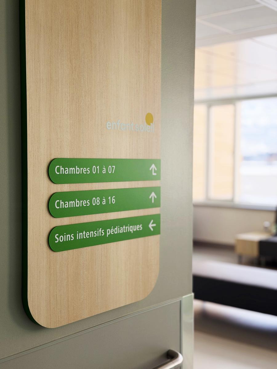
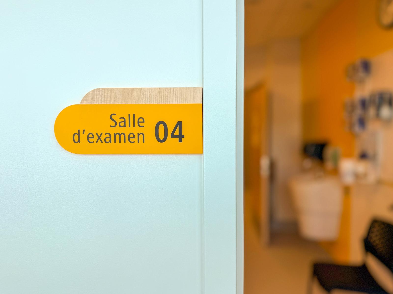
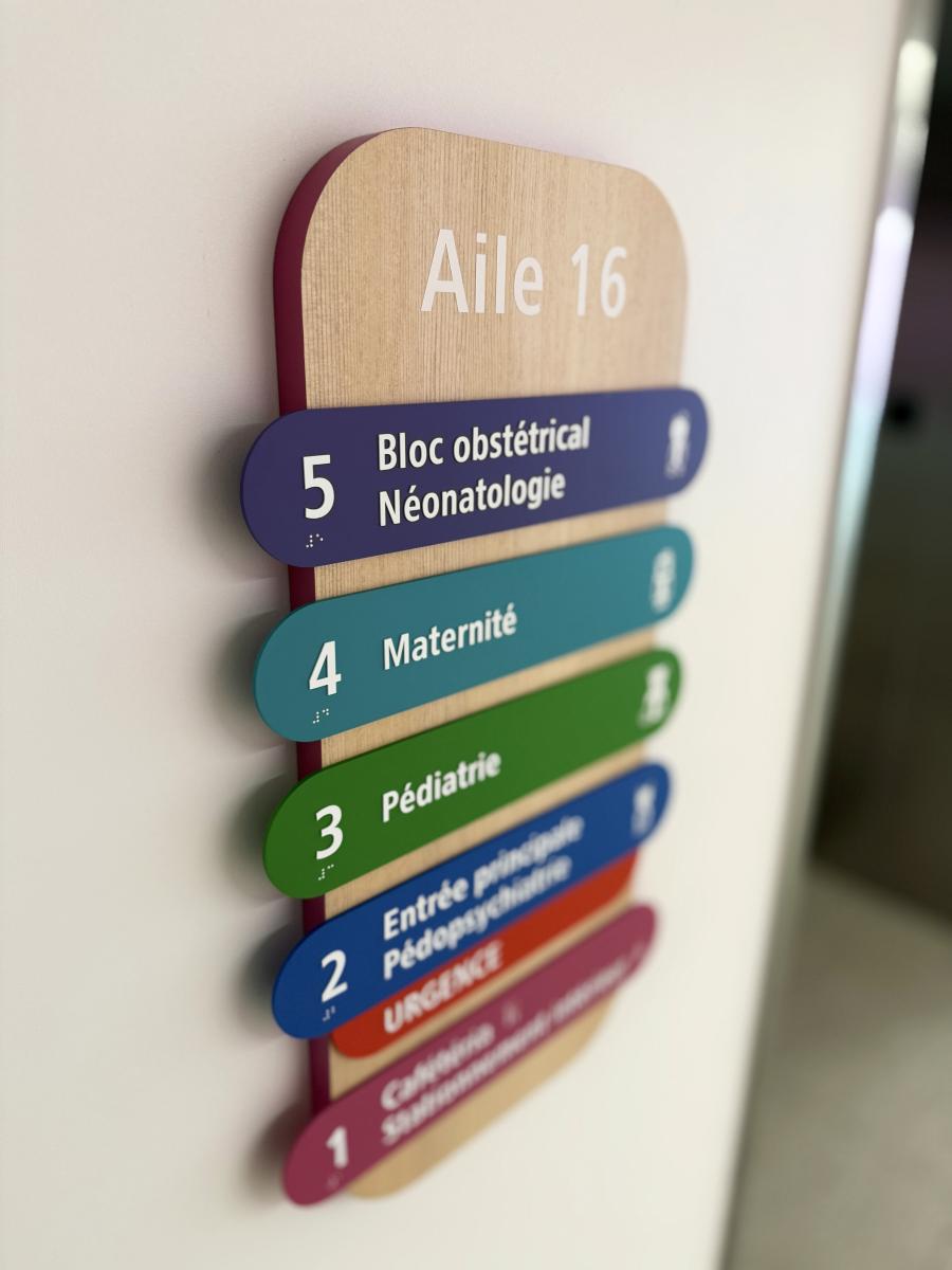
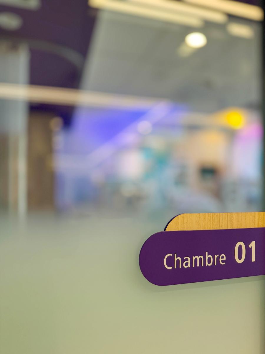
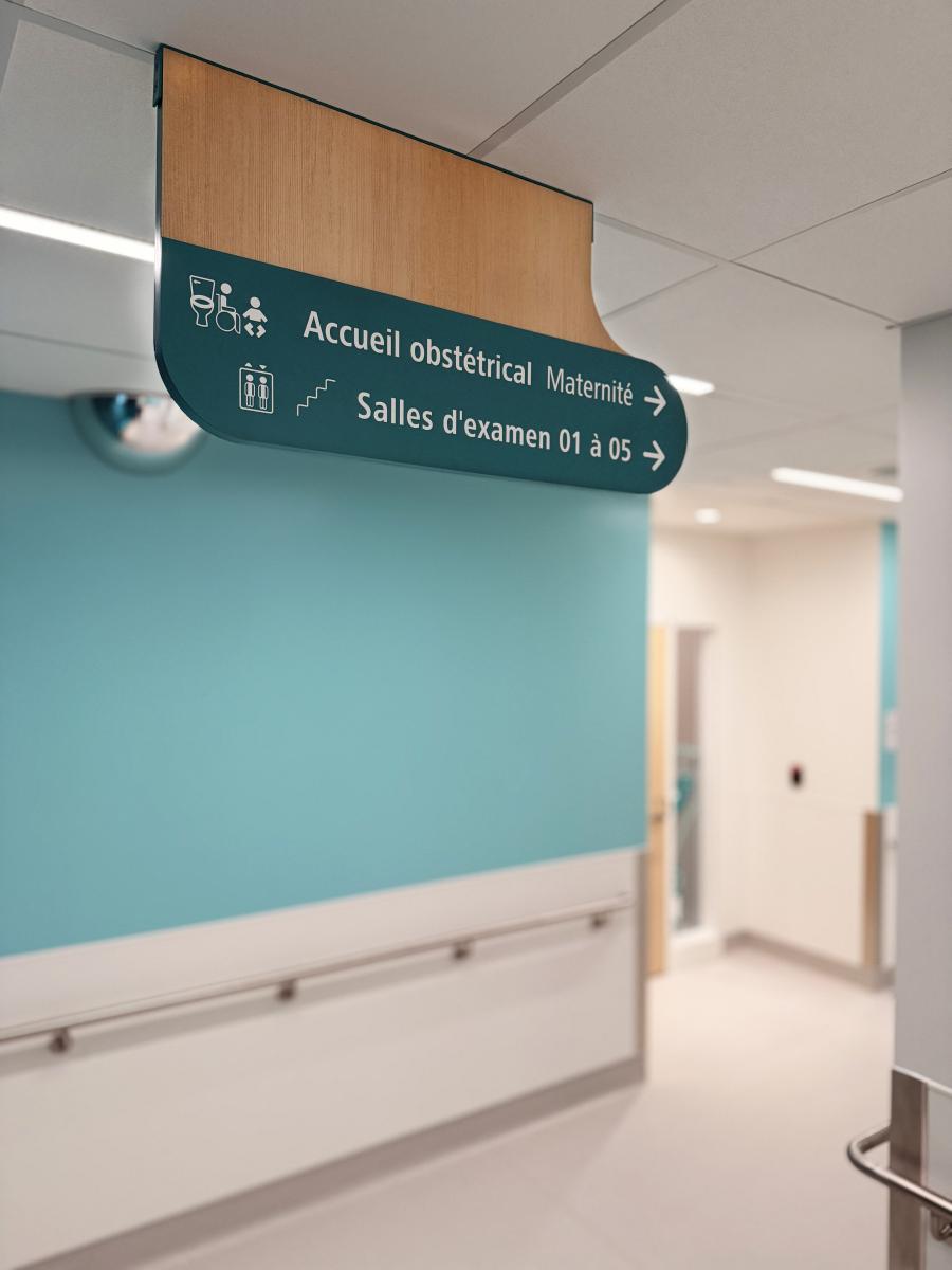
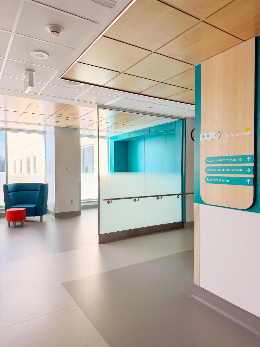
The CMEU illustrations do not float freely in space: they are integrated into a rigorously constructed signage family, built in natural wood and colored surfaces, whose hues correspond to the thematic territories of each level. Color, animal, and material combine into a unified visual language where each element reinforces the others. The wood brings warmth and a connection to nature; the color anchors the geographical reference point; the animal brings life, narrative, and a sense of shared discovery to the whole.
This system is designed to last and evolve. The illustrated supports can be updated without a complete overhaul, allowing the facility to periodically refresh the atmosphere of its spaces while preserving the overall coherence of the concept. It is a living signage system — much like the children and families it welcomes every day.
Collaboration
Communication & Branding : Bélanger Branding Design ltée
Photo credit