




Share to
OLAOLA Protein Smoothies
By : Basalte

GRANDS PRIX DU DESIGN 19th edition
Discipline : Communication & Branding
Categories : Packaging Design / Packaging : Gold certification
Committed Quebec company, OLAOLA creates healthy and tasty products from fruits and vegetables saved from food waste.
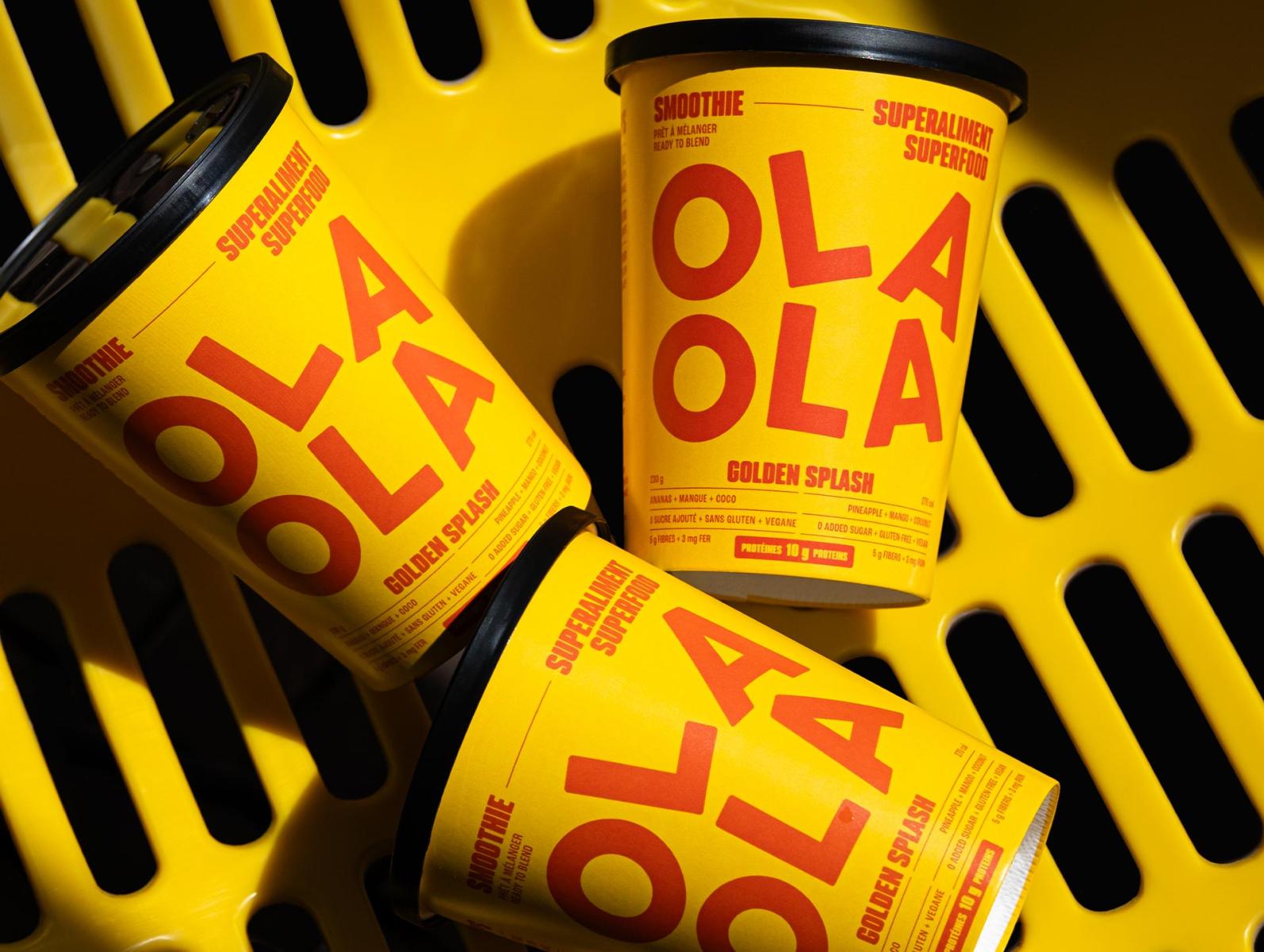
A new range of protein smoothie glasses has been designed for OLAOLA.
Intended for ready-to-eat counters and events, these packaging highlight the freshness of the ingredients and the diversity of their benefits. Playful and energetic, they convey both the pleasure of flavors and the dynamism of OLAOLA.
To distinguish this range from other OLAOLA products while preserving brand recognition, the logo has been reworked: the two identical parts forming its name have been superimposed, and their slightly random positioning evokes movement, symbolizing the mixing needed to create smoothies.
To convey the boldness and creativity of OLAOLA's mixes, the packaging stands out with contrasting color duos in vibrant harmonies that immediately capture attention.
Each color combination has been carefully chosen to evoke the flavors and spirit of the product, while affirming the brand's joyful and modern identity. The whole creates a visual experience that intrigues, seduces, and invites discovery at first glance.
The typography used, Podium Soft, both robust, generous, and geometric, occupies the space with character while guiding the eye. Its rounded shapes and optimal readability ensure clear and intuitive reading of the essential information for consumers of this type of beverage, while reinforcing the brand's modern and energetic identity.
Collaboration
Communication & Branding : Basalte
Photo credit