
Share to
Molson Quarter
By : Groupe Montoni, Deux huit huit et Fonds immobilier de solidarité FTQ

GRANDS PRIX DU DESIGN 18th edition
Discipline : Communication & Branding
Categories : Brand Design / Brand Identity Creation and Update : Gold certification
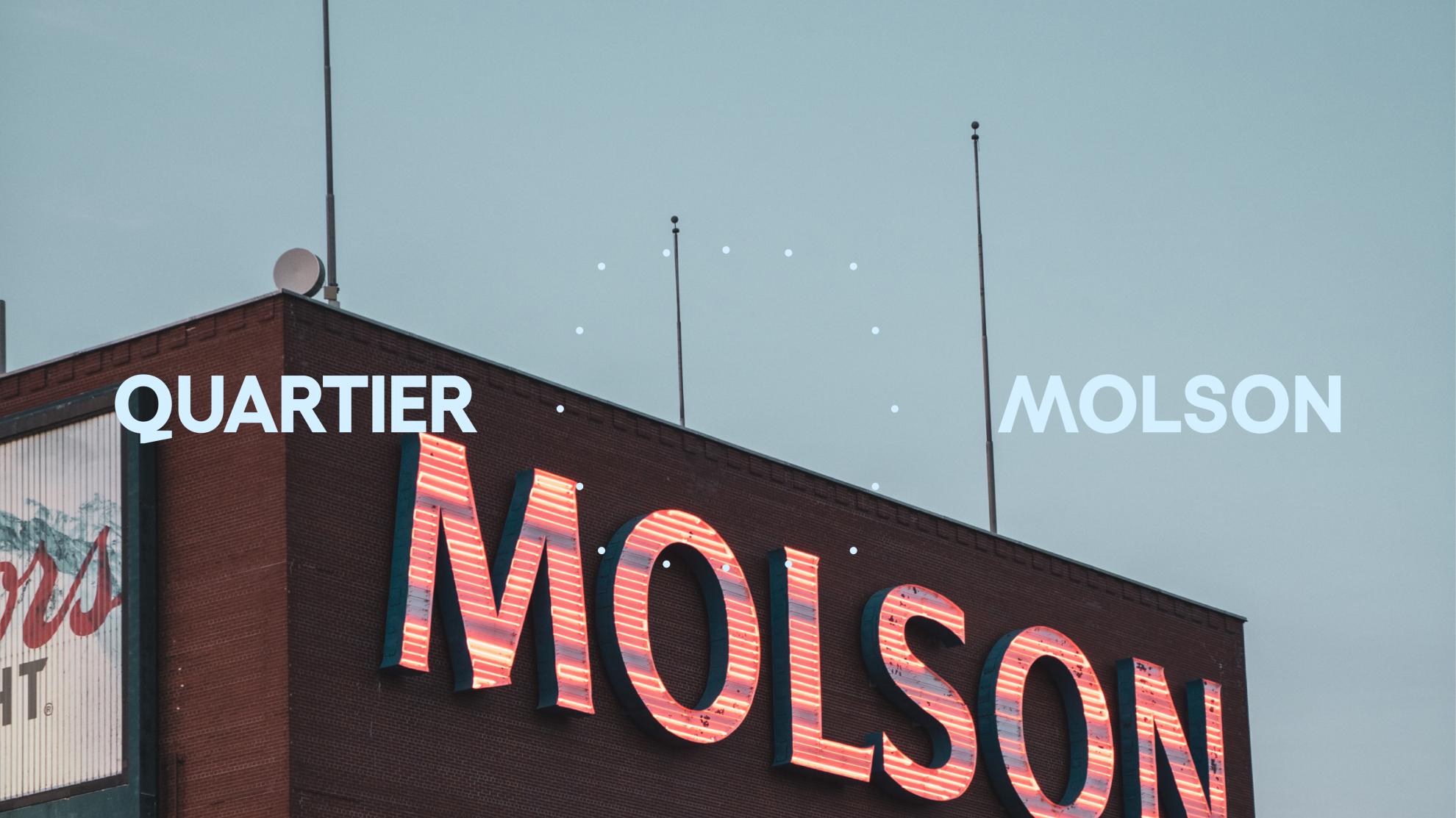
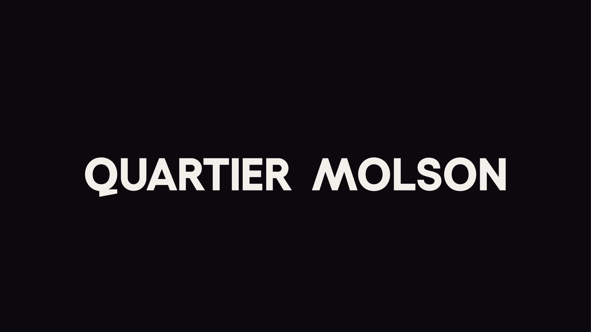
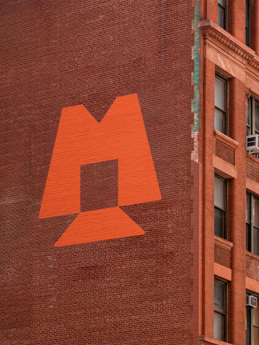
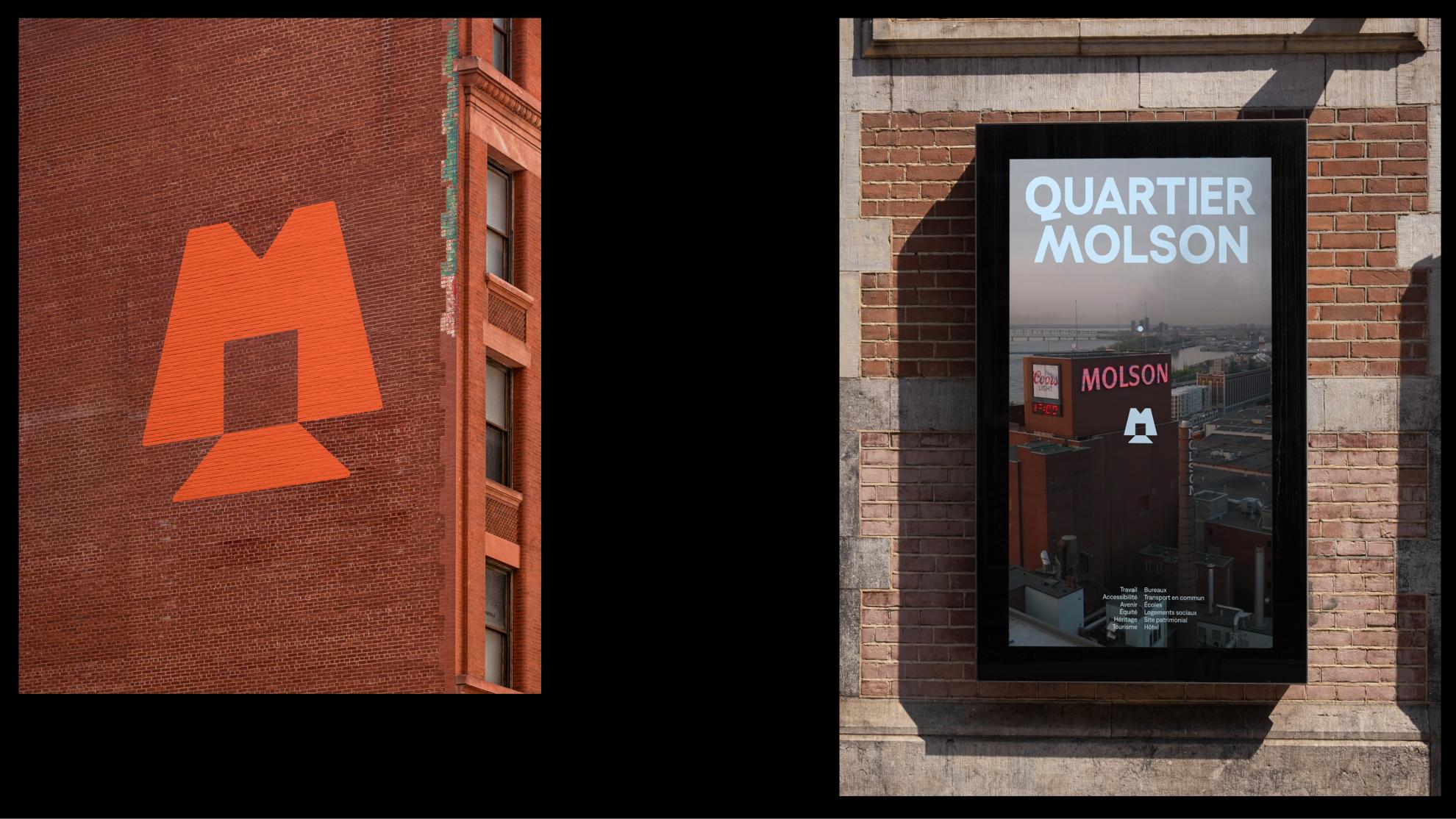
A reinvented Montreal emblem.
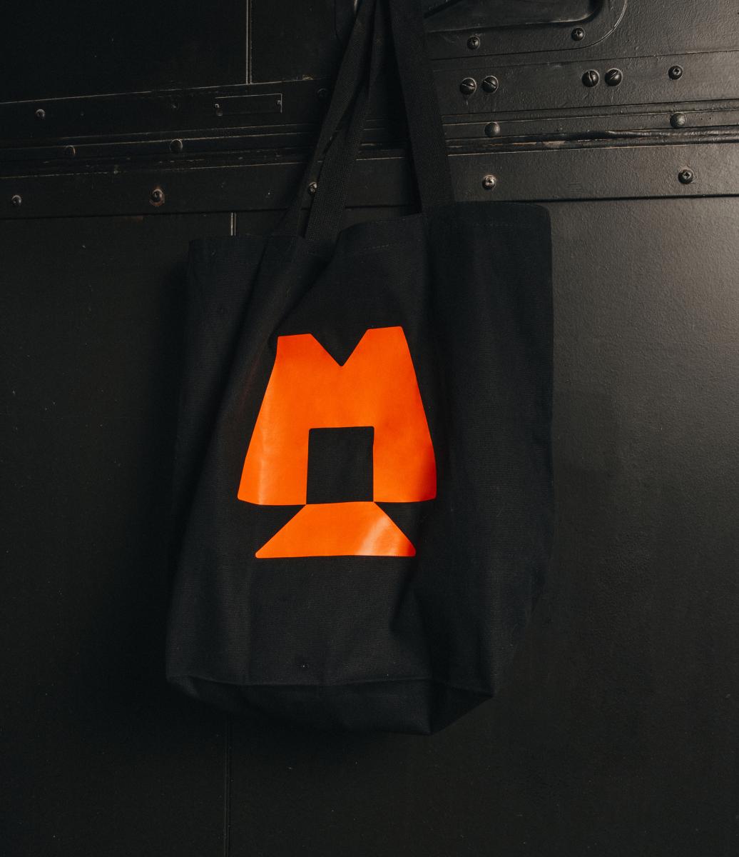
The logo of Quartier Molson is rooted in the heritage of the site while opening the door to its future. It merges history, structure, and modernity through a typography that is custom-made, impactful, and timeless.
- Lettering inspired by the past. The details of the word-symbol evoke the historical inscriptions of the Molson brewery.
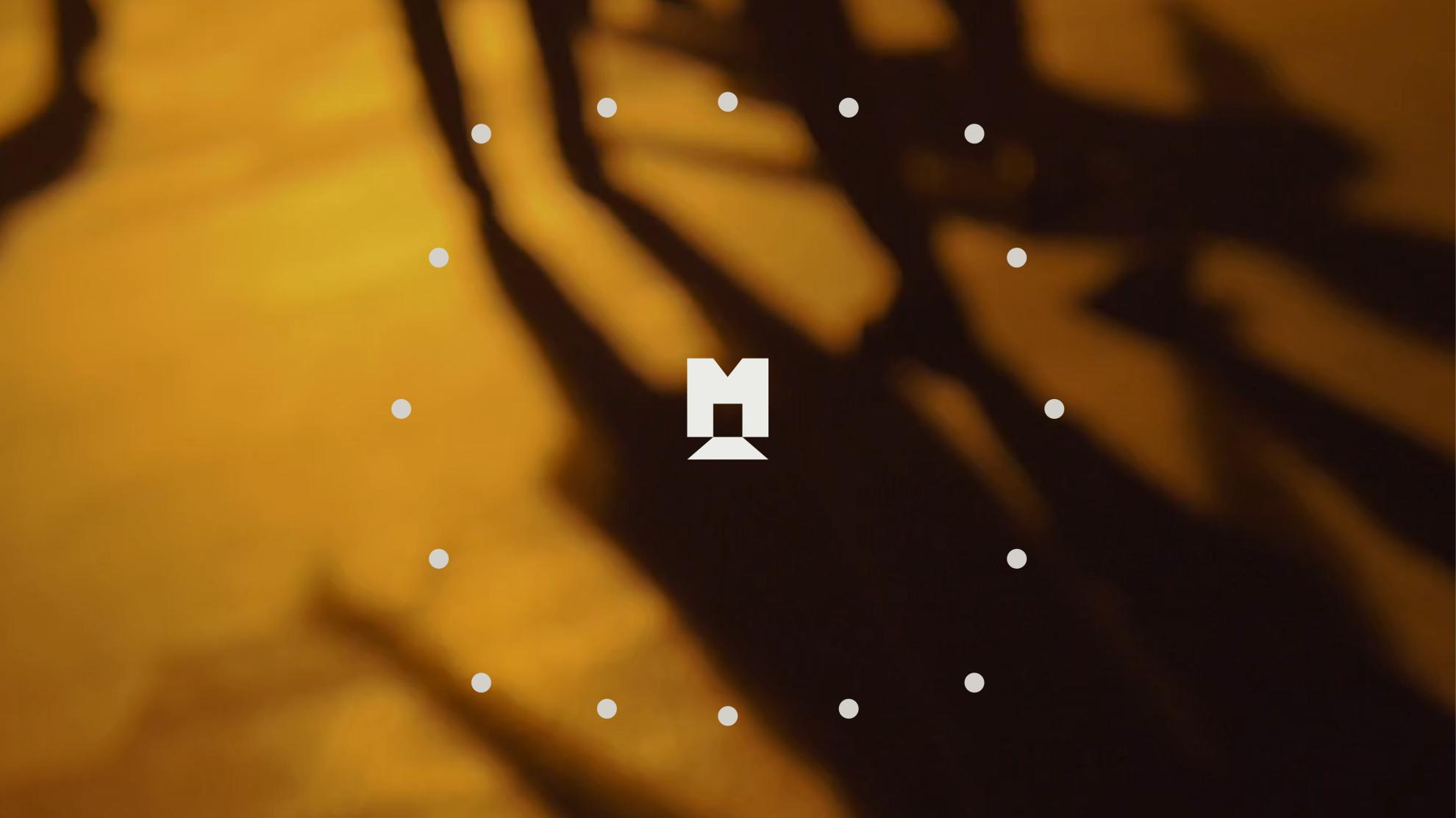
- An emblem that carries the future. The “M” monogram stands out as a symbol of renewal and openness.
- A strong typographic system. The use of uppercase maximizes impact and readability in signage.
A logo that echoes the history while charting the future of the district.
LOGO - Communication challenges for the project realization
Transforming an iconic site into a contemporary destination.
The challenge: to create an identity rooted in collective memory while projecting a vision oriented towards the future.
- Resonating a legacy. Transforming Molson's notoriety into a neighborhood marker that is accessible and unifying.
- Balancing heritage and modernity. Designing a logo and graphic system capable of adapting to the new vocations of the place.
- Unifying stakeholders. Bringing residents, investors, and creators together around a shared and sustainable identity.
A design that celebrates history while shaping an influential neighborhood.
IDENTITY - Description of the piece
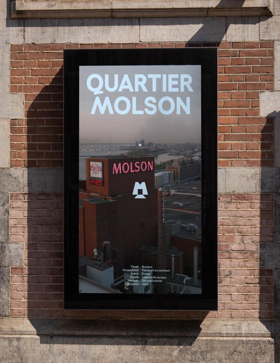
The identity of a new place that has always existed.
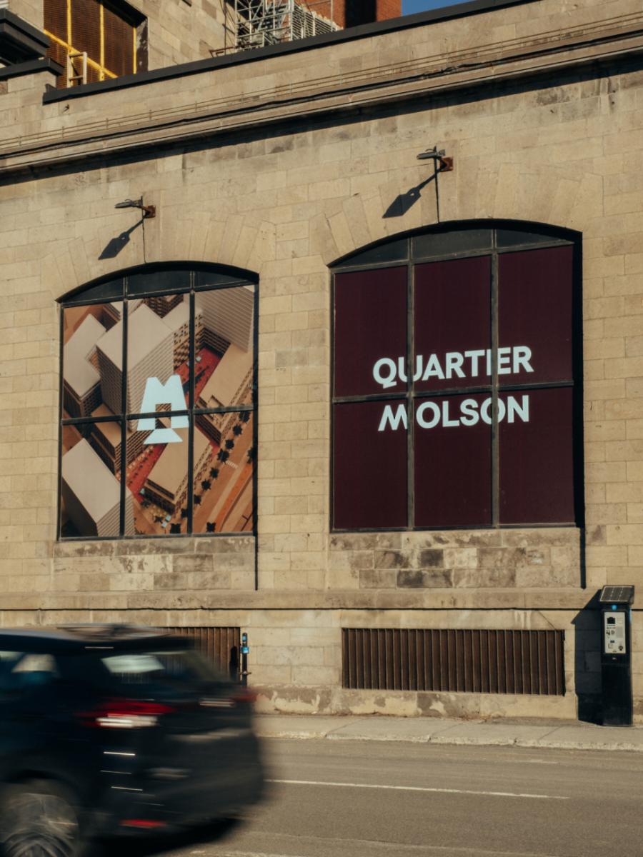
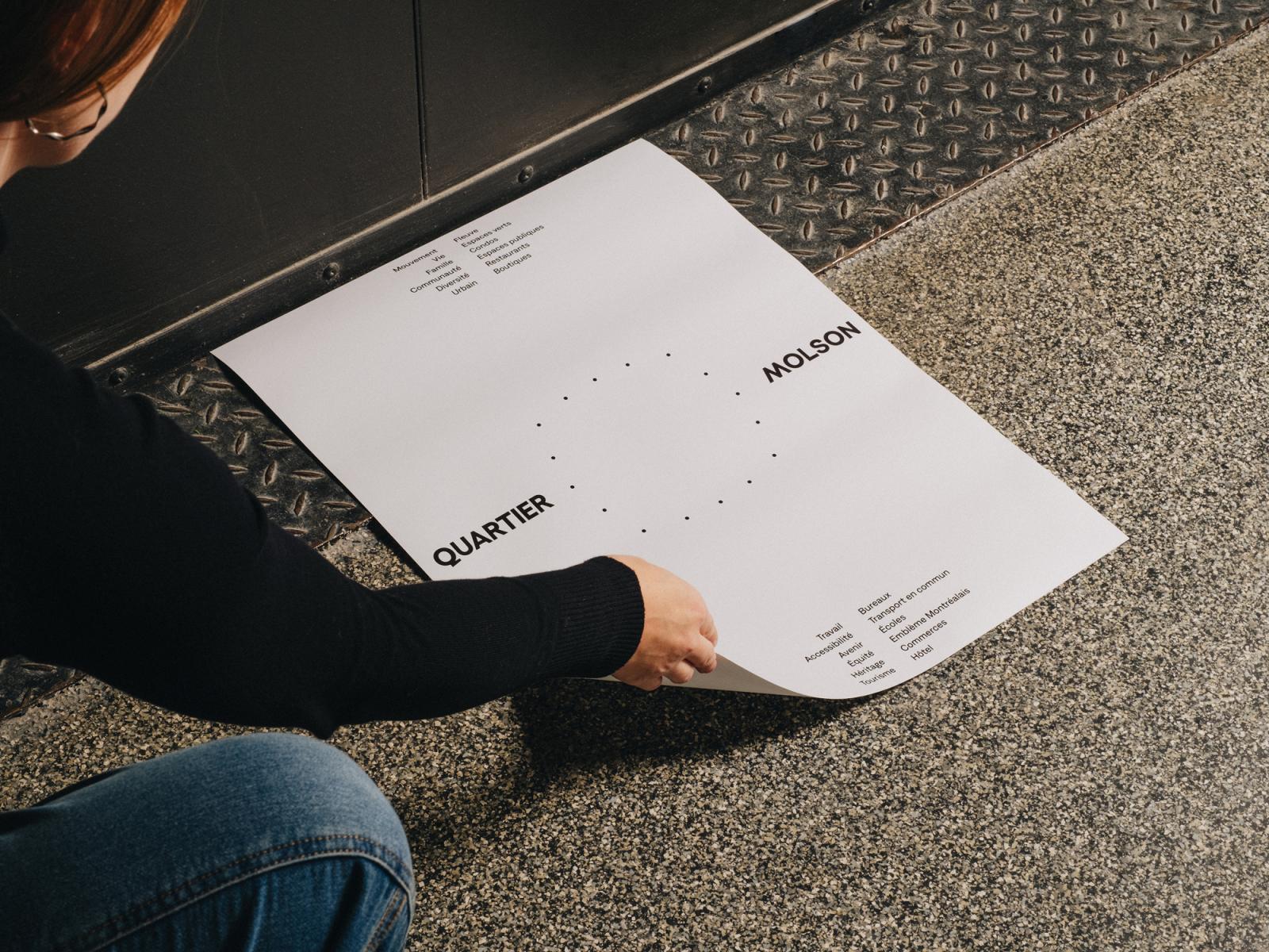
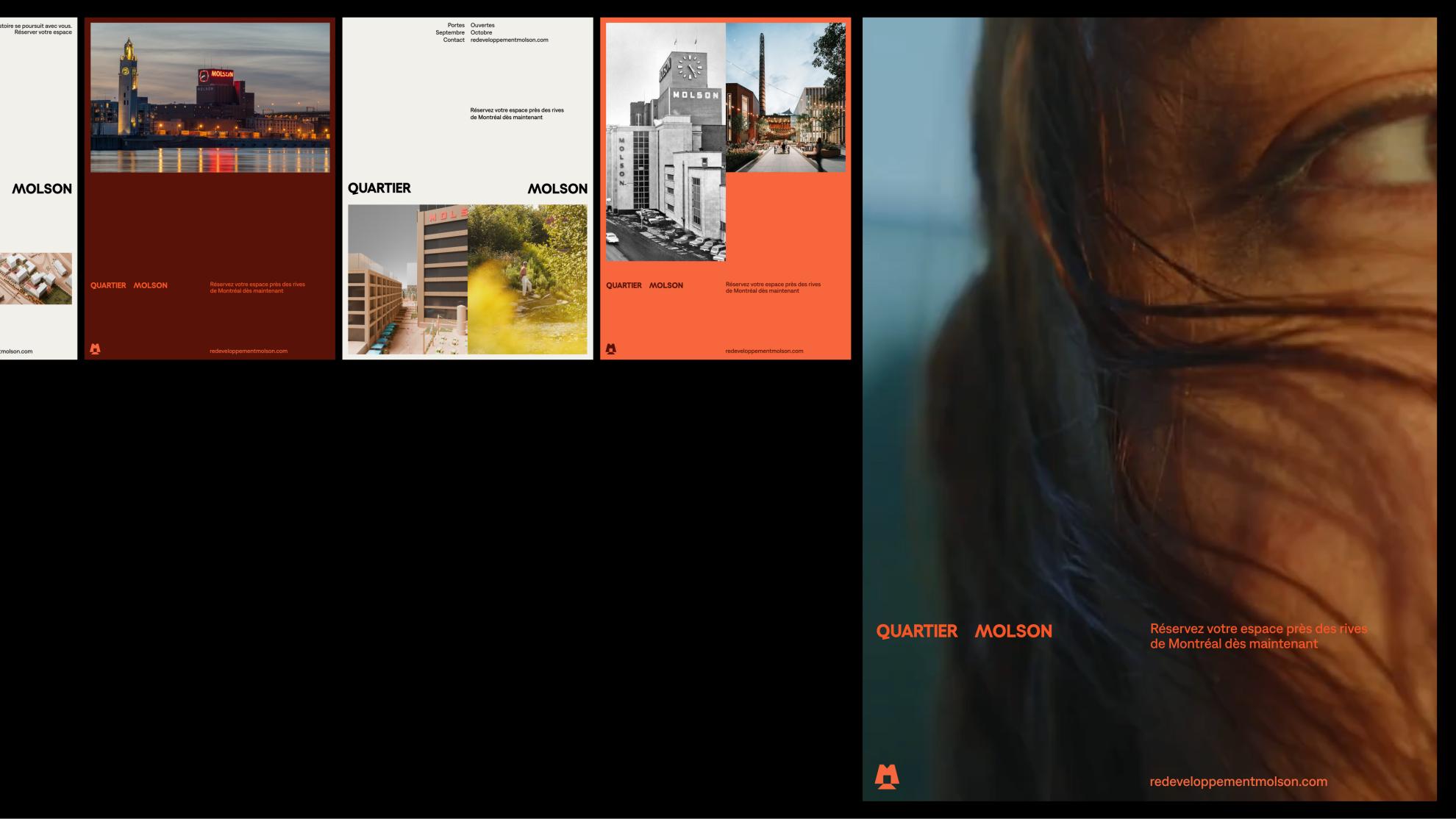
The visual identity of Quartier Molson conveys the power of a historical site and the vision of a moving district. Inspired by the site's architecture and the iconic clock, it plays with structured typographical codes and a palette rooted in the history of the place.
- A balance between tradition and renewal. A visual language that links industrial heritage and contemporary urbanity.
- A palette rooted in the past. Colors inspired by Molson brewery, modernized for the future of the district.
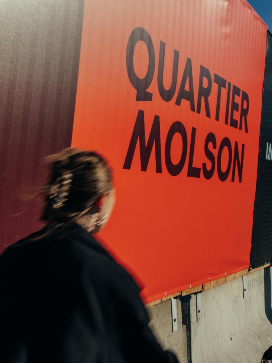
- Significant signage. An impactful graphic system accessible to everyone.
- The awakening of a Montreal emblem.
IDENTITY - Communication challenges for the project realization
An identity for Montreal's next influential district.
The identity had to honor the past while creating a lasting urban marker, in a city where every Montrealer has an opinion on its development. Quartier Molson does not start from scratch—it is part of one of the most iconic sites in the country.
- A place at the crossroads of generations. Speaking to Montrealers sensitive to their heritage as well as new residents and entrepreneurs.
- Creating an urban landmark. A strong and immediately recognizable identity.
- An evolving visual framework. An identity that can accompany the development of the district over several decades.
Collaboration
Real estate developer : Groupe Montoni
Communication & Branding : Deux Huit Huit
Photo credit