


Share to
Micro espresso
By : Basalte

GRANDS PRIX DU DESIGN 18th edition
Discipline : Communication & Branding
Categories : Communication Design / Packaging : Grand Winner
Categories : Brand Design / Brand Identity Creation and Update : Gold certification
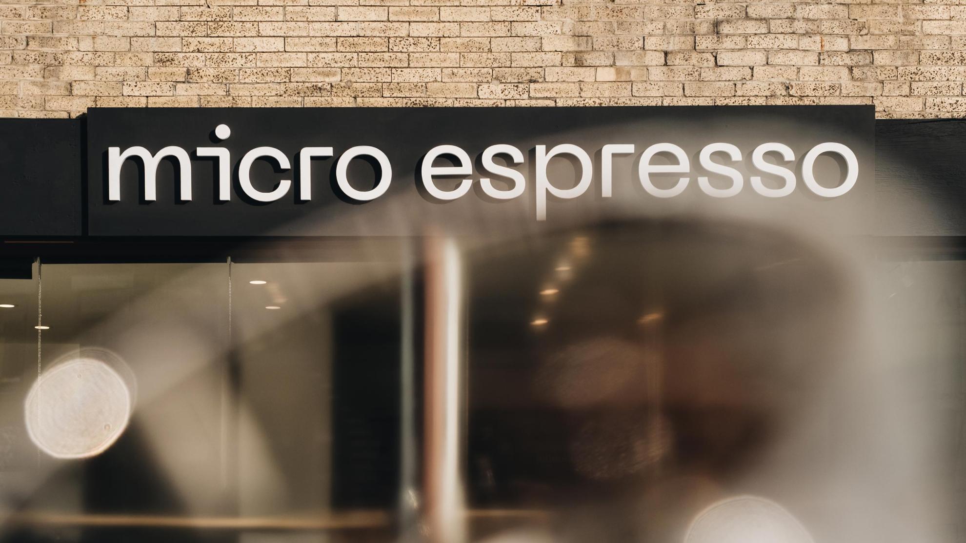
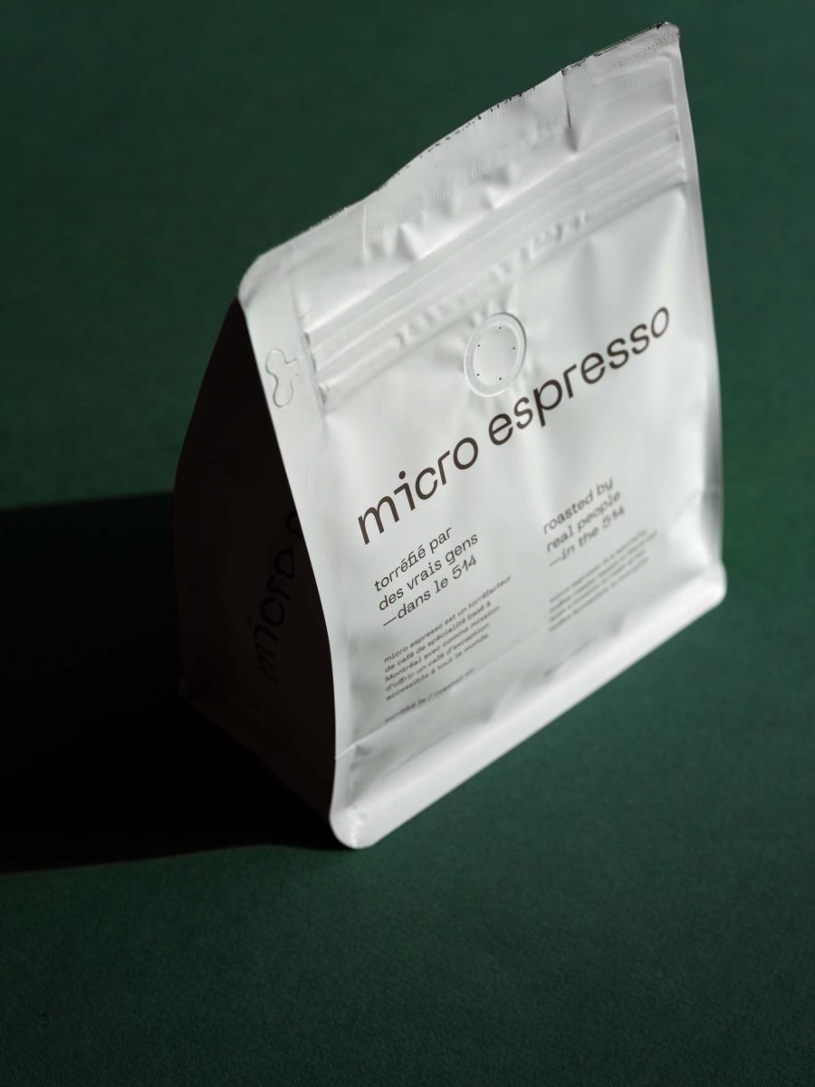
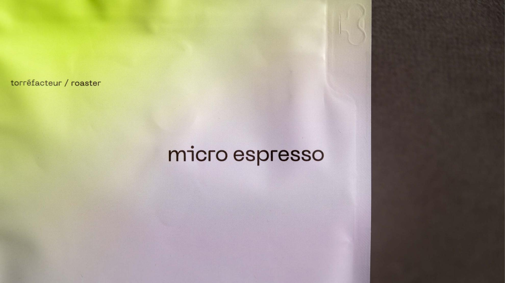
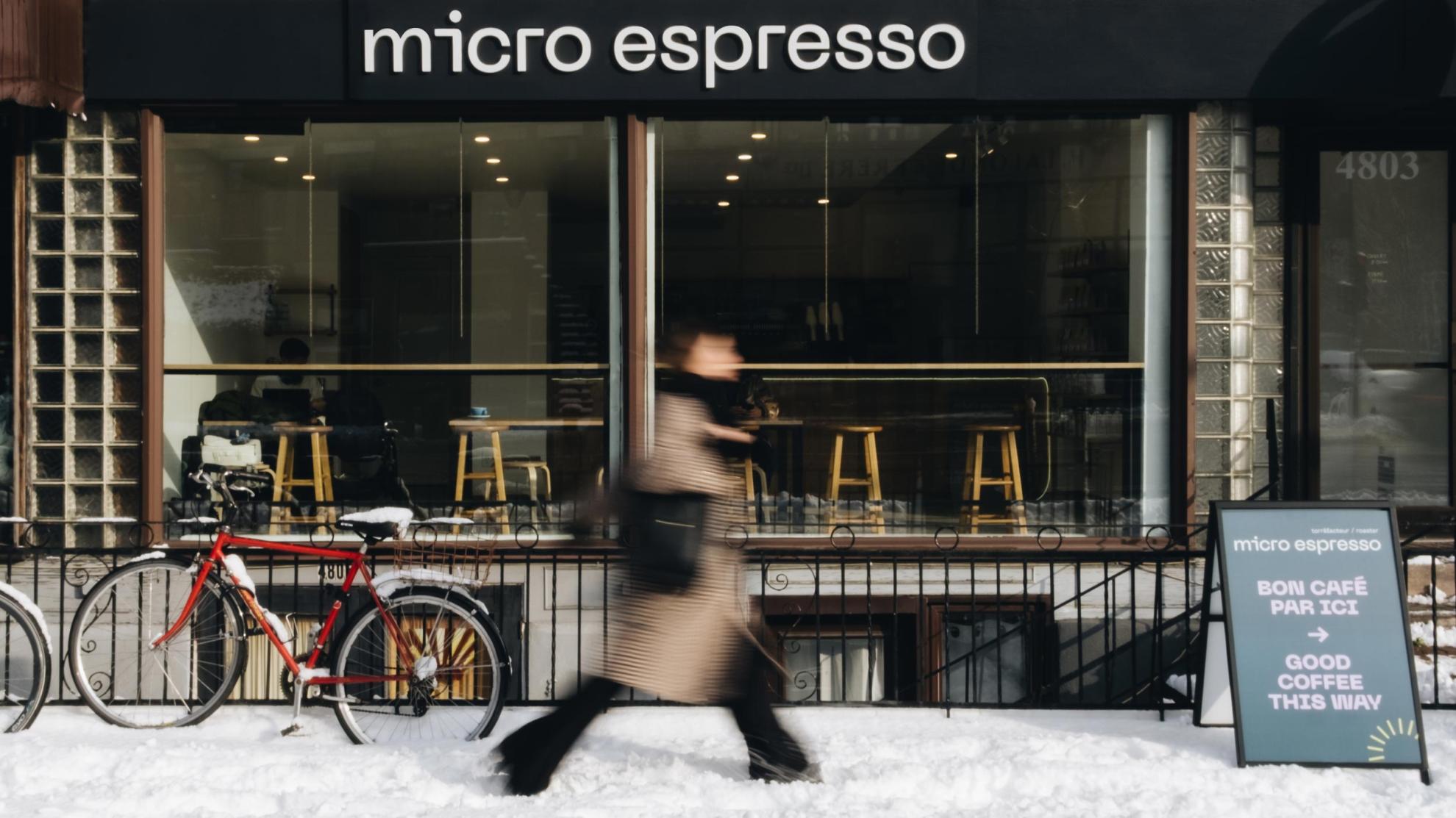
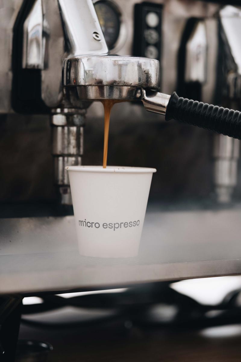
Micro espresso is a Montreal-based roaster with a mission to offer exceptional coffee that is accessible to everyone. Their motto makes it clear: Roasted by real people—in the 514. With its various locations all situated in Montreal, Micro espresso is a must-visit third wave coffee shop in the city.
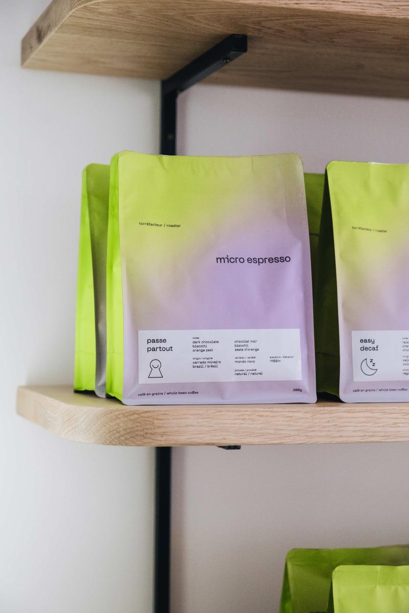
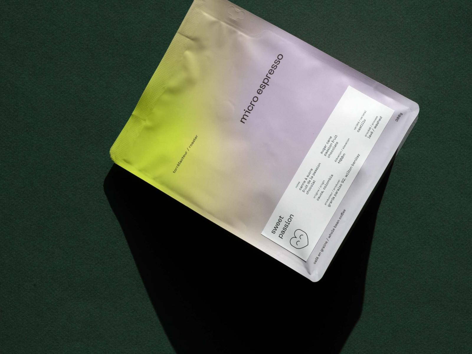
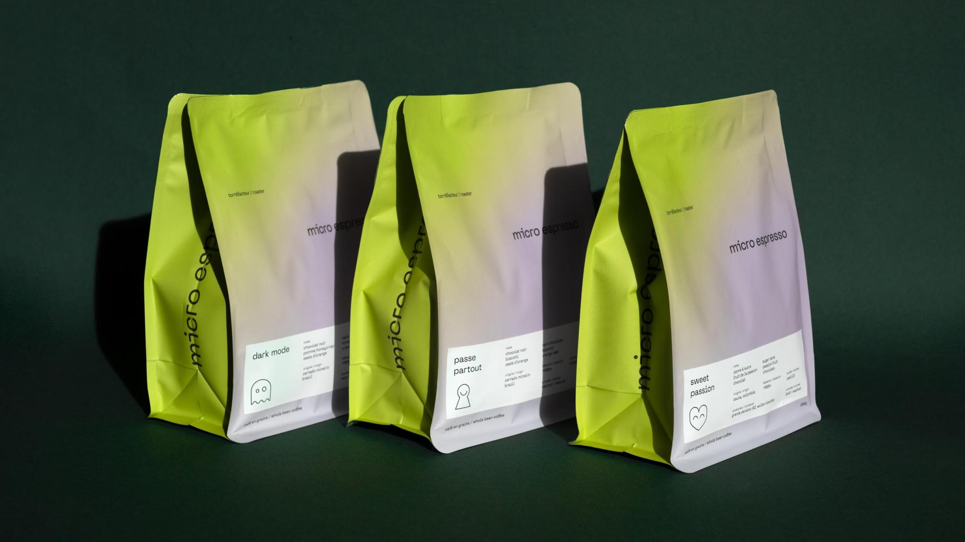
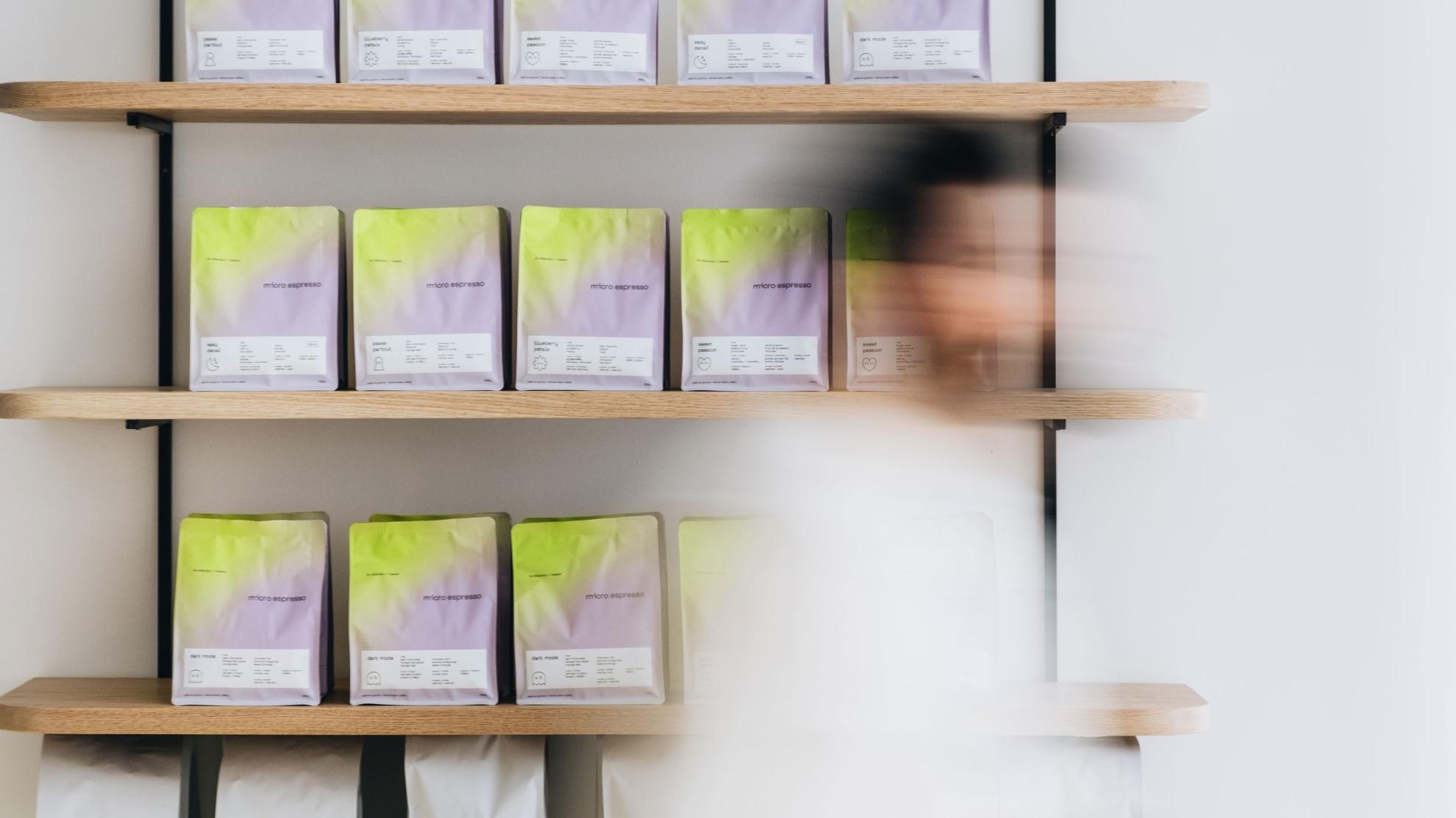
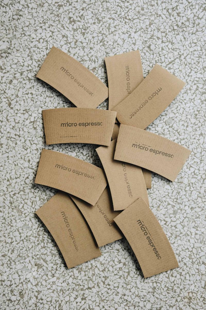
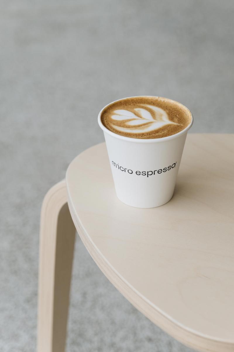
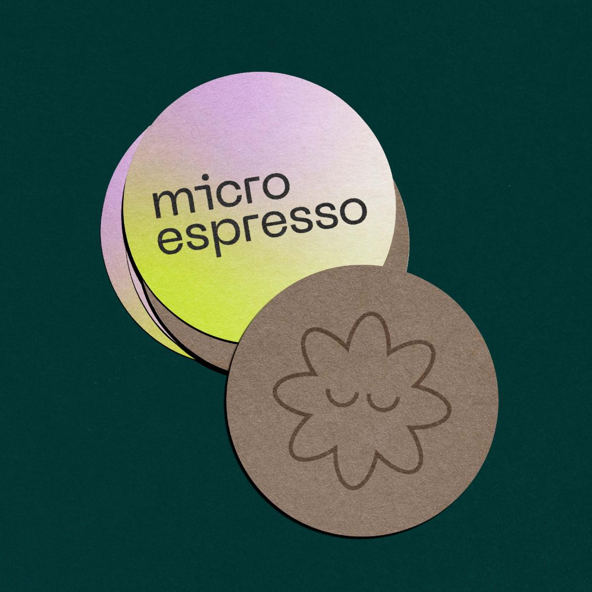
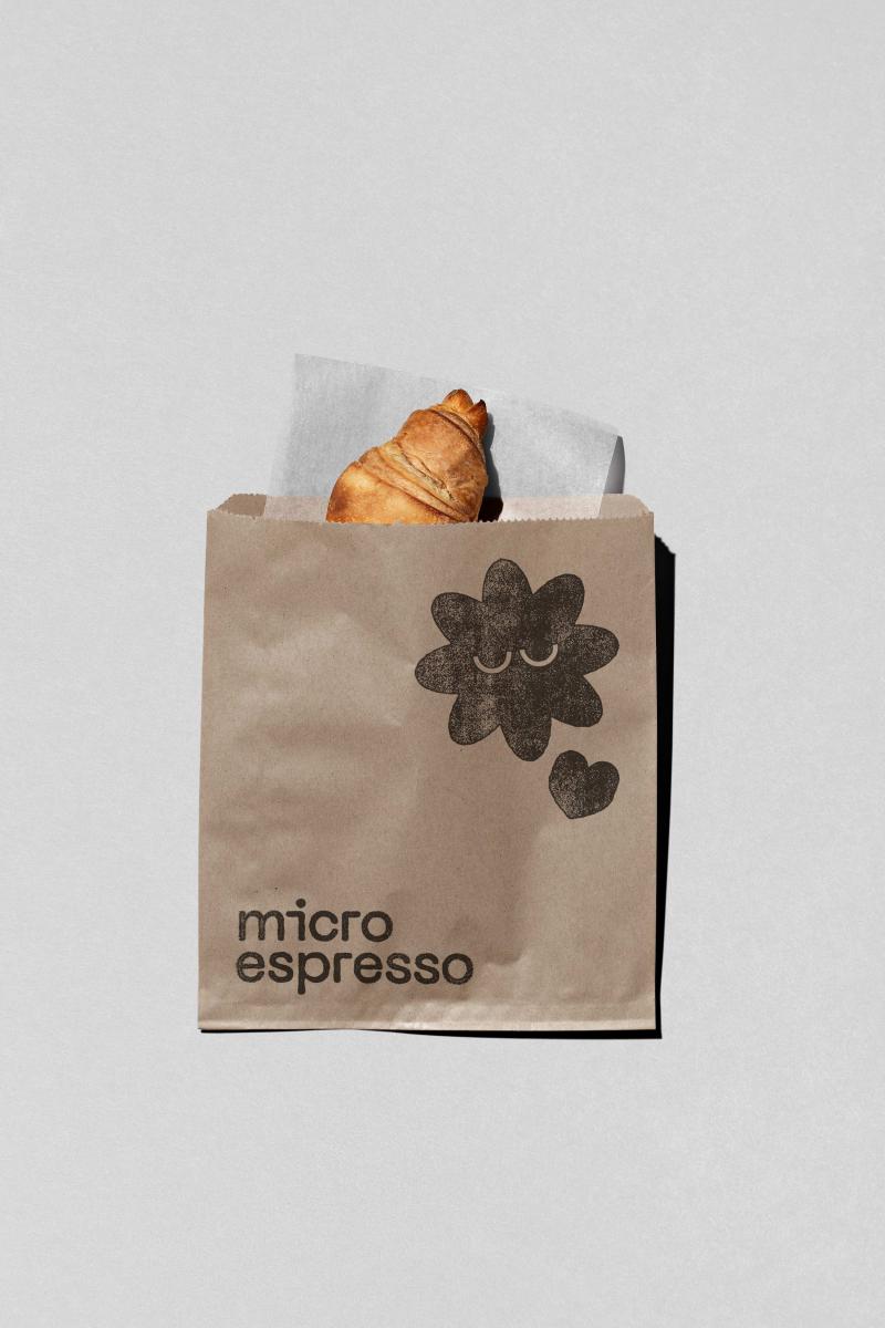
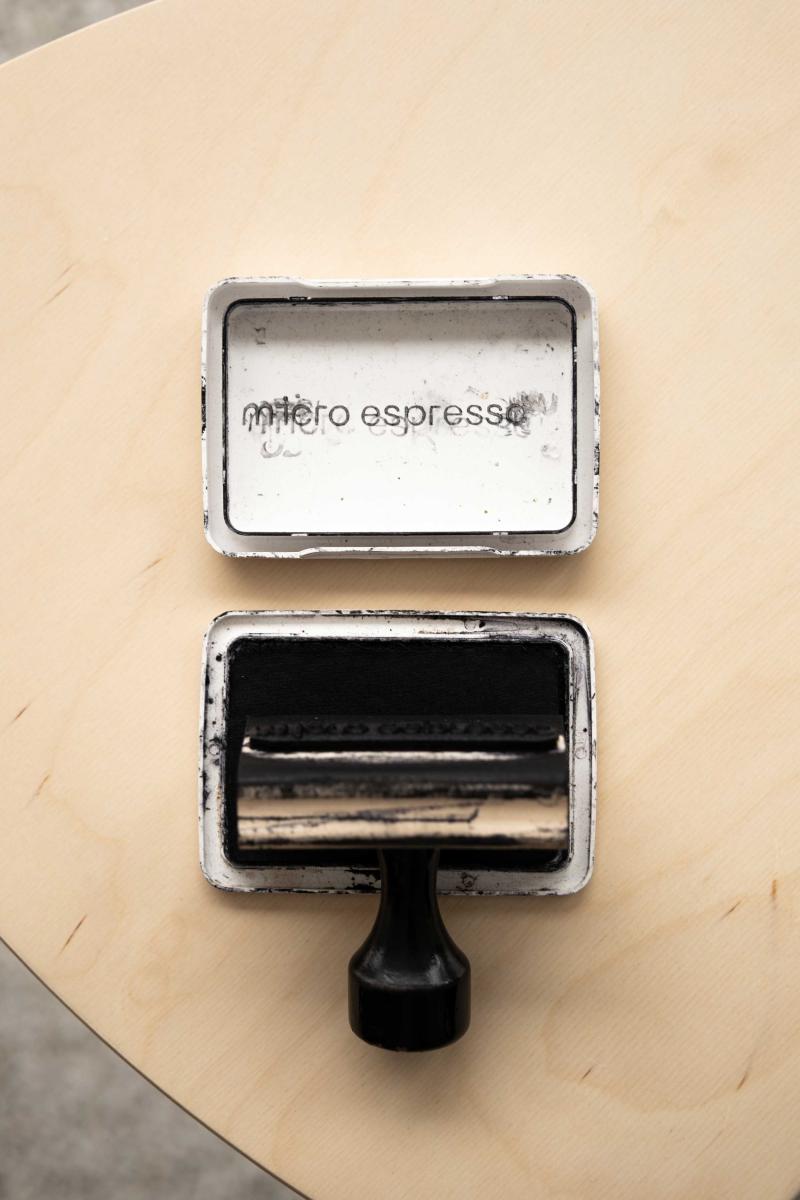
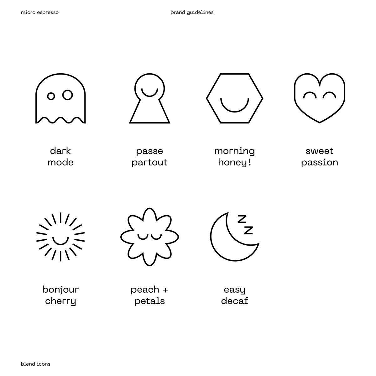
The logo was created using a typeface with mechanical aspects, which is balanced by the use of lowercase letters for a more friendly appearance. The brand image, with its gradient colors that have a techno flair and playful iconography, aims to be digital yet warm.
Its color palette reflects this dichotomy and stands out in its industry, rather than blending in. The design of the bags, with their assumed minimalism, serves as a cornerstone for the brand and has developed across a range of visuals to bring the brand to life in various locations and to enrich the roaster’s social media presence.
Collaboration
Communication & Branding : Basalte
Photo credit