

Share to
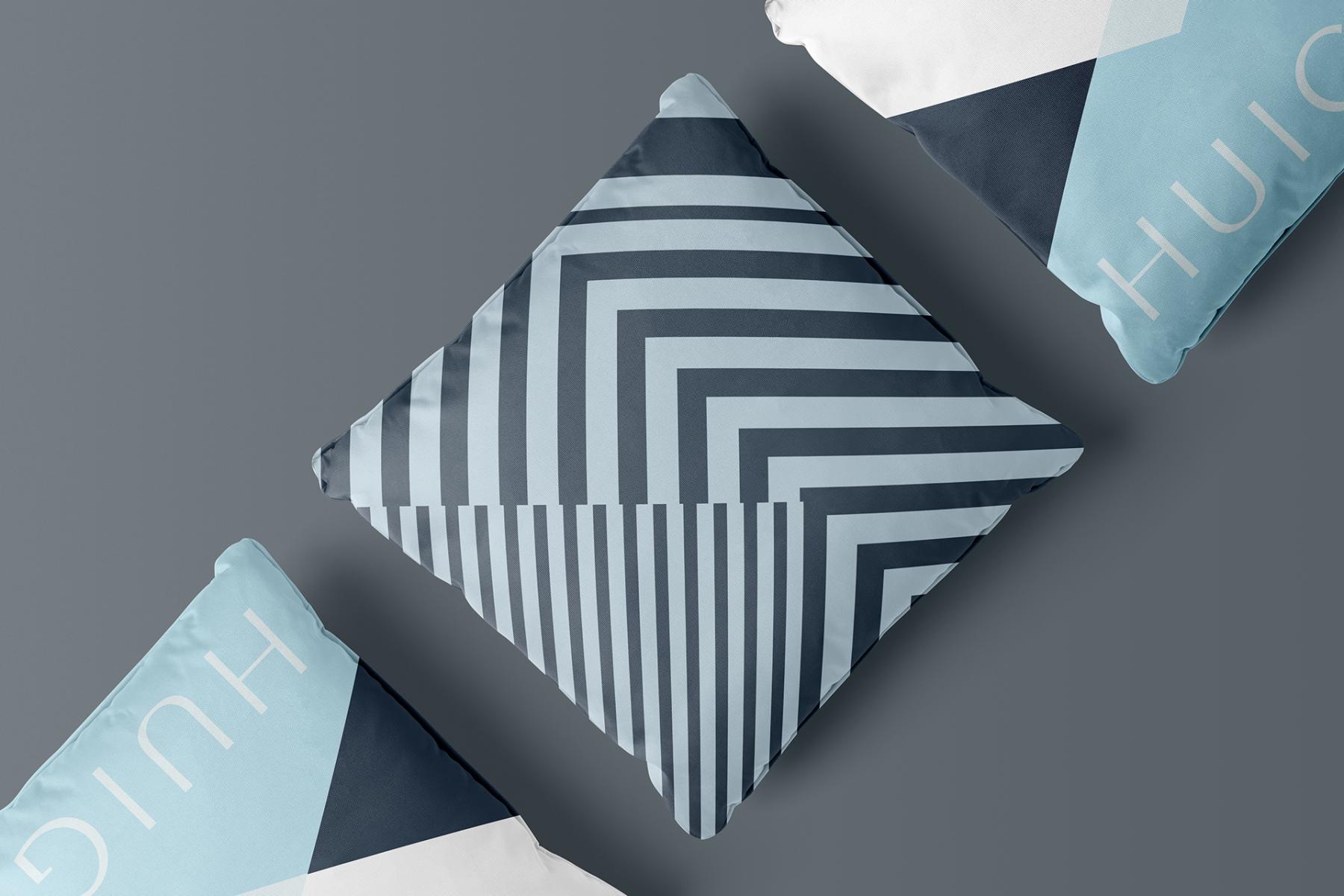
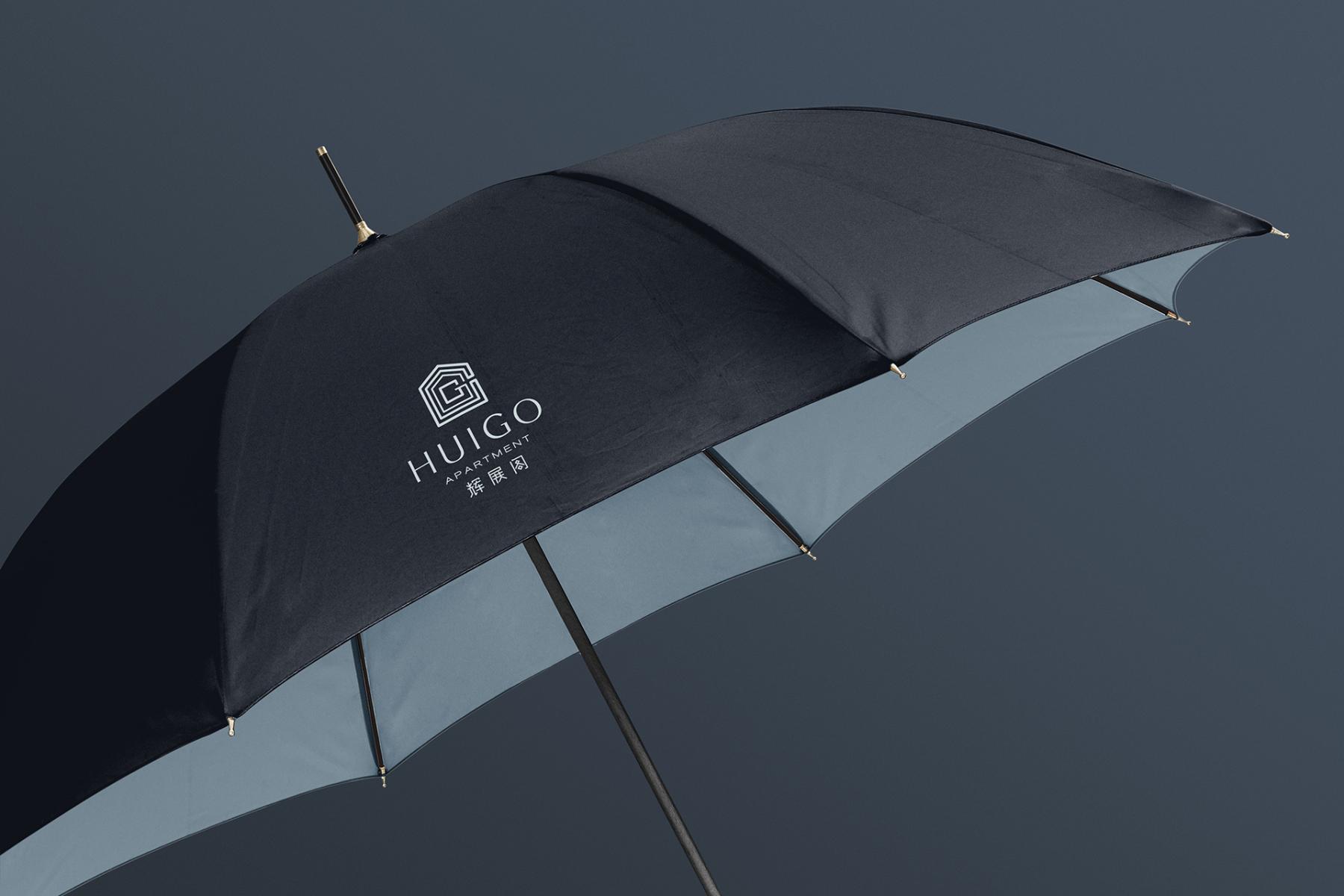
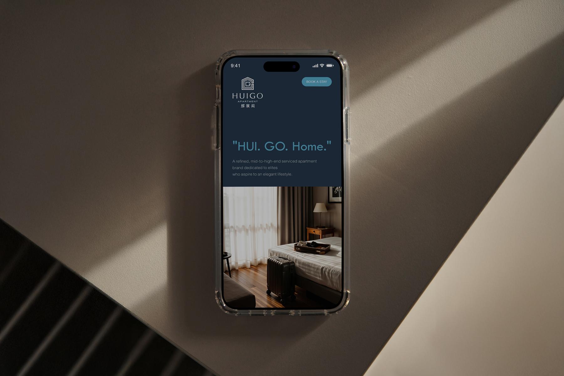
HUIGO Apartment Brand Visual Identity Design
By : Zhou Yu-Shanghai Sinostar Art Design Co.,Ltd.

GRANDS PRIX DU DESIGN 19th edition
Distinctions
Discipline : Communication & Branding
Categories : Brand Design / Brand Identity (Creation & Rebrand) : Silver certification
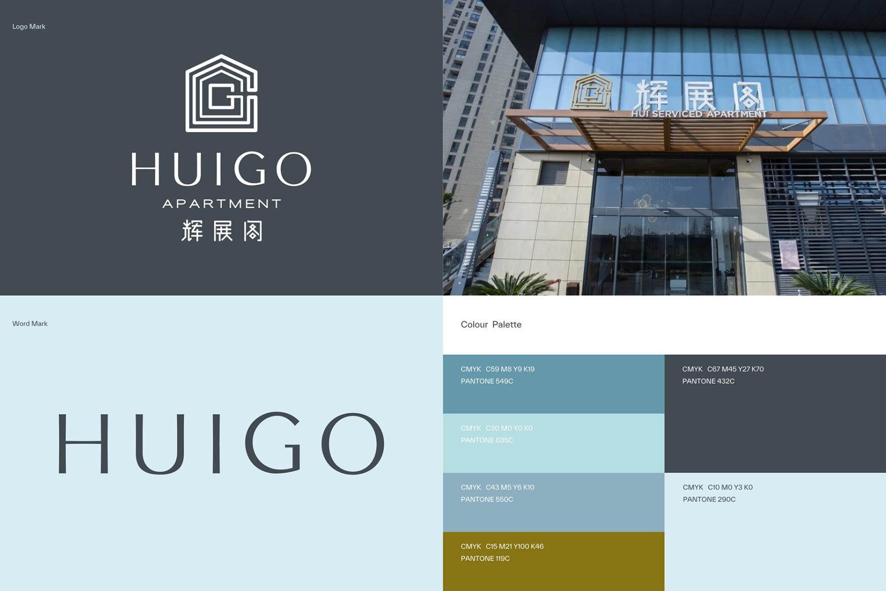
For our client, Huizhange, what began as the functional "Hui Serviced Apartment" needed to evolve into a brand with soul.
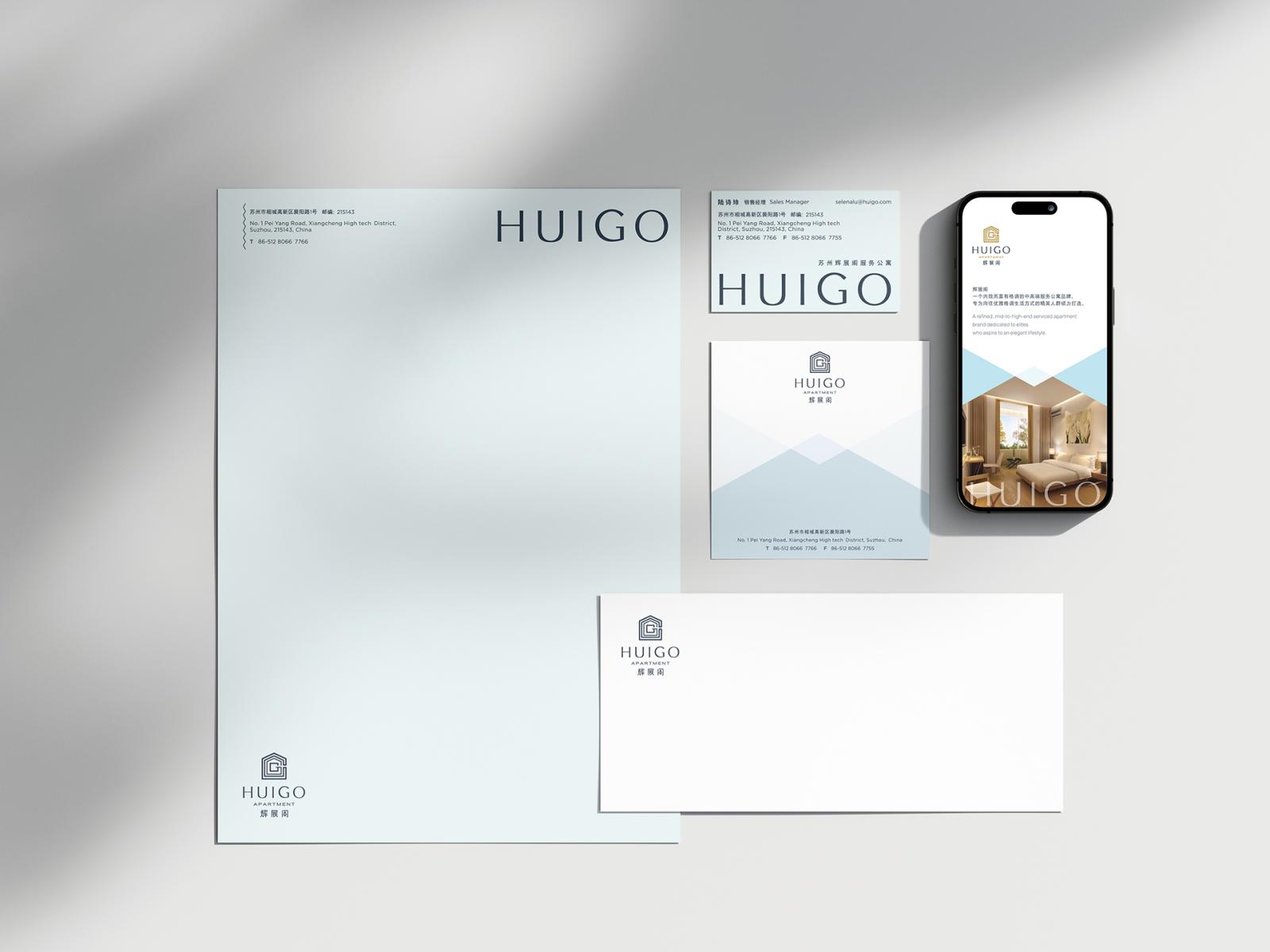
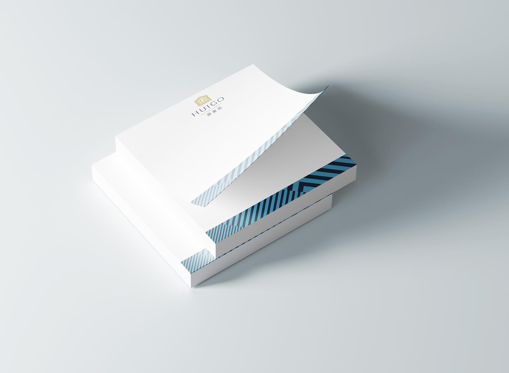
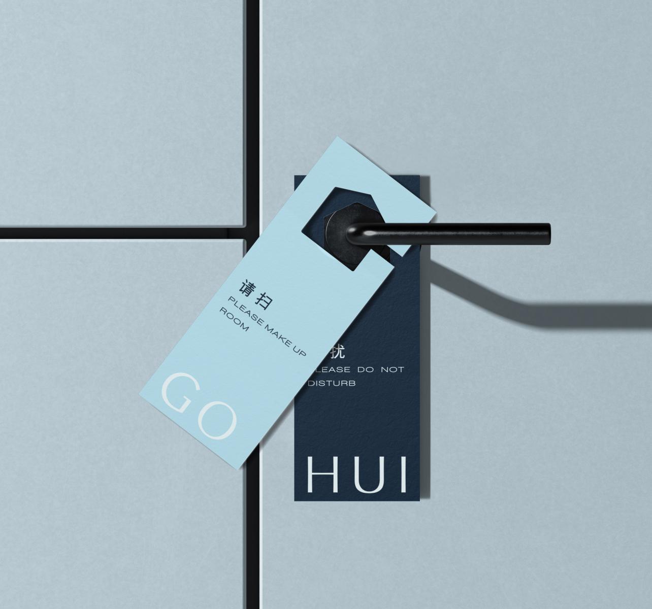
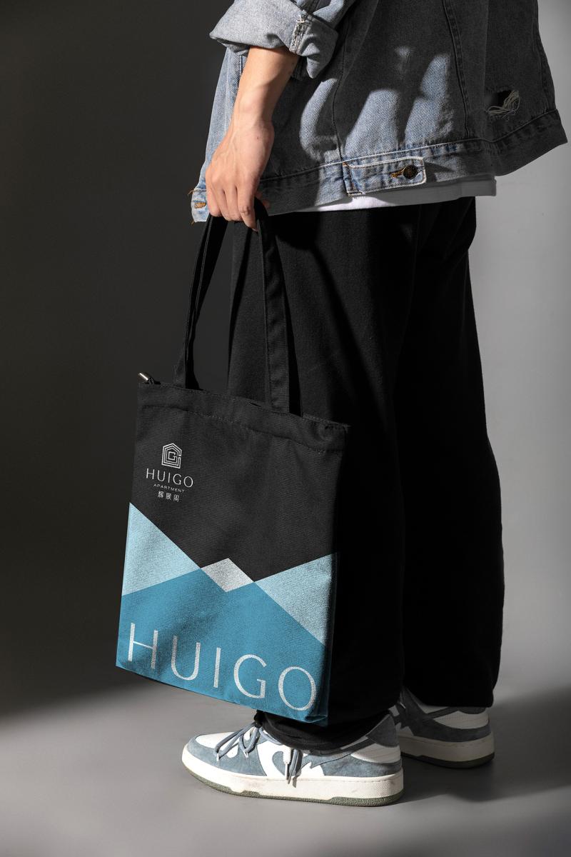
We developed HUIGO—a name signifying a holistic elevation from its predecessor. This project went beyond mere aesthetics; we reconstructed the brand architecture from the ground up, aligning the naming, positioning, and visual systems into a cohesive narrative.
The Strategy:
We positioned HUIGO as a mid-to-high-end sanctuary for the modern elite, embracing a lifestyle of grace and style.
The Symbolism:
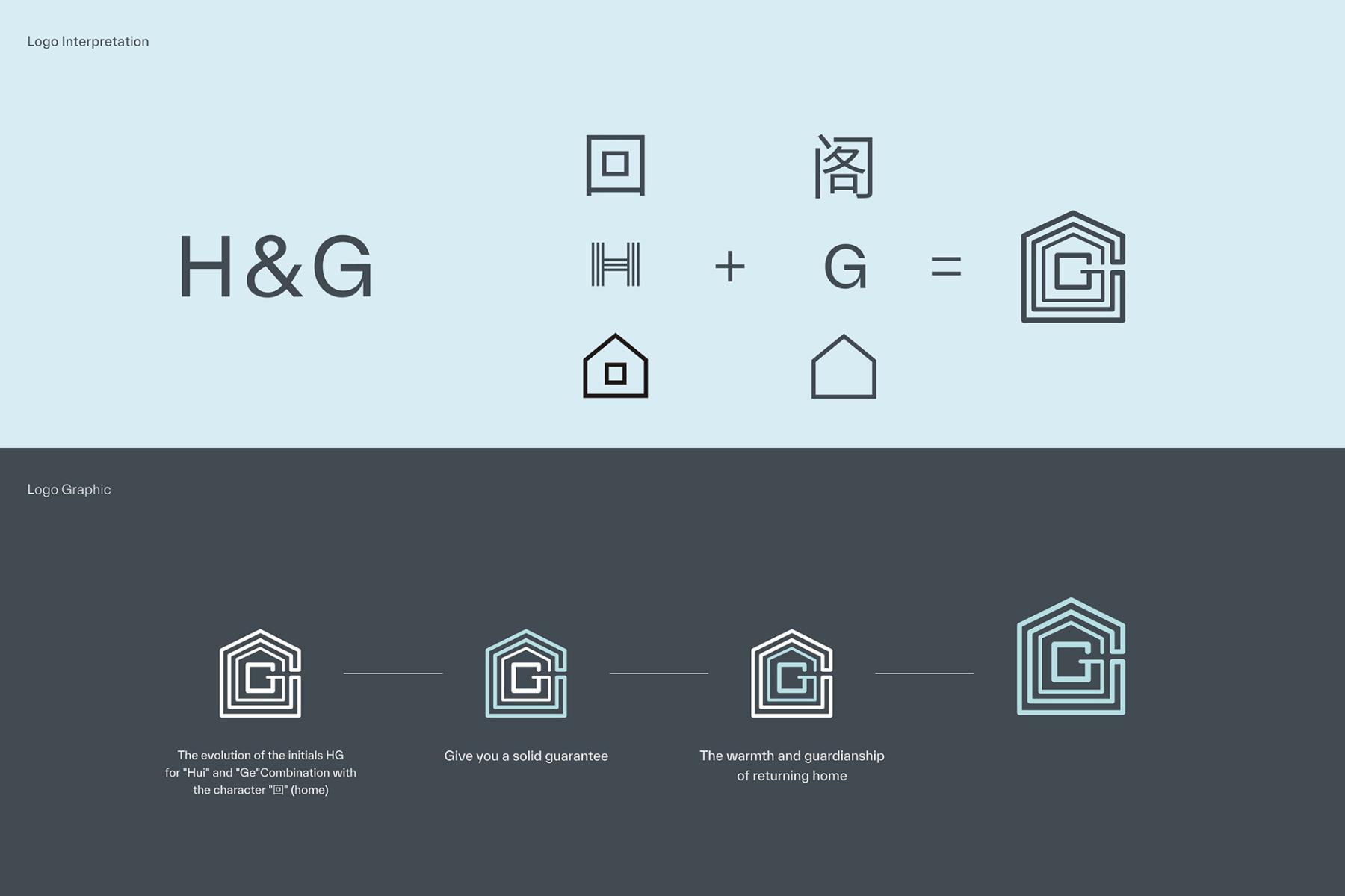
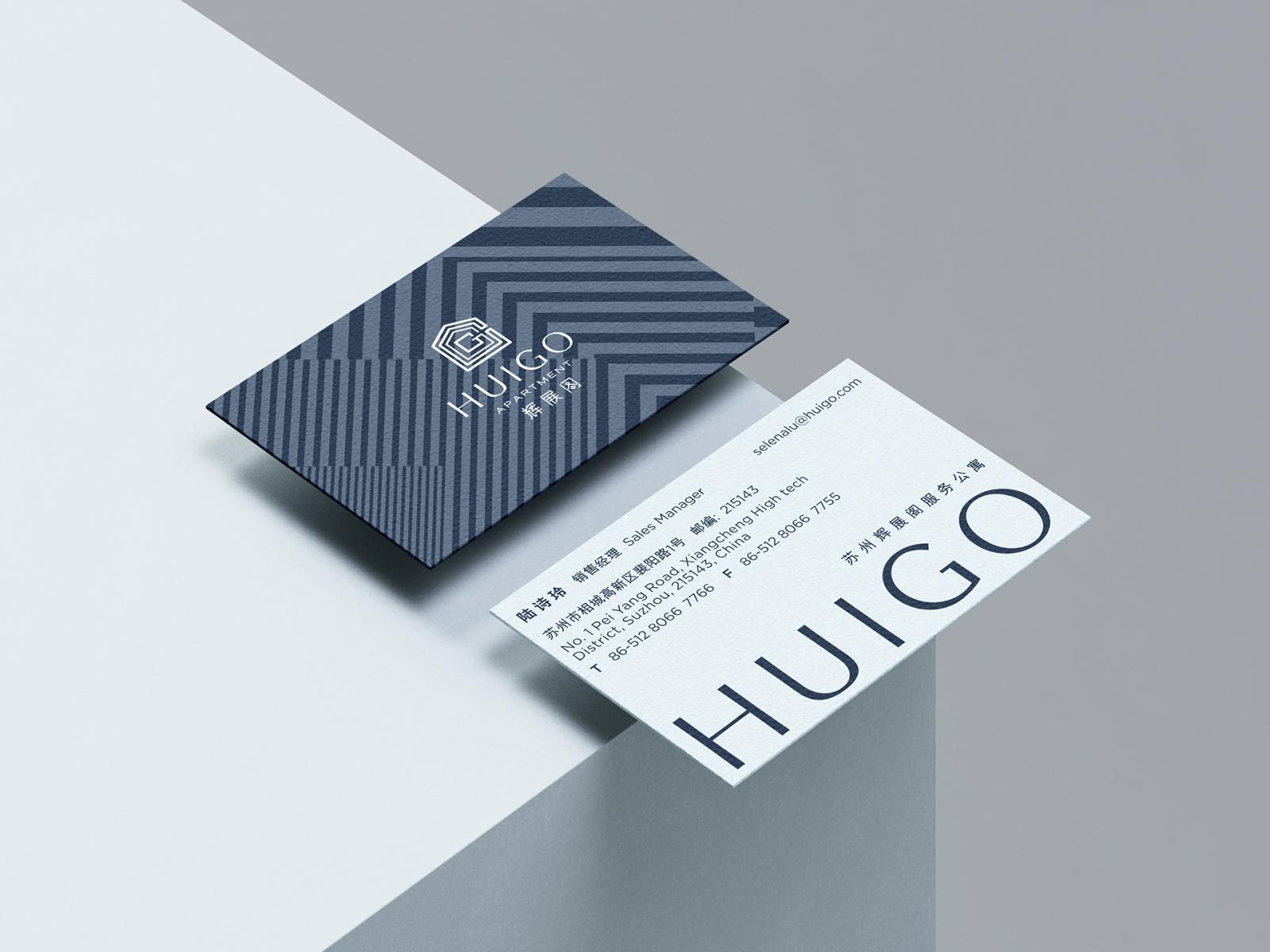
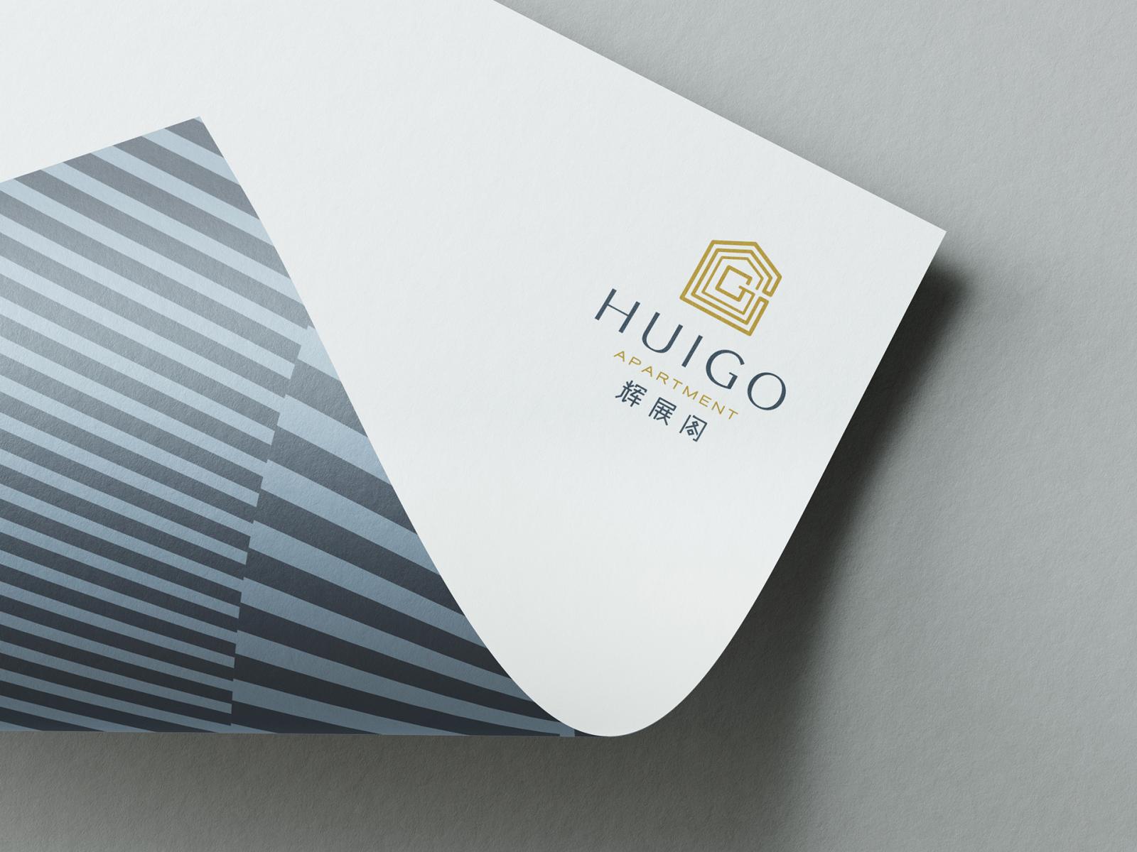
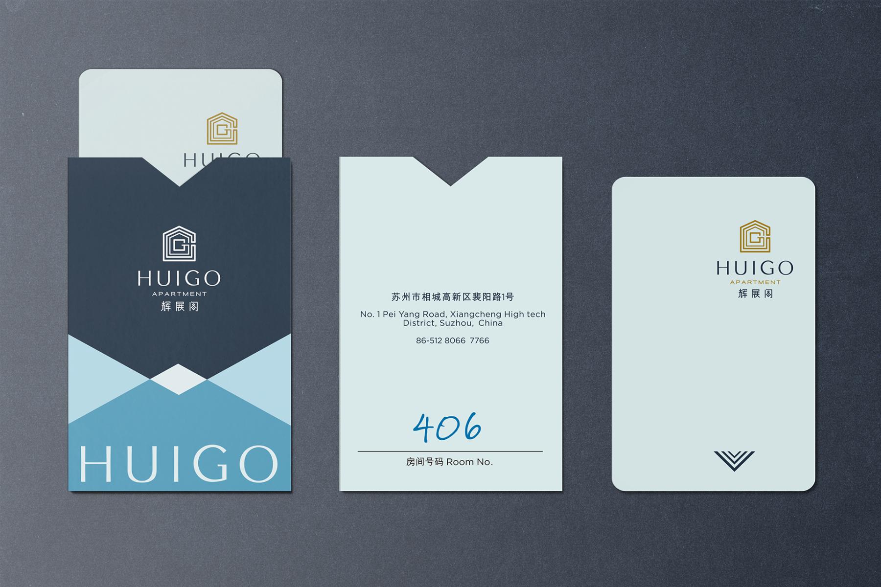
The logo we designed is a study in duality: appearing as the letter "G" from a distance, yet resolving into the shape of a house up close. This represents the seamless journey between the outside world and your private haven.
The Name:
HUIGO is a layered union of meanings:
H = Home, House, Harmony.
G = Go Home, Glorious, Grand.
Through this comprehensive upgrade, we helped HUIGO redefine "returning." No matter where you are from, HUIGO is where you Go Home.
Collaboration
Communication & Branding : Shanghai Sinostar Art Design Co.,Ltd.
Photo credit