


Share to
HEMISPHERE
By : Kodem | Agence SIX

GRANDS PRIX DU DESIGN 19th edition
Distinctions
Discipline : Communication & Branding
Categories : Brand Design / Brand Identity (Creation & Rebrand) : Silver certification
Categories : Brand Design / Logo Design : Silver certification
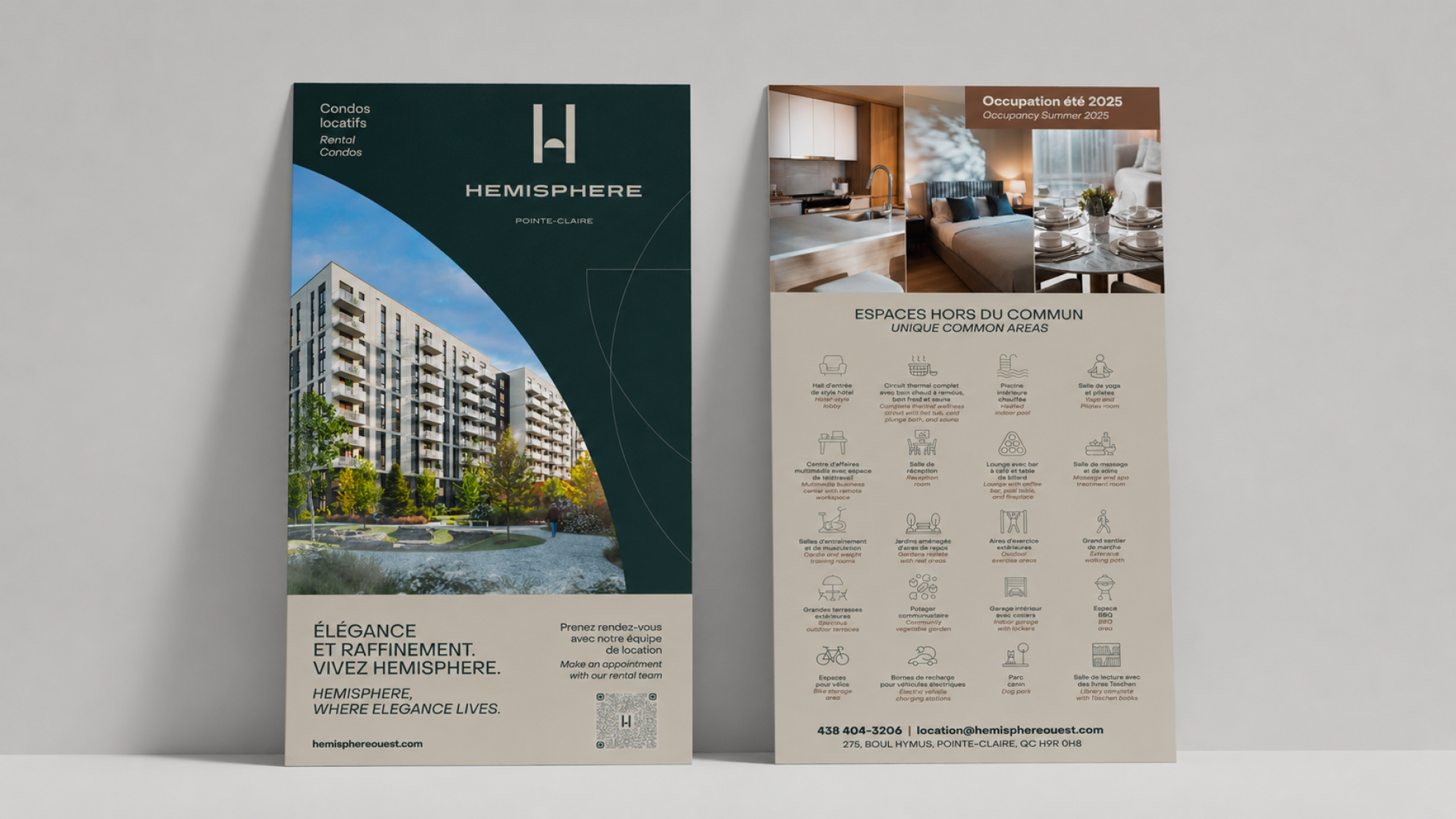
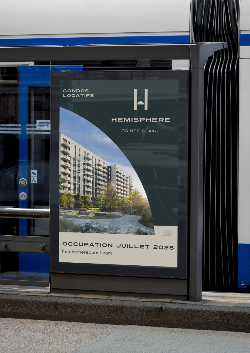
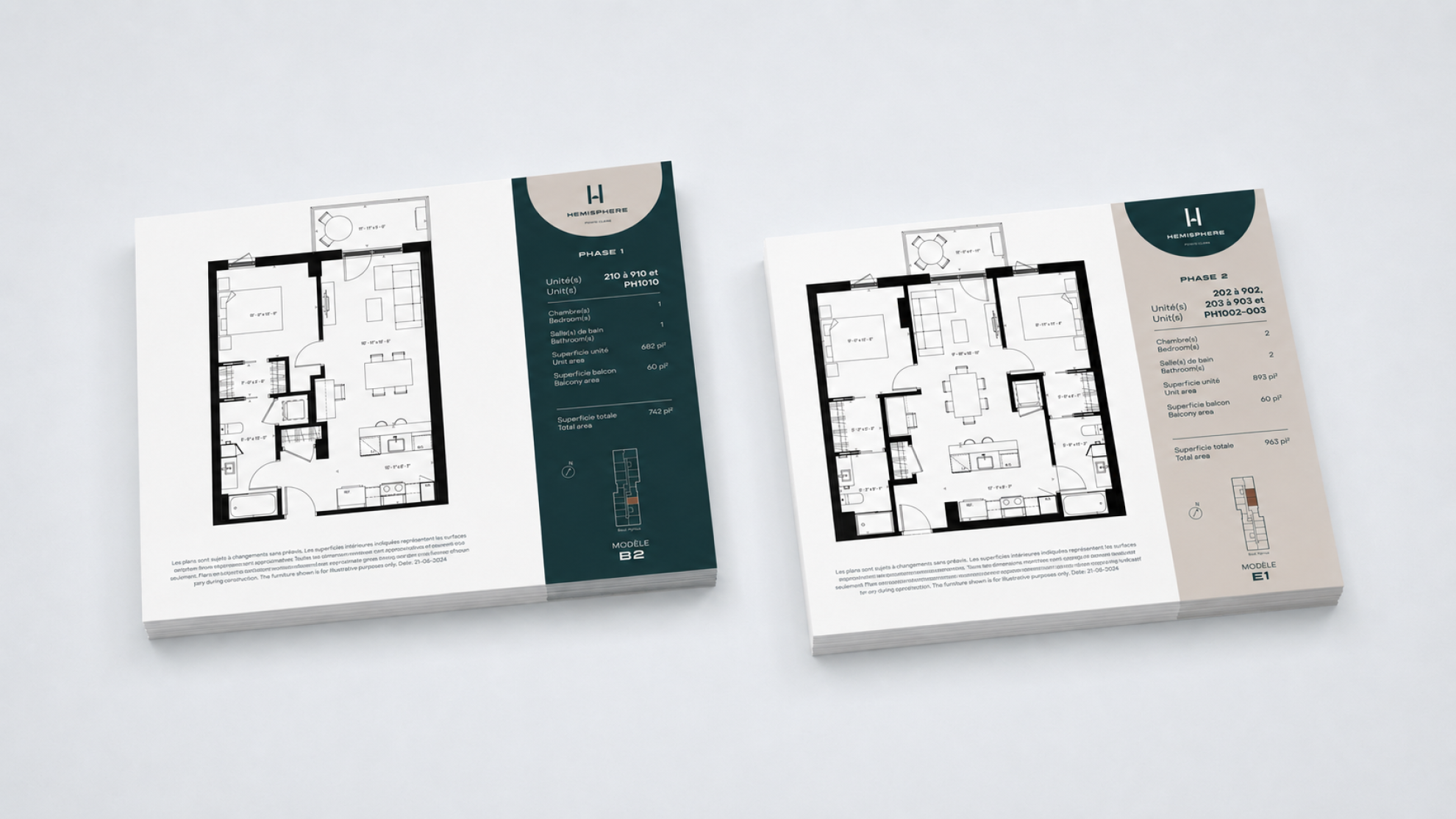
Categories : Communication Design / Poster & Print Collateral : Silver certification
Categories : Communication Design / Corporate Communication & Publishing : Silver certification
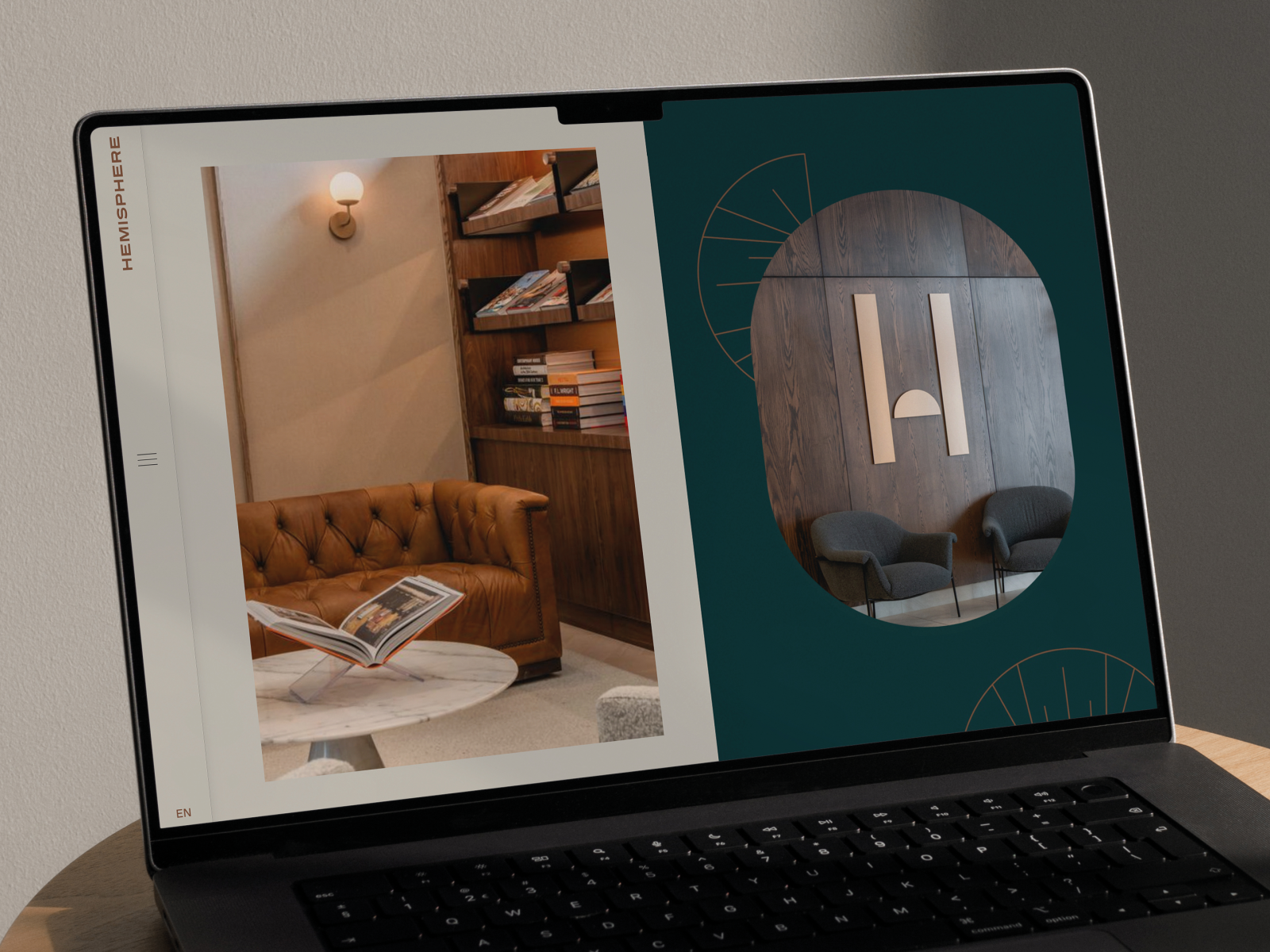
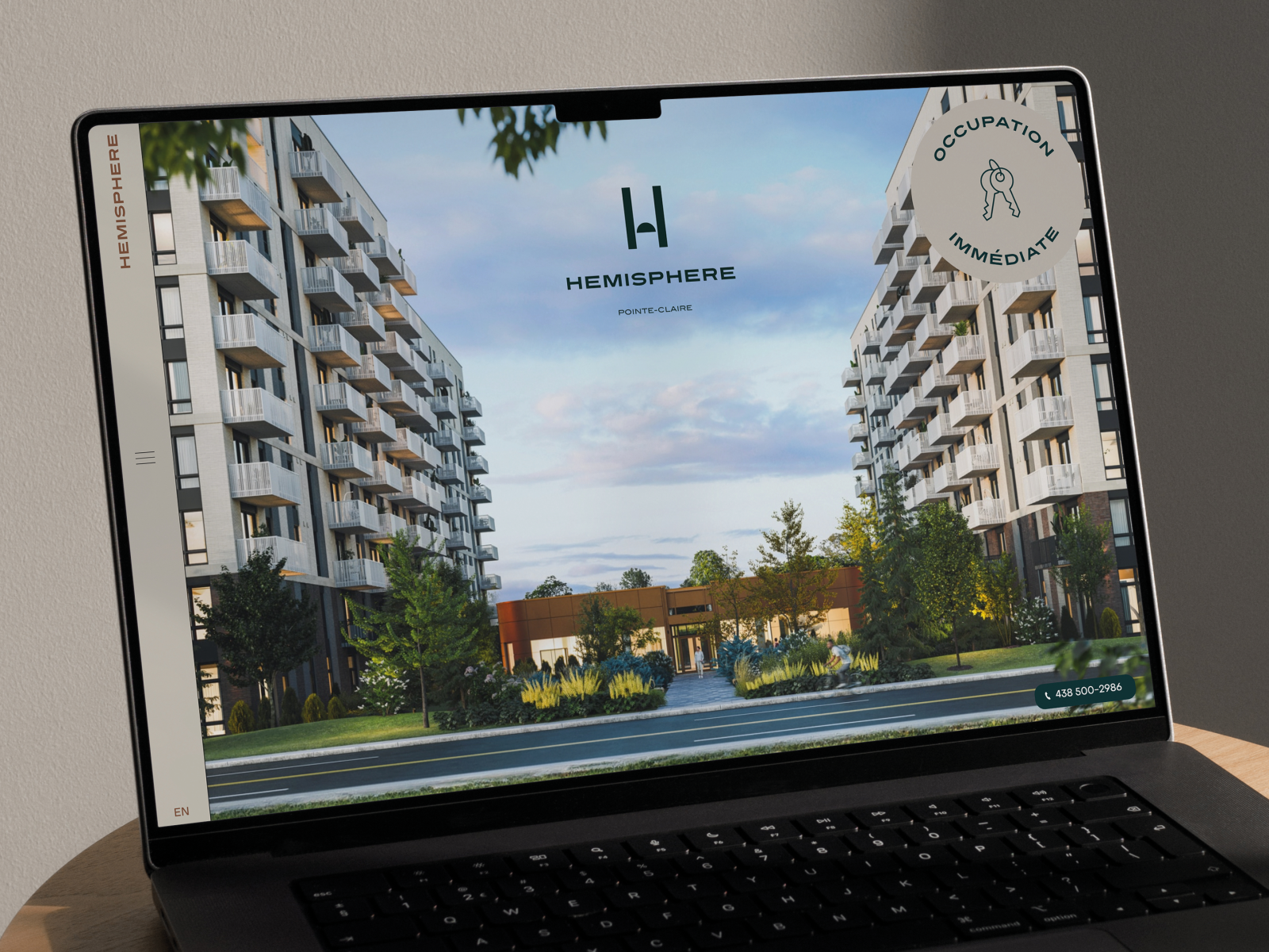
Categories : Communication Design / Website, Apps & UI / UX : Gold certification
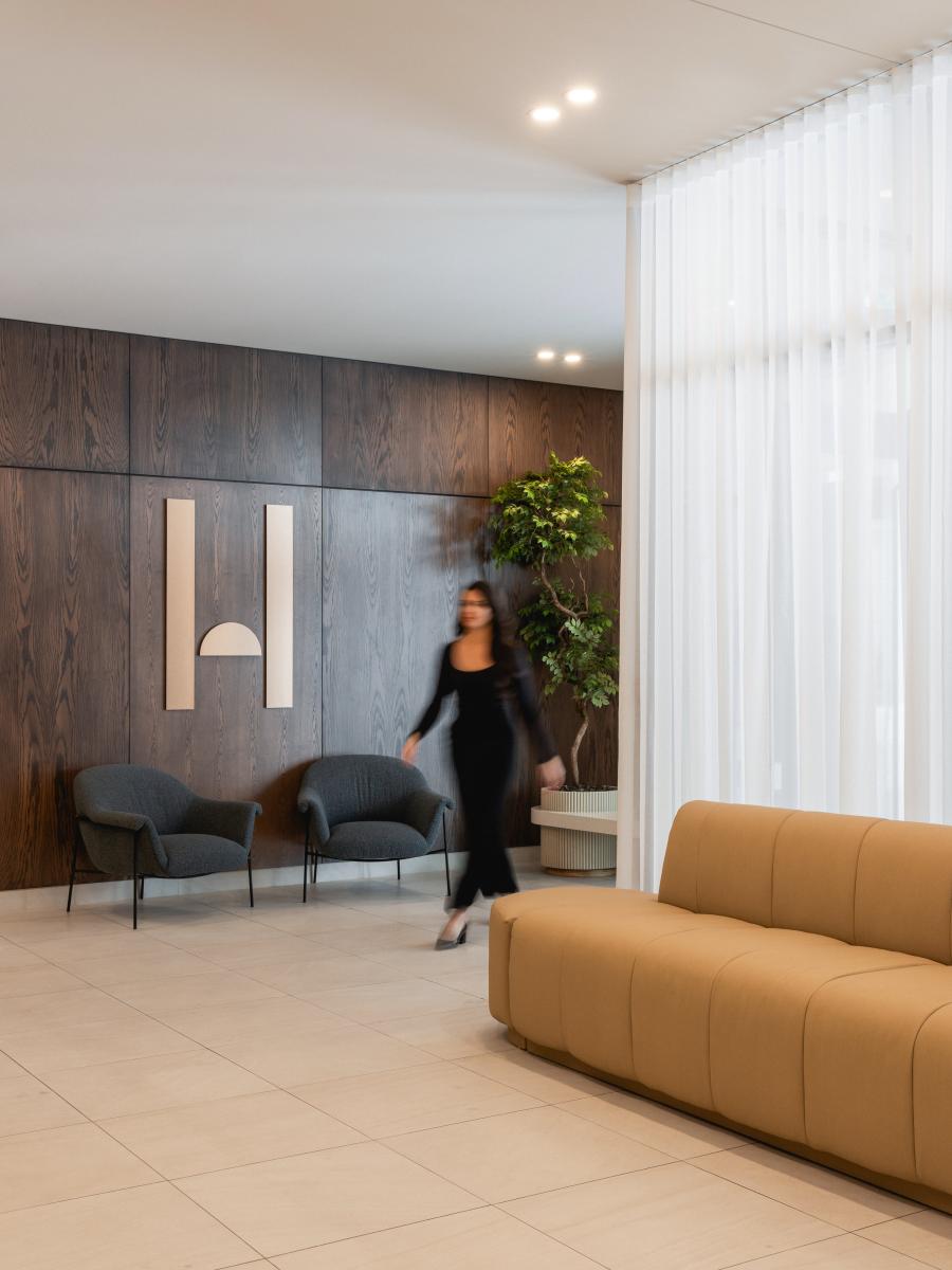
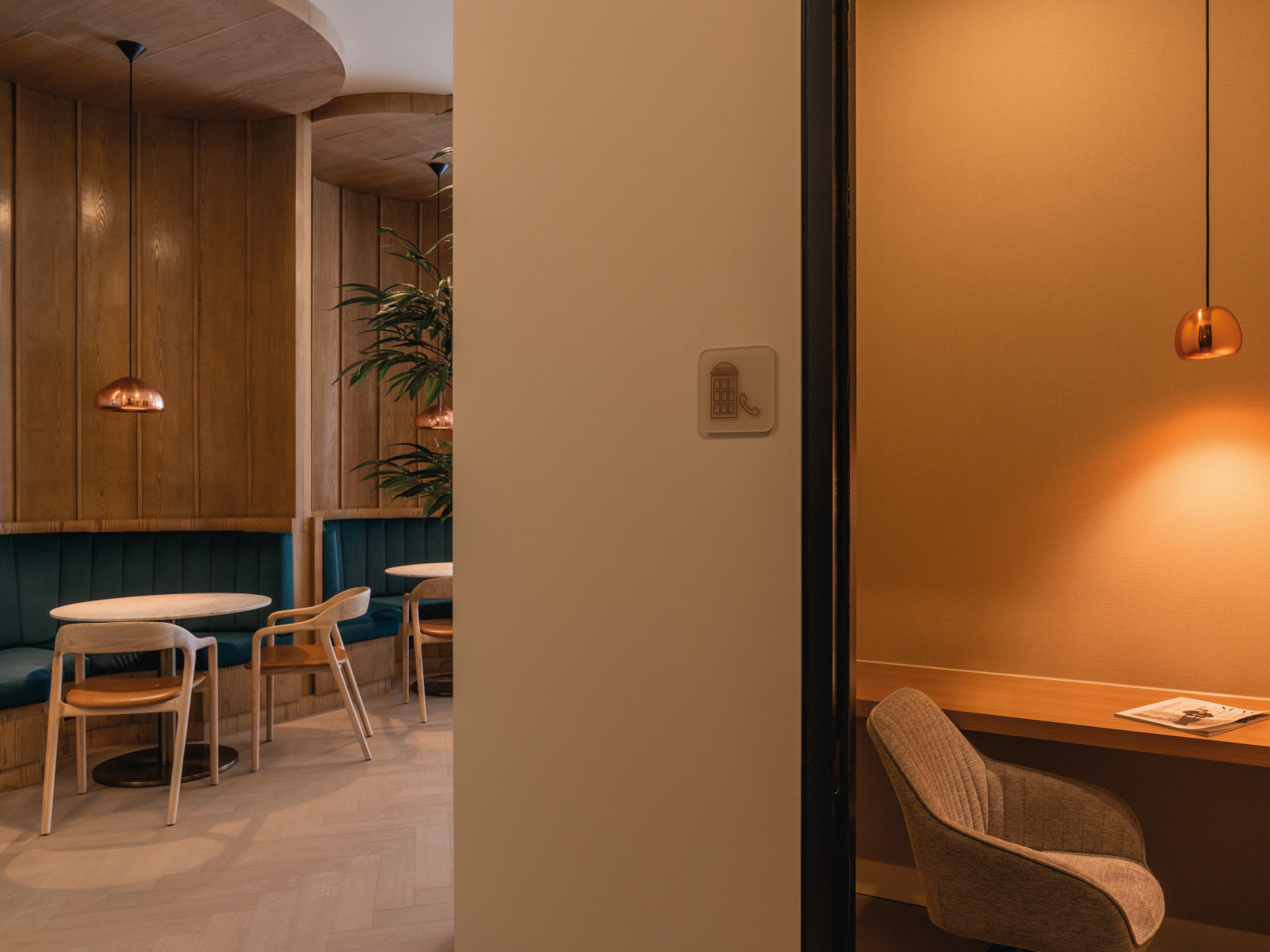
Categories : Environmental Design / Branded Environments (Retail & Spaces) : Gold certification
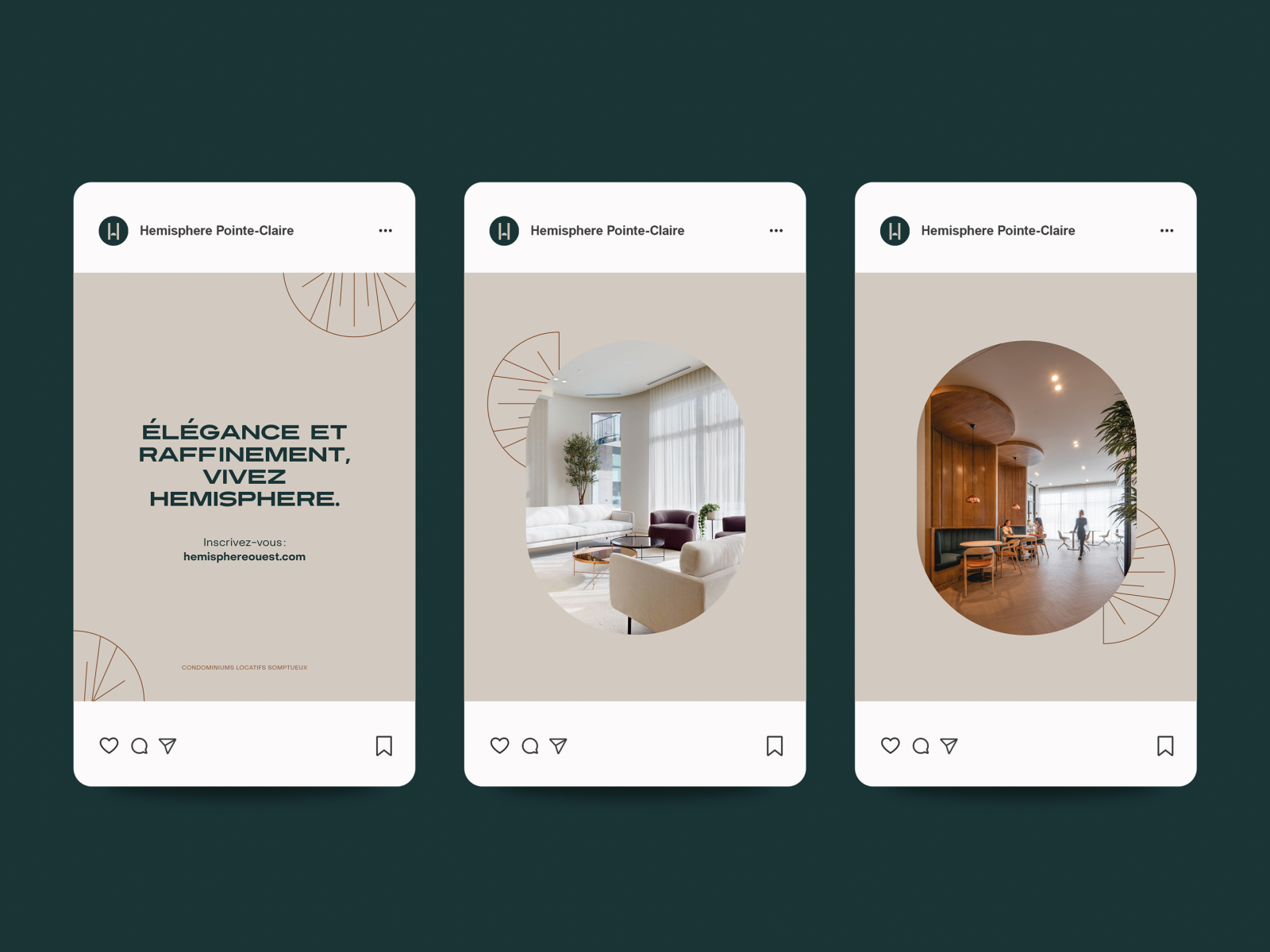
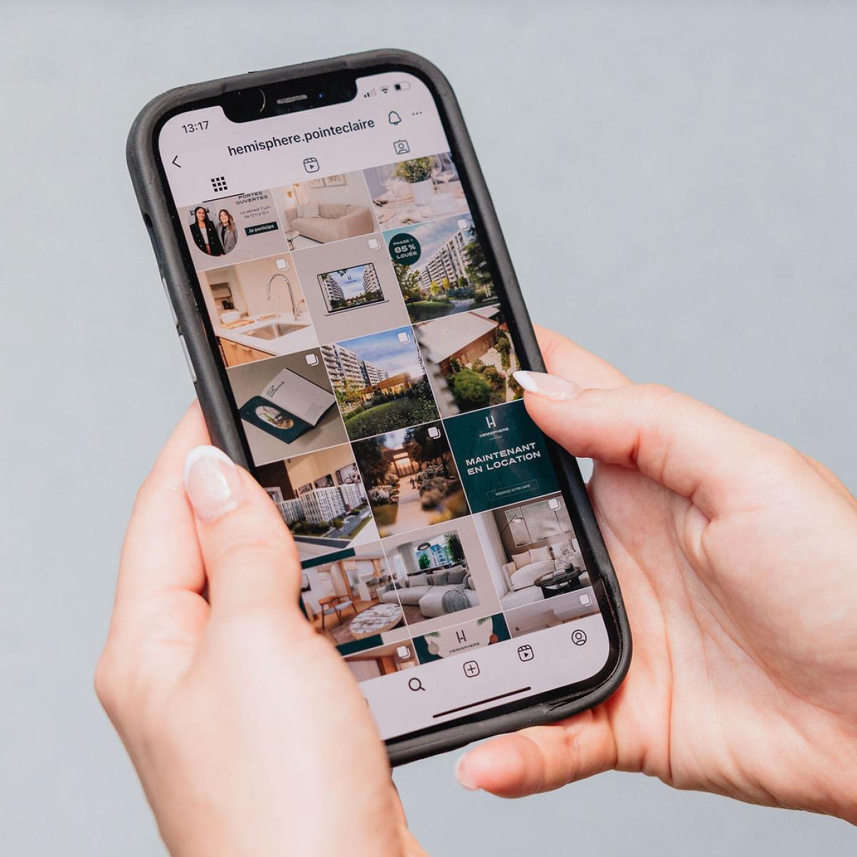
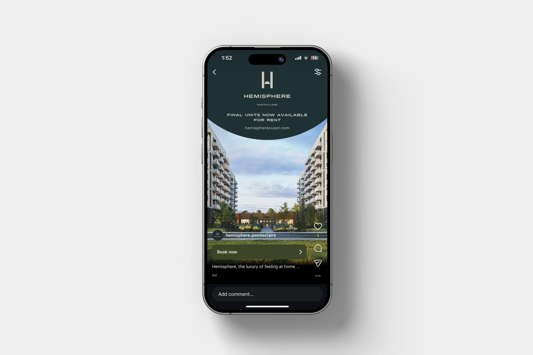
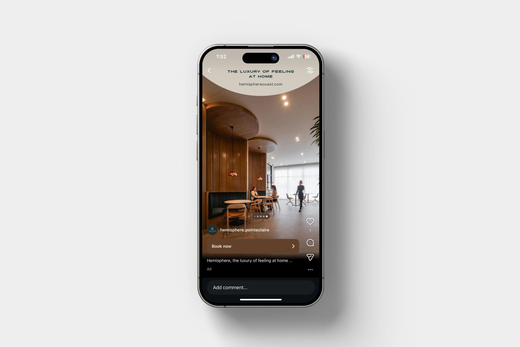
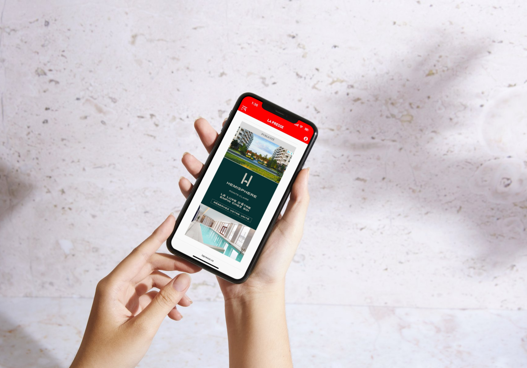
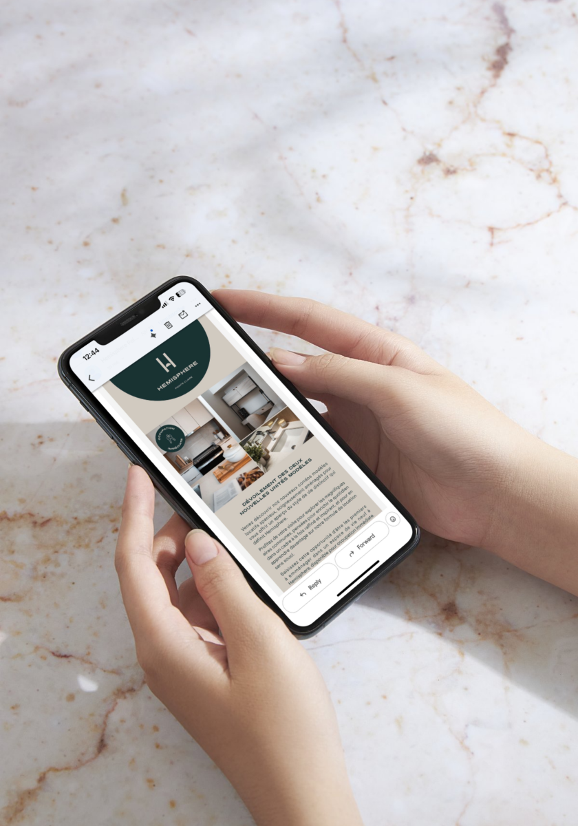
Categories : Communication Design / Digital Content & Social Marketing : Gold certification
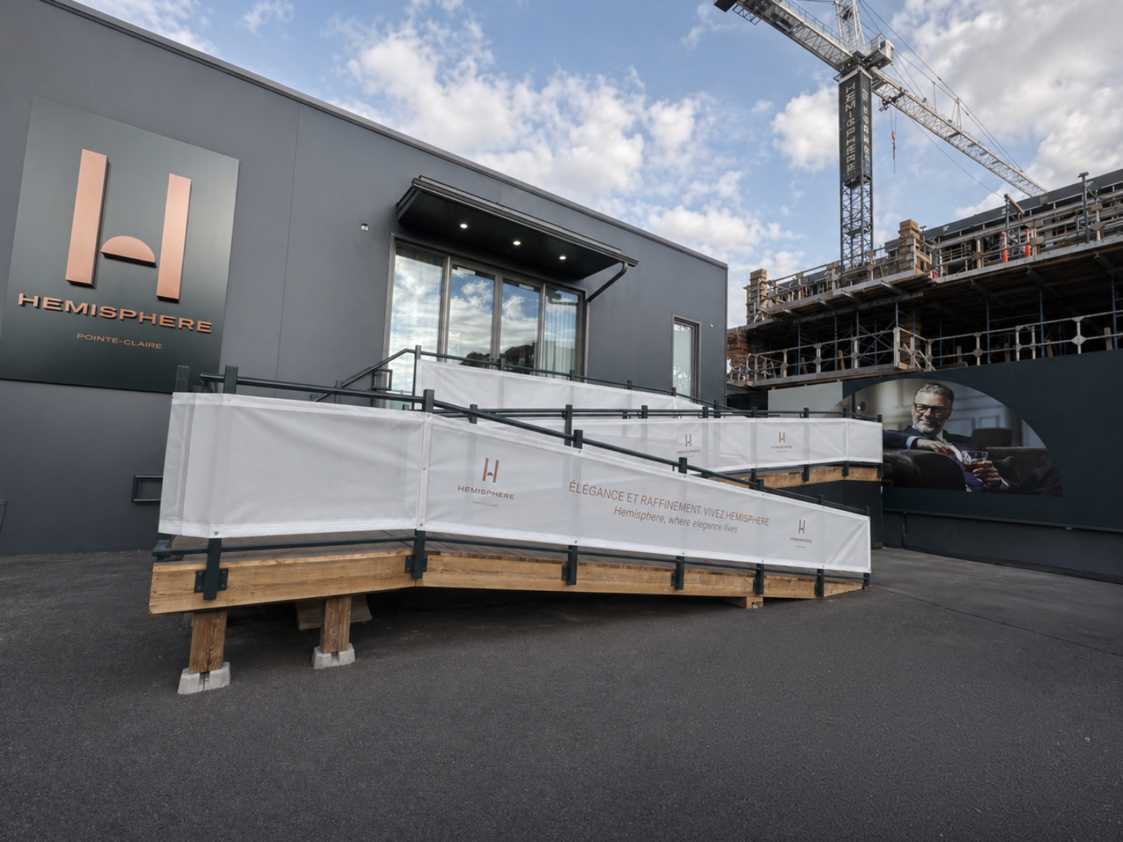
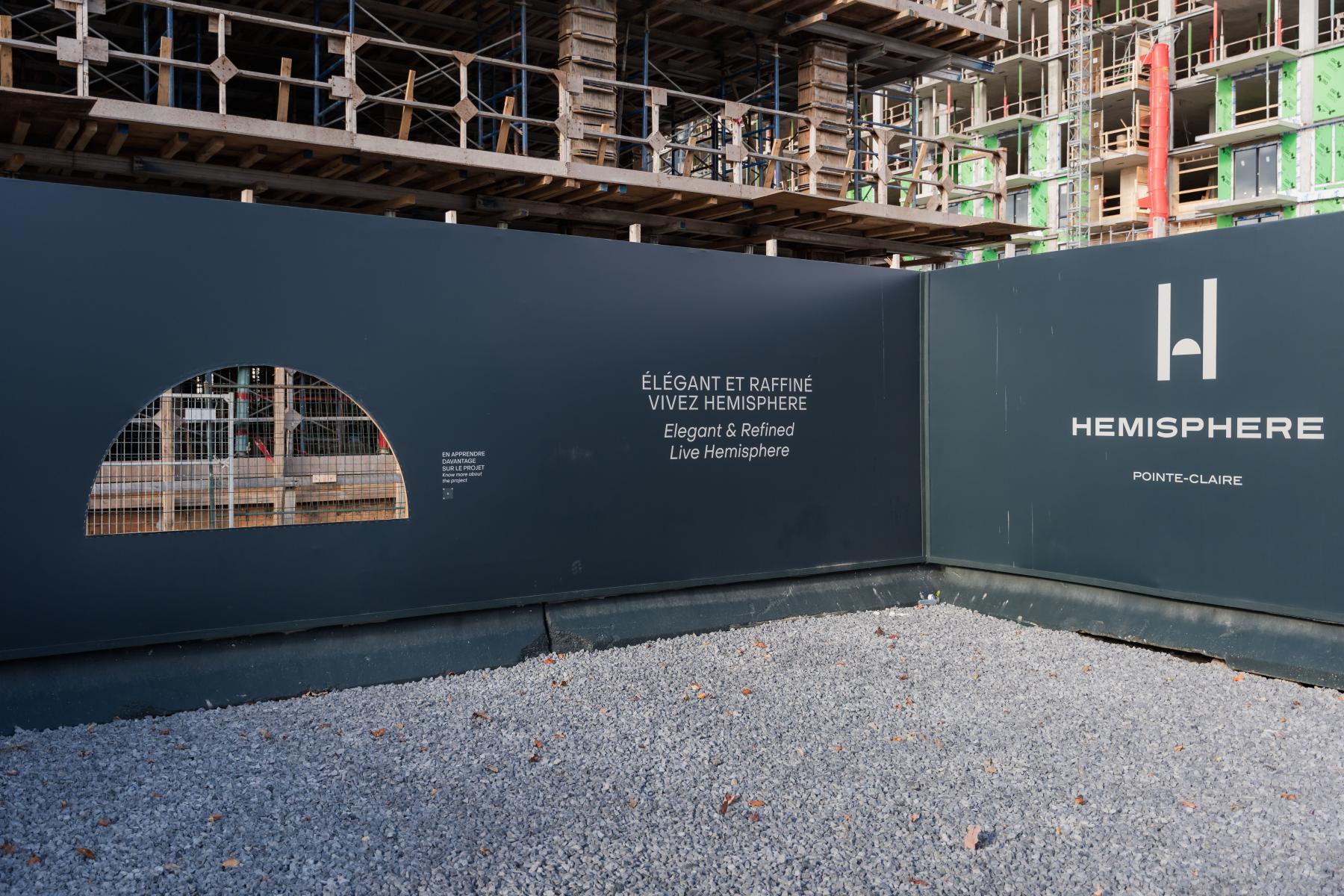
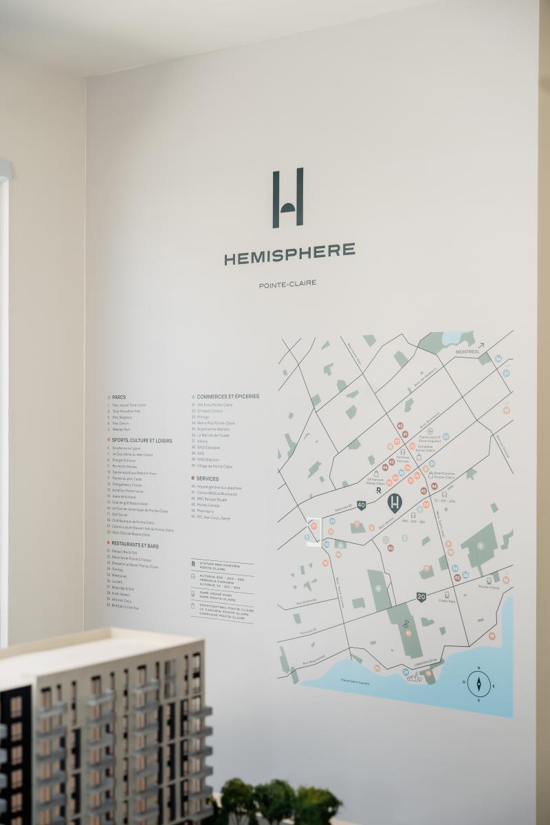
Categories : Environmental Design / Signage, Wayfinding & Murals : Silver certification
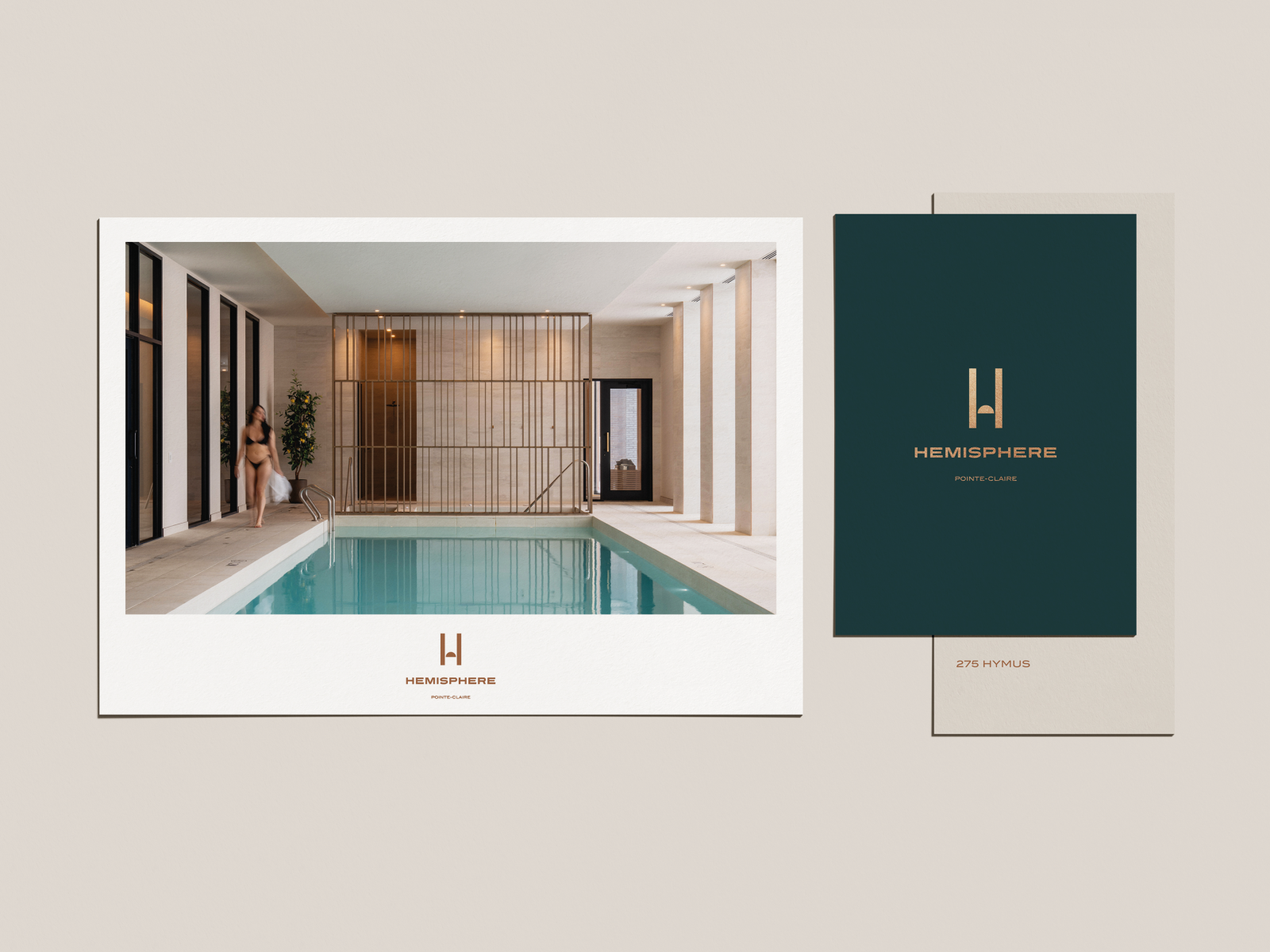
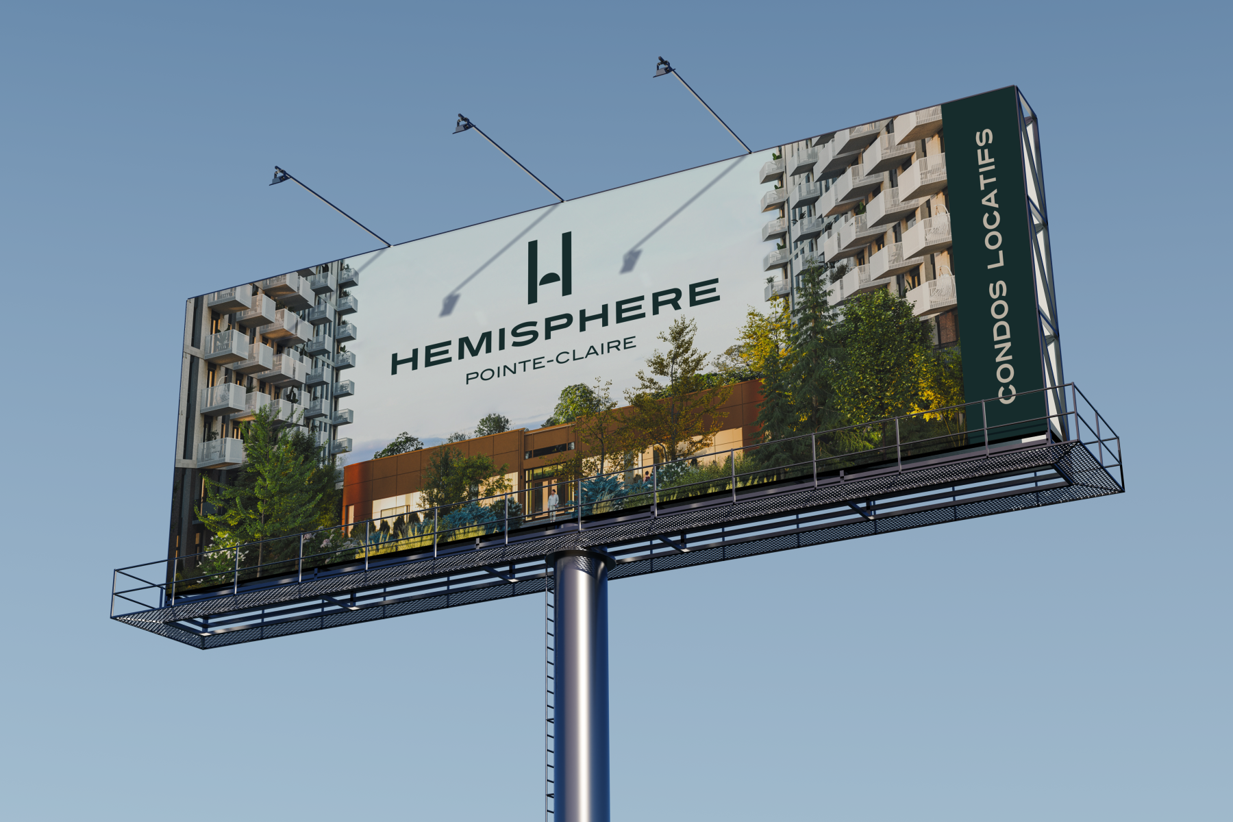
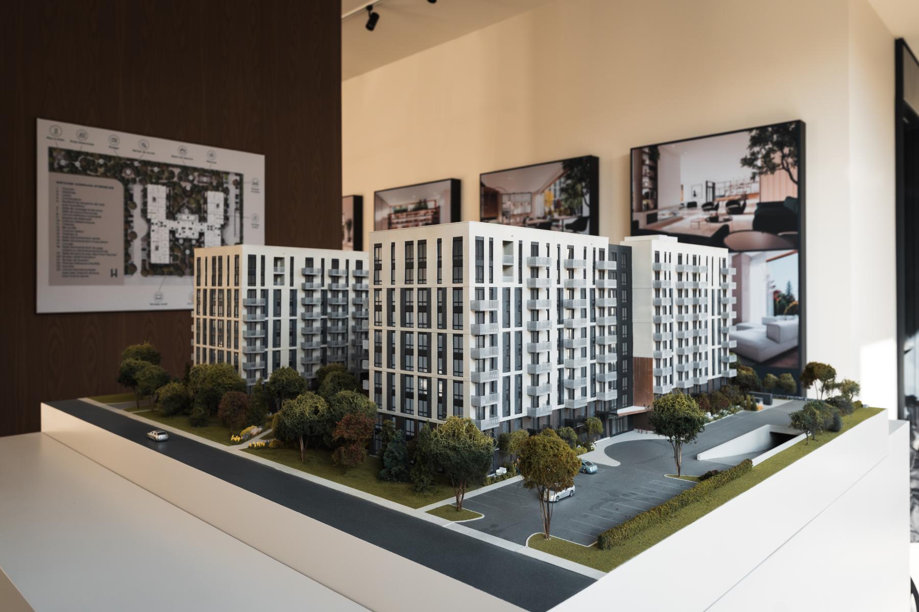
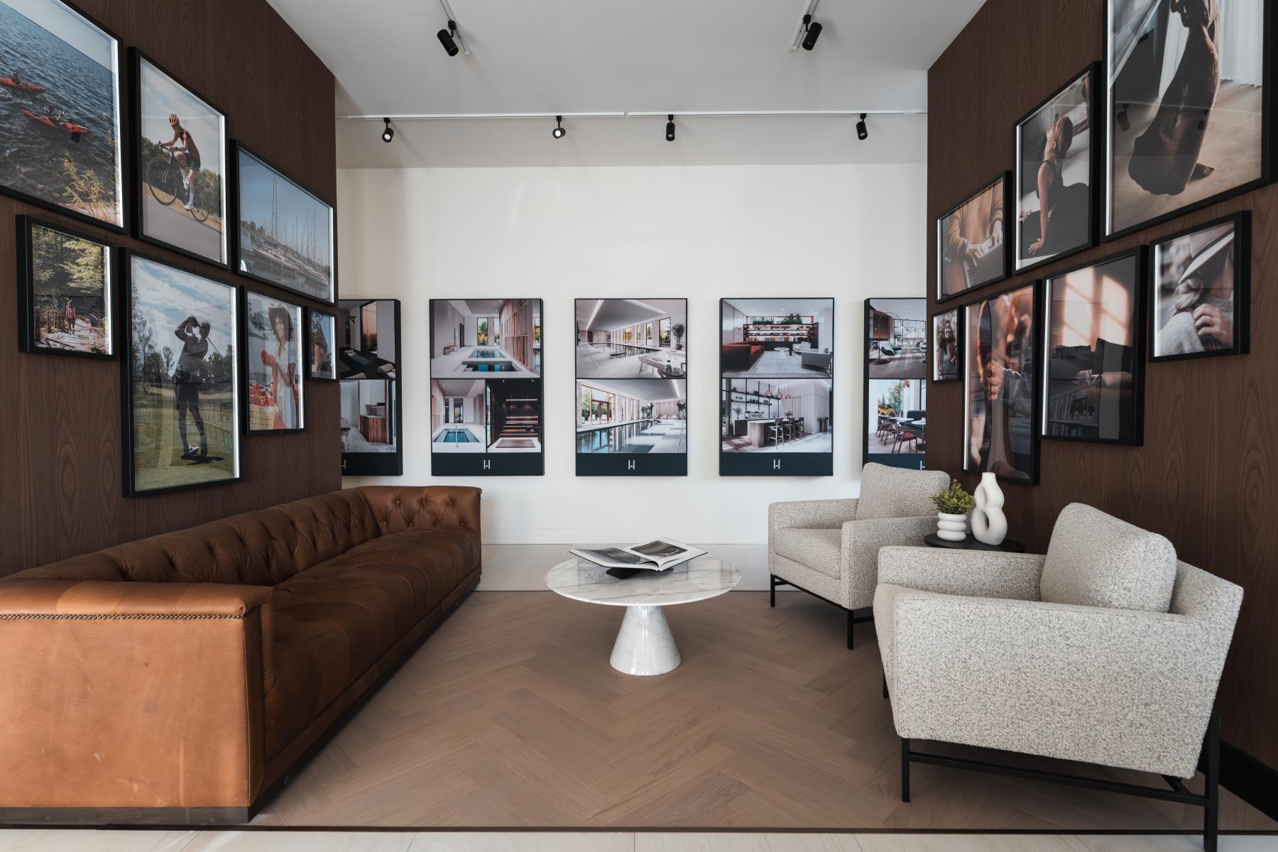
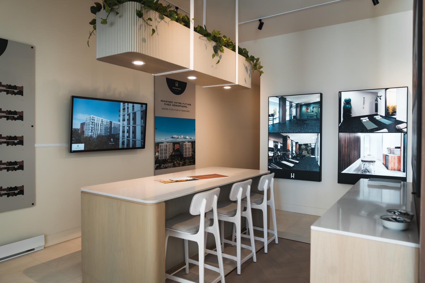
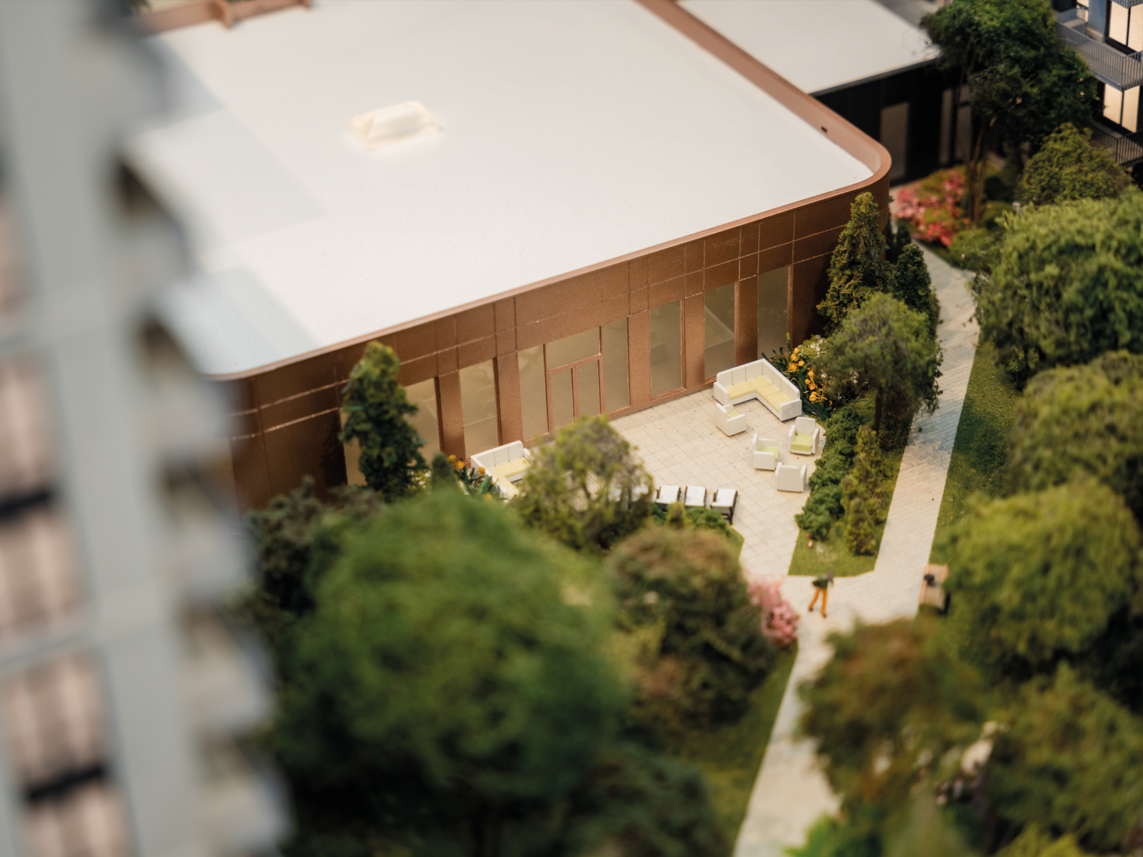
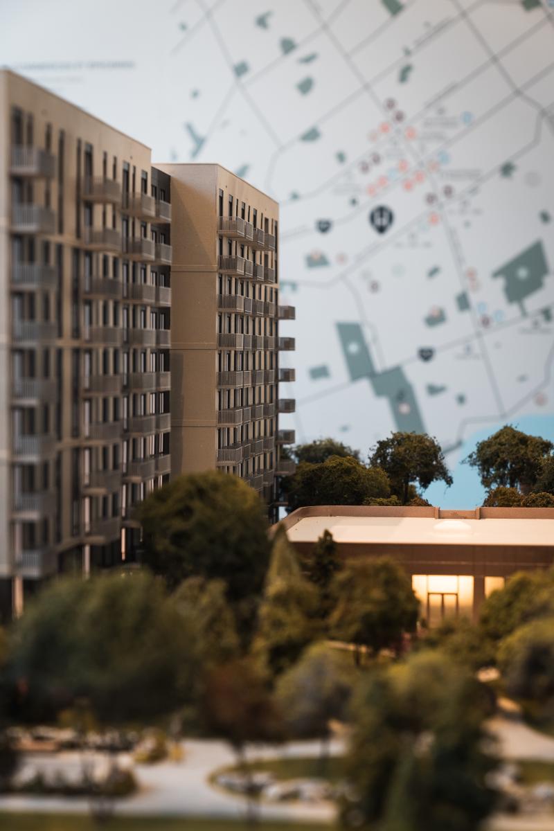
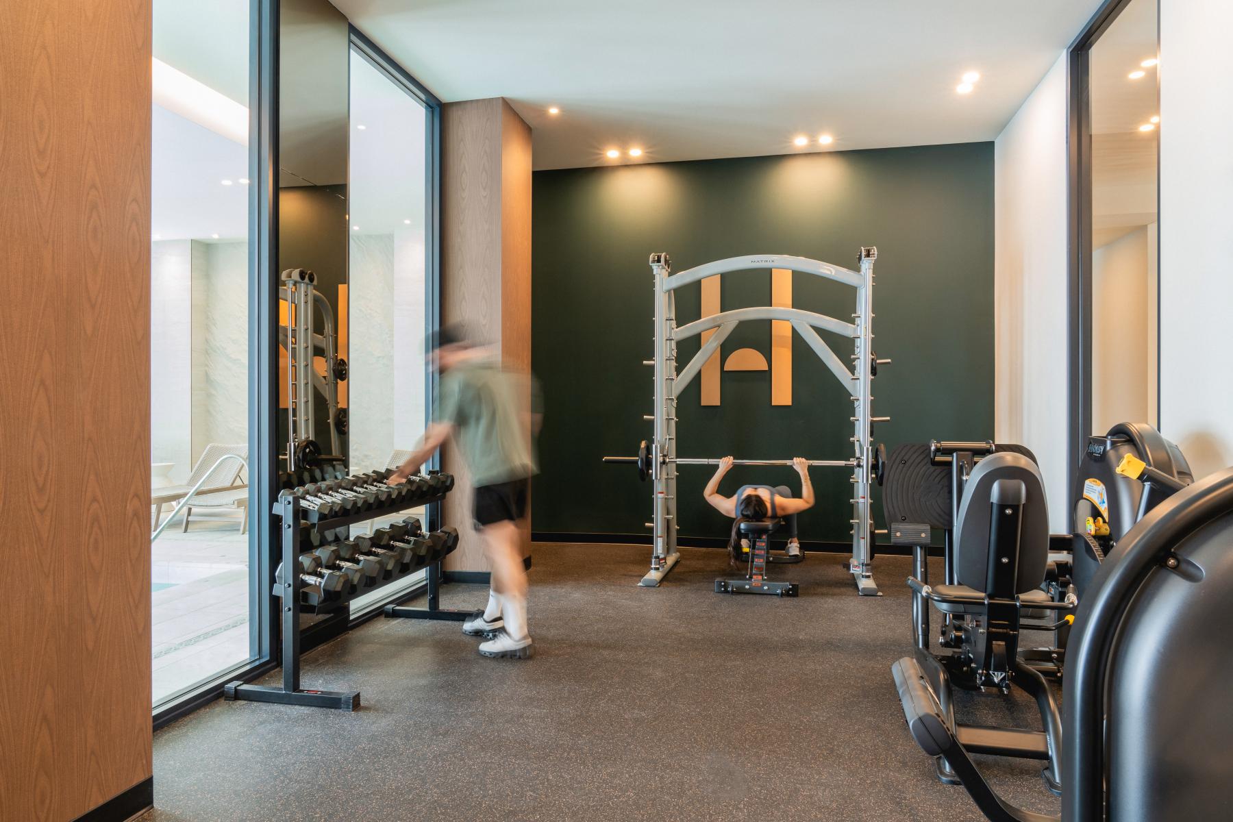
Located in Montreal's West Island, Hemisphere embodies refined modern luxury, seamlessly blending timeless architecture with comfortable surroundings. The project stands out with its distinct "H" configuration, connecting two ten-story buildings via a central pavilion. A true symbol of harmony and human connection, this structure fosters a strong sense of community. Anchored by a light-filled podium that houses exceptional common areas, including a thermal circuit, indoor pool, yoga studio, café and workspaces, Hemisphere naturally integrates into its surroundings with an impressive 65% dedicated green space. More than just a building, Hemisphere redefines urban living into a meaningful, purpose-driven environment.
A Visual Identity that Elevates the Architecture
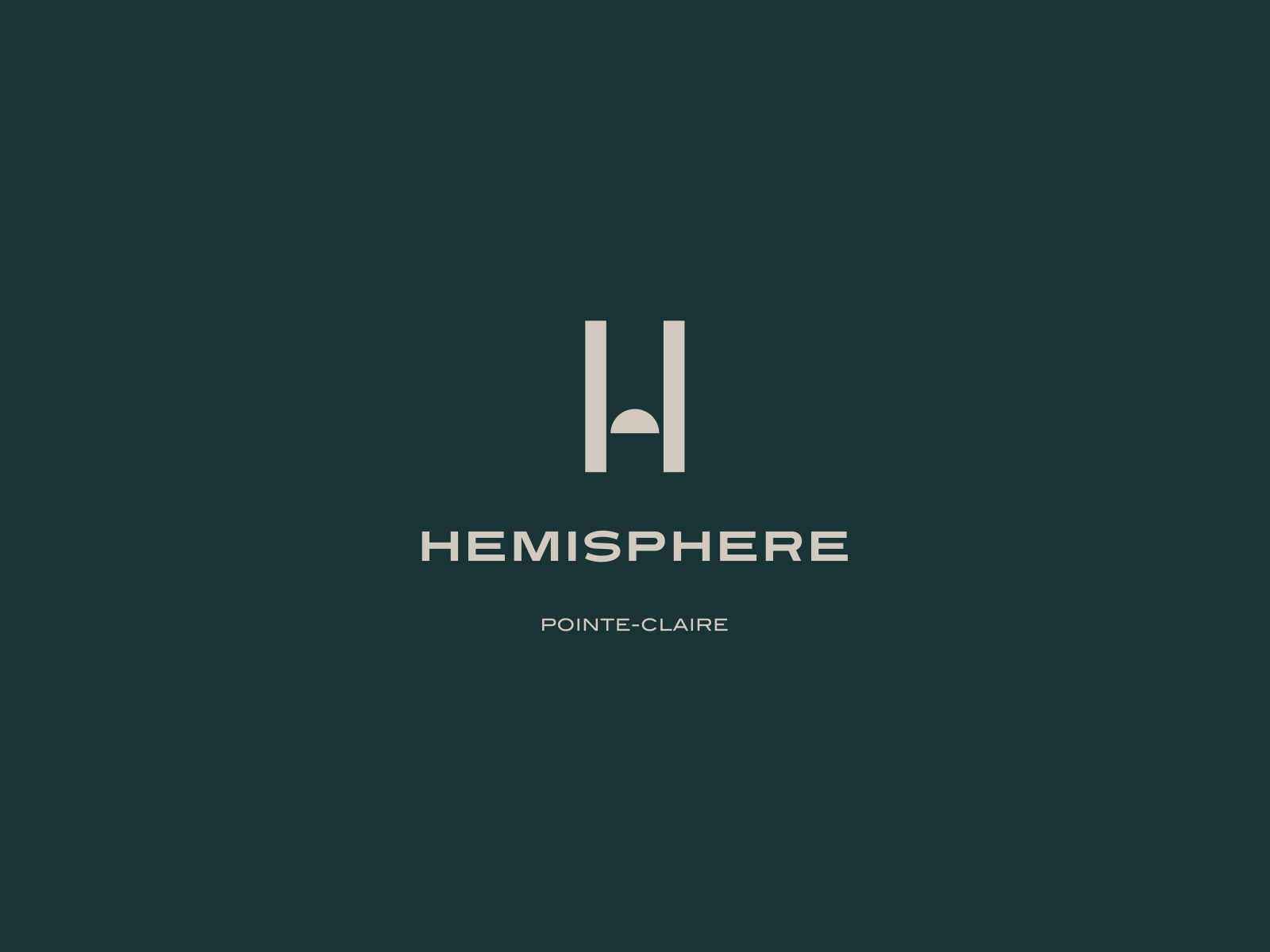
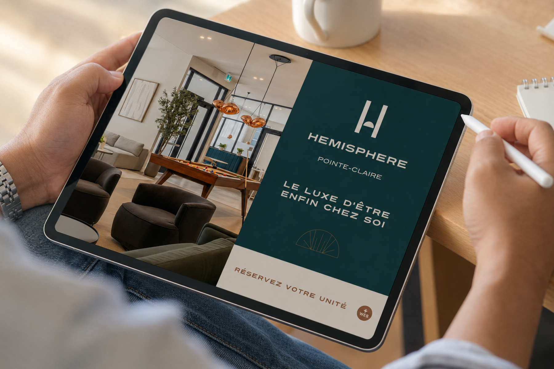
In designing the brand, our objective was to capture and elevate the very essence of the architecture: its elegance, symmetry, privileged connection to nature and prestige. Embracing a highly minimalist approach, we developed a brand signature that is both direct and sophisticated, instantly communicating the development's high-end positioning.
Typography and Symbolism Conveying Scale
At the core of the identity lies a classic, broad and firmly grounded typography. This carefully considered choice immediately evokes a sense of stability, permanence, and refinement.
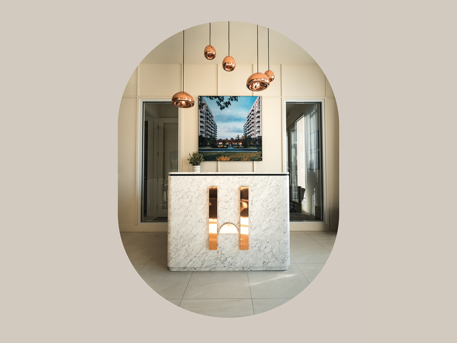
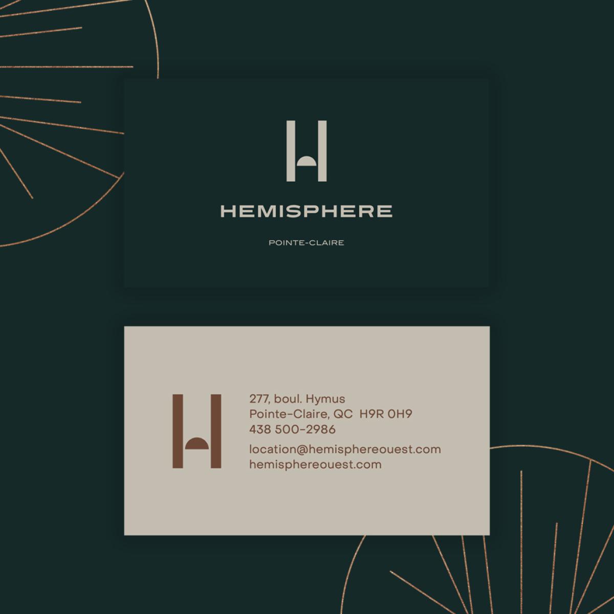
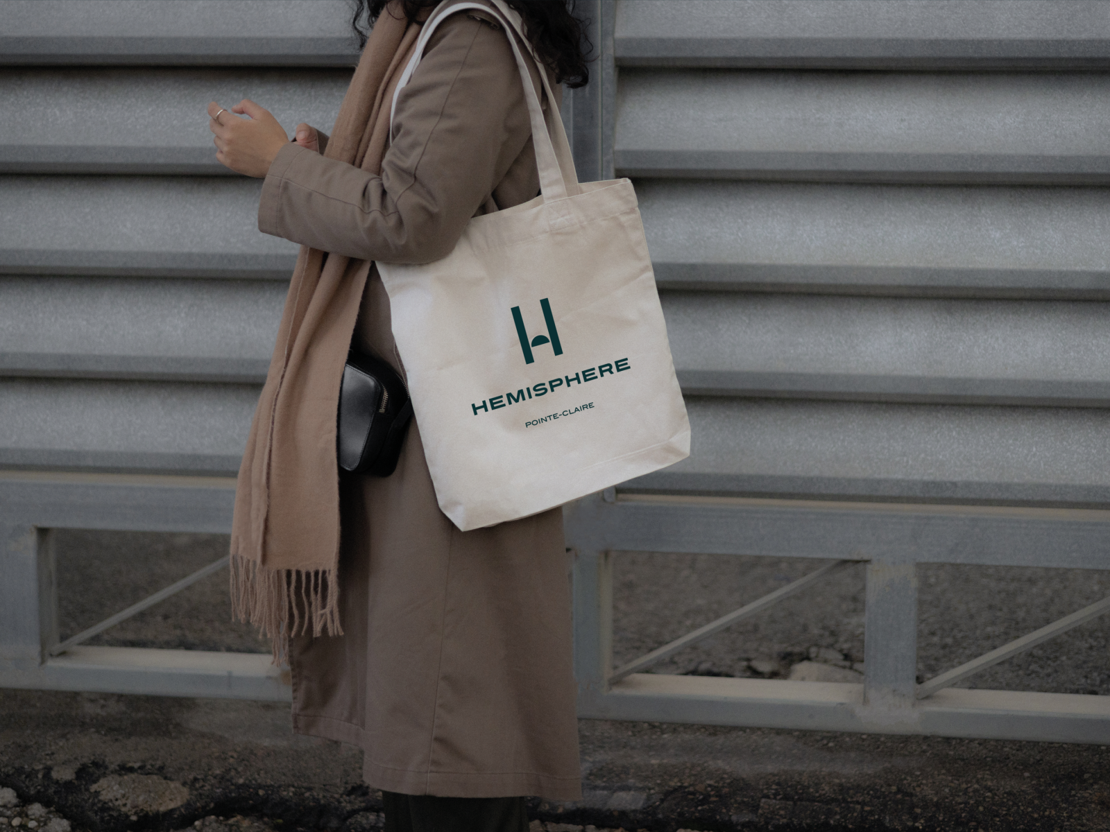
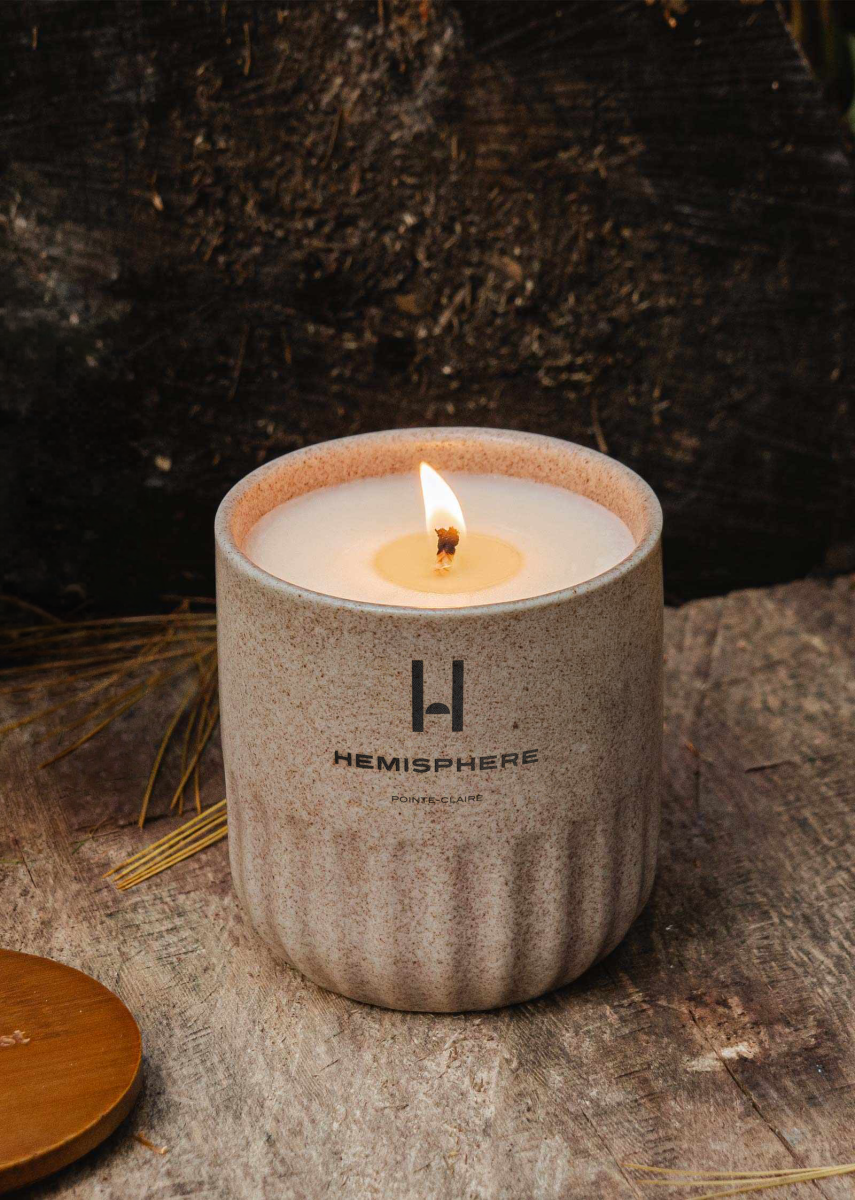
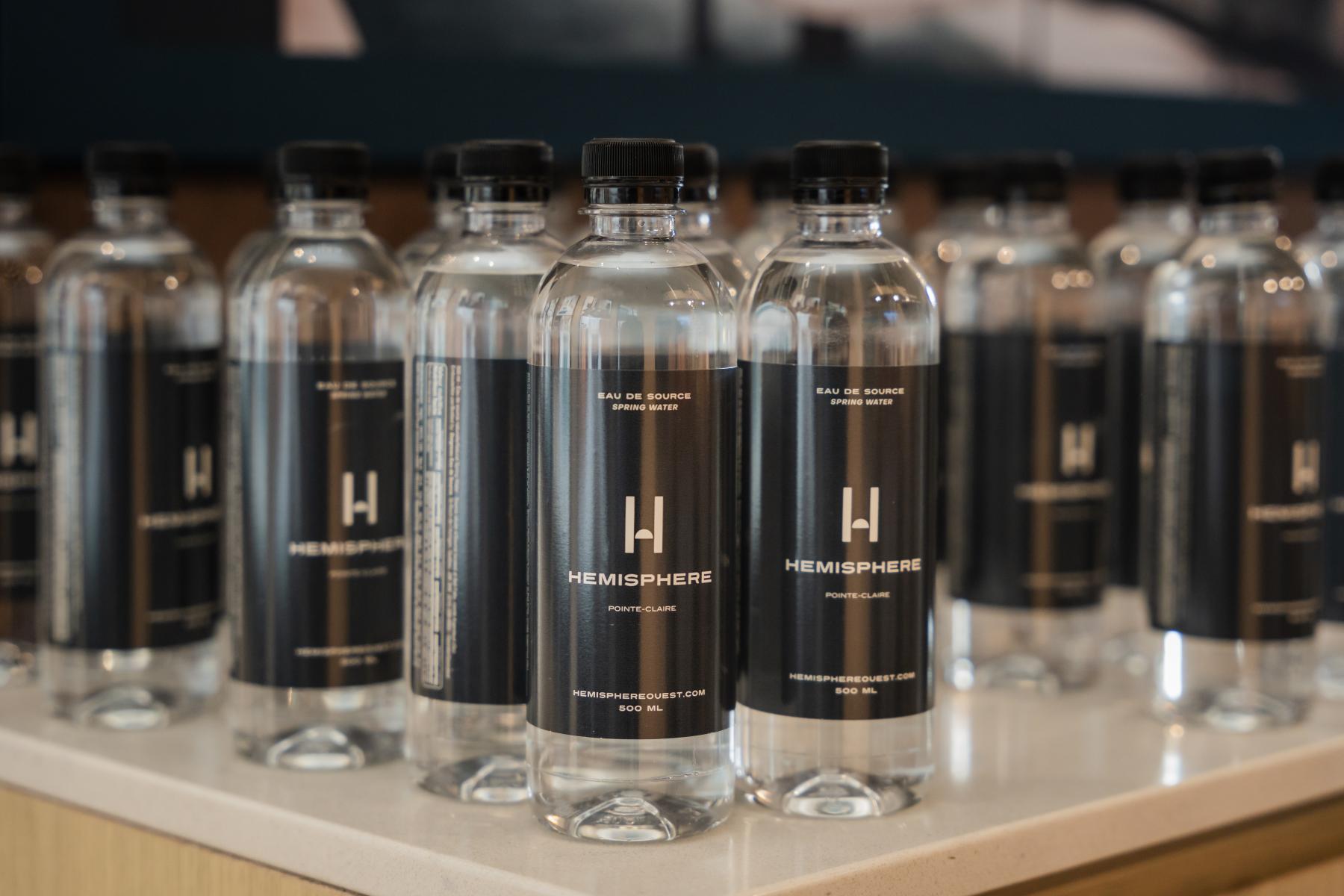
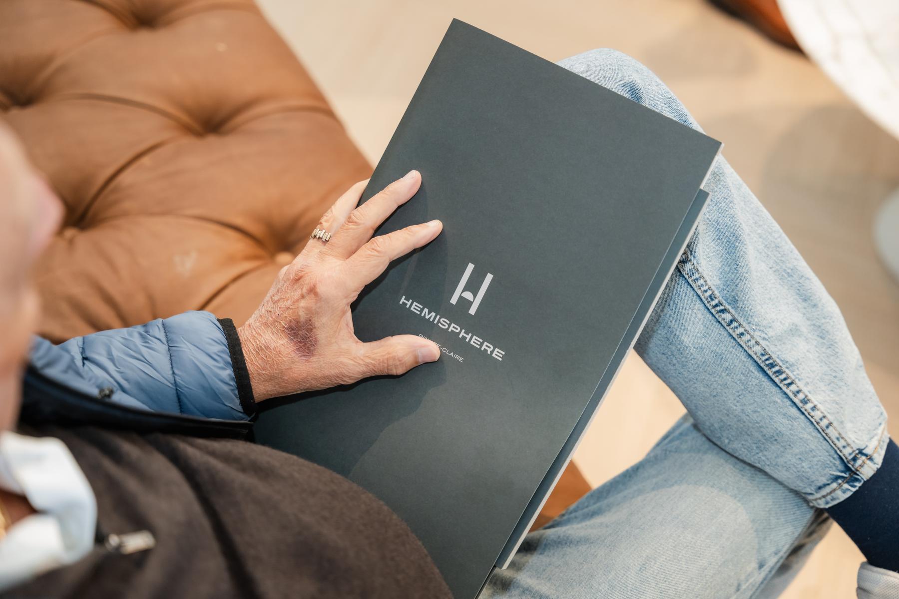
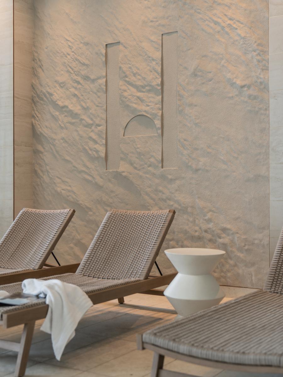
The brand is crowned by a distinctive icon: a vertically elongated "H" that mirrors the project's architectural shape while granting the brand a striking visual scale. This symbol is subtly paired with a semi-circle, a literal nod to the word "hemisphere" (half of a sphere), injecting a unique, geometric, and highly memorable personality into the logotype.
Minimalism in Service of Community
A bold strategic decision in the design process was the deliberate removal of the French accent mark from the word "Hemisphere". This brilliantly simple graphic detail fosters linguistic harmony. It unifies the brand under a universal, bilingual name, making it seamless and unifying for all audiences.
A Graphic Grid with Room to Breathe
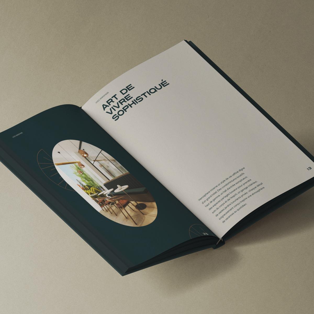
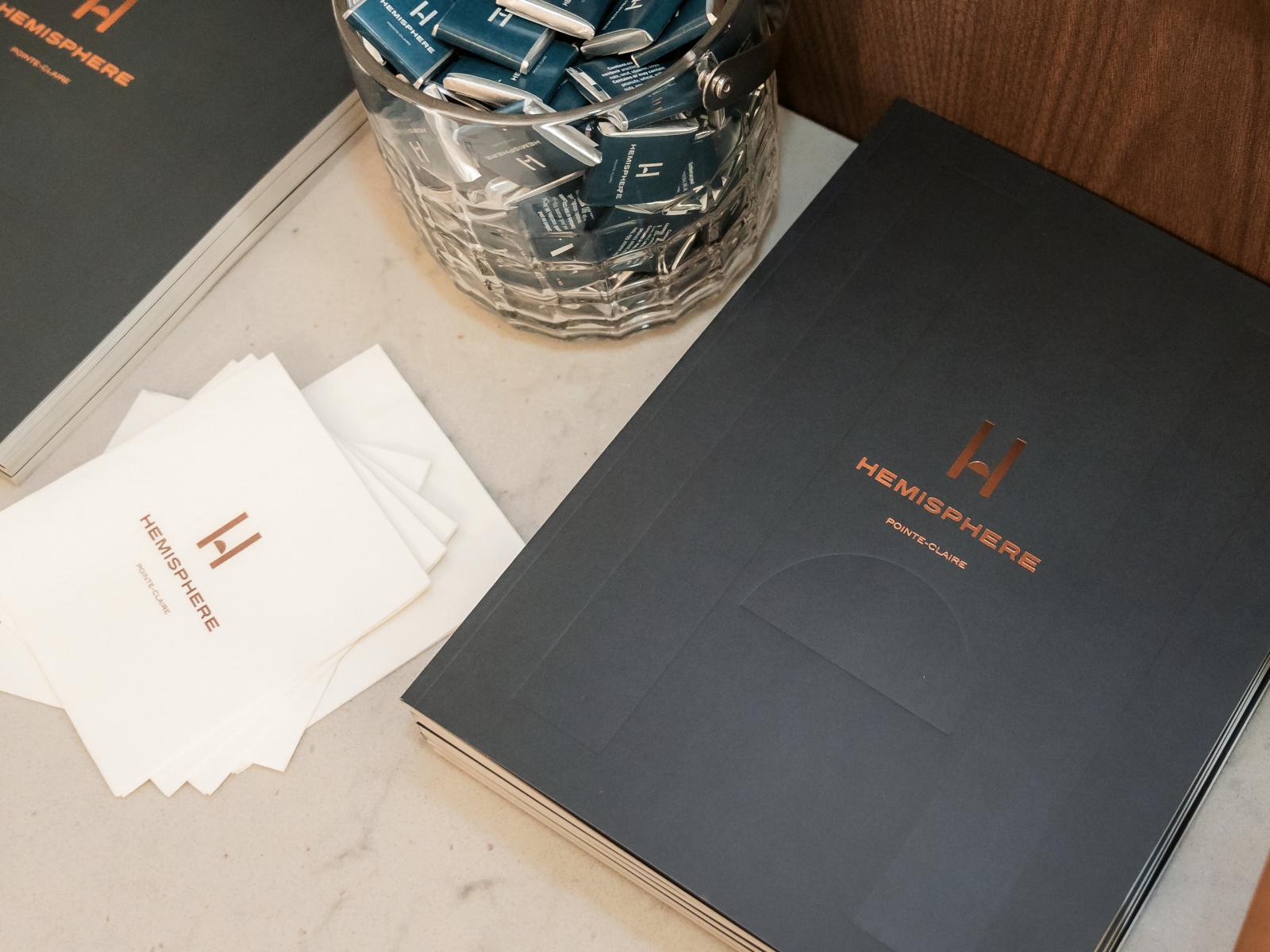
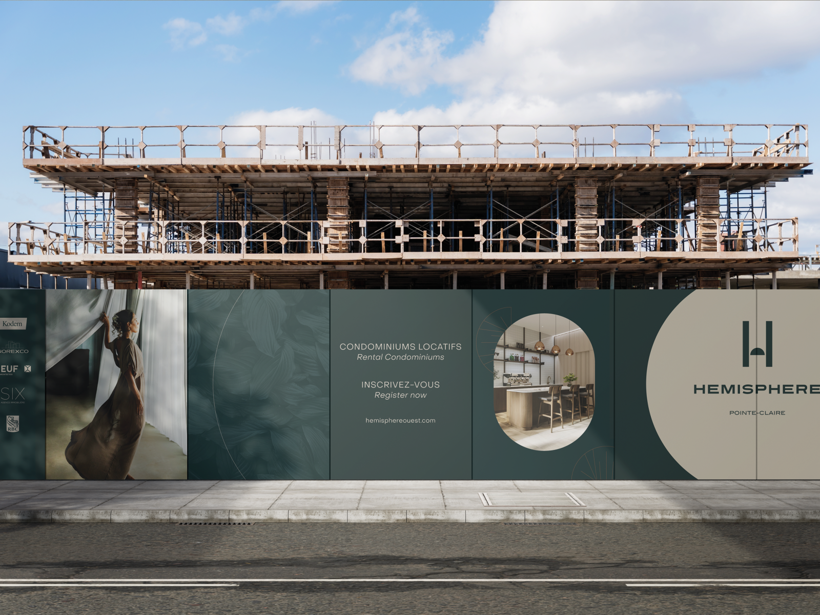
The brand experience is equally felt through its rollout. The graphic grid was meticulously designed to translate the physical experience of the architecture itself. By strategically leveraging margins, negative space and a streamlined structure, it successfully conveys the concept of a spacious, calming and resolutely modern living environment.
An Organic and Prestigious Palette
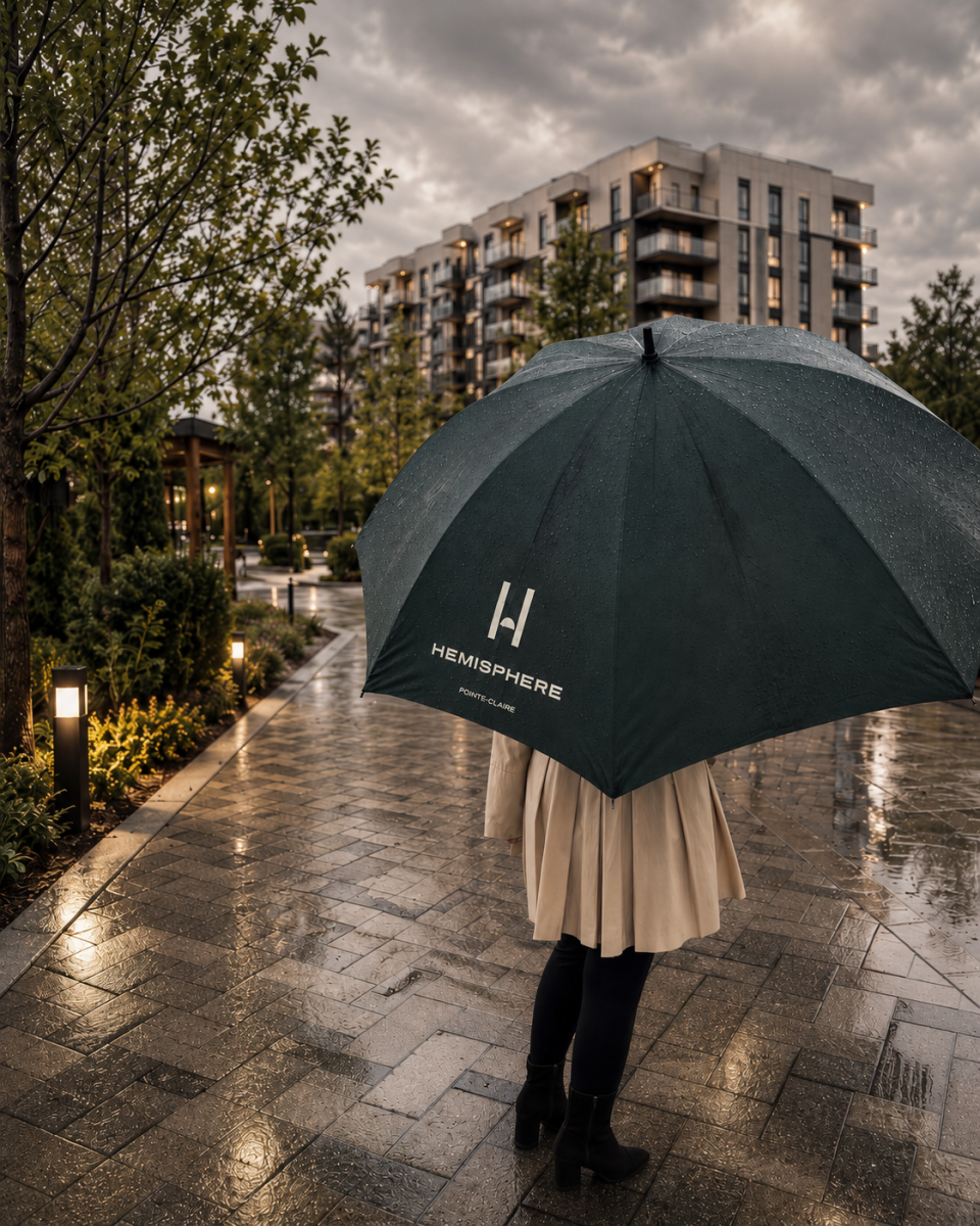
The color scheme draws its inspiration directly from the estate's lush and expansive inner courtyards. The palette blends a deep emerald green, a warm brown, and a luminous ivory.These tones forge a direct connection with nature while exuding a sense of timeless elegance. Finally, subtle applications of golden textures elevate the various communication materials, flashes of light that confidently reaffirm the exceptional, high-end positioning of this living environment.
Collaboration
Communication & Branding : Agence SIX
Real estate developer : Kodem
Photo credit