


Share to
Folio Design brand identity
By : COSMO | Folio Design

GRANDS PRIX DU DESIGN 19th edition
Distinctions
Discipline : Communication & Branding
Categories : Brand Design / Brand Identity (Creation & Rebrand) : Gold certification
Categories : Brand Design / Logo Design : Silver certification
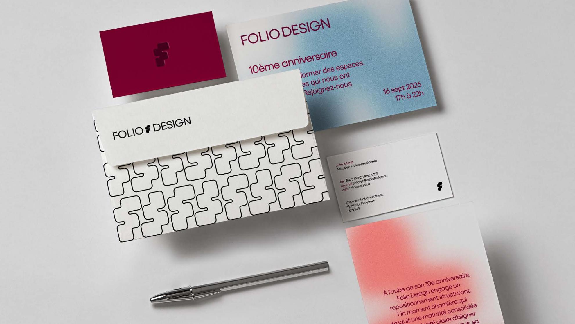
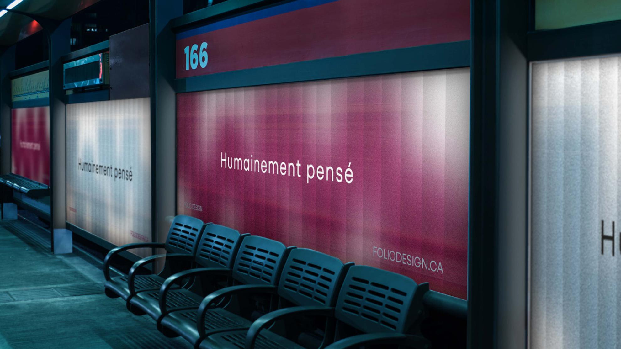
Categories : Communication Design / Poster & Print Collateral : Grand Winner
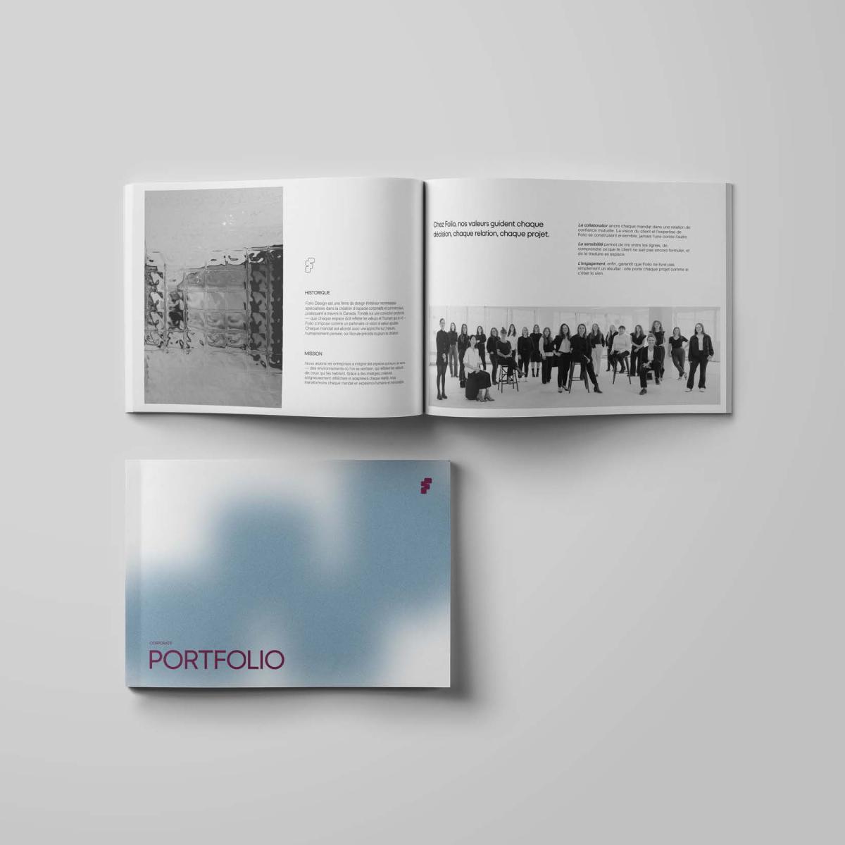
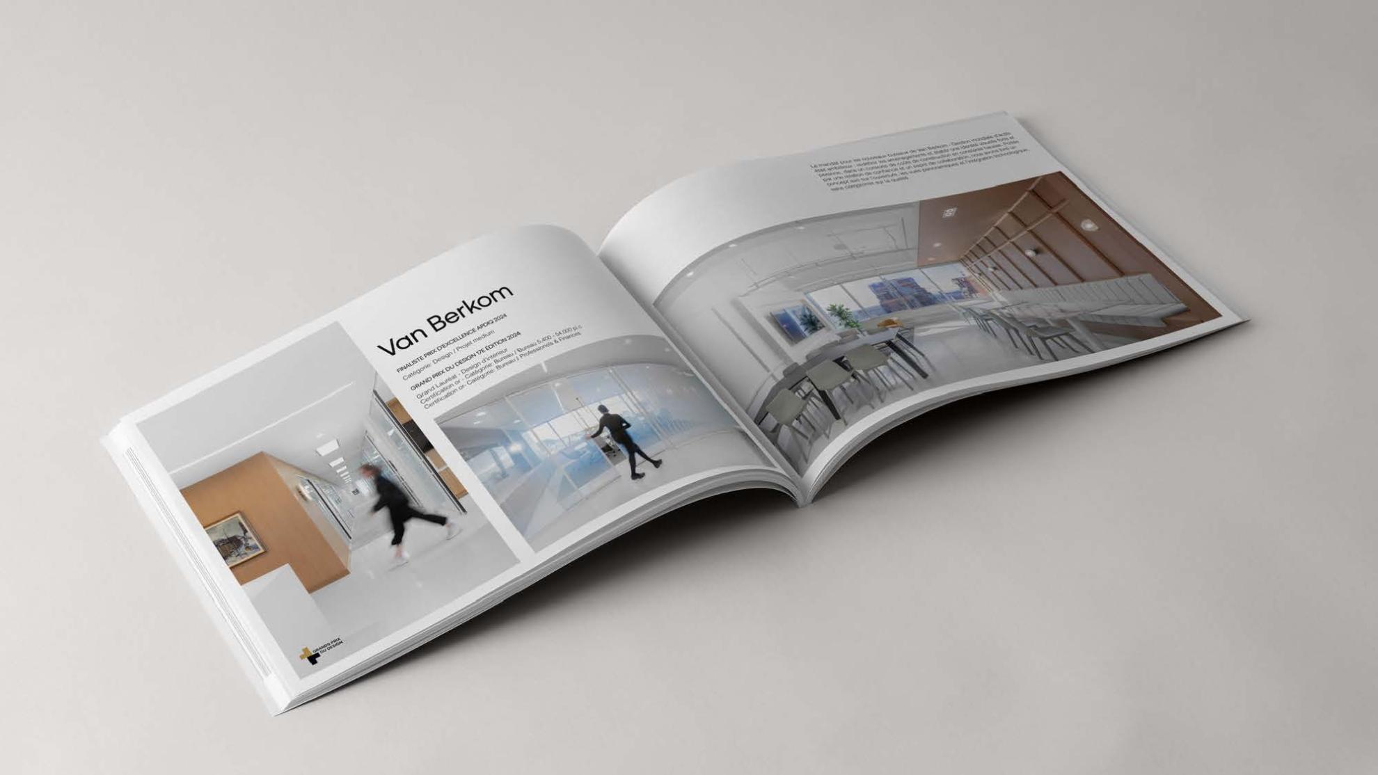
Categories : Communication Design / Corporate Communication & Publishing : Gold certification
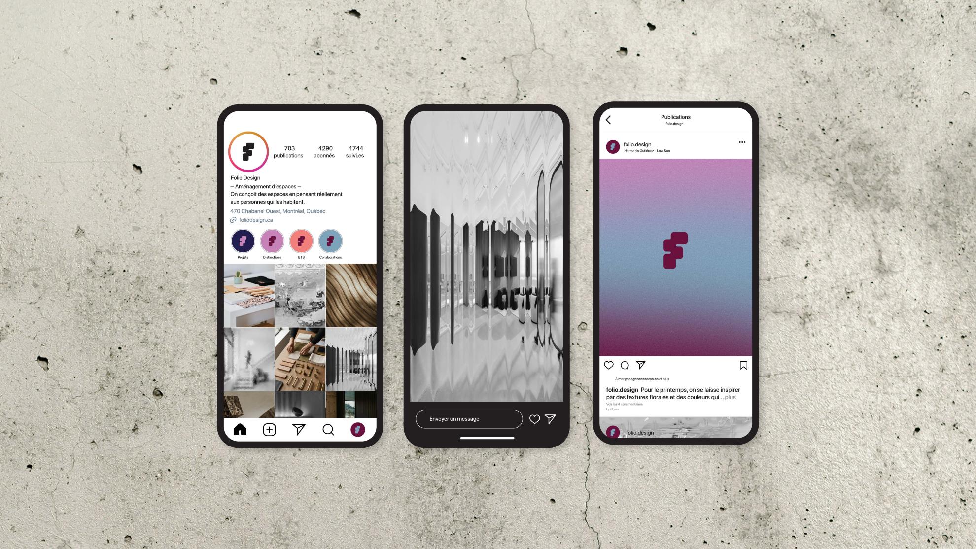
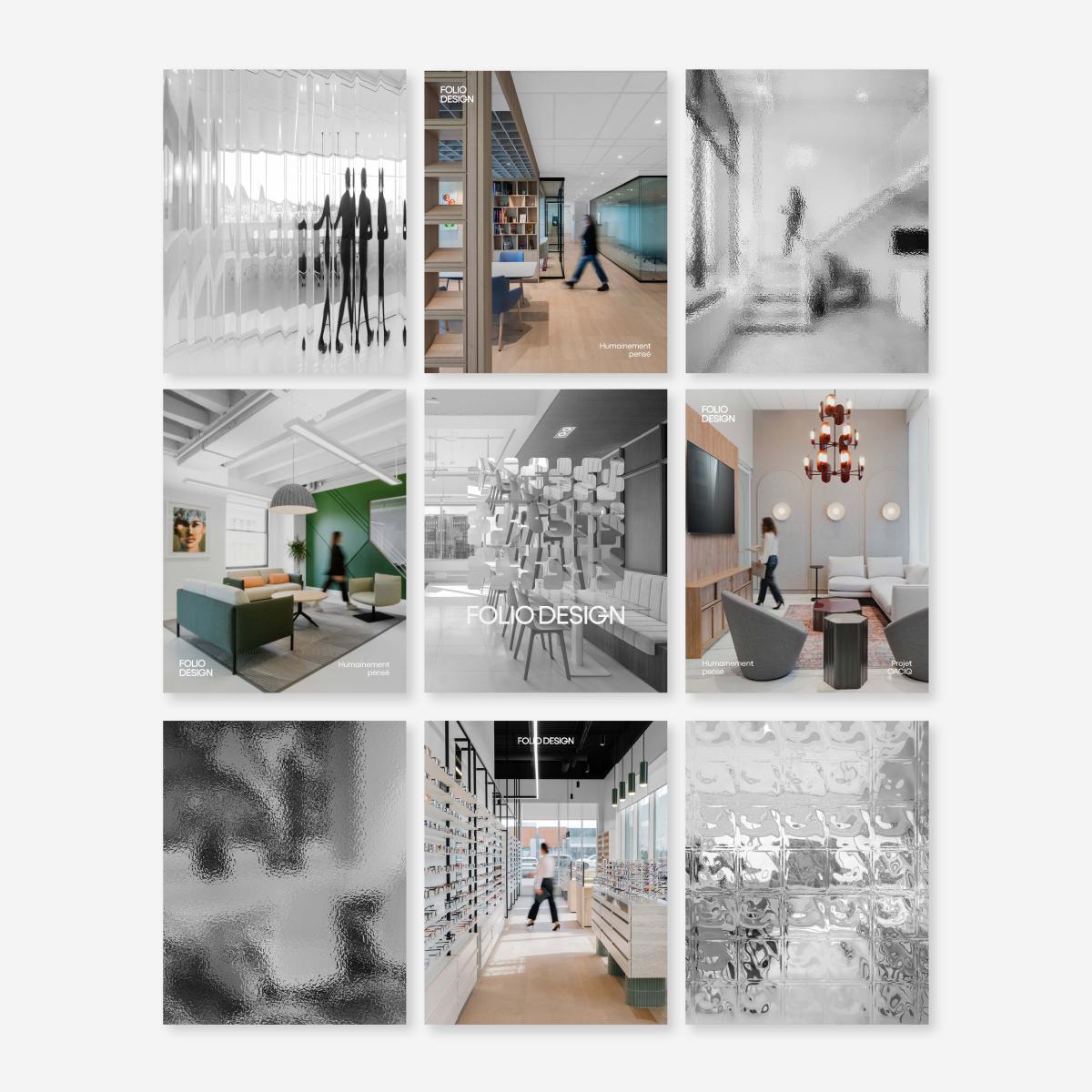
Categories : Communication Design / Digital Content & Social Marketing : Gold certification
At 10 years, a firm does not summarize its journey.
It defines what comes next.
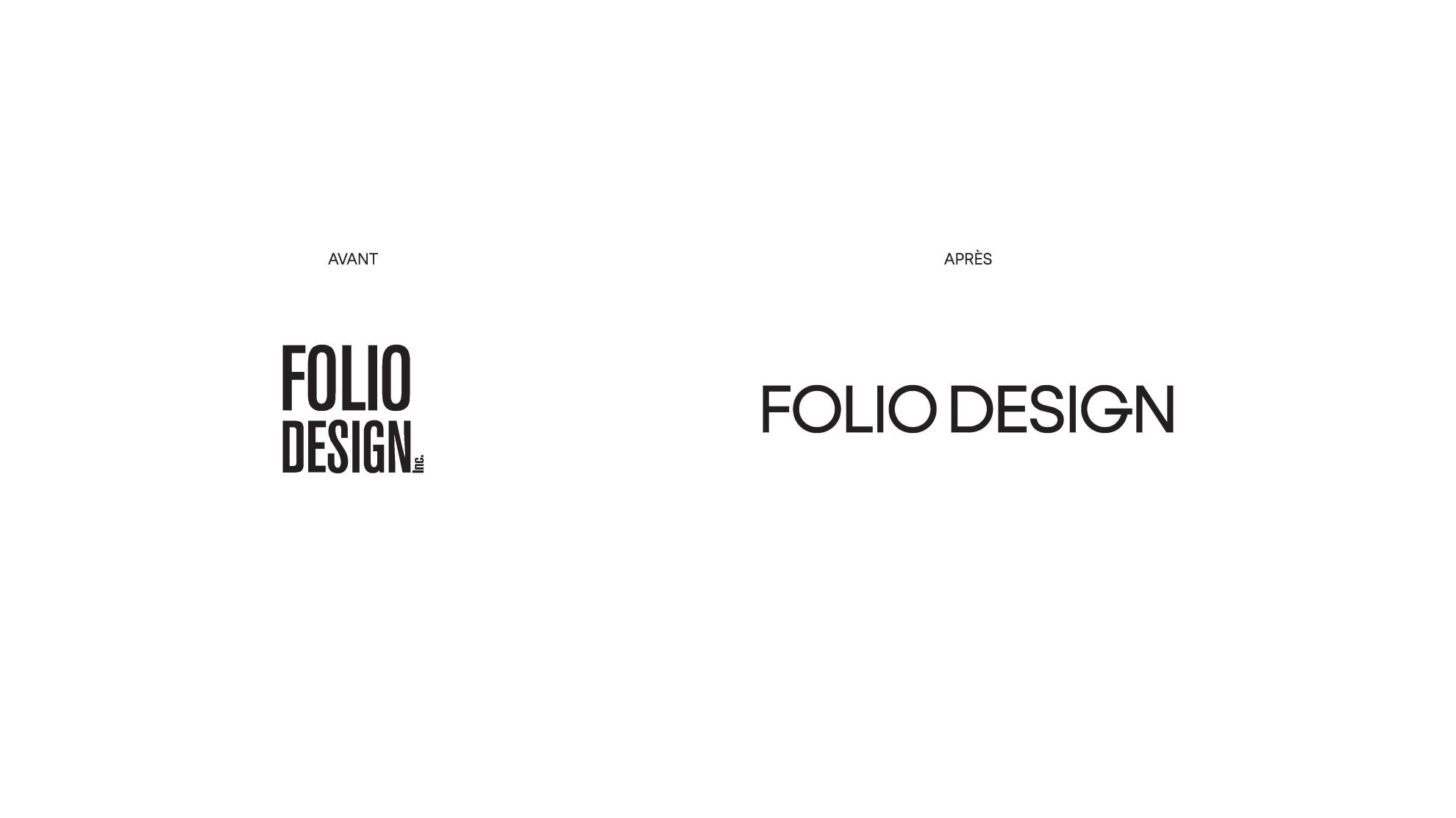
A brand refresh extends far beyond aesthetics alone. It is rooted in a precise alignment between what a firm has become, what it represents today, and the direction it consciously chooses to embrace.
On the eve of its 10th anniversary, Folio Design undertook a defining repositioning initiative. A pivotal moment reflecting both a strengthened maturity and a clear intention to more accurately align its practice, presence, and perception.
Created by COSMO, the new identity emerged through a collaborative creative process with Folio Design, giving rise to a natural convergence between the worlds of design and branding. Each phase of the process refined the strategic thinking and contributed to the development of a cohesive, precise, and enduring identity system.
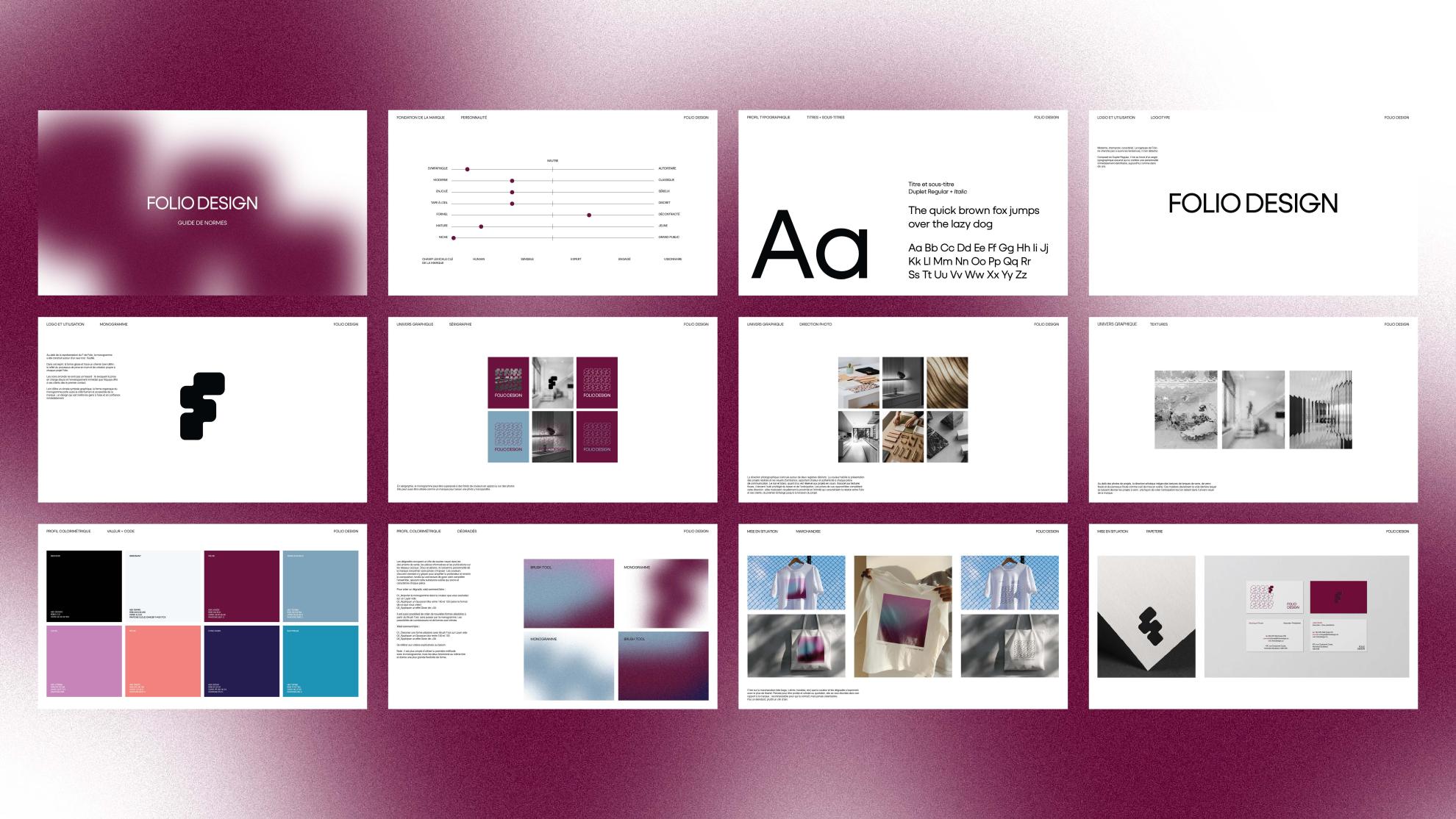
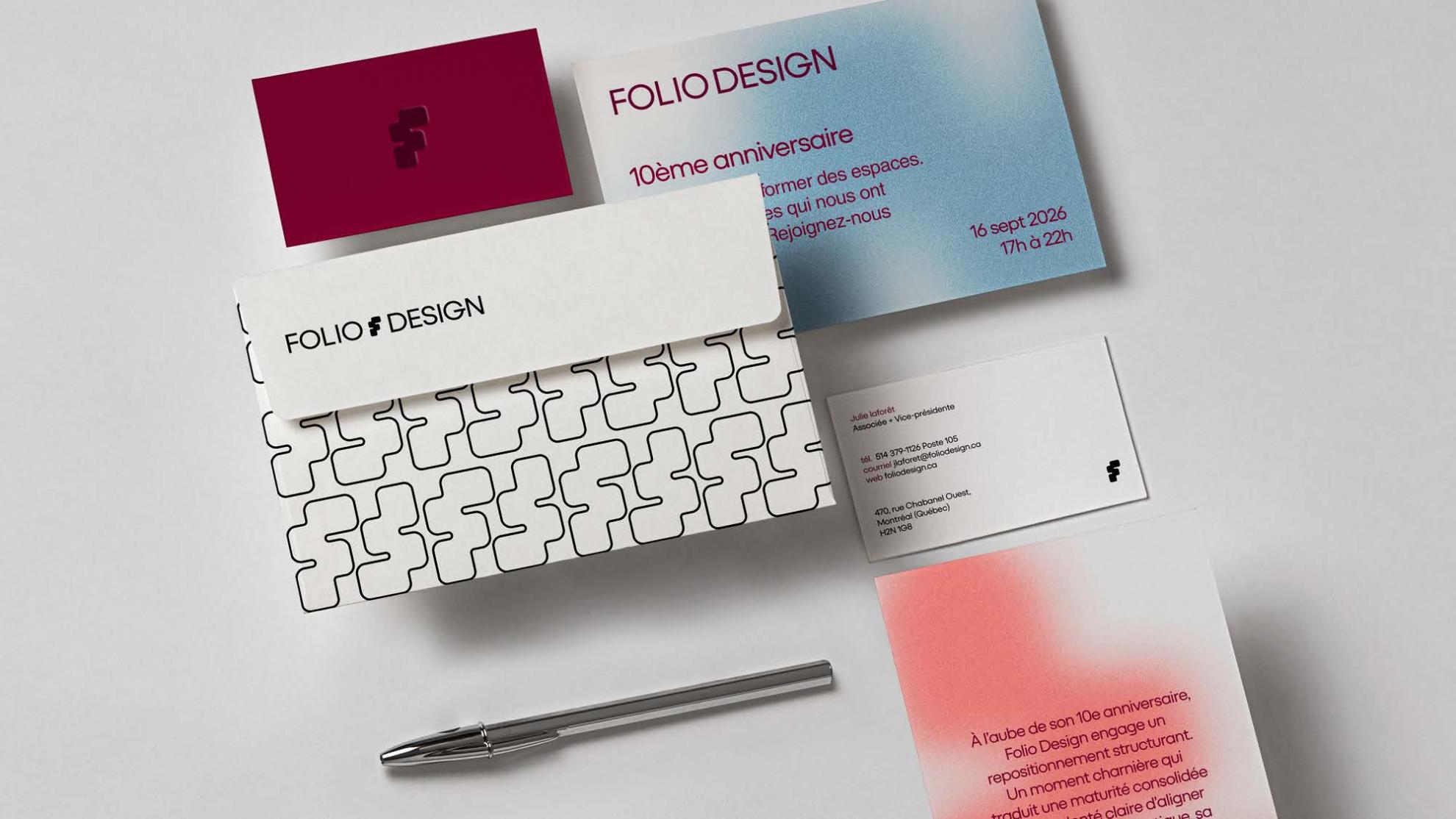
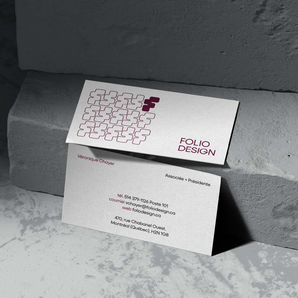
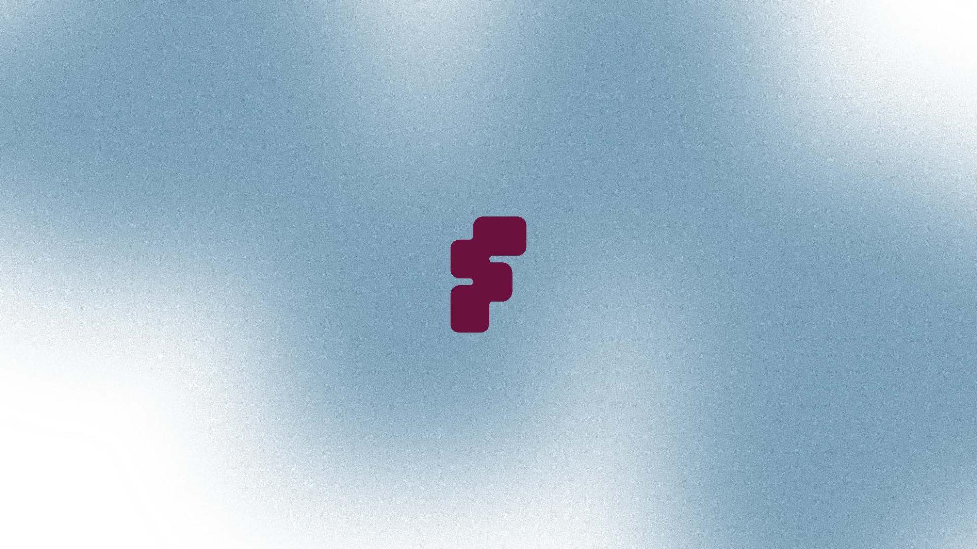
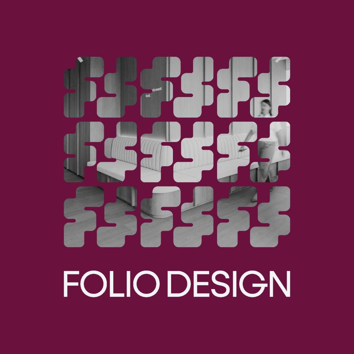
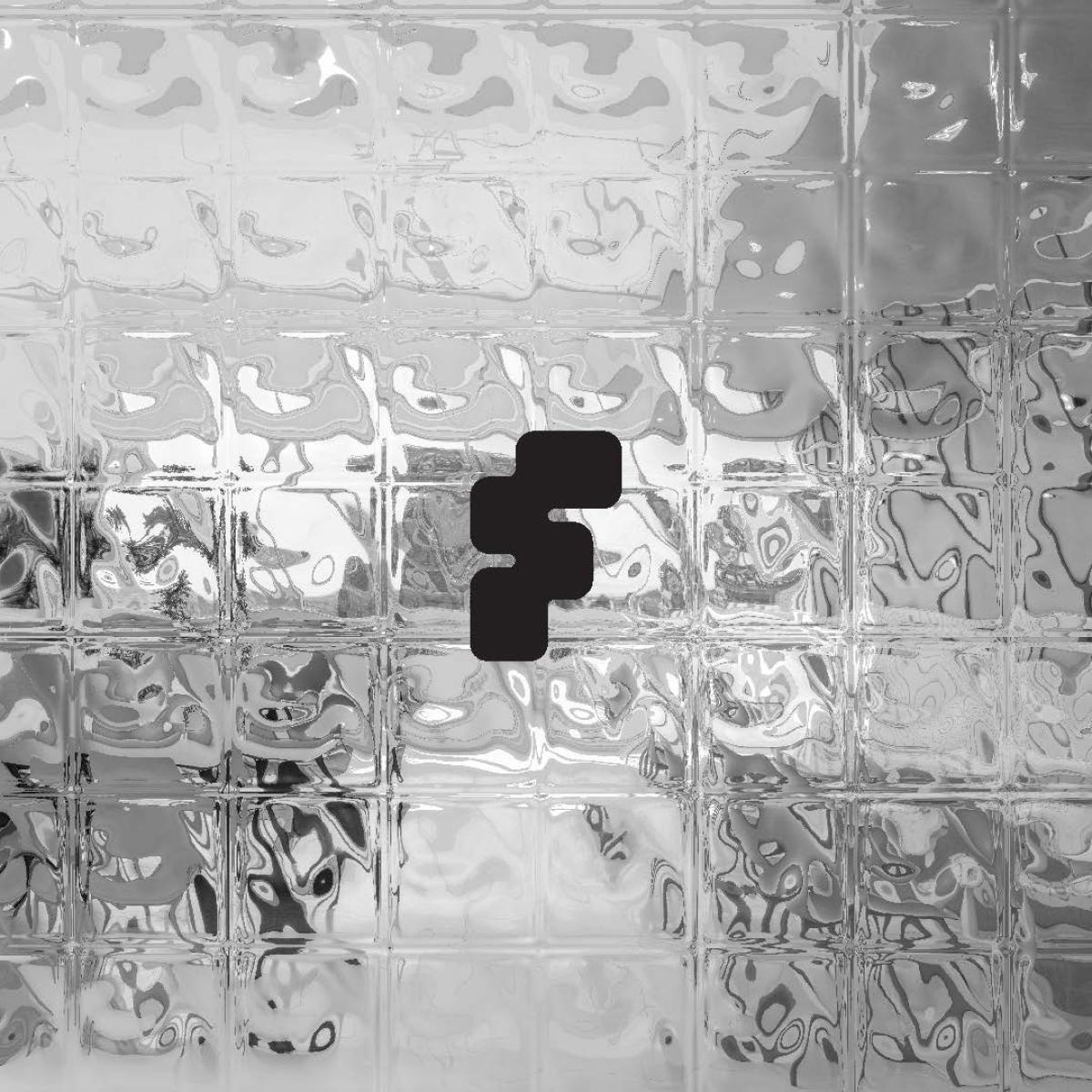
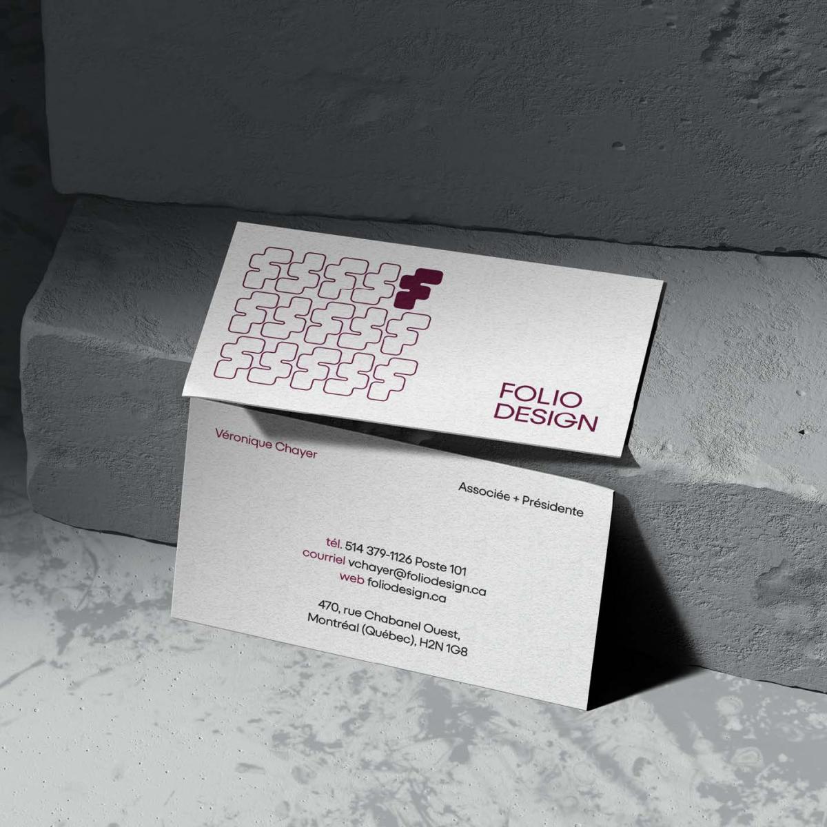
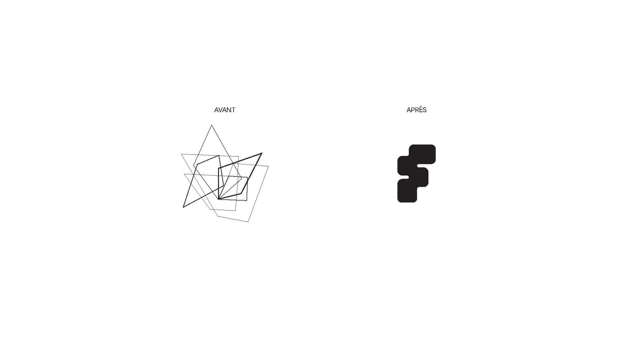
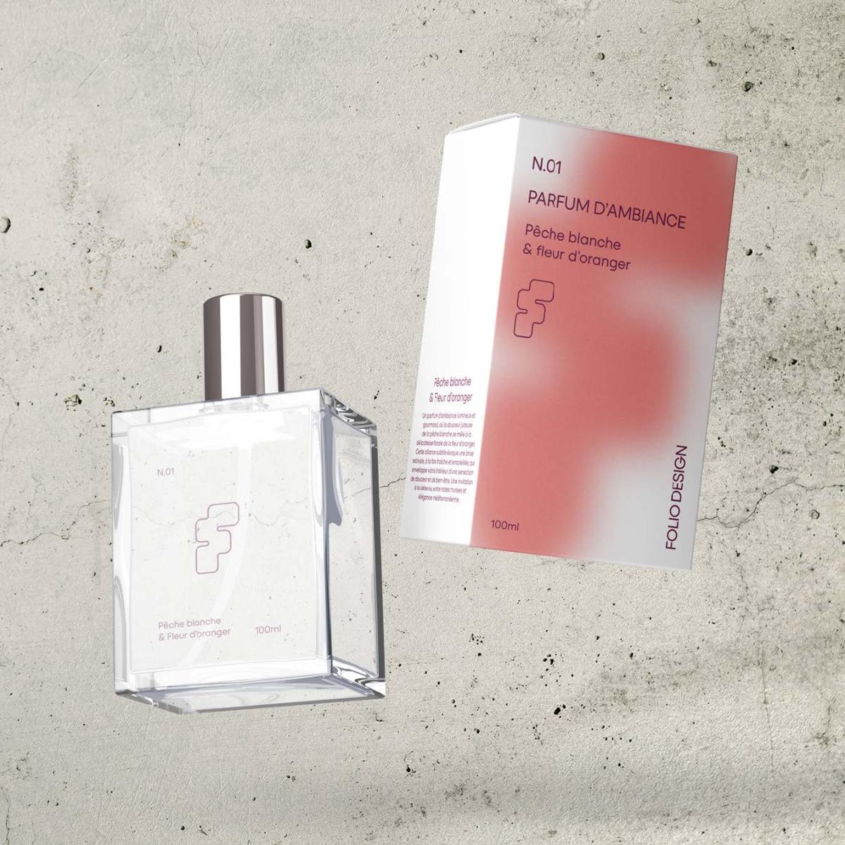
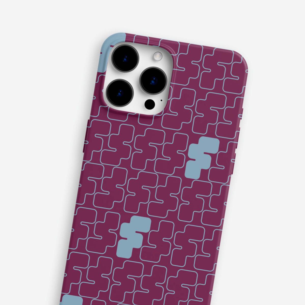
At the core of the system, the monogram derived from the initials “F” and “D” becomes the foundation of the identity. Moving beyond the role of a simple signature, it establishes itself as a visual structure capable of carrying the entire graphic language. Its construction is based on a subtle balance between rigor and fluidity, directly reflecting the firm’s practice. It acts as a stable anchor while remaining flexible enough to evolve across a variety of contexts.
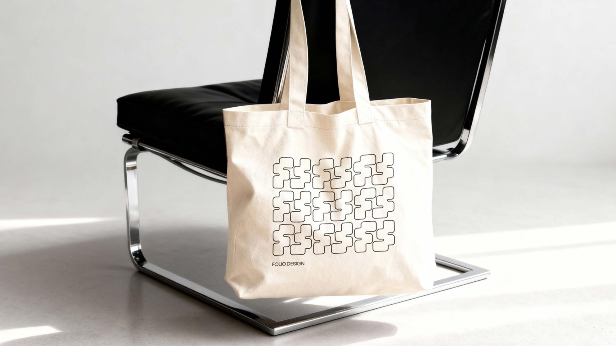
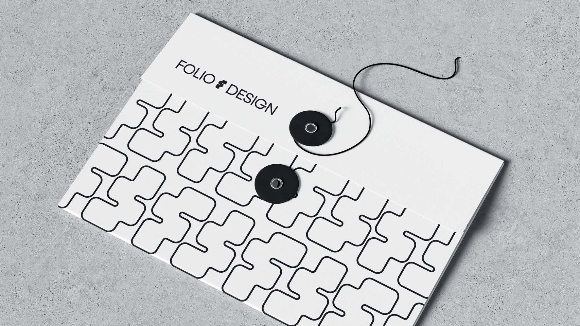
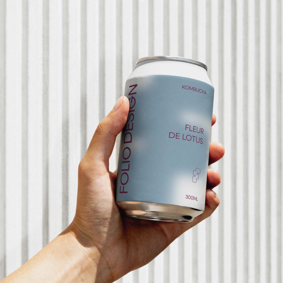
Around this symbol unfolds a complete graphic system conceived as a flexible field of expression. Depending on the context, it can appear more institutional and restrained, or more open and expressive. This visual universe allows for continuous variation without ever compromising coherence.
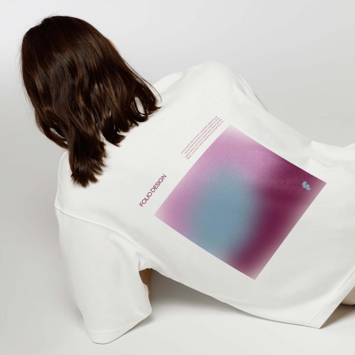
The visual language draws from an exploration of materials associated with the architectural realm. Reflections, transparencies, densities, and depth become elements of construction. Rather than illustrating, they evoke presence, spatiality, and a more tactile reading of the identity.
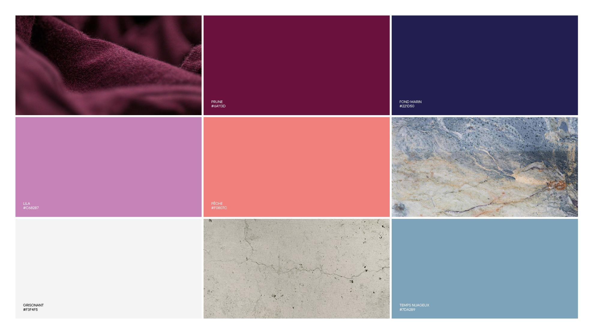
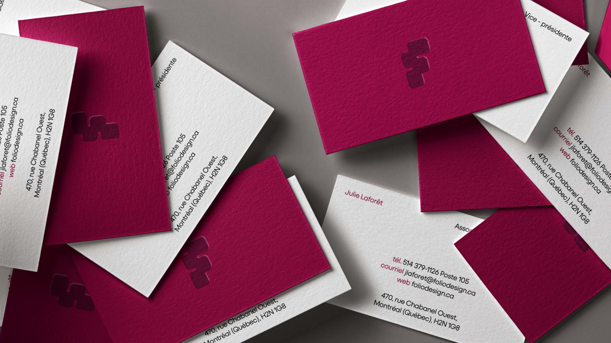
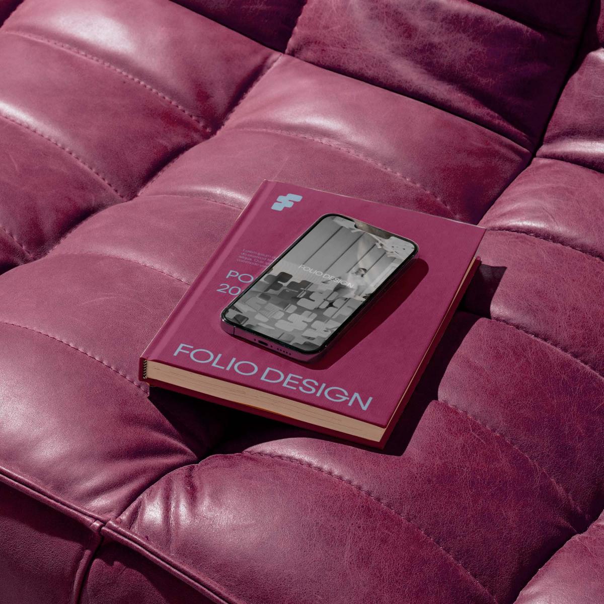
Colour and contrast further reinforce this intention. Every choice is measured, structured around a balance between tension and restraint. Each decision is guided by durability, both in application and in perception.
Nothing here is decorative.
Everything serves a structural purpose.
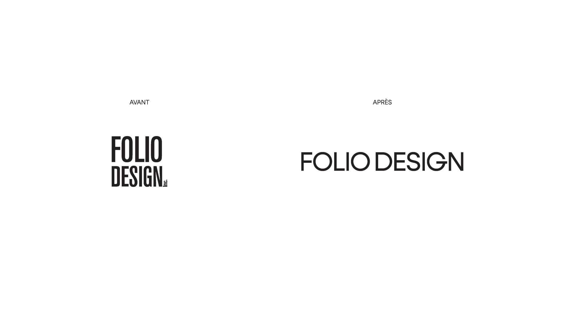
This rebrand offers a more accurate expression of Folio Design. It does not seek to add, but to clarify, revealing what already exists while giving it a more legible and coherent form.
More than a new image, it is an alignment.
More than a repositioning, it is a clarification.
Through this approach, Folio Design affirms a simple and deliberate position: to continue evolving without losing the integrity of what it has already become.
At 10 years, a firm does not summarize its journey.
It defines what comes next.
Collaboration
Communication & Branding : COSMO
Interior designer : Folio Design
Photo credit