



Share to
École de Formation Professionnelle de Châteauguay
By : Bélanger Design

GRANDS PRIX DU DESIGN 19th edition
Distinctions
Discipline : Architecture
Categories : Institutional, Civic & Education Building / Higher Education & Research Building : Silver certification
A School Rooted in Its Territory
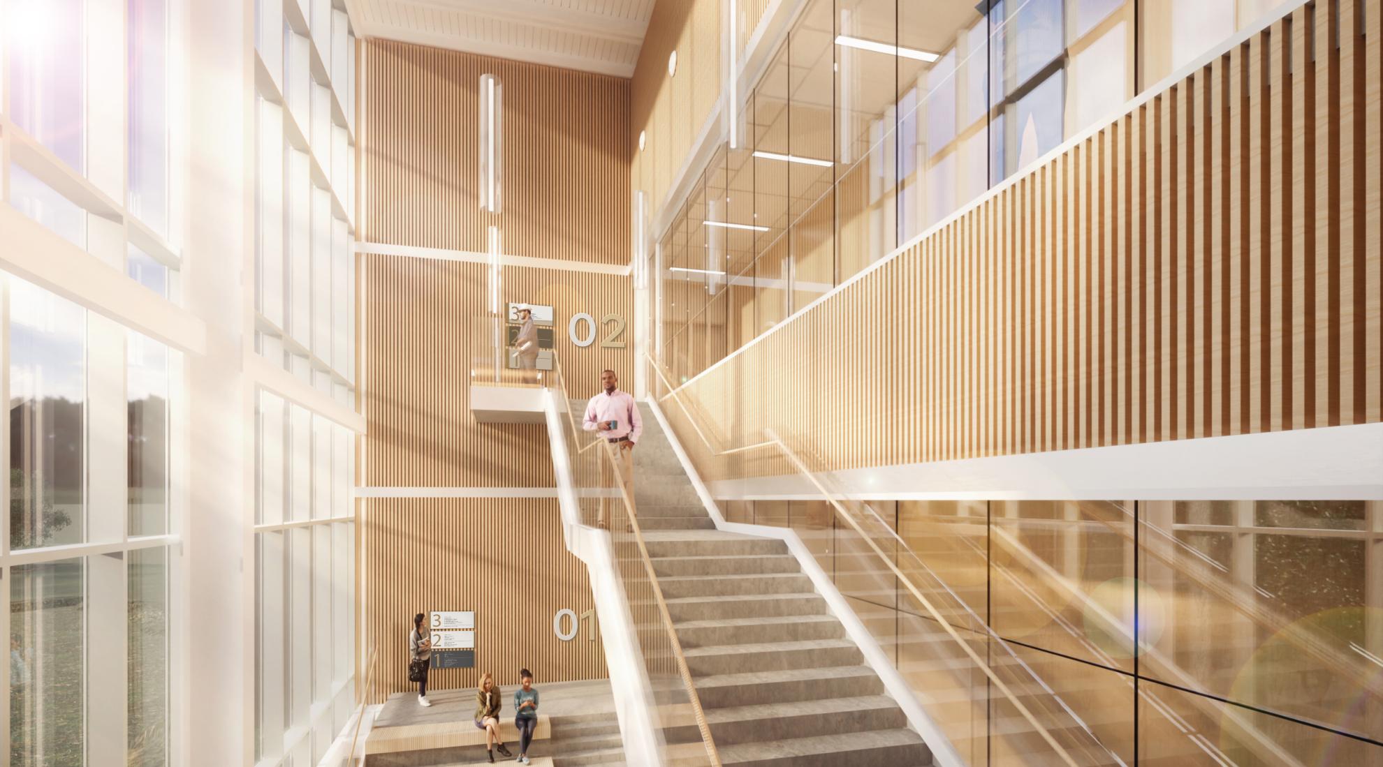
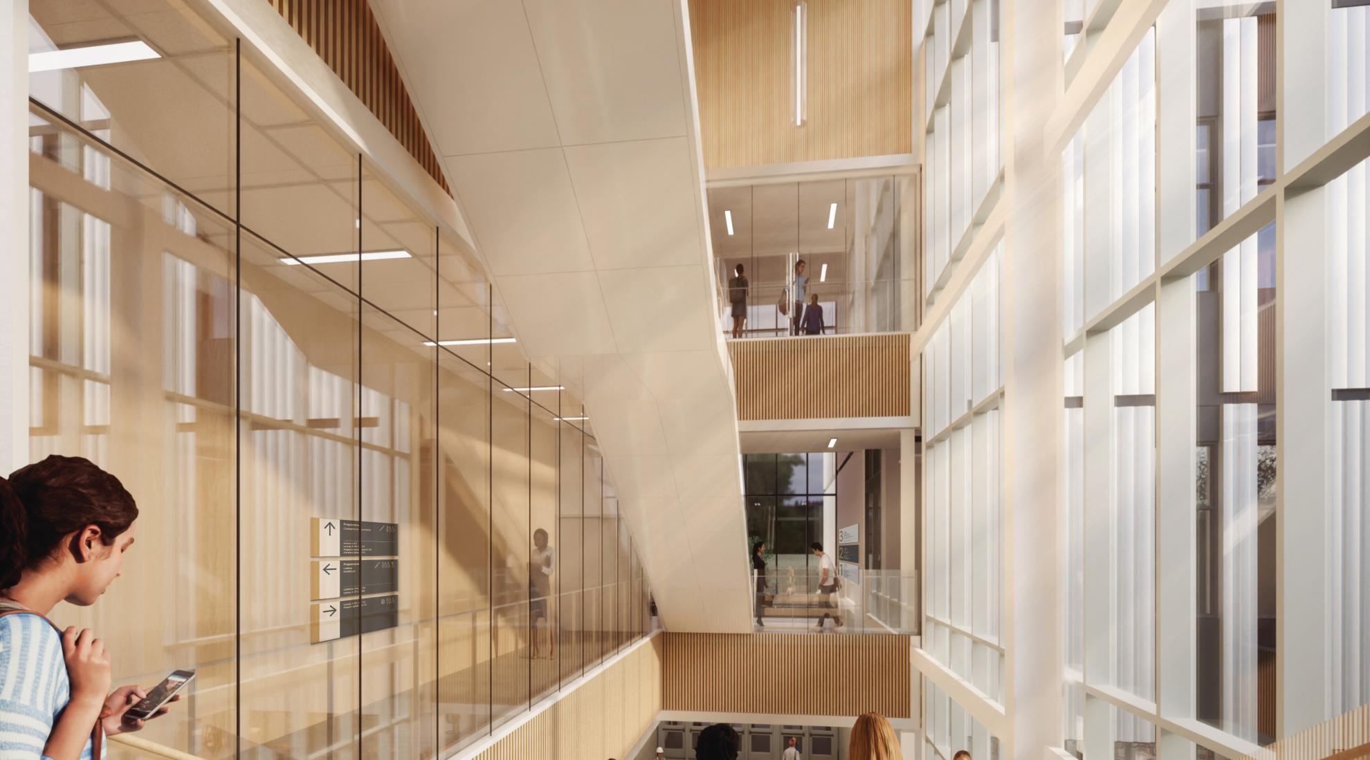
The new École de formation professionnelle de Châteauguay presents itself as a lightweight structure, designed to minimize its environmental footprint. This distinctive setting, simultaneously natural and industrial, deeply informed the wayfinding design thinking carried out by Bélanger Design.
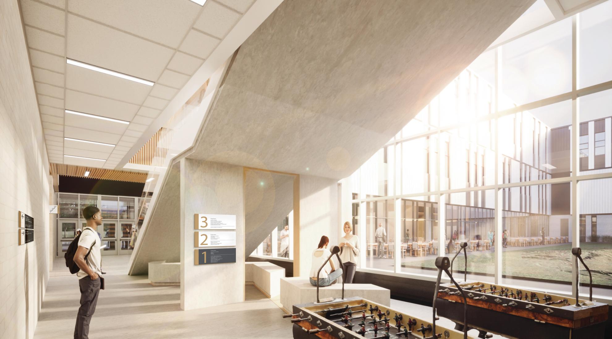
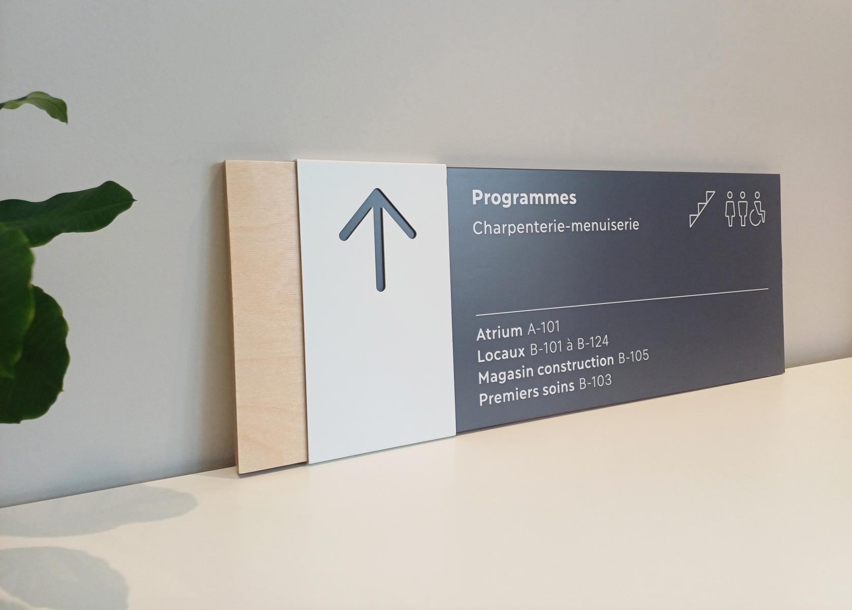
The school articulates two distinct and contrasting worlds: a dark monolith dedicated to the heavy trades of construction, and a white, flexible module for the lighter trades. Raw versus pure, solid versus light, natural versus clinical — this strong architectural duality became the guiding thread of the signage concept. The signage does not overlay the architecture: it is an extension of it, drawing from its materials, colors, and spatial logic to create a fully integrated system.
The school welcomes a diverse range of users: a clientele of young and adult students, teachers, and staff, as well as an external public drawn by the open workshops, hairdressing, esthetics, makeup, and more. The signage must guide both audiences with equal fluency, across three levels of service, while anticipating the constant turnover of the student population.
A Concept Built in Layered Materials
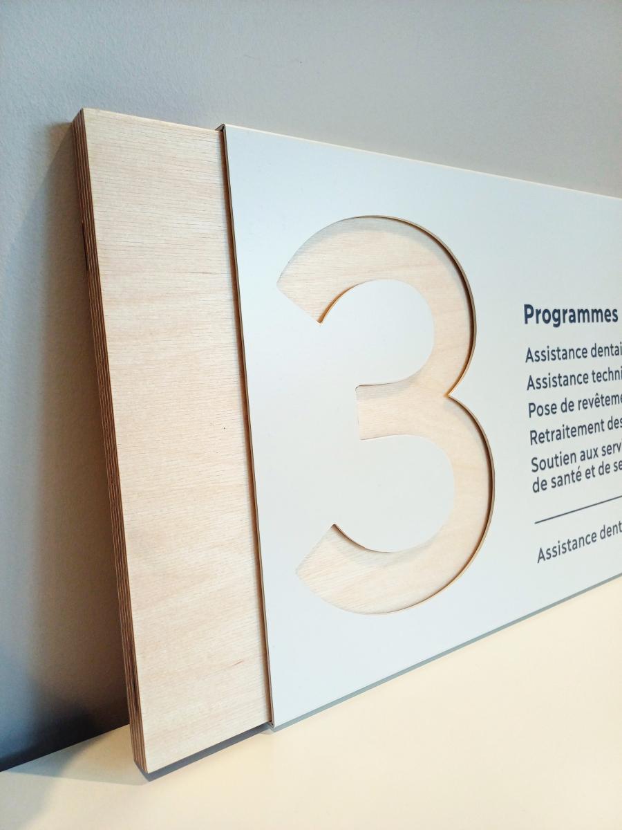
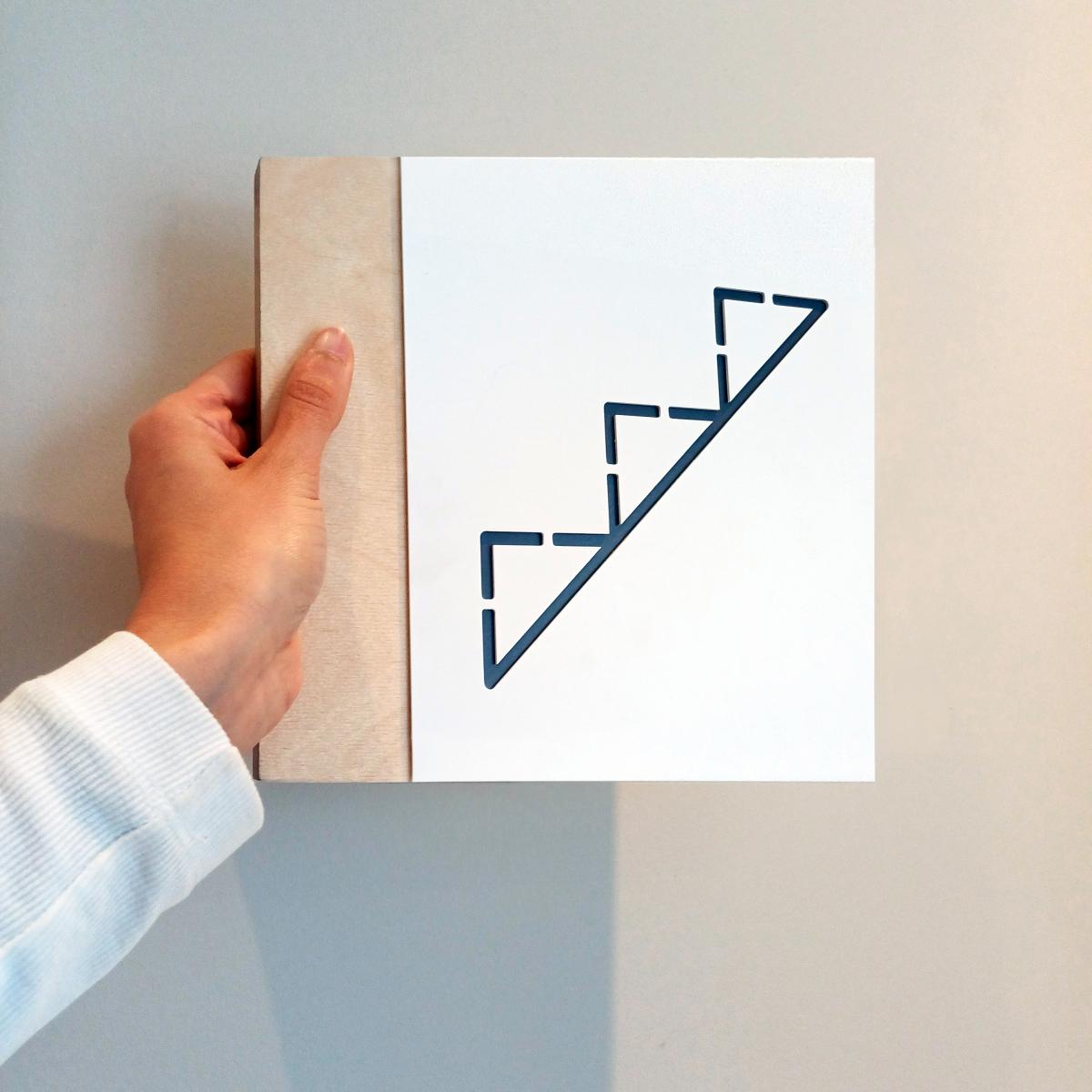
The signage family adopts the Ilisarniq typeface, chosen for its legibility and versatility, along with a family of pictograms custom-drawn by the Bélanger Design team. Three materials form its backbone: Russian birch plywood, warm and alive; painted aluminum in white, clean and clinical; and painted anthracite grey, solid and contrasting. These materials are layered in distinct strata, held together by rods directly inspired by the pilotis on which the school rests, elevated above the wetland it crosses without disturbing. This constructive principle becomes a signage language: each panel carries within it the memory of the founding architectural gesture.
The layering is also expressed through openings cut into the surface layer, revealing the materials beneath. This disclosure of successive layers creates a visual depth that enriches the reading of each element while reinforcing the connection between the signage and the building's structure. The architectural colors of the three levels, red, midnight blue, and forest green, participate in this narrative and transform the journey through the school into a didactic and sensory experience where orientation becomes intuitive.
A System Built to Last
Beyond aesthetics, the EFPC's signage is designed to be robust, flexible, and economical. It accommodates changes in room use, aligns with a logic of ecological and durable materials, and withstands the demands of an active school environment. It is a living system, much like the school it inhabits.
Collaboration
Communication & Branding : Bélanger Branding Design ltée
Architect : Provencher Roy
Photo credit