


Share to
Après Architecte
By : SGD A

GRANDS PRIX DU DESIGN 19th edition
Discipline : Communication & Branding
Categories : Brand Design / Logo Design : Silver certification
Categories : Brand Design / Brand Identity (Creation & Rebrand) : Silver certification
APRÈS was born from a reflection on the real place of a project in time.
During the meetings surrounding the nominal identity of the firm, one idea constantly resurfaced: a project never truly belongs to those who design it. During its creation, it is carried by a team, drawn, thought out, and built with precision. Then it separates from its authors to belong to those who inhabit it, use it, and evolve with it over the years.
The name APRÈS was born from this awareness.
It evokes what remains once the delivery is completed. What transcends time, usage, and generations. It carries a vision of architecture designed not to follow a trend, but to endure and continue to have meaning for those who come after.
This idea of transmission has guided the entire development of the visual identity.
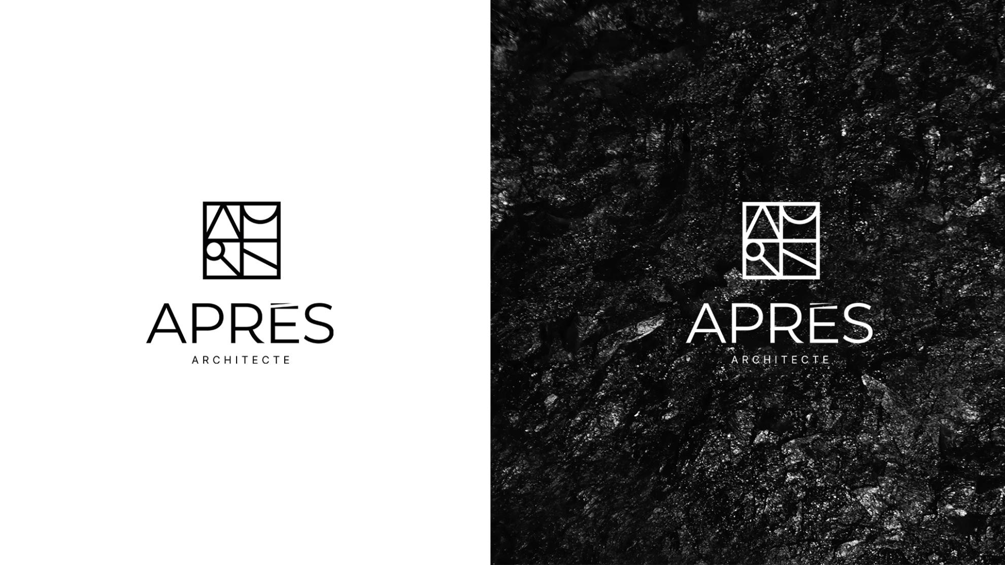
The logotype was designed from a typography deliberately sober and readable. The objective was not to create a demonstrative symbol, but to leave all the space for the meaning carried by the name itself. Each graphic intervention was thus reduced to the essential.
The most worked elements are found in the "R" and in the "È". The curve integrated into the "R" brings a more organic presence and echoes the internal and spatial approach of the firm. The grave accent of the "È", fused directly to the letter, becomes a constructed element rather than a simple typographic addition. These details introduce a tension between architectural rigor and more human sensitivity.
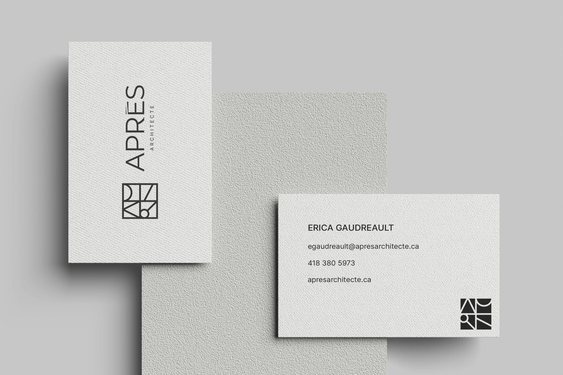
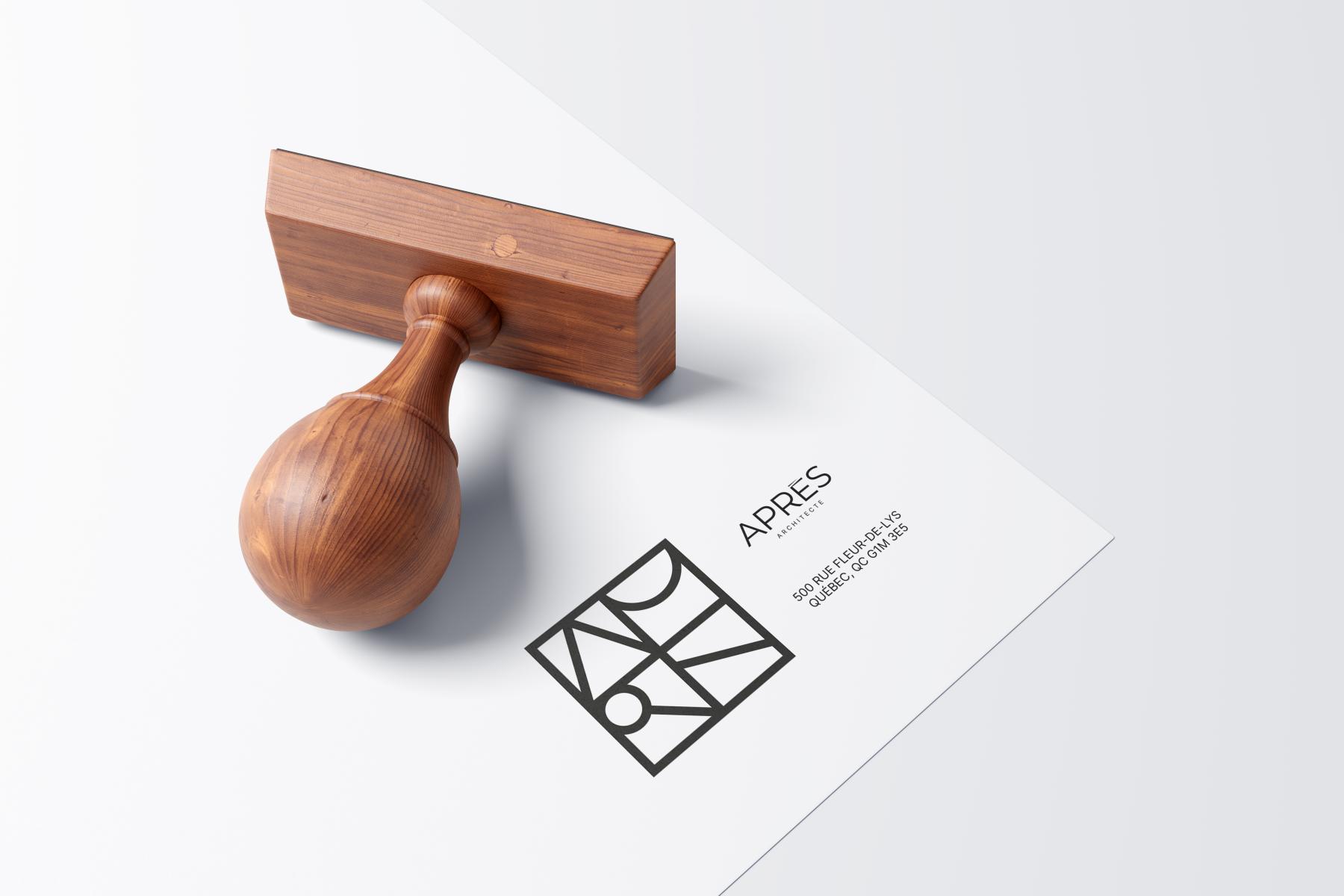
The icon developed from the letters of the word APRÈS acts as a discreet seal. It accompanies the projects as a trace left at the moment of their conception, before they are transmitted to those who will inhabit them and evolve them over time.
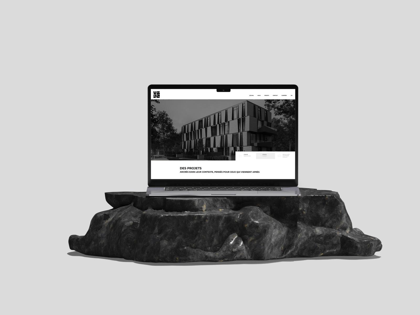
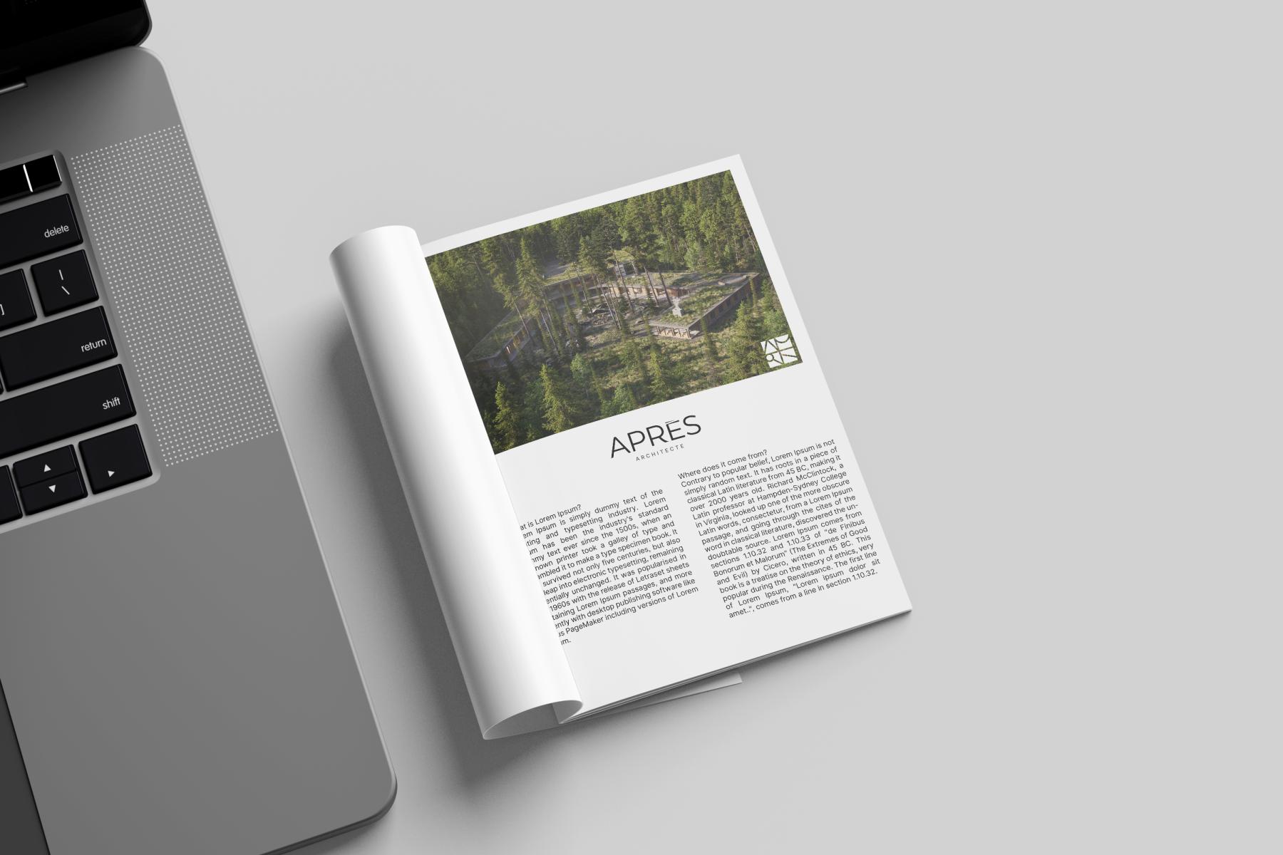
The identity was also designed to remain timeless and adaptable. It unfolds only in black and white to leave room for materials, textures, images, and contexts in which it is inscribed. This voluntary restraint allows the graphic system to traverse supports without losing its coherence or seeking to dominate the project it accompanies.
Through APRÈS, the brand identity becomes the direct extension of the firm's vision: to design projects anchored in their context, precise in their execution, and meant to last beyond those who created them.
Collaboration
Other : SGD A
Architect : Apres Architecte
Photo credit