


Share to
Zephyr
By : Henriquez Partners Architects
GRANDS PRIX DU DESIGN – 15th edition
Discipline : Architecture
Categories : Residential Building / Apartment & Condo ≥ 10 storeys : Gold Certification
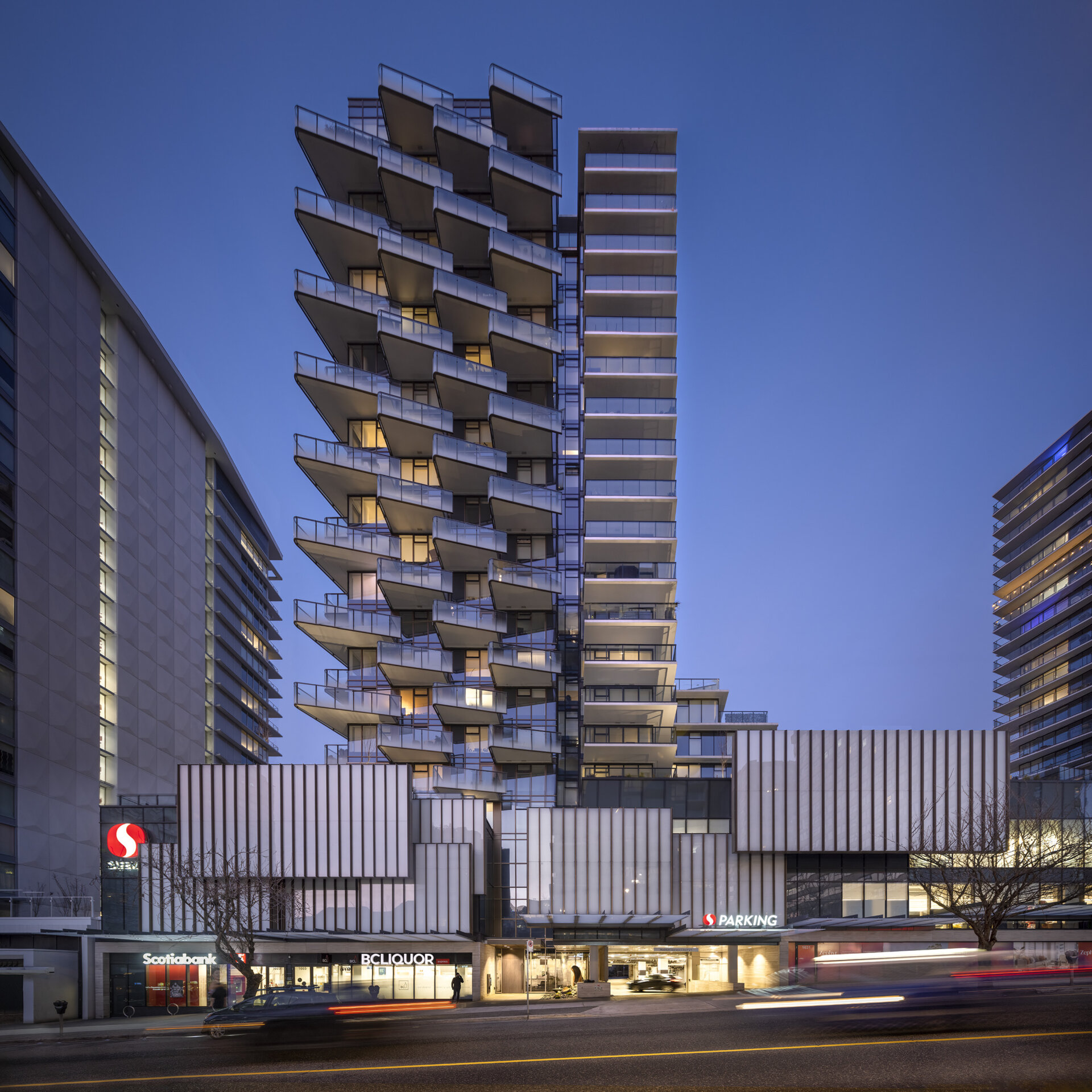
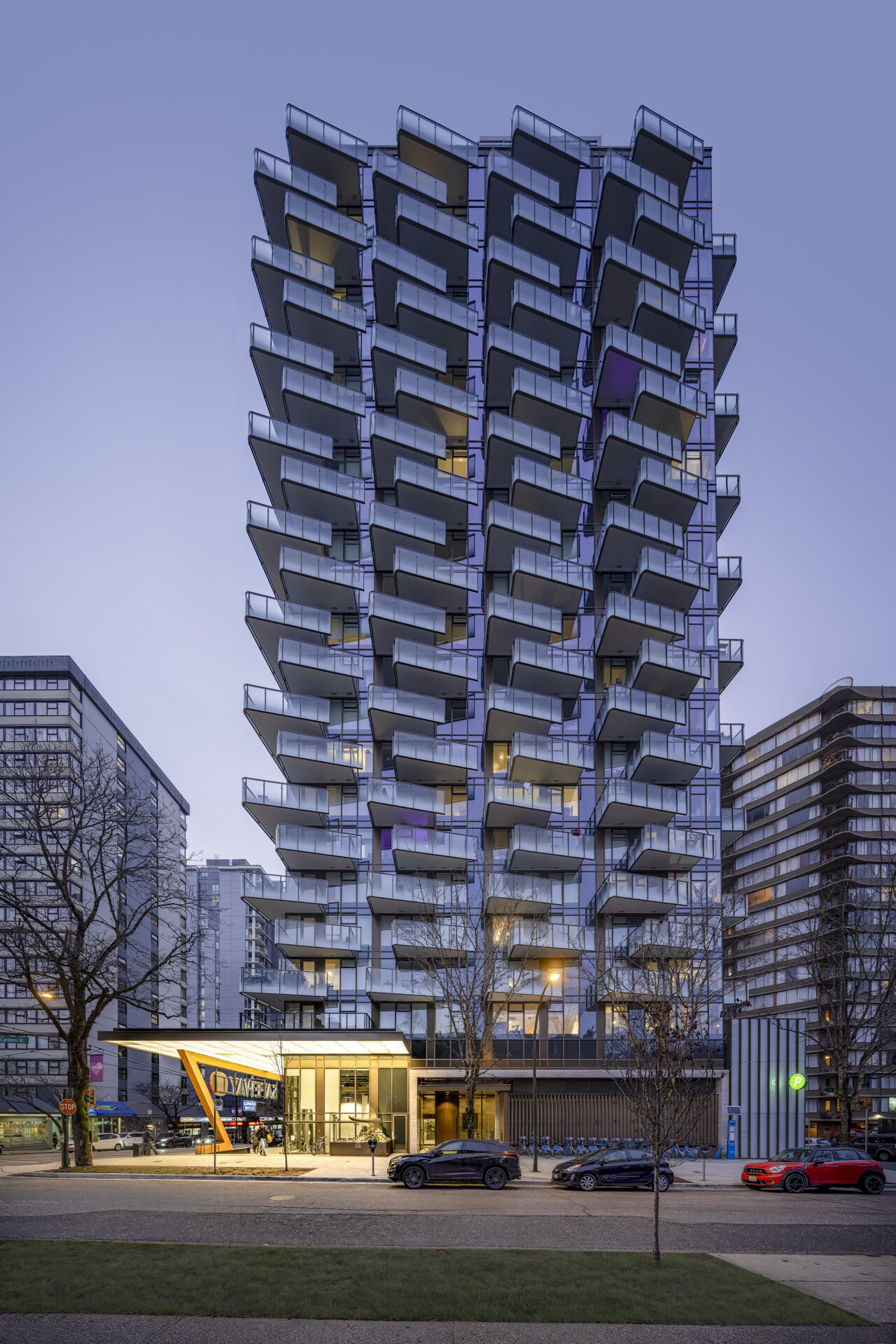
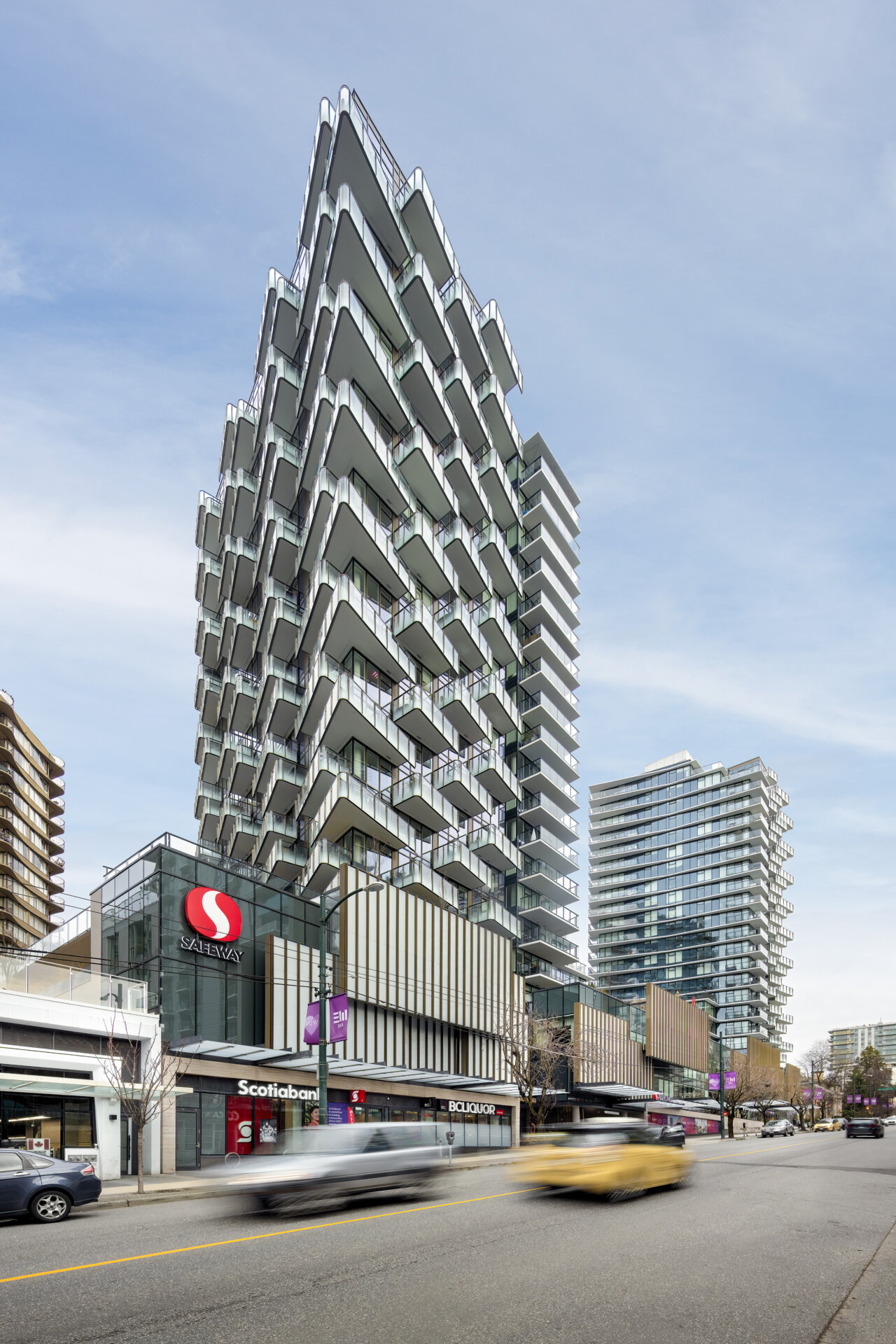
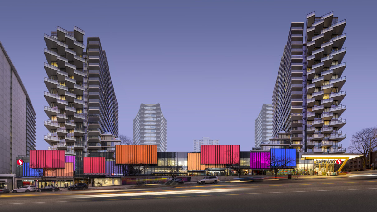
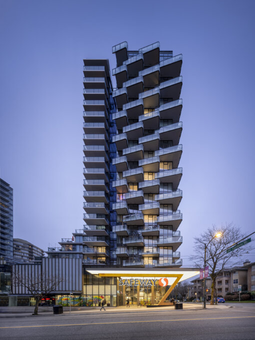
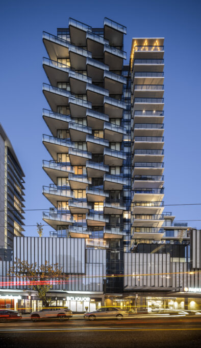
Located within Vancouver’s densely populated West End neighbourhood, Zephyr is a residential development situated above a local Safeway supermarket. This Safeway is vital to the community, offering daily necessities, support for local events and a gathering place for neighbours. Zephyr builds on this history, providing an expanded, updated supermarket, continuous commercial frontage and two residential towers comprising 330 units of purpose-built market rental.
This development successfully addresses priorities outlined in the West End Community Plan. Through redevelopment of a large, under-utilized site spanning almost half a city block, it supports densification and augments the city’s supply of rental housing, a goal also targeted in Vancouver’s Housing Continuum, and Housing and Homelessness Strategy. The new rentals (33% of which are family units to support a diverse demographic) are desperately needed in Vancouver with vacancy rates in the 1% range, and especially in this neighbourhood with 130% higher density than the city average
Zephyr carefully respects the materiality and character of the West End and incudes several public realm improvements to enhance the pedestrian experience including an activated lane that serves as an attractive public space. Zephyr’s rooftops offer common spaces for residents with community gardens, while the enhanced ground plane has expanded areas for outdoor seating creating new gathering spaces Sustainable living is promoted through support for cycling as a viable alternative to driving; on-site end-of-trip facilities and ample secure storage contribute to this effort and the project’s LEED Gold rating.
Though Zephyr closely aligns with neighbourhood plan policies and critical City goals, multiple challenges faced this development, including tight zoning restrictions. A limited number of towers are permitted per West End block and at the outset the project encountered resistance. A thorough and ultimately successful design exploration demonstrated that Zephyr could be sculpted and situated to allow for necessary setbacks and tower separations, preservation of protected view corridors, minimization of shadowing and respect for privacy for adjacent buildings, all while adding considerable value to the community.
Local zoning also dictates that storefronts must have a maximum width to preserve the articulation of small shopfronts, characteristic of the neighbourhood. Implementing multiple commercial retail units along the length of the site proved untenable however given slope variation. A 12-foot height difference from one end to the other meant inadequate headroom for standard CRUs in some sections. Further, Safeway desired a significant presence at street level to reinforce its prominence as a retail destination and community hub.
An innovative solution was devised, integrating a large format public art installation. Translucent floating glass panels trace across the podium elevation in a layered pattern like shoji screens, providing a unified expression for the street wall and grocery store, while introducing natural light into the commercial space. The façade public art, designed by Neil Campbell and entitled “Zephyr” is inspired by the beautiful natural environment, and colours and light of the West End.
Zephyr evolved through mediation of complex issues to provide essential rental housing in a high-density urban environment.
Collaboration
Architect : Henriquez Partners Architects
Interior Designer : Leckie Studio
Landscape Architecture : HAPA Collaborative


