



Share to
Transformation des espaces d’entrée et renouvellement de l’identité du 6750 Esplanade
By : DMA architectes
GRANDS PRIX DU DESIGN – 15th edition
Discipline : Architecture
Categories : Commercial Building / Low-Rise Office Building (< 5 storeys) : Silver Certification
Categories : Special Award / Architecture + Art : Silver Certification
This intervention stands out in several ways by combining art and architecture. First of all, the integration of murals in this project seemed essential to create a sophisticated and warm place with a unique atmosphere. Secondly, the interventions carried out allowed us to optimize the surface areas dedicated to common spaces, to gather the circulation, but above all to revitalize the entire first floor, thus renewing the identity of the building inside and outside. Finally, the industrial and original aesthetics of the building remain well anchored by polished concrete surfaces, exposed or other sections in raw concrete.
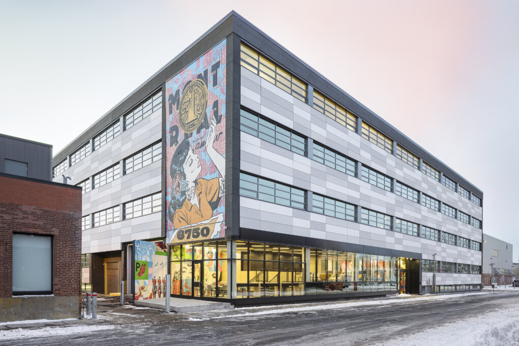
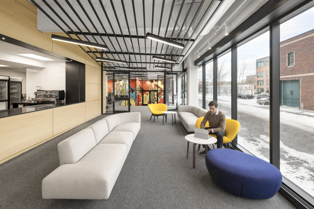
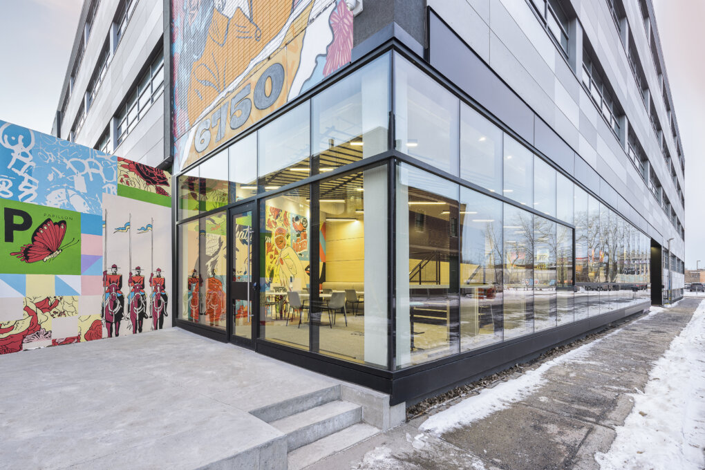
Due to the limited space in the lobby and the intention to create an entrance that would have a strong presence, the demolition and relocation of the loading dock, as well as the interior walls and the complete modification of the slab, offered the possibility of having an airy and spacious lobby. In addition, the curtain wall on the first floor was very opaque and limited visibility and light at this level of the building. The existing wall was replaced entirely by a new, sleek glass envelope that maximizes natural light and gives the lobby an open feel to the outdoors.
The concept is inspired by the artist's canvas and also refers to weaving in relation to the historical context of the textile industry omnipresent in this neighborhood. Inspired by the artwork already on the exterior wall of the building, the canvas creates a link between the art and the architectural space. The idea of the canvas serves as a guiding thread like an imprint that can be found in many forms, materials or finishes throughout the ground floor layout, accompanying the visitor on his or her journey.
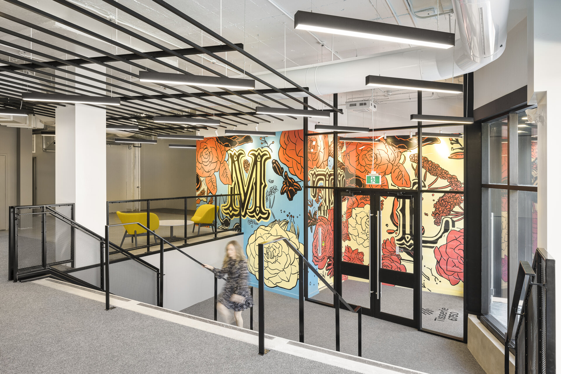
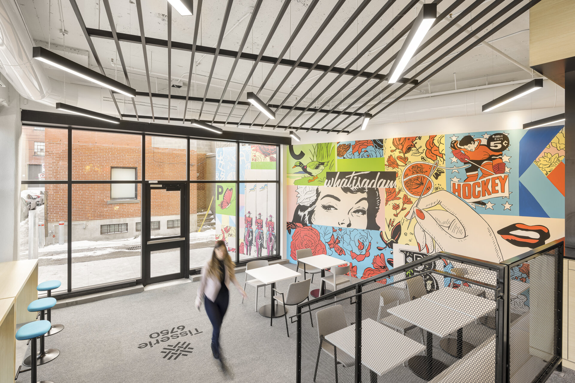
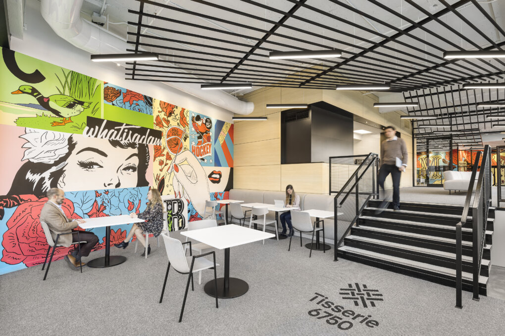
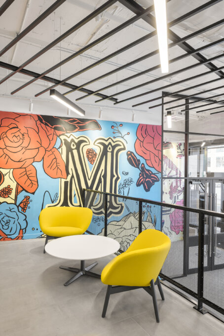
The project features a collaboration with lndmrk and the artist whatisadam who created the mural on the building. Two major new murals were created for this development; the first work animates the new entrance at an angle to the interior of the façade. This gesture signifies the entrance and the work unfolds inside on three offset walls forming a large visual triptych. The creation of this new entrance allows the existing hall to be replaced by an entrance directly in line with the elevators. The second work is located to the left of the terrace and extends into a café space that we relocated and arranged with tables, chairs and a counter along the exterior glass wall among other elements.
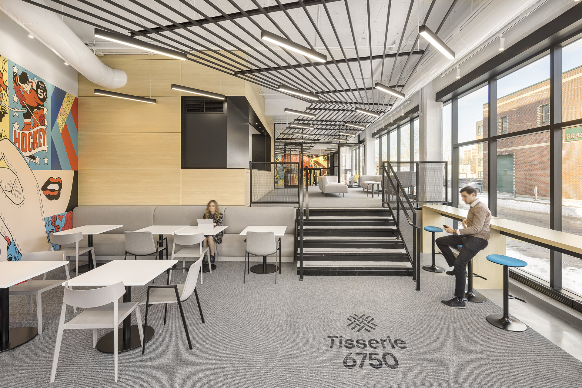
The bright colors and shapes of the weaving effect murals surprise the visitor and put him in the atmosphere. The space offers a vast open staircase leading to the café or to the elevator. This intervention allows for a hall with related spaces for gathering and exchange that are not cluttered by traffic.
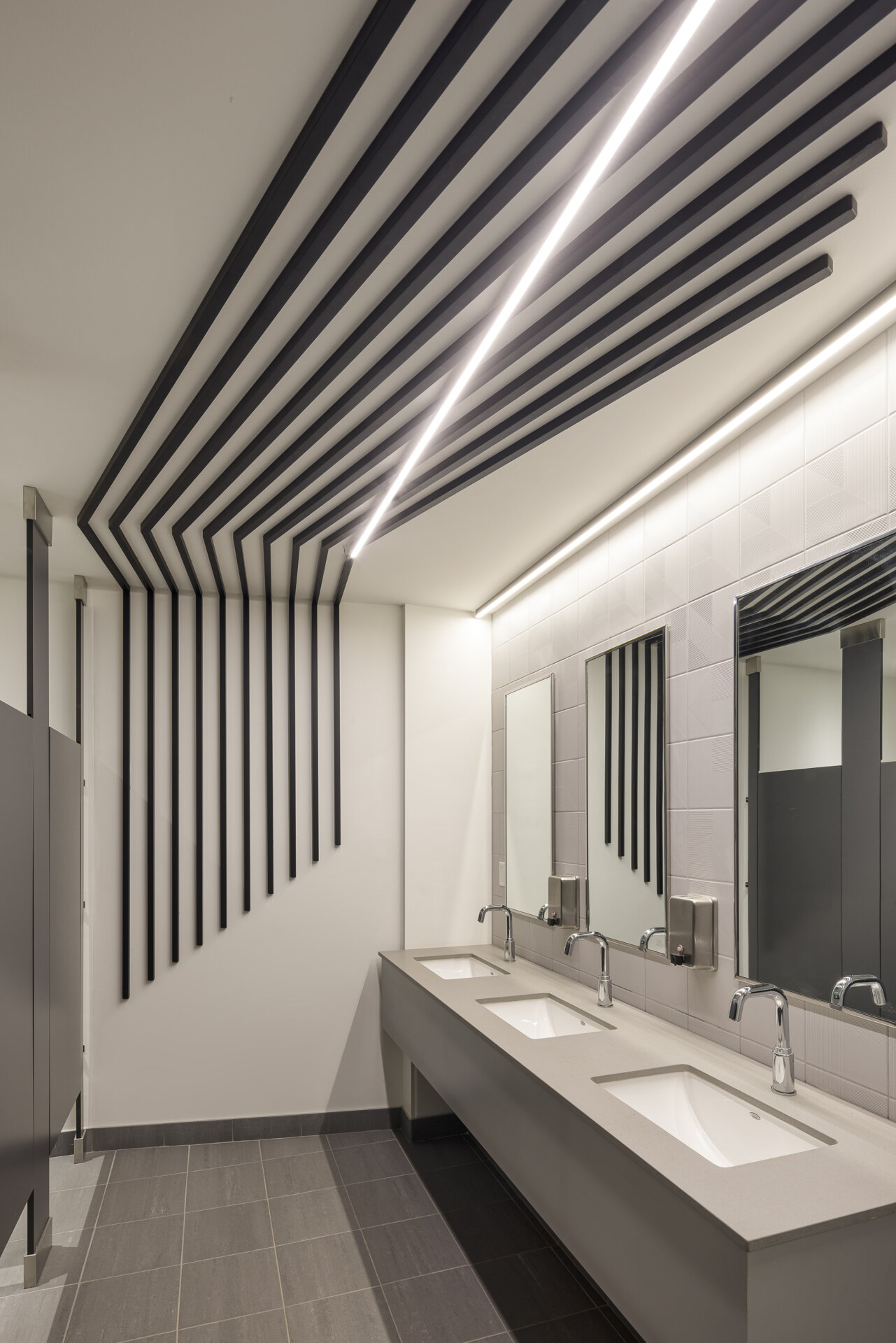
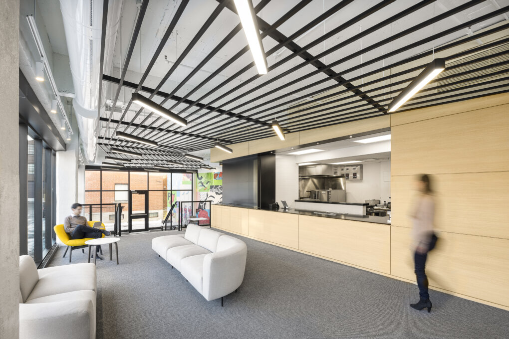
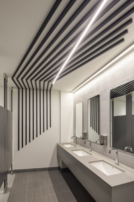
The effect of lines is also found in the common spaces (ceilings with black metal strips) where the rhythm of these black strips is broken by that of thin, linear and suspended lights giving an impression of depth and fabric.
This new layout takes advantage of an outdoor space on the alley to create a terrace and give new visibilitý to the café́ with more presence in the neighborhood. This mural establishes a link between the interior and exterior offering an interesting extension and different angles of view that reveal themselves depending on where you are.
Collaboration
Engineering : Pageau Morel Associés
General Contractor : Ombrage Construction
Real Estate Developer : Colliers


