





Share to
Qwelli – centre Eaton
By : Humà Design + Architecture, Caroline Reumont design
GRANDS PRIX DU DESIGN – 15th edition
Discipline : Interior Design
Categories : Accommodation, Restaurant & Bar / Café & Food Concession : Silver Certification
Categories : Commercial Space / Commercial Space ≤ 1,600 sq.ft. (≤ 150 sq.m.) : Gold Certification
Categories : Special Awards / Interior Design + Collaboration : Gold Certification
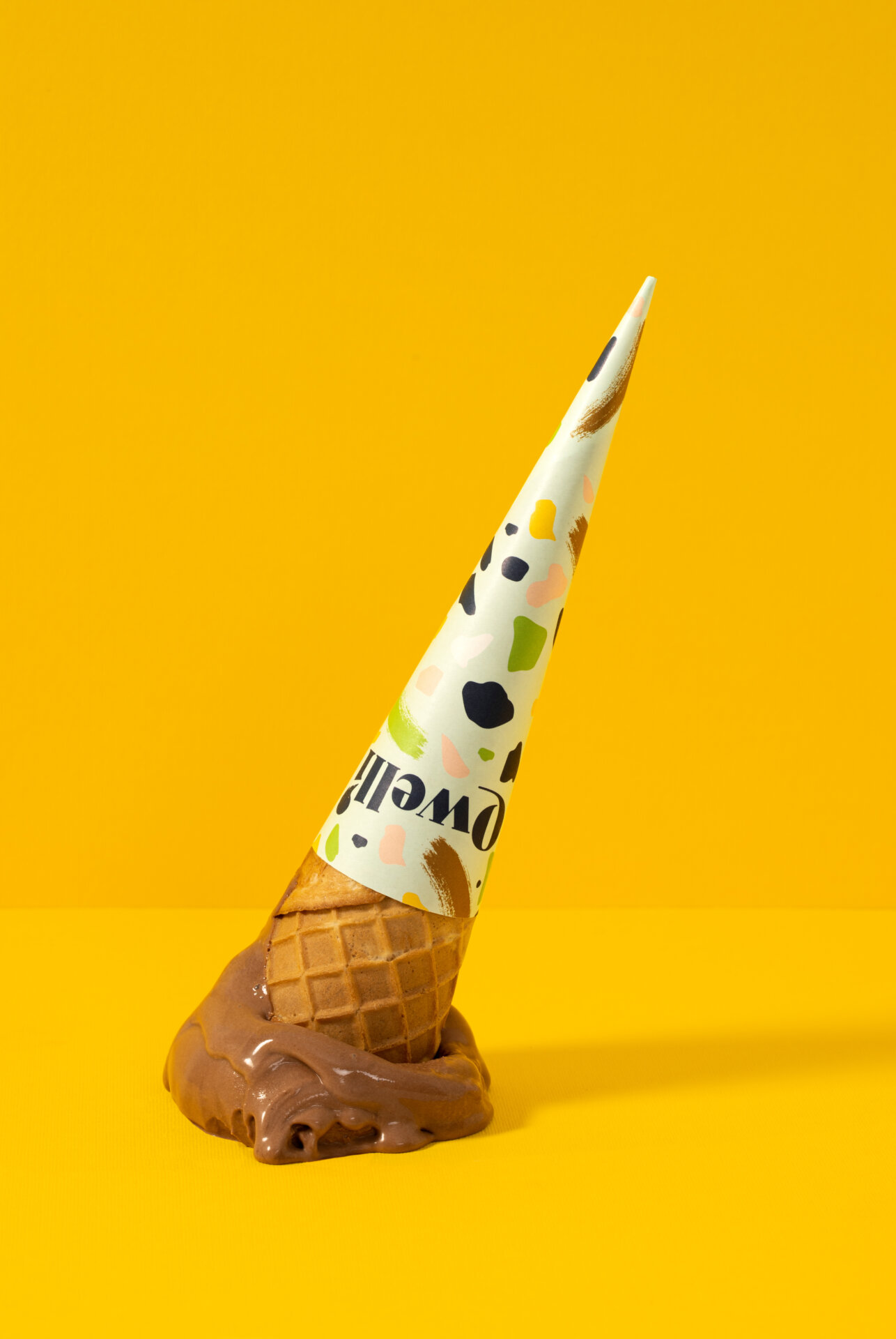
In 2021, the 30 years-old family brand Paysanne Gelato gets a total makeover and becomes "Qwelli, l'Art du Gelato" made and sold in Quebec. Humà Design + Architecture had the honor of being commissioned to design the entire design langage of the brand through 8 concessions: the Qwelli of Eaton Center is a part of this total restructuring.
It was essential to create spaces where the brand could express itself fully and thus, to ensure that the materiality and the volumes were distinctive and anchored the brand in its new communication approach. The goal was to create a real dialogue between its identity and the design of its concessions.
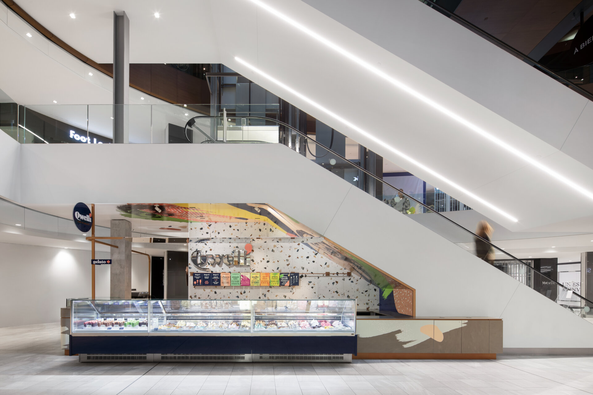
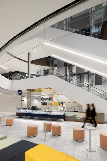
The biggest challenges of this Eaton Center concession are the limited space available (less than 10m2) and its location within the shopping center itself: placed under an escalator and against the elevators leading to the upper floor.
We immediately considered these challenges as assets:
We worked together with the client in order for the teams to flourish as much as possible in a minimum space. The development of the service area is the result of this exchange and it was essential to take into account the very functional aspects of the business. The layout and location of each position allows teams to move from one side to the other smoothly and efficiently.
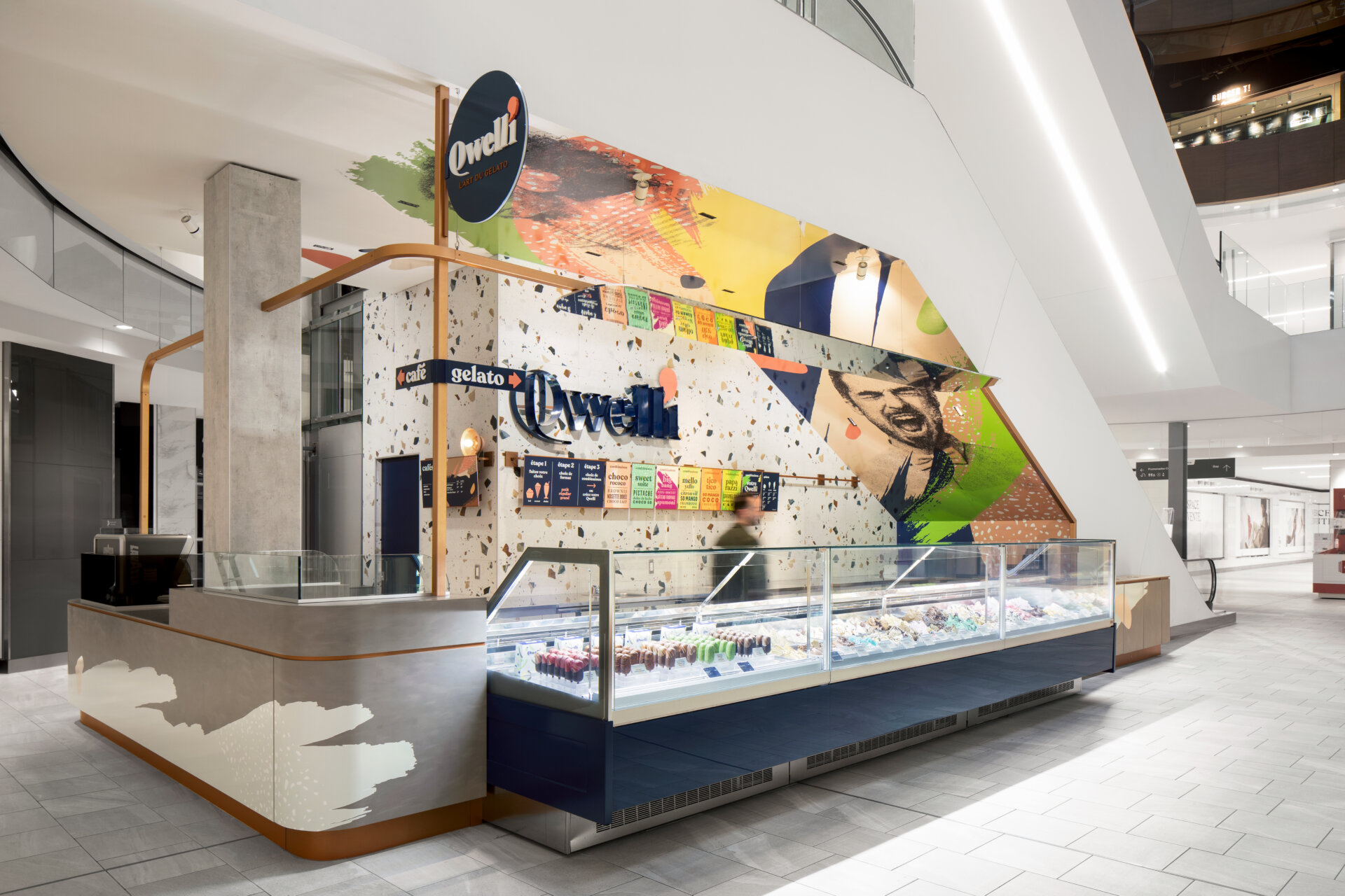
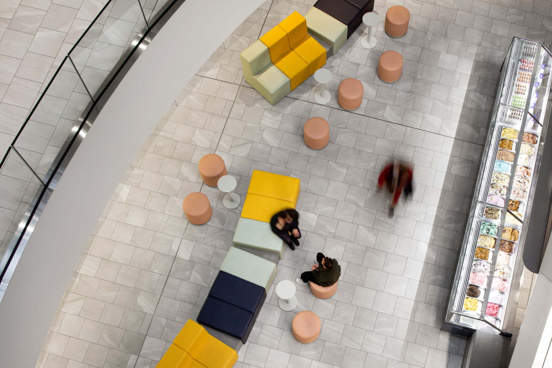
The gelato displays and the metal structure serving as a support for the second logo were designed in projection to be visible from the first floor and also, from the back of the centre.
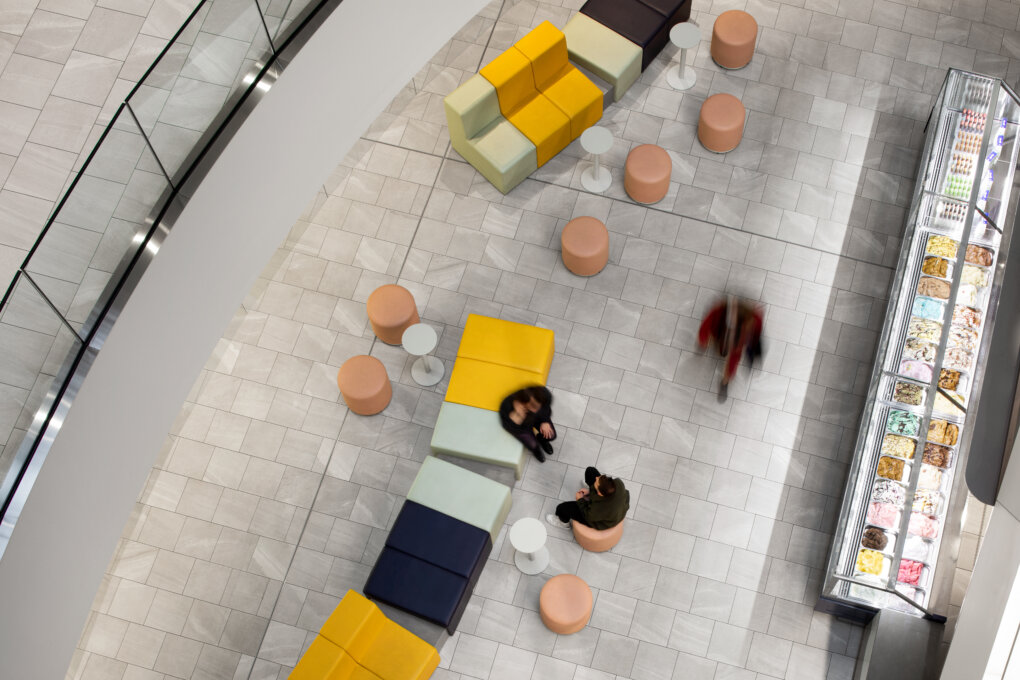
The modular terrace in the colors of the brand has also been designed to be visible from above and makes it possible to delimit the space of the brand without enclosing the kiosk.
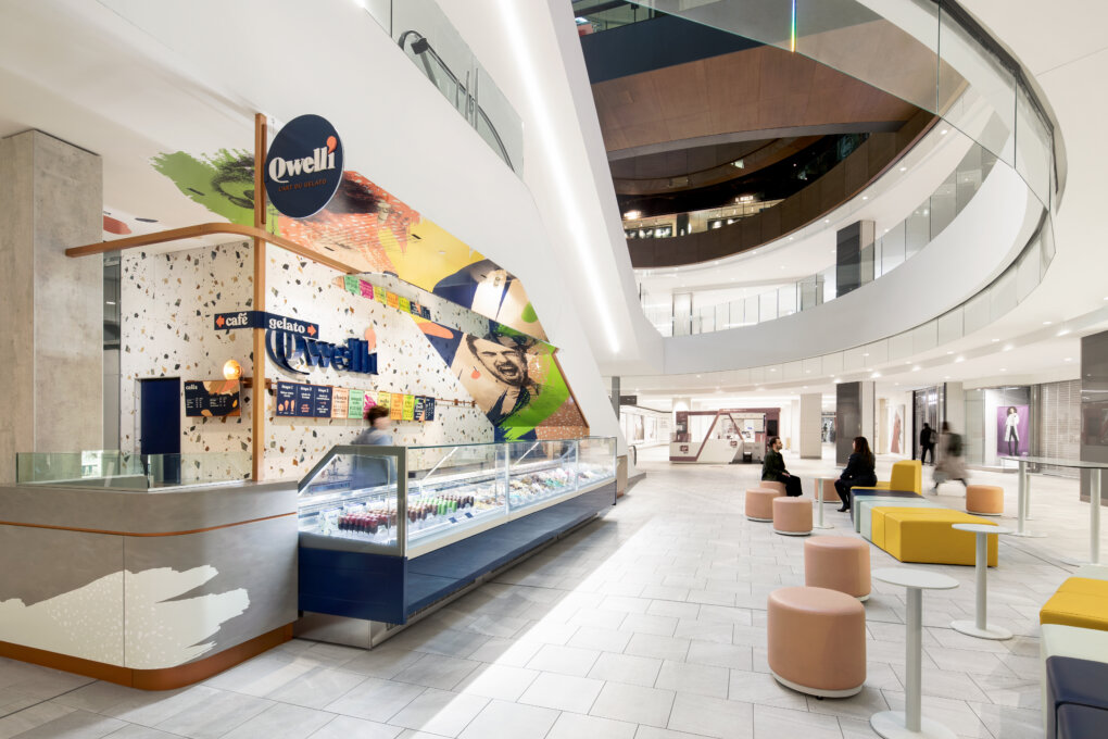
The materiality of the project allows a flagrant contrast with the white and minimalist universe of the shopping center and, which forms just as many characteristics that we will find through the 8 concessions:
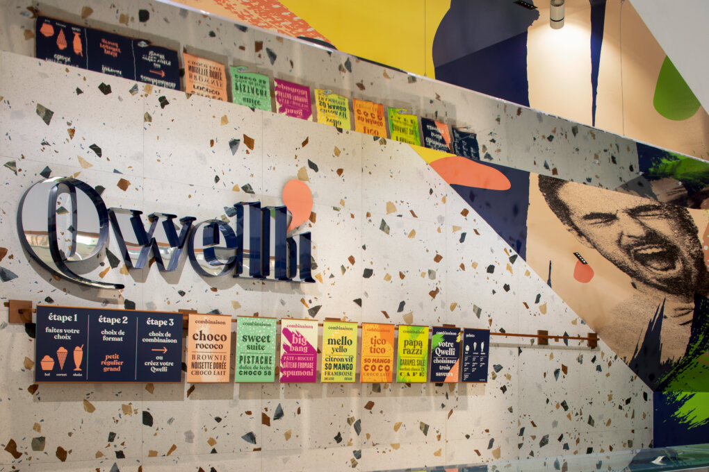
The deep blue Qwelli becomes the solid base of the language. It highlights the ice cream, thus establishing the very strong colored signature of the brand.
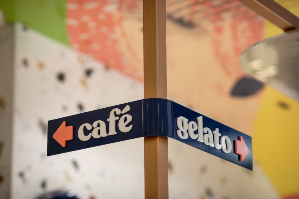
The copper-colored structure, serving as a support for the brand's logo, becomes the common thread present in all the concessions: sometimes overhead, sometimes as a support for menus or even inserted in the counters.
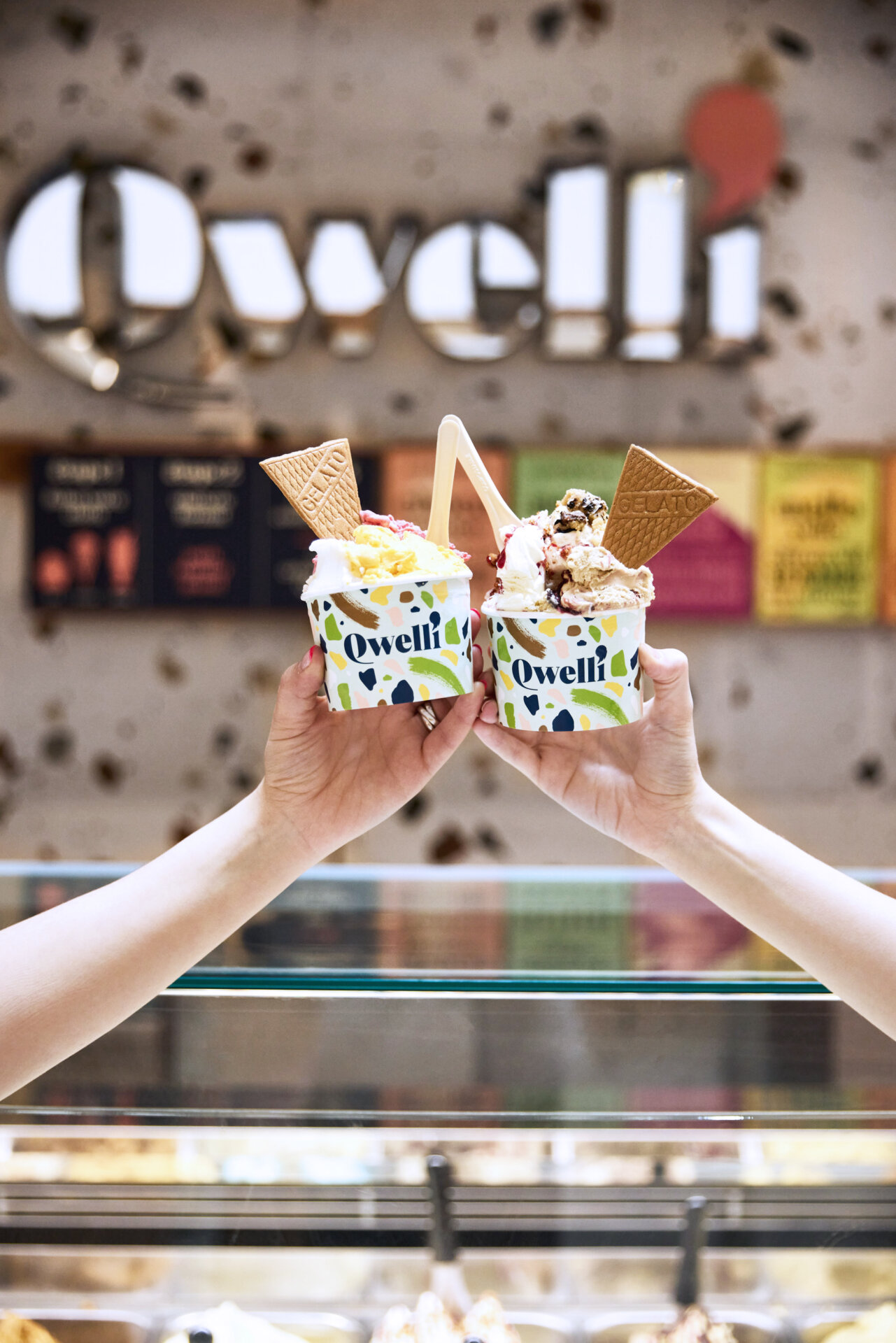
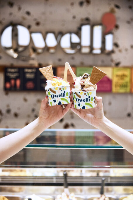
The concession is inspired by show scenes: from the mirror above the gelatos and from the fully custom-made modular bench, we watch the show of ice cream makers. The terrazzo tiles on the wall are reminiscent of the different flavors of the ice creams on offer.
The logo acts as an object in itself: surrounded by deep blue letter-boxes, it takes volume and radiance coming from the mirror inside them. It reflects the shopping mall life and thus creates a link with it.
A mural at the back of the concession sets the tone for Qwelli's new communication: direct reference of the Montreal famous murales.
By its materiality and its volumes, we wanted to reflect all the generosity of the Qwelli brand!
Collaboration
Architect : Humà Design + Architecture


