



Share to
Prakrishi
By : Vishal Vora/ Sol Benito
GRANDS PRIX DU DESIGN – 15th edition
Discipline : Communication & Branding
Categories : Communication Design / Packaging : Bronze Certification
Categories : Communication Design / Illustration : Silver Certification
Prakrishi Honey
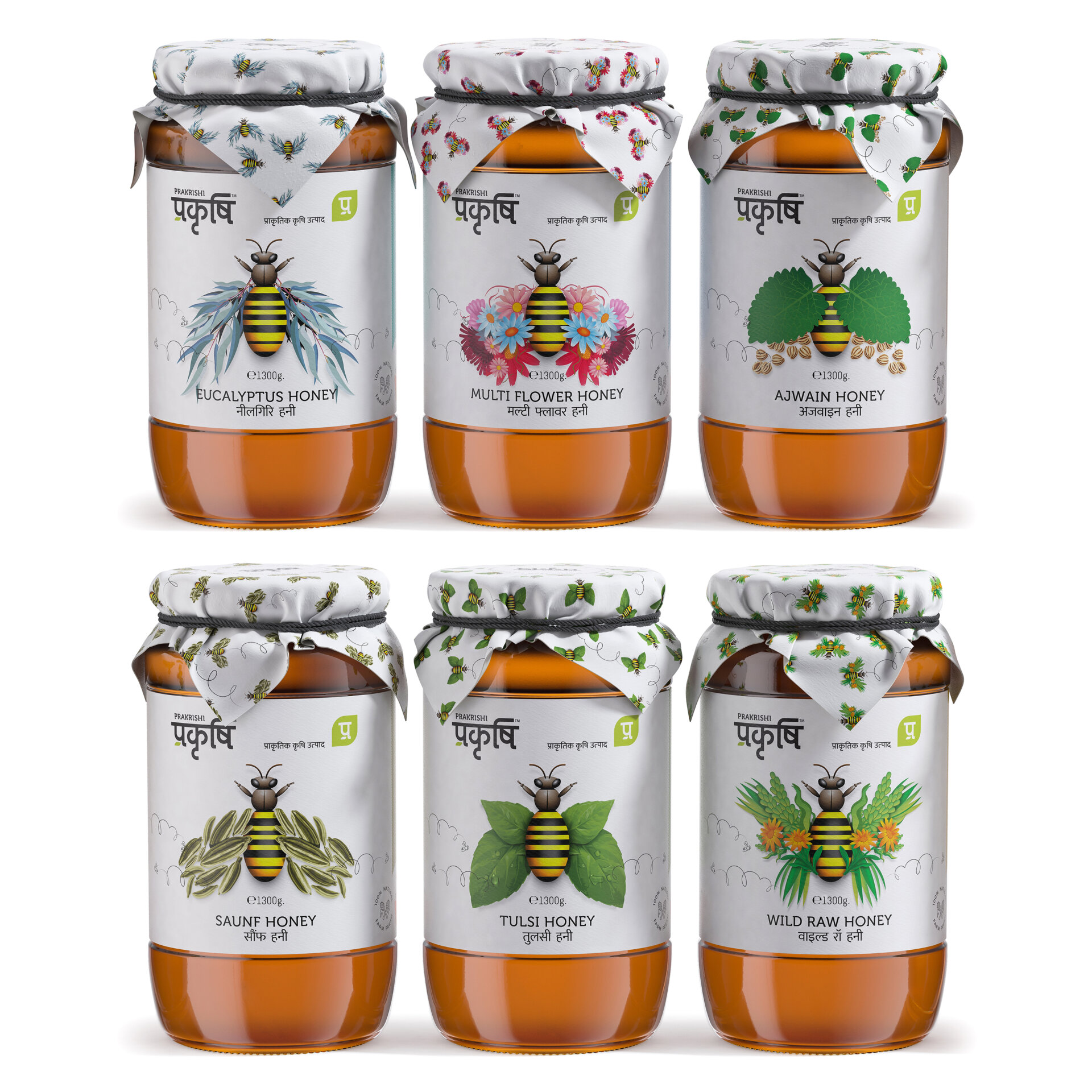
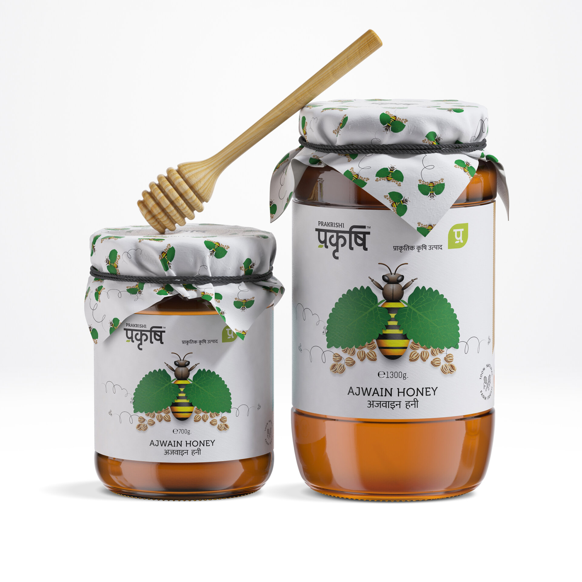
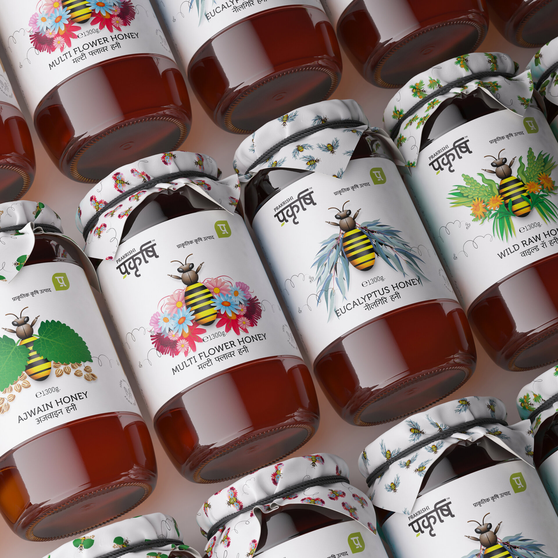
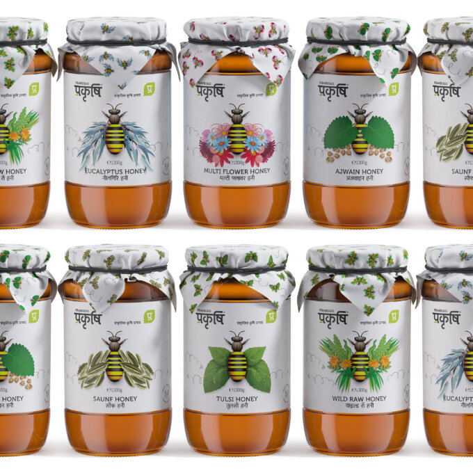
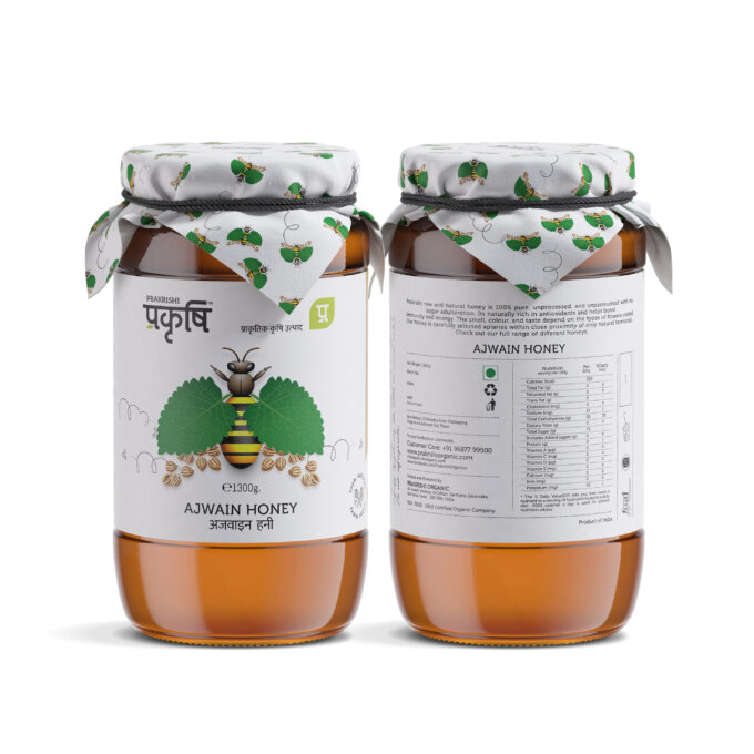
A product extension for the mother brand Prakrishi – which has several other segments under it – this range of 6 distinct flavored honey faced a challenge to maintain the fine balance. on one hand, it should have a distinguished identity as product segment but without being too away from the flagship brand's visual grammar.
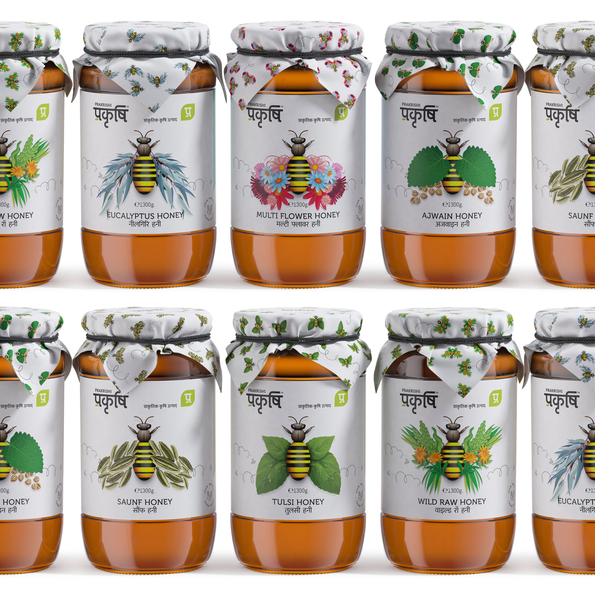
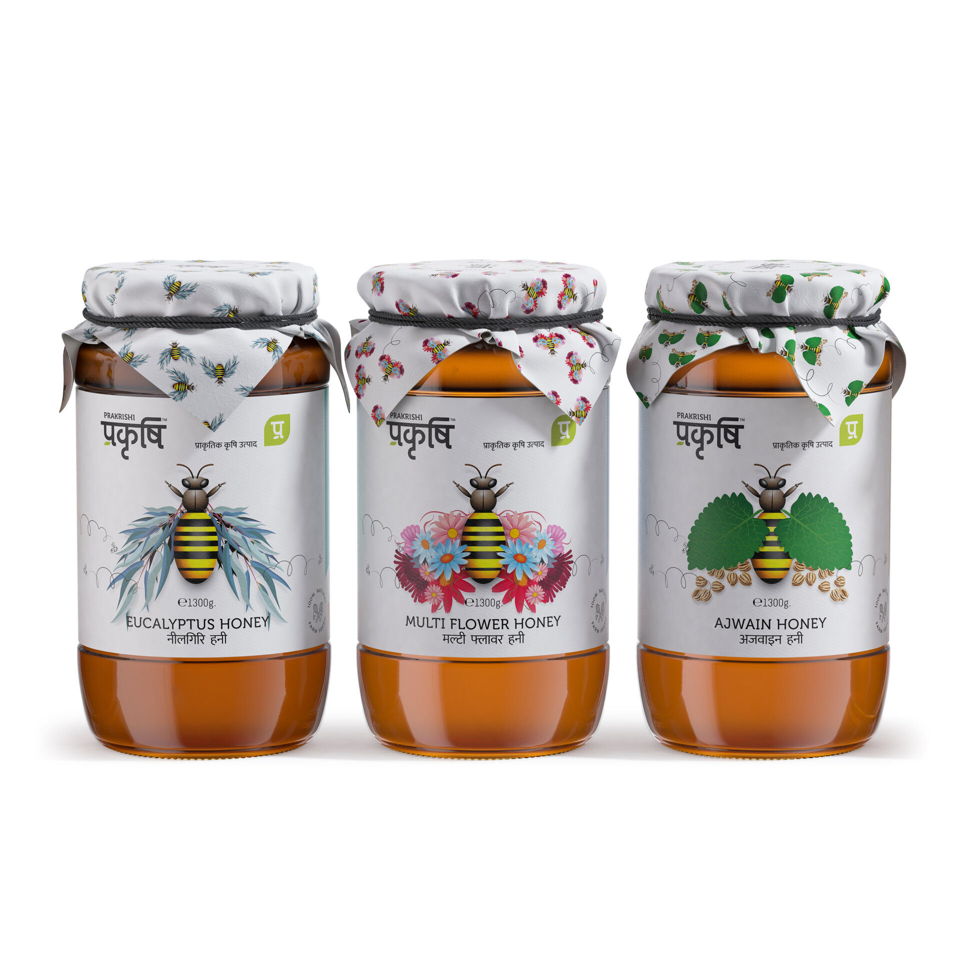
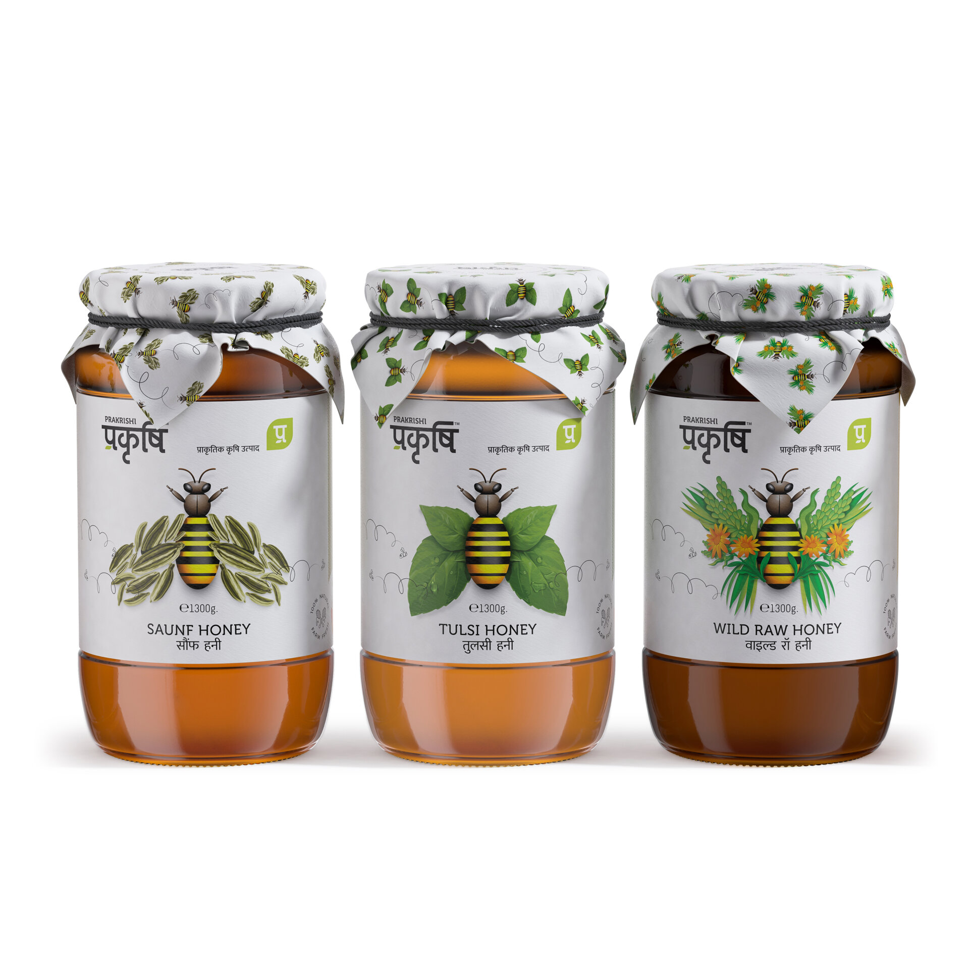
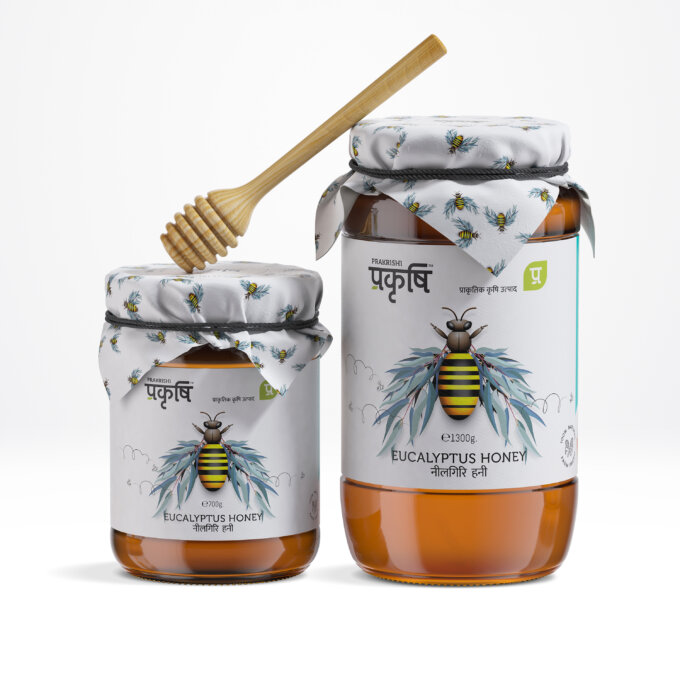
Hence, the transliteration of bee wings into an aesthetic manner as a visual device that not just creates an eye-catching graphic but also delivers sufficient visual information to the consumer to make an informed decision at the shelf.
As we can see, the design parameters of the flagship brand have lots of white space and minimal approach to it. so we carried forward the same principles and used only the necessary part of the graphic to convey the whole story without moving away from the packaging and design guidelines.
what makes it more interesting is the fact that the motif of a bee is turned into an interesting, engaging and informative visual that is quite different from the usual lot where we see the insect in its so-called natural (and well, a boring) avatar. But here, the same bee turns into a heart-warming messenger!
Collaboration


