

Share to
Kiosque Canard Goulu
By : STGM Design
GRANDS PRIX DU DESIGN – 15th edition
Discipline : Interior Design
Categories : Commercial Space / Booth & Exhibition Space : Gold Certification
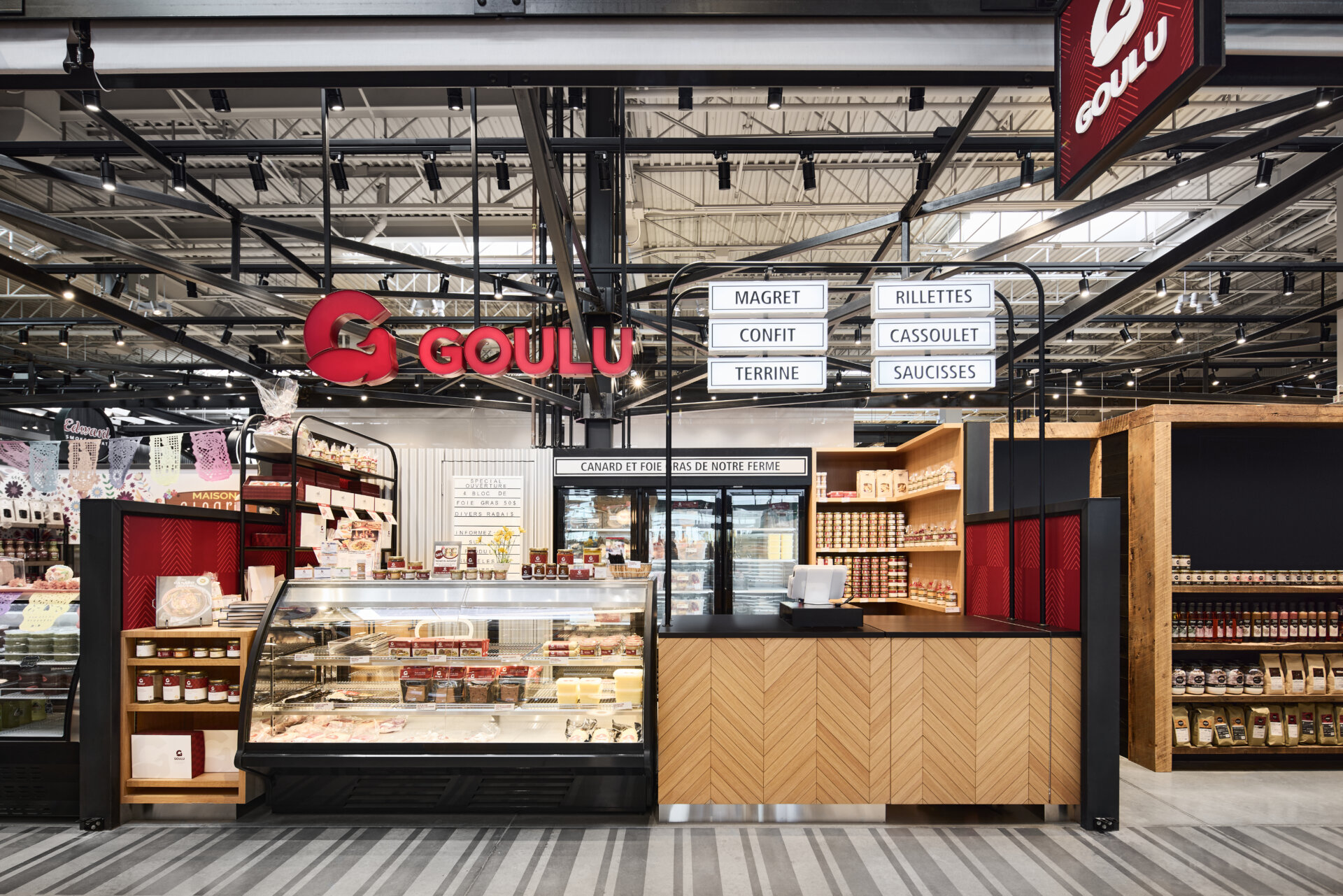
Canard Goulu is a local company that respects the environment and promotes responsible agriculture. As the client owns three agricultural farms, it was important to recreate this aspect of natural simplicity.
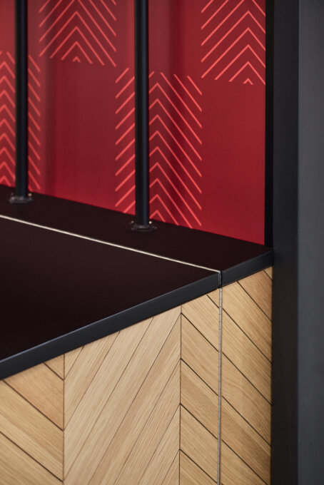
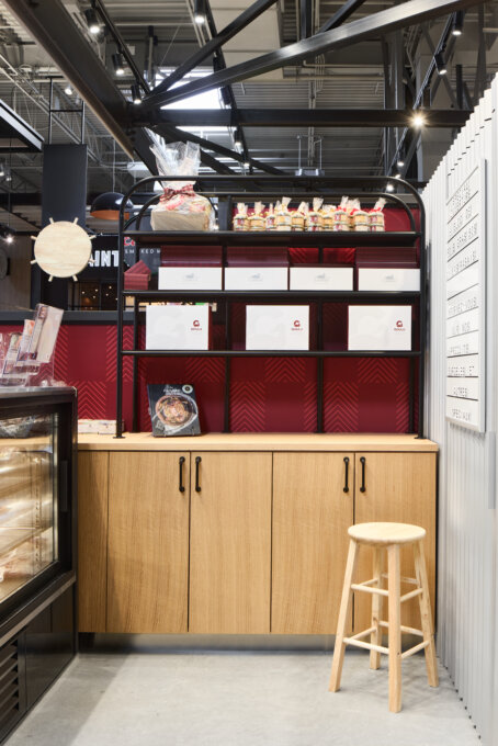
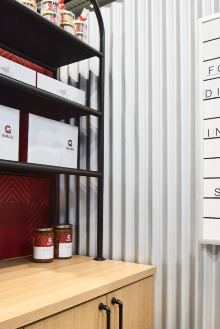
The mandate was to create a kiosk that would fit with the product's brand image. Thus, blond wood, reminiscent of wheat fields, was selected as the main material. The grooved treatment of the kiosk's facade is also a tribute to the lines created by the irrigation systems in the fields, in addition to sticking to the brand's graphic patterns found on the packaging of the various products.
In the same manner, a custom red wallpaper inspired by this same signature creates a nice contrast with the blond wood. The use of corrugated and curved steel is reminiscent of the raw materials often found on farms. The simplicity of the display reflects the authenticity of the products.
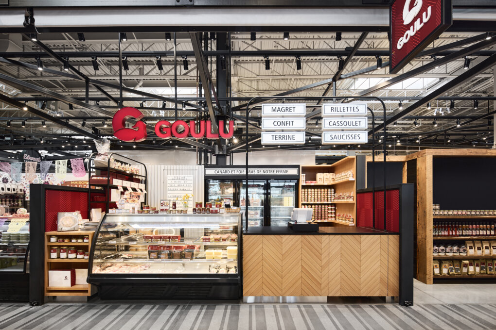
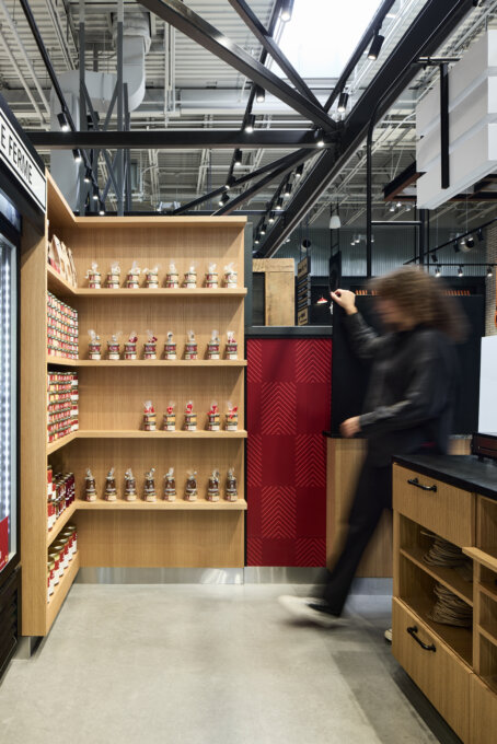
Considering the limited space, the project also aimed to make the space's functionality more profitable. Since the kiosk is barely 15m2, we had to think carefully about the positioning of the various displays to maximize the square meters and ensure complete visibility of the products in all angles of the kiosk. To achieve this, an "L" shaped display was designed to catch the customers' eye, no matter which direction they were coming from. Also, the integrated furniture had to be designed in such a way as to ensure a double function, allowing the employees to accomplish their daily tasks, while making room for the display of the products offered for sale.
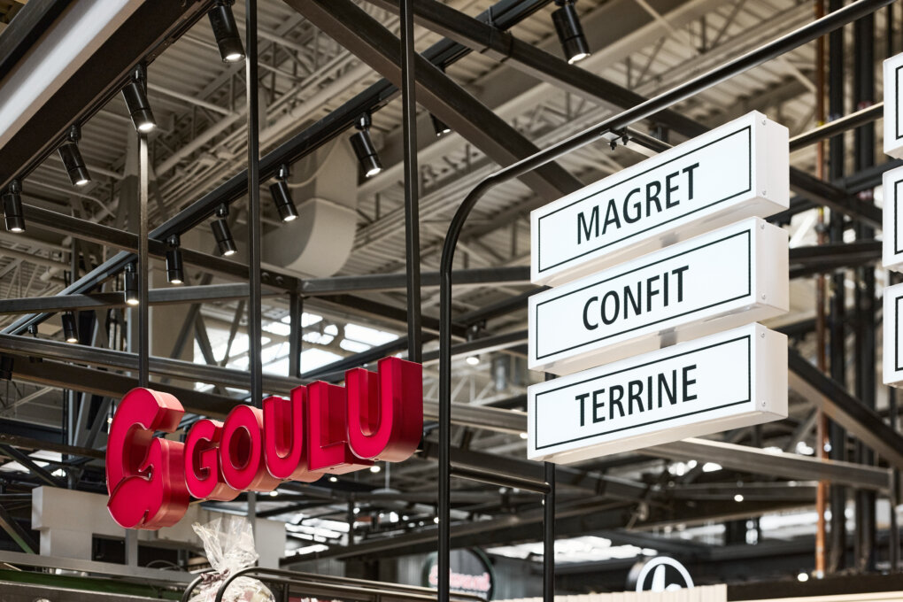
Displays at the rear of the kiosk were worked up to maximize space and allow for attractive product merchandising while reducing the possibility of shoplifting. Similarly, the low, shallow displays offer a limited amount of product accessible to the customer's hand. The design of the high displays had to consider the stability of the structure in relation to the weight of the stored items and the illuminated signs. The use of a metal structure allowed for a strong yet airy structure to lighten the space. Also, the metal pipes made it possible to conceal the wiring for the illuminated signs, for an impeccable finish.
The use of recyclable materials, such as wood and metal, was favored to be consistent with the client's philosophy of sustainable development.
Collaboration
Interior Designer : STGM Design


