


Share to
Jenga Box
By : Kris Lin International Design

GRANDS PRIX DU DESIGN – 15th edition
Discipline : Architecture
Categories : Commercial Building / Retail, Health Clinic & Small Commercial Space : Platinum Winner, Gold Certification
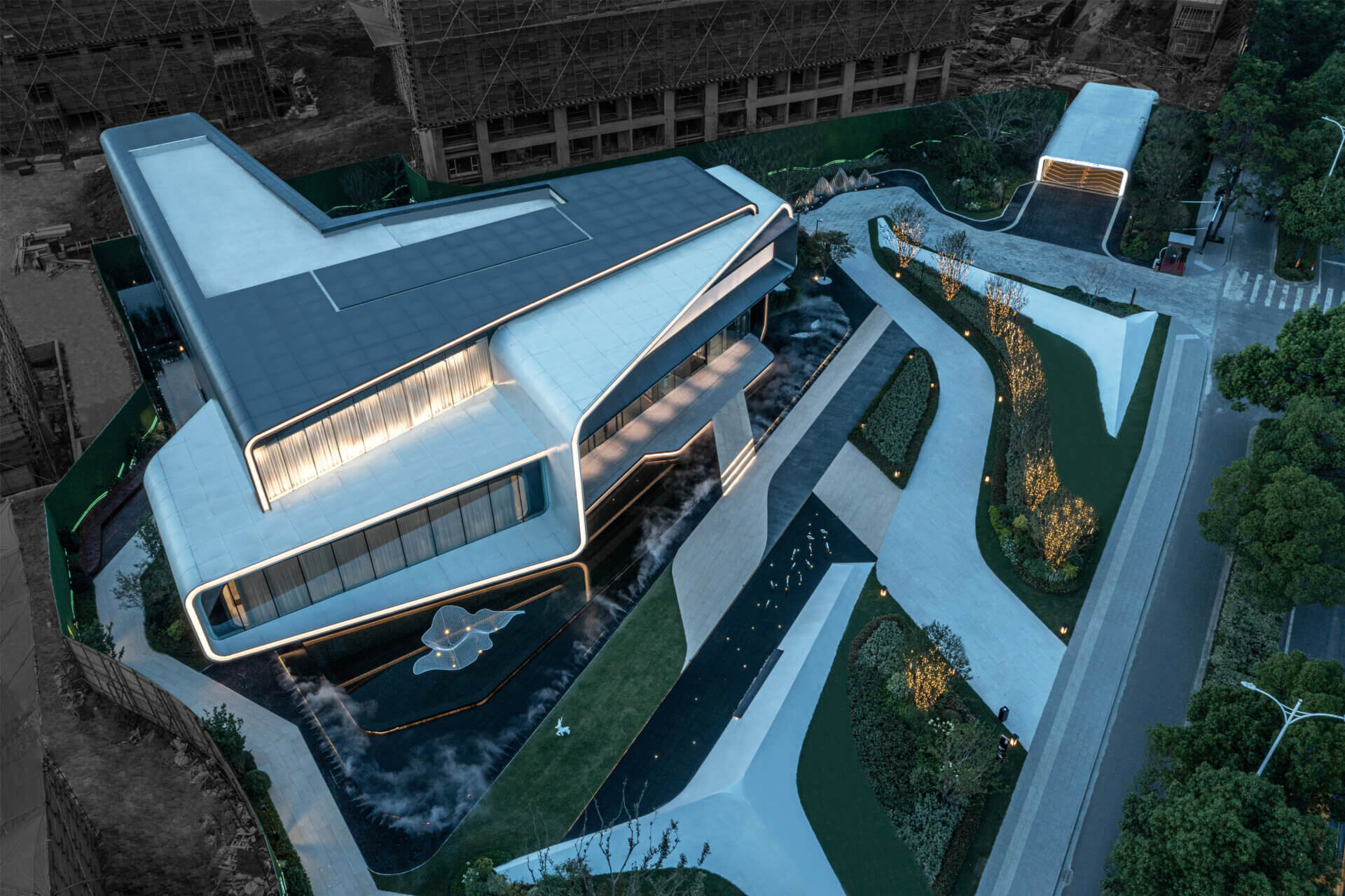
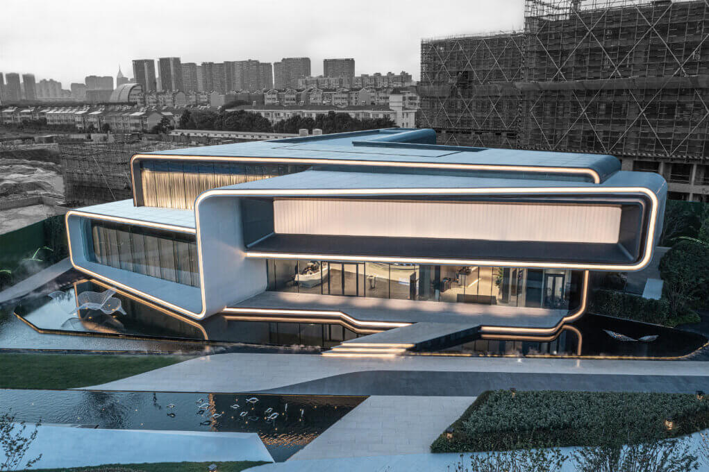
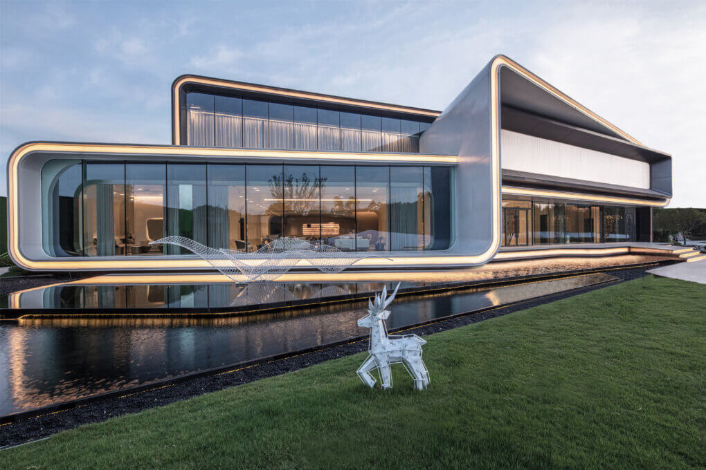
01 Volume and space
The project site is compact and particularly narrow to the north. With the site planning in mind, we opted for a design that integrates architecture, interior design, landscape and site lighting.
The space planning conforms to the topographical variations of the site, juxtaposes and combines each functional space, and forms an architectural space and functional planimetry that meets the functional requirements by taking advantage of a rational spatial organization.
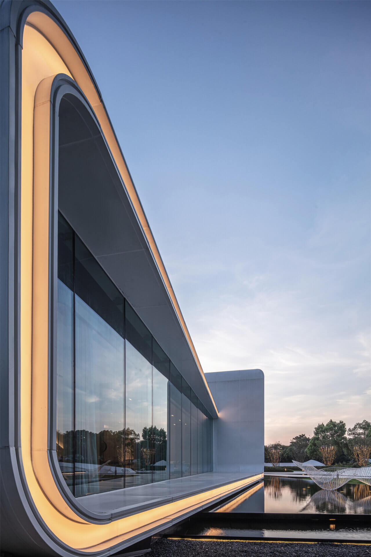
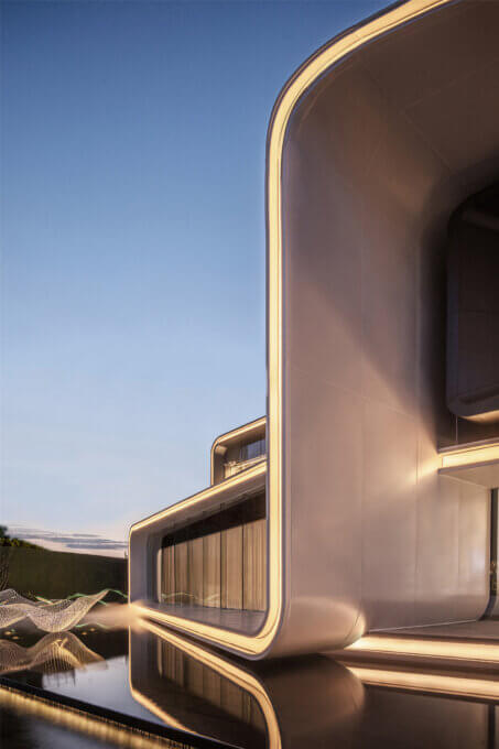
The three-dimensional configuration of the building frees the space from the will of an interpenetration and torsion of the volumes that compose this block. The interweaving of the different angles of the block creates numerous overlapping vertical and parallel lines. The choice of materials and the treatment of the interlacing make the façade of the building diffuse in the environment.
To the south of the site is the city’s main road, which provides an ideal backdrop for the architectural signature of the entire project.
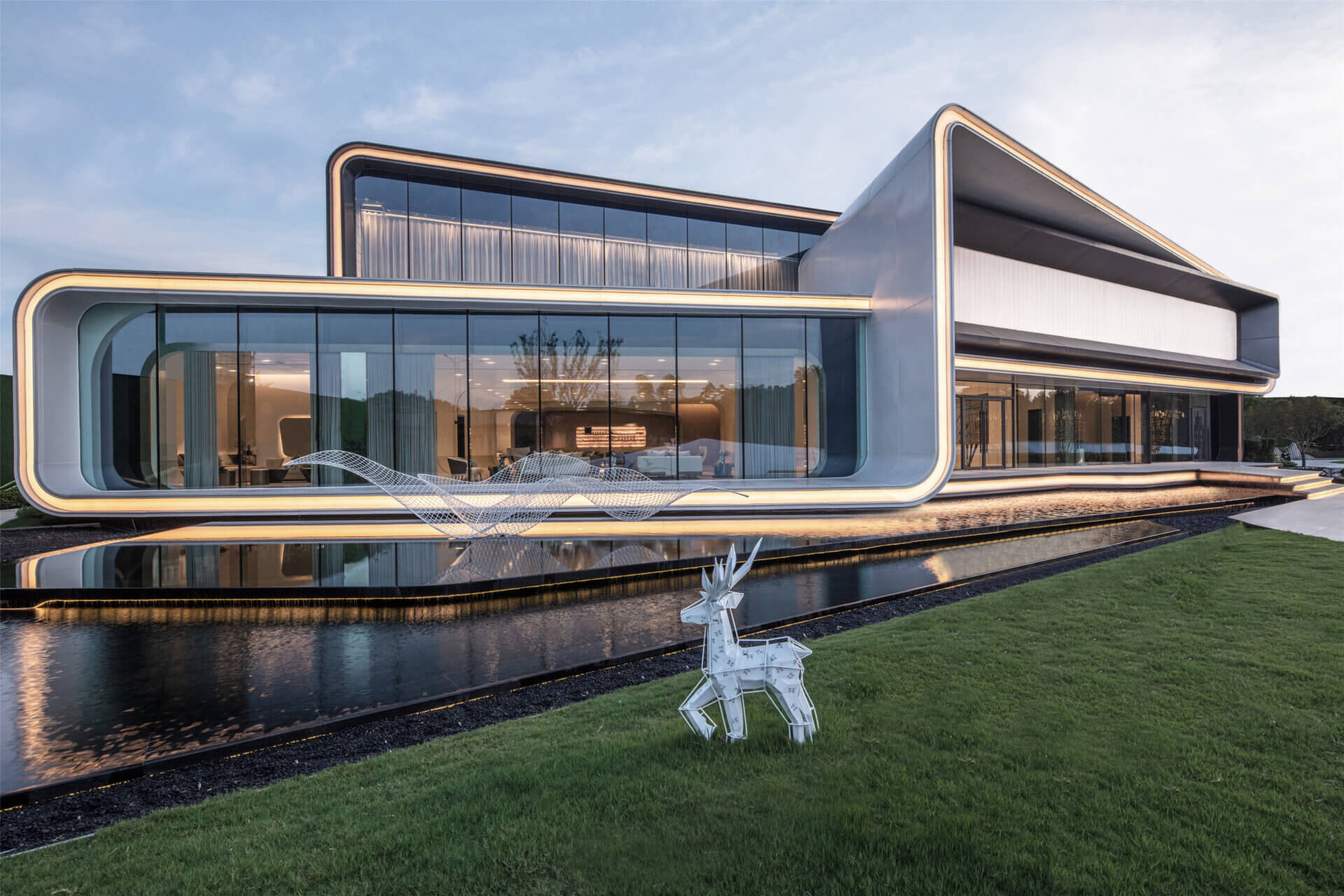
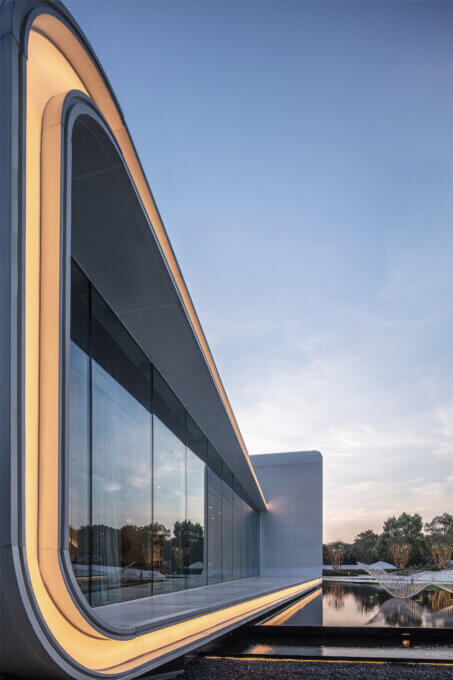
The façade along the street was designed to emphasize the commercial functions of the building, creating a transparent and blurred spatial boundary, making the visual experience that connects the interior with the exterior coherent and integrated.
Elements providing continuity were placed throughout the building’s façade – the combination of the GRC folding board and the LED light belt connect the building modules in series across the façade to reinforce the integrity and logic of the composition, forming a coherent and unified architectural image. The linguistic interweaving of the arch curve and clear glass provides a simple and smooth visual appearance.
The internal and external lights form a background that gives the architectural ensemble a storefront appearance, with an exquisite and generous resonance.
Under the background of the internal and external lights, the entire space resembles a storefront with an exquisite and opulent connotation that reflects on the city.
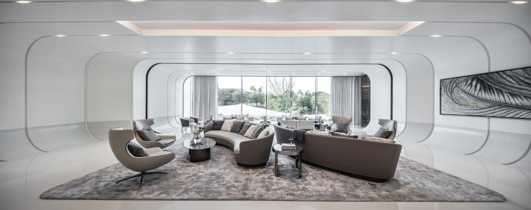
02 Unlimited views in a limited space
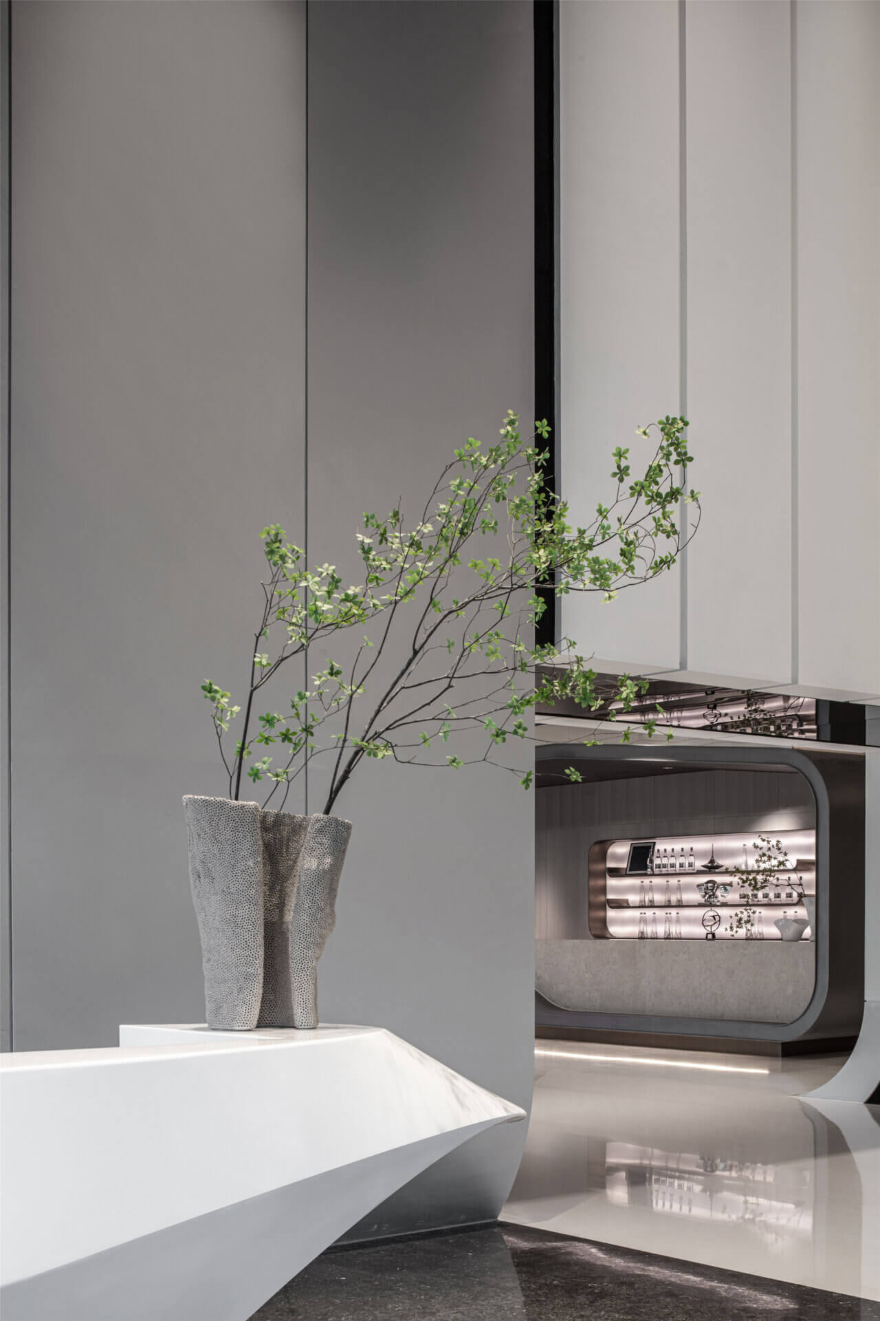
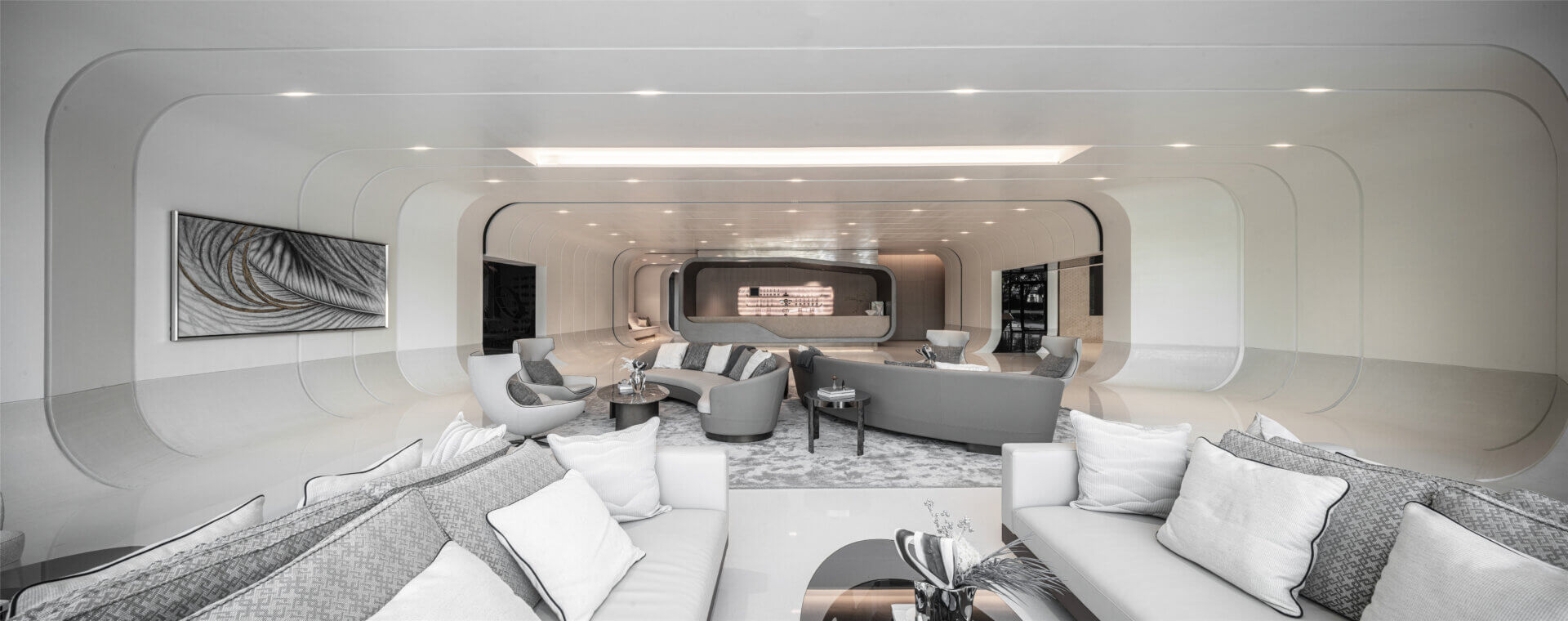
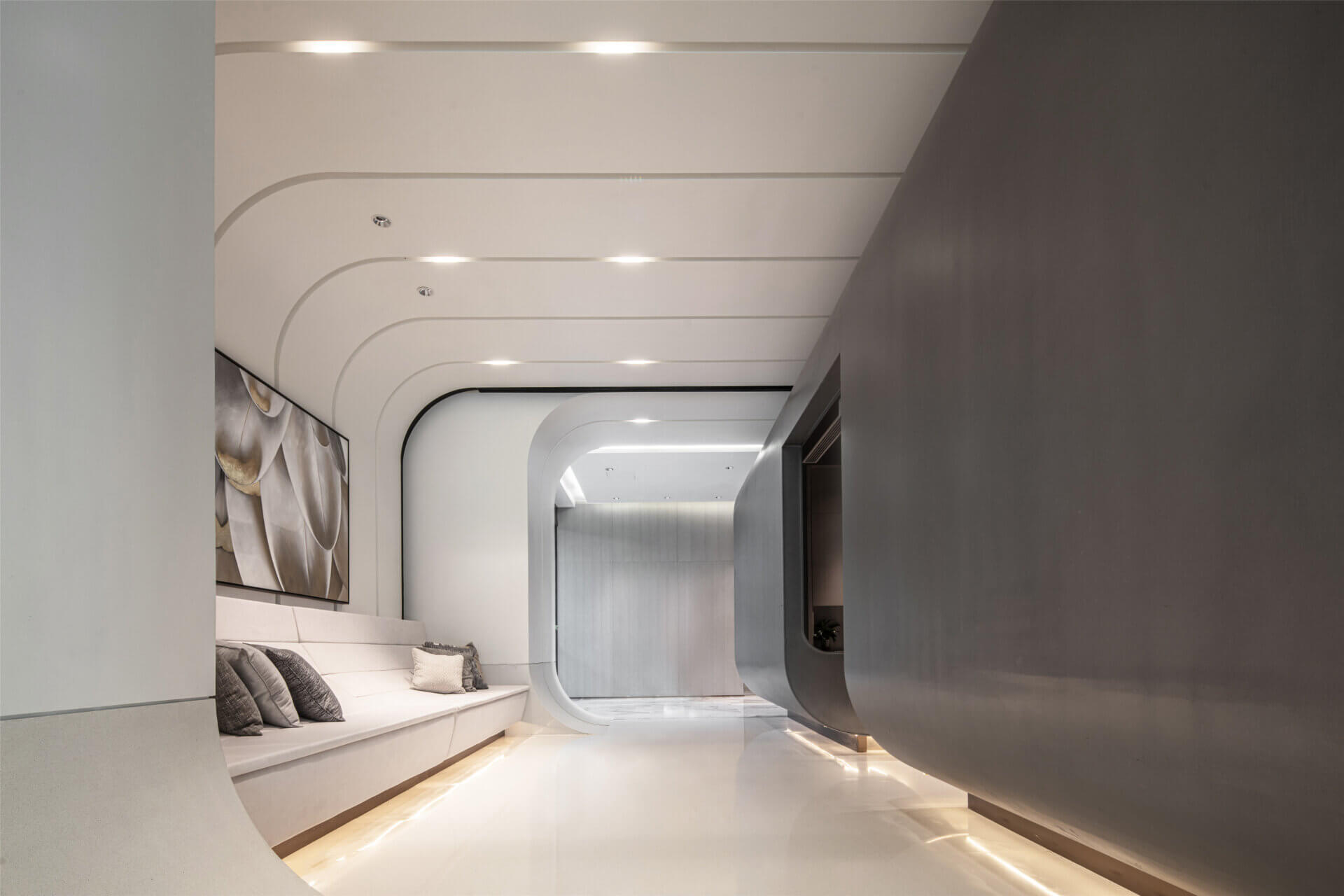
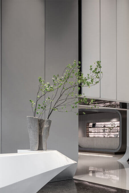
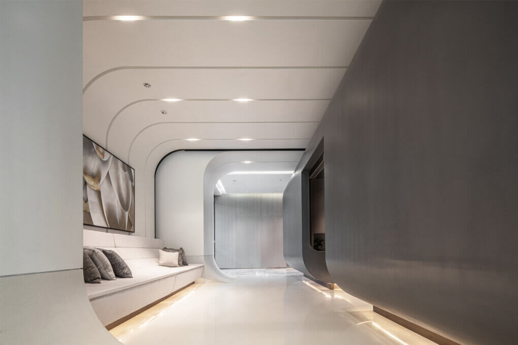
Upon entering the lobby, a wide and comfortable double-height space reveals the prologue of the space. The reception counter is made of marble to emphasize the style of the surrounding space. The vertical separation of the exterior wall reinforces the vertical height of the reception area. At the same time, the white paint used helps to give the wall a piano look, which reinforces the sense of rhythm in the composition.
The entire space creates an artistic atmosphere with an expansive and pure white tone. Through the extension of the surface and the folding of materials, the effect of partition between the internal plane, the facade and the overall structure of the space is eliminated. The layout of the grid creates a sense of order, extending the experience of visual depth in this clear, uncluttered space. Floor-to-ceiling windows allow us to see the entirety of the exterior landscape, creating an “unlimited view within a limited space” effect.
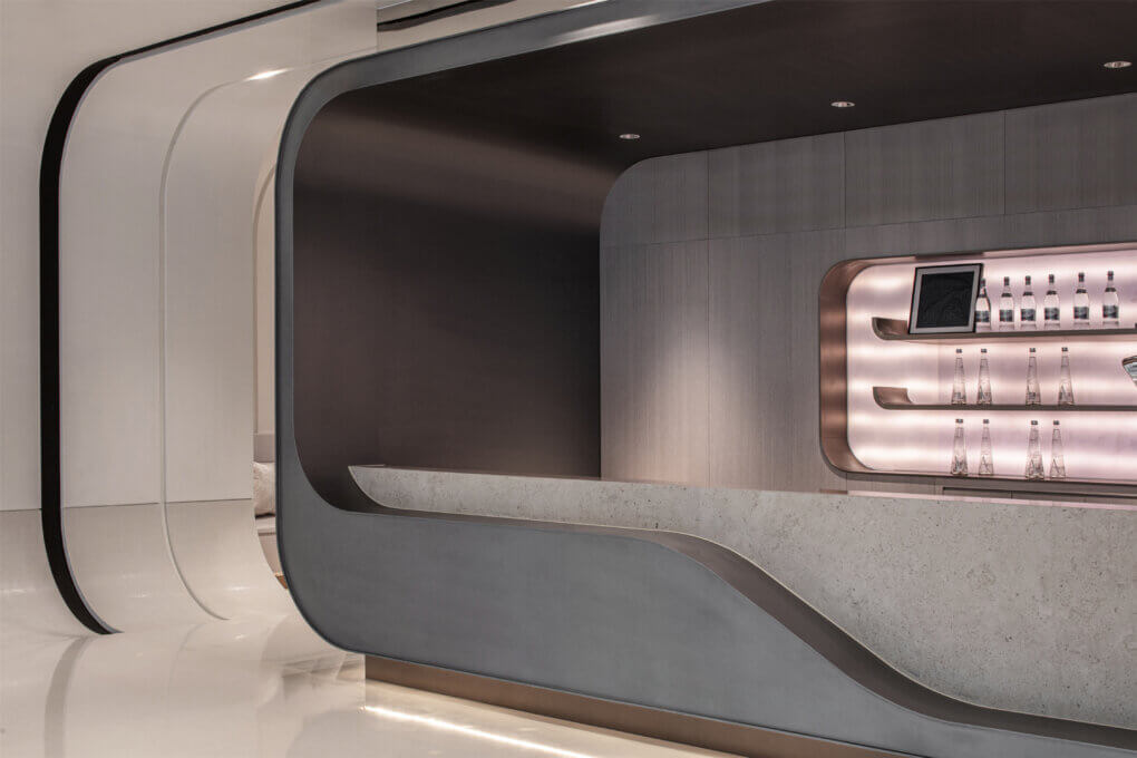
Iron-gray fluorocarbon paint, marble, mirrored stainless steel and other dark materials contrast with the pure white space to achieve a balance, creating a sense of virtual and real. The wet bar and finance room space was well served by architectural thinking that was equal to the challenge. With a judicious alternation of lines and masses, the transition between the different spaces becomes interesting and the layers diversify. The VIP room picks up on the curved silhouette of the entrance arch, multiplying the visual elements from one end to the other. The ordering of the interior hues, ranging from pure rice to gray, punctuated by brown-toned ornamentation, adds to the elegance of the space.
03 Landscape
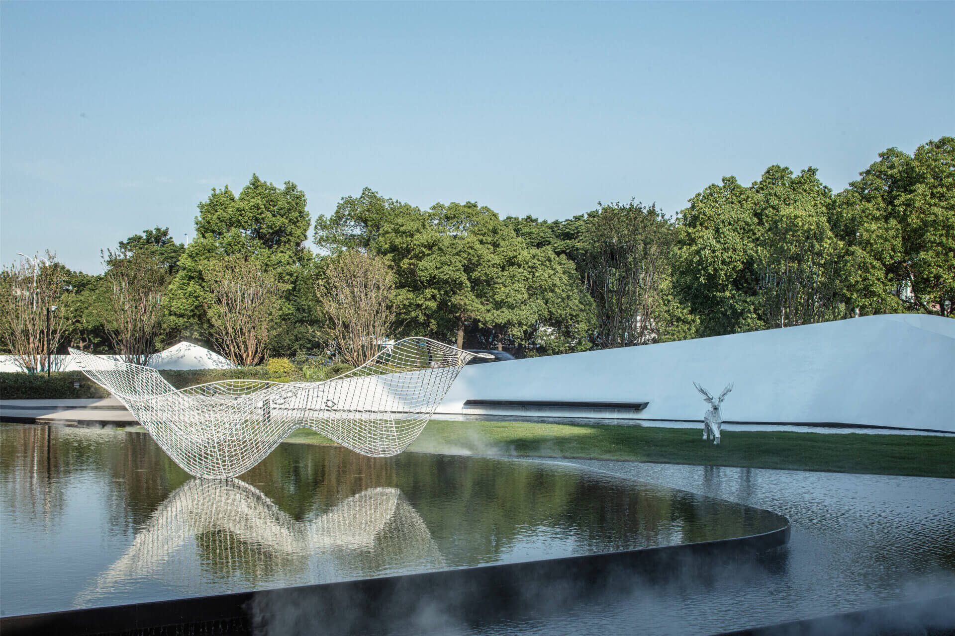
The exterior spaces were designed to be an extension of the interior design space. The water feature in front of the building acts as a mirror, as if there is another space between the building and this reflection. The undulating landscape wall generates a continuous interaction with the architectural silhouette and the spatial feeling is particularly fluid.