



Share to
italimenti – épicerie fine
By : optima design
GRANDS PRIX DU DESIGN – 15th edition
Discipline : Interior Design
Categories : Commercial Space / Grocery Store : Platinum Winner, Gold Certification
creating a space for international caliber gourmet grocery shopping in downtown montreal.
italimenti – épicerie fine is a gourmet grocery store specializing in fine italian products, located in the heart of downtown montreal. driven by their passion for food, they aim to provide an epicurean experience to all their guests by curating a selection of high end, imported and locally sourced products. no pre-packaged foods; always cut fresh and always made daily.
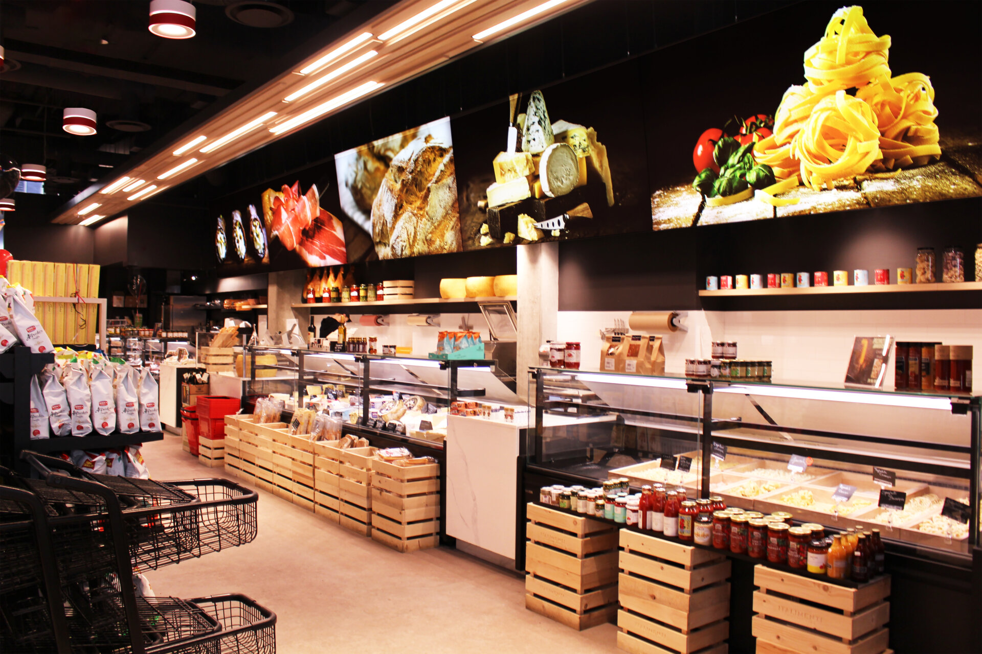
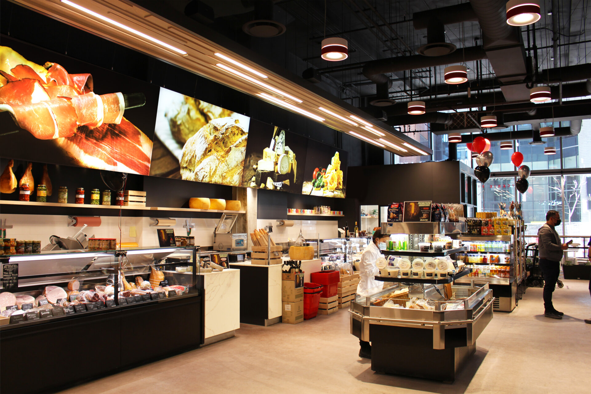
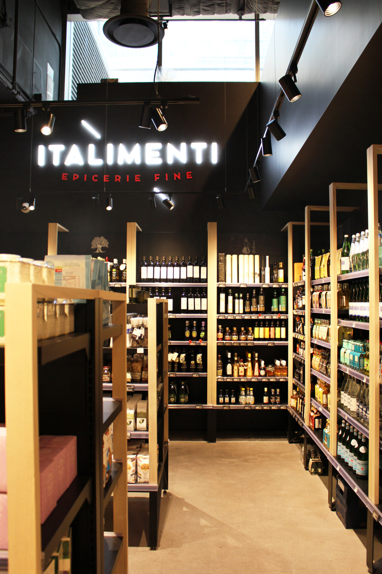
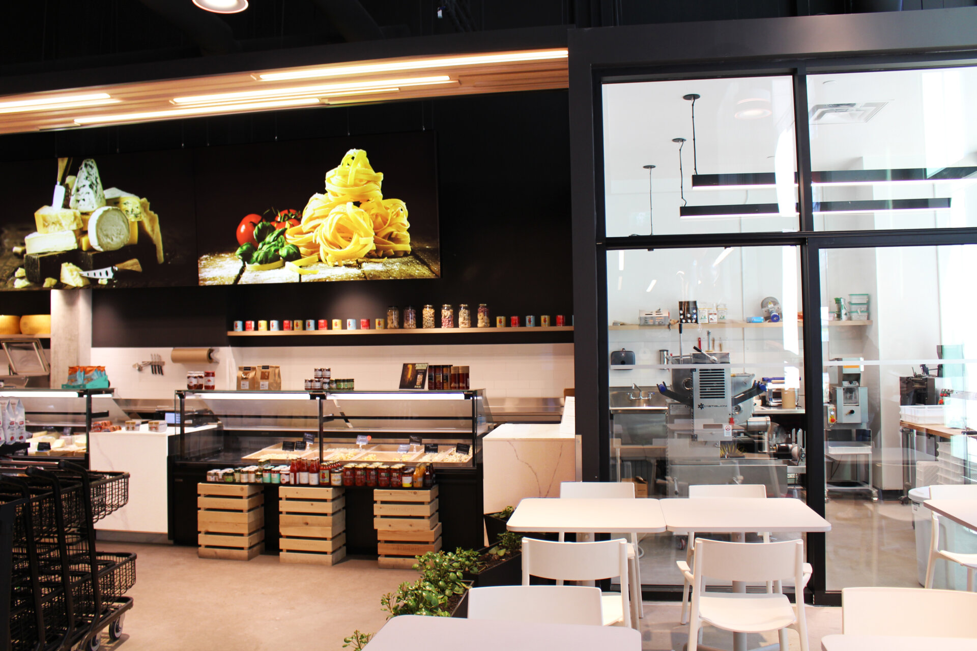
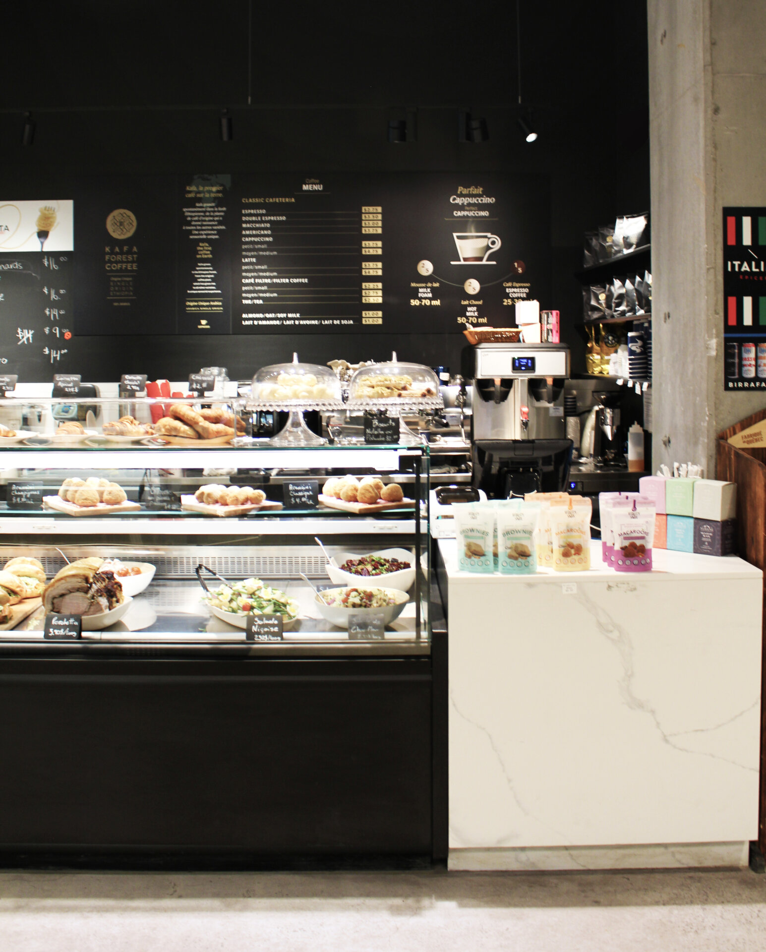
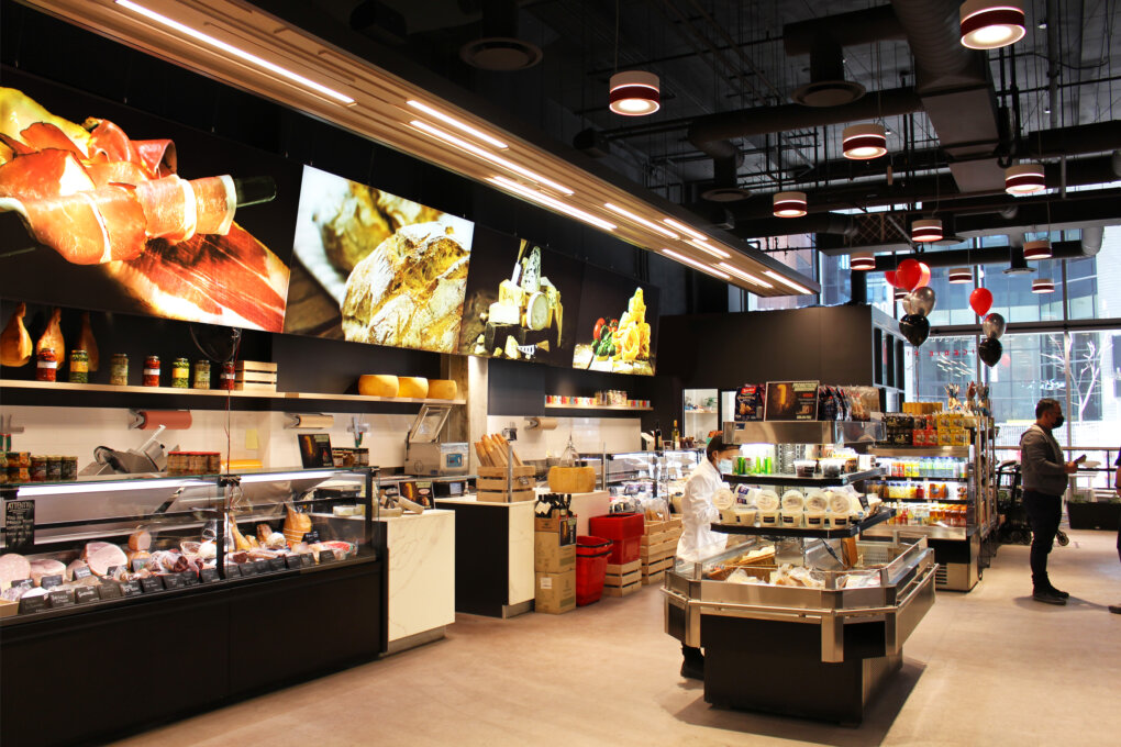
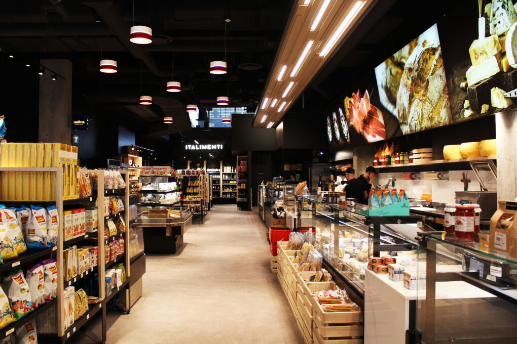
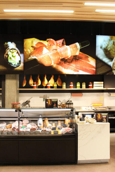
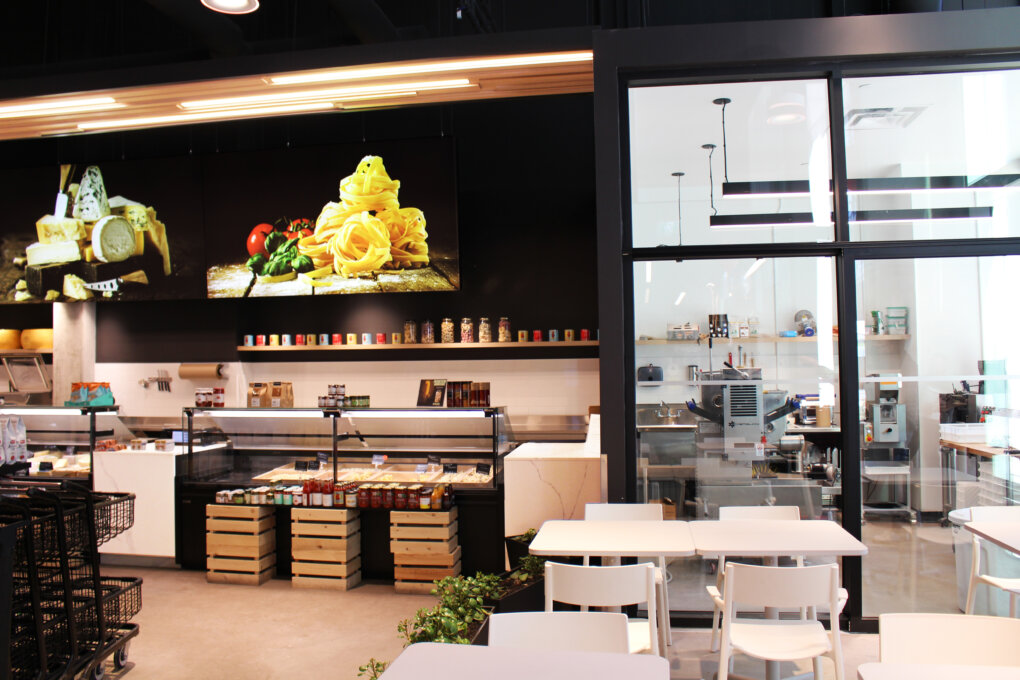
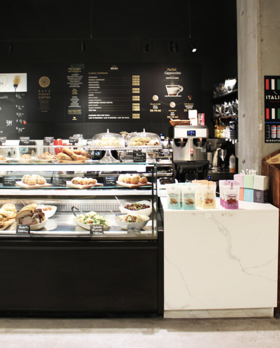
our mandate for this project was to create an elevated environment to showcase fine italian goods, making them readily available to the everyday – modern – downtown consumer. getting inspired by the different regions of italy and their distinct differences and qualities, we reflected on the basics of italian cuisine and were inspired to designate a food counter to each element, hoping to highlight the origins, quality and freshness. our main goal was to make it all about the food, and to modernize the idea of an italian market.
our design process included 4 major categories;
inspiration. when starting out this project, we turned to the roots for inspiration. researching historical italian materials and architecture, we came up on beautiful marble flooring, rich earth tones as well as repetitive pattern, all of which educed our concept.
planning. when diving into the planning phase, we sketched through multiple layout options with one main goal in mind: to showcase the freshness and quality of the food, all the while being convenient for a quick grocery run.
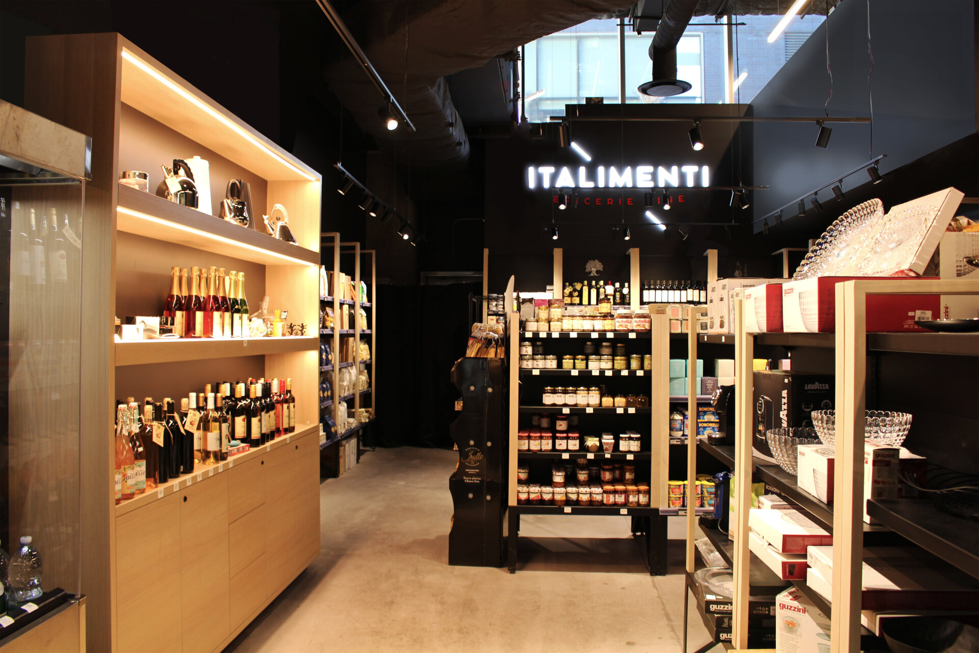
millwork. creating custom millwork pieces for this project was an essential factor in attaining the targeted market. our goal was the elevate the typical wall panel racking systems to prioritize functionality while keeping a cleaner look. incorporating lighting into our display systems was also a top priority to showcase products.
three dimensional planning. working through many phases of conceptual, three-dimensional planning, we were determined to create an immersive environment using custom lighting, color, pattern and merchandizing to attain the end goal; a modern italian market.
we used 4 main design elements to bring our concept to life:
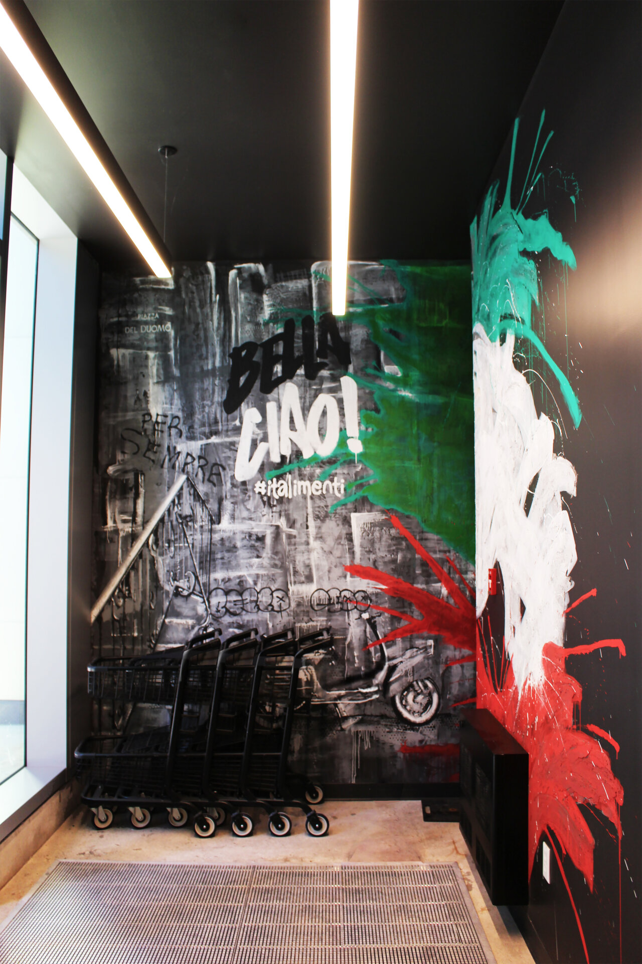
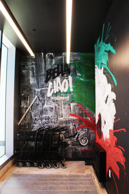
pattern: wanting to create a distinct image for our client, we developed¬ a pattern inspired by italian art, unique to them, that is not only used throughout the space, but is also incorporated and used for their branding.
lighting: we turned to lighting as our main resource to make the space feel modern and high end. steering away from typical high bays, we used fixtures tactfully to not only highlight the products but to also make the space feel more dramatic. these innovated fixtures also adjust to the natural light in the space to constantly maintain flattering lighting.
colour: we chose to go with a darker palette of colors to create a more intimate experience for the clients as well as to direct and draw the guests’ eyes straight to the product.
merchandizing: guiding the clients on how to stock up their shelves , display their fresh food and organize their inventory was essential to attaining their desired consumer market while keeping the authentic but elevated italian market feel.


