


Share to
Covenant House New York
By : Entro

GRANDS PRIX DU DESIGN – 15th edition
Discipline : Communication & Branding
Categories : Environmental Design / Signage : Silver Certification
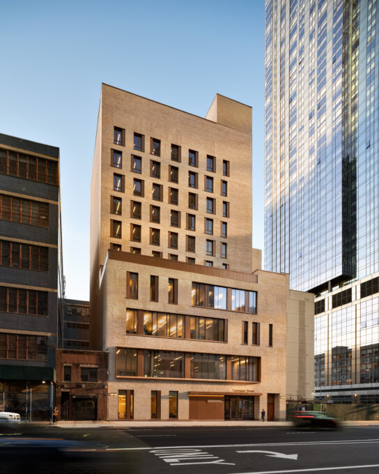
In 2021, Covenant House New York (CHNY) opened the doors of its new, purpose-built facility. The 11-storey building provides food, shelter, and healthcare services to the City’s most vulnerable homeless, runaway, and exploited youth. The space is designed to achieve the organization’s core mission to provide an open and welcoming yet safe and secure environment; to celebrate community and never forget the individual; and to function in a way that is both easy to navigate yet flexible enough to allow for change.
Entro worked closely with the client and architect to design a customized wayfinding and donor recognition program that aligns with these goals. From the outset of the project, we challenged ourselves with how our work could help to create a feeling of welcome, warmth, and respect, while looking for opportunities to connect people to the place they are in.
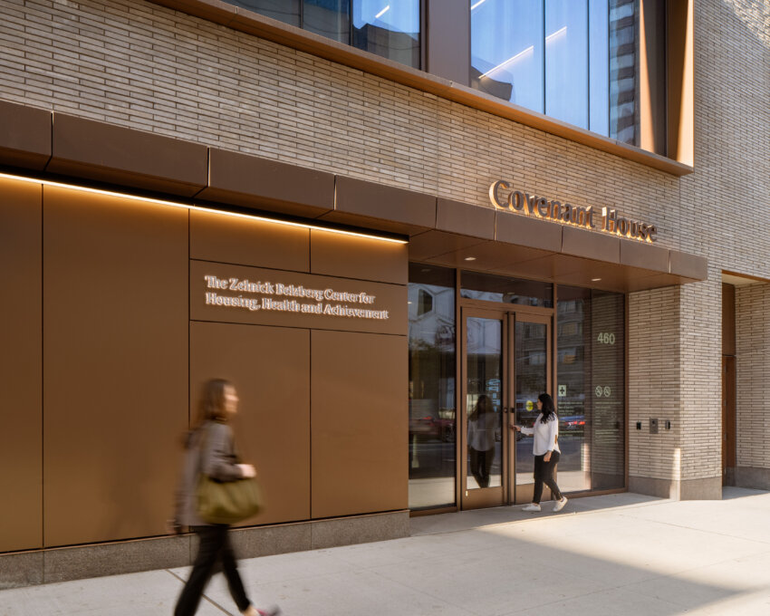
The new CHNY sits on the same site as the old building, which featured an iconic mural by Katie Yamasaki on one of the exterior walls. This mural, painted in 2011 in conjunction with 360 residents, was deeply personal to CHNY – not only was it used as a beacon to help people identify the building, the subjects depicted in the mural were the residents themselves, using their own words.
Unfortunately, the mural needed to be demolished along with the old building, but not before being thoroughly documented in photographs. These photos and the story they told served as our inspiration. The donor wall welcomes visitors to the main lobby and incorporates fragments of the mural photographs on dimensional rails, which follow the architectural pattern of the vertical wood rails of the feature staircase. The prominent location of the donor wall was a key opportunity to celebrate the distinct character of Covenant House, its values, community, and history, told through a video featured on the wall. The wall also introduces the vibrant color palette we used for the entire wayfinding and interior program.
Color forms the basis of the wayfinding strategy at Covenant House, where each hue denotes a different area of the building, not only on the signage, but throughout the interior design. These areas correspond to the services/resources that Covenant House provides, ranging from Mental and Physical Health and Wellness Services, to educational programs, art and music studios, and lounge and dining areas.
A key component of the program was fostering a sense of welcome and shelter for the residents using the space. We isolated the color blue, which we used to identify private residential areas, demarking “your” private space for youth living in the building. As an additional level of customization and nod of respect towards each resident, we designed a changeable frame system that allows each person to display their own art adjacent to their room during their time at CHNY.
Beyond residential areas, many CHNY rooms have multiple functions and require identification signs that can be easily updated. Both the upper and lower segments of room signs are removable, held in place by magnets that are easily changed by staff as required.
To welcome the diversity of youth who visit CHNY, all signage is bilingual (English/Spanish) and ADA compliant. Key amenities and services are identified with icons which follow the same color palette as the rest of the wayfinding, allowing for visual comprehension beyond the two languages.
Collaboration


