B-1104x680.jpg)
 B-1104x680.jpg)
-1106x680.jpg)
-1020x680.jpg)
-997x680.jpg)
-907x680.jpg)
-453x680.jpg)
-1020x680.jpg)
-1020x680.jpg)
-453x680.jpg)
-1020x680.jpg)
-453x680.jpg)
-453x680.jpg)
-904x680.jpg)

Share to
Cannoe
By : Williamson Williamson

GRANDS PRIX DU DESIGN – 15th edition
Discipline : Interior Design
Categories : Commercial Space / Commercial Space ≤ 1,600 sq.ft. (≤ 150 sq.m.) : Gold Certification
Categories : Special Awards / Interior Design + Colour : Gold Certification
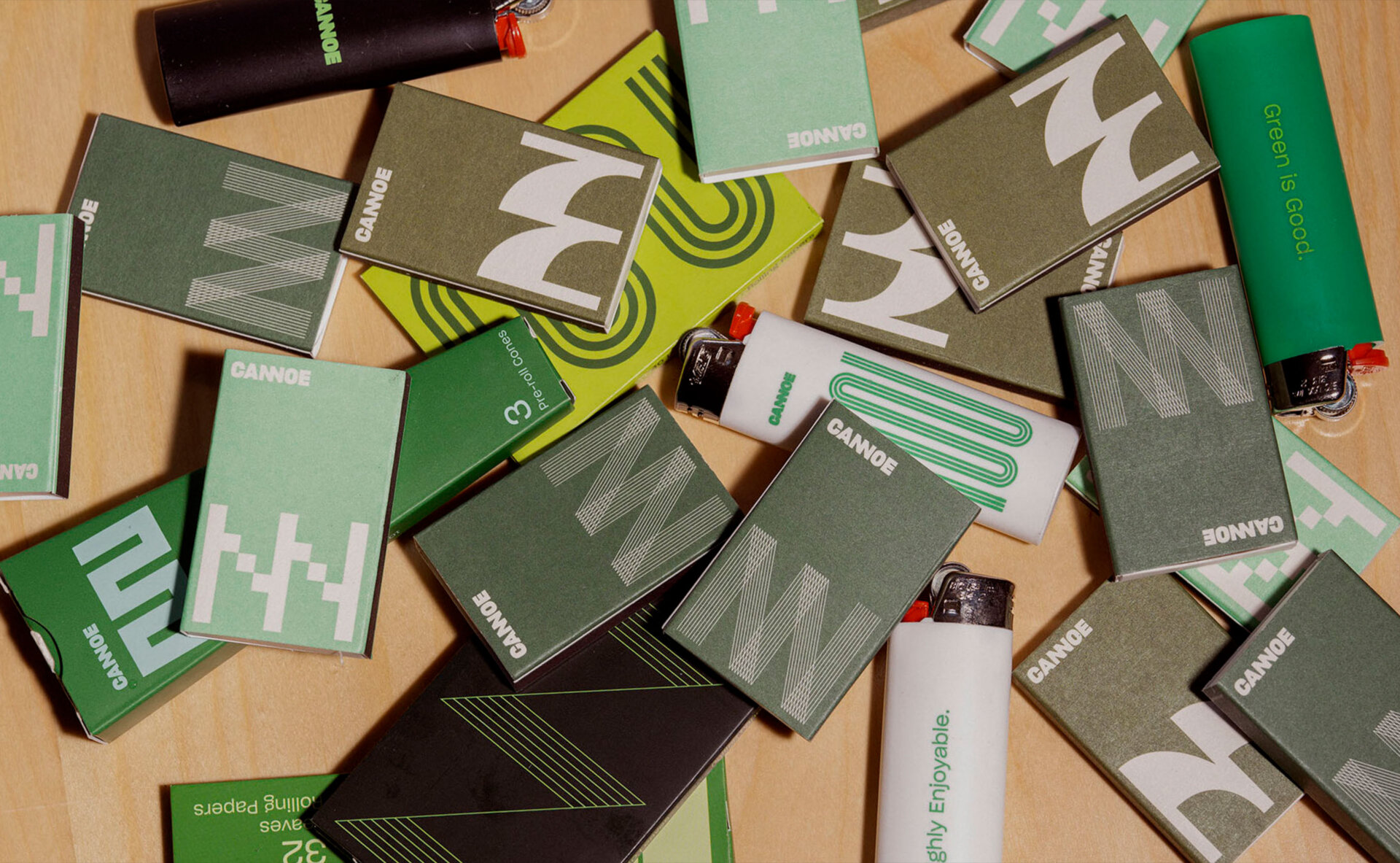
If it’s a shade of green, it’s a go. A suite of three flagship stores, opened concurrently, define the flexibility of a cannabis brand to create a new type of branded environment; Not a retail store, not a bar, but something in between.
Anticipating the deployment of Cannoe across a city and ultimately across Ontario, we understood that to fit in, we had to be different – and to us that meant consistently contextual. As opposed to designing a prototypical store and creating a generic experience independent from location, each Cannoe store reflects its neighbourhood through a unique palette, anchored by the colour green, while keeping consistent the detailing and functions of the ‘bud bar’ to provide continuity.
The spaces and brand put design first, developing memorable shops that will become your local ‘neighbourhood’ store.
The branding design, done with a specialty office, created a mutable logo from the connected ligature of the NNs. As long as the NNs are connected, any font will work. Likewise, an open colour palette of literally any shade of green further shows the flexibility to create unique design moments. Green equals freshness in the cannabis industry and a combination of shades allows the palette to slightly shift while still being consistent.
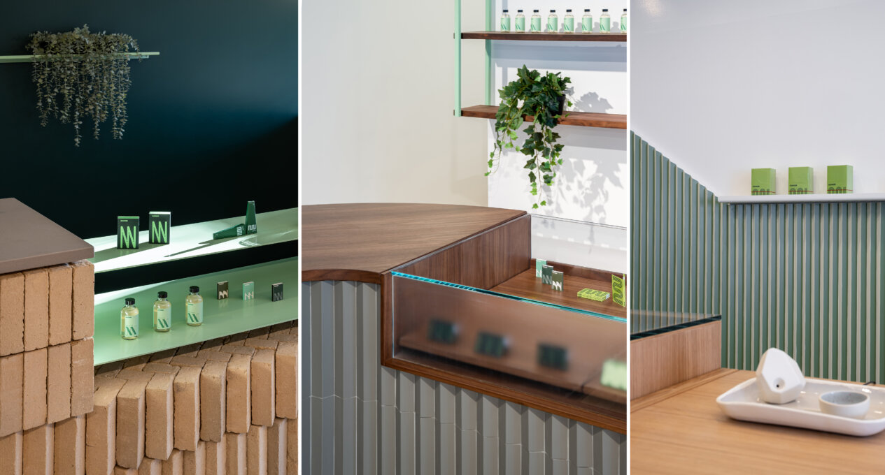
Each retail store, including two in downtown Toronto and one in Collingwood, Ontario, has a material palette customized for its location.
On Queen Street East, a buff brick bar nods to the neighbourhood Victorian houses. The modular size and sand-molded solid body allows the stacking and twisting bricks to cantilever and create shapes – creating a curved seating area at the end of the bar and the stepping and herringbone details at the linear areas of the counter. The brick is contrasted against a deep forest green wall with light green powder coated shelving. The colour provides the power and the drama for the space as well as the delicate details.
Joining the trendy retail landscape of Queen Street West is a light filled space defined by green ladder shelving with etched glass panes – taking advantage of windows on two sides of the corner building. The clean, open and modern store is ringed with light green self-structural shelving ladders that are hung form the ceiling and pinned to the floor, enhancing their slender profiles. The bud bar is clad in sage green tiles and radiused between two long display counters. A walnut counter adds richness to the palette and creates a set of datum lines throughout the space.
Cannoe Collingwood tells the story of the transition from summer to winter on the Niagara Escarpment. Corrugated millwork panels are painted green on the entry face, representing the green summer slopes popular with cyclists. The hill culminates in a supergraphic NNs milled out of the same material. The opposite sides are white, creating a ski slope landscape that is punctuated by thin shelving. Between, a white oak ‘bud bar’ welcomes customers to engage with the products and staff.
Collaboration
 B-1920x1182.jpg)

 B-1920x1182.jpg)
-1920x1180.jpg)
-1920x1280.jpg)
-1920x1310.jpg)
-1920x1439.jpg)
-1280x1920.jpg)
-1920x1280.jpg)
-1920x1280.jpg)
-1280x1920.jpg)
-1920x1280.jpg)
-1280x1920.jpg)
-1280x1920.jpg)
-1920x1444.jpg)