

Share to
Boutique Quilicot
By : DKA Architectes
GRANDS PRIX DU DESIGN – 16th edition
Discipline : Interior Design
Categories : Commercial Space / Commercial Space > 5,400 sq.ft. (> 500 sq.m.) : Platinum Winner
Categories : Special Awards / Interior Design + Lighting : Platinum Winner
With 7 stores located across Quebec, Bicycles Quilicot is a century-old company specialized in cycling. Driven by their love for the sport, they aim to offer comprehensive services to a wide range of customers: advice, sales, maintenance, tuning, storage, travel case rentals, e-bike testing, mobile workshop and positioning.
The mandate was to create a flagship store to democratize cycling in its various forms, allowing flexibility and adaptability, integrating the latest digital technologies, and offering the wide variety of a department store while maintaining the characteristics of a neighborhood bike-shop.
The store is composed of a reception, a workshop, meeting spaces and various sales areas which are articulated seamlessly around the main floor area. The mezzanine area is reserved for the members of the Quilicot team, providing an overview of the store.
The concept was developed around various elements and experiences of a typical bike ride:
Crossing a passage: The entrance, within the mall, appears in the form of an intriguing tunnel, from which it is possible to perceive the reception and the sales area. To its left, the bike workshop is hidden behind tinted glass. This tunnel serves as an entrance to the spectacular universe of cycling.
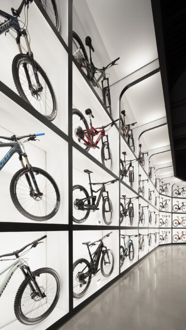
Riding in a peloton: The bike-wall is the core element of the shop, highlighting 48 bicycles accentuated by backlighting. This feature is unique and offers a major visual impact that can be perceived from the Highway 15.
Taking the lead: The bike test circuit, located between the bike display and the perforated steel shelfs of sporting goods, offers the opportunity to try and experiment with the products.
Climbing the mountain: The raised stalls help showcase the bikes and make them accessible to consumers.
Taking a break in the city: The waiting area allows you to sit on armchairs or bar stools, have a coffee, meet people or simply gaze at the shop.
With the desire to make the space a flagship store, we focused on creating singular pieces. The design of a grid lighting system is unique. The lighting created from scratch highlights the bicycles inside light boxes as well as the shop, like an exhibition room.
For this project, the creation of custom woodwork was essential to meet the client\’s needs for modular displays and functional storage. The use of blond wood and black pre-painted perforated steel was carefully selected to reflect the accessible character of the brand. The black color, predominant in the space, soothes the stimulating environment, while emphasizing the products on display. The simplicity of the orange-colored signage reflects Quilicot\’s branding.
Collaboration
Lighting : Richporter Lighting


