


Share to
Alchimiste Microbrasserie
By : Agence Minimal
GRANDS PRIX DU DESIGN – 15th edition
Discipline : Communication & Branding
Categories : Brand Design / Brand Identity Creation and Update : Silver Certification
Maintaining a place of choice in the ever-changing Quebec brewery market and rediscovering a strong link with the consumer: these were the two goals of the Alchimiste Microbrasserie.
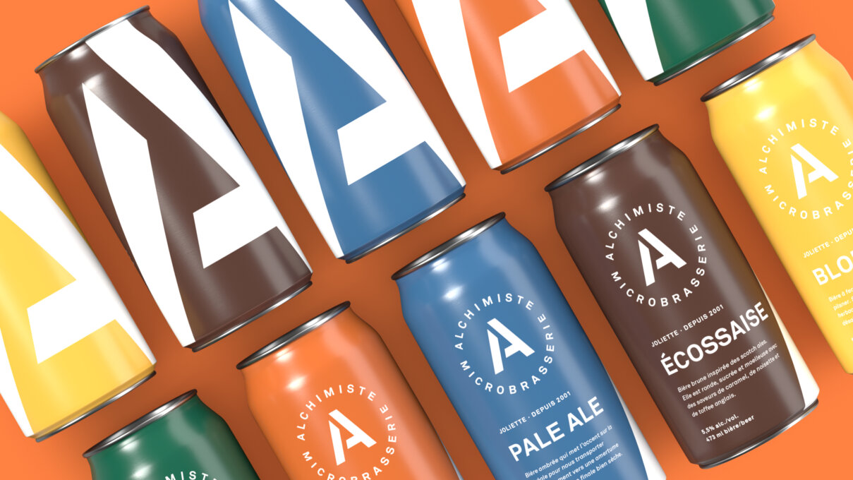
The brand dates back to a certain time when the packaging of micro beers was more or less in the forefront. The trend having evolved towards a strong "pack appeal", it was becoming more and more obvious that the Alchimiste was being downgraded to a shelf stable.
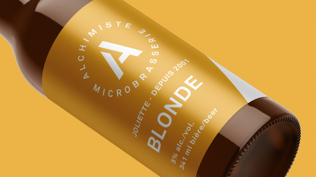
The idea was therefore to create an image that would mark a turn towards modernity and refinement while evoking simplicity and proximity. An evolution that marks a change, while maintaining the roots of the brand.
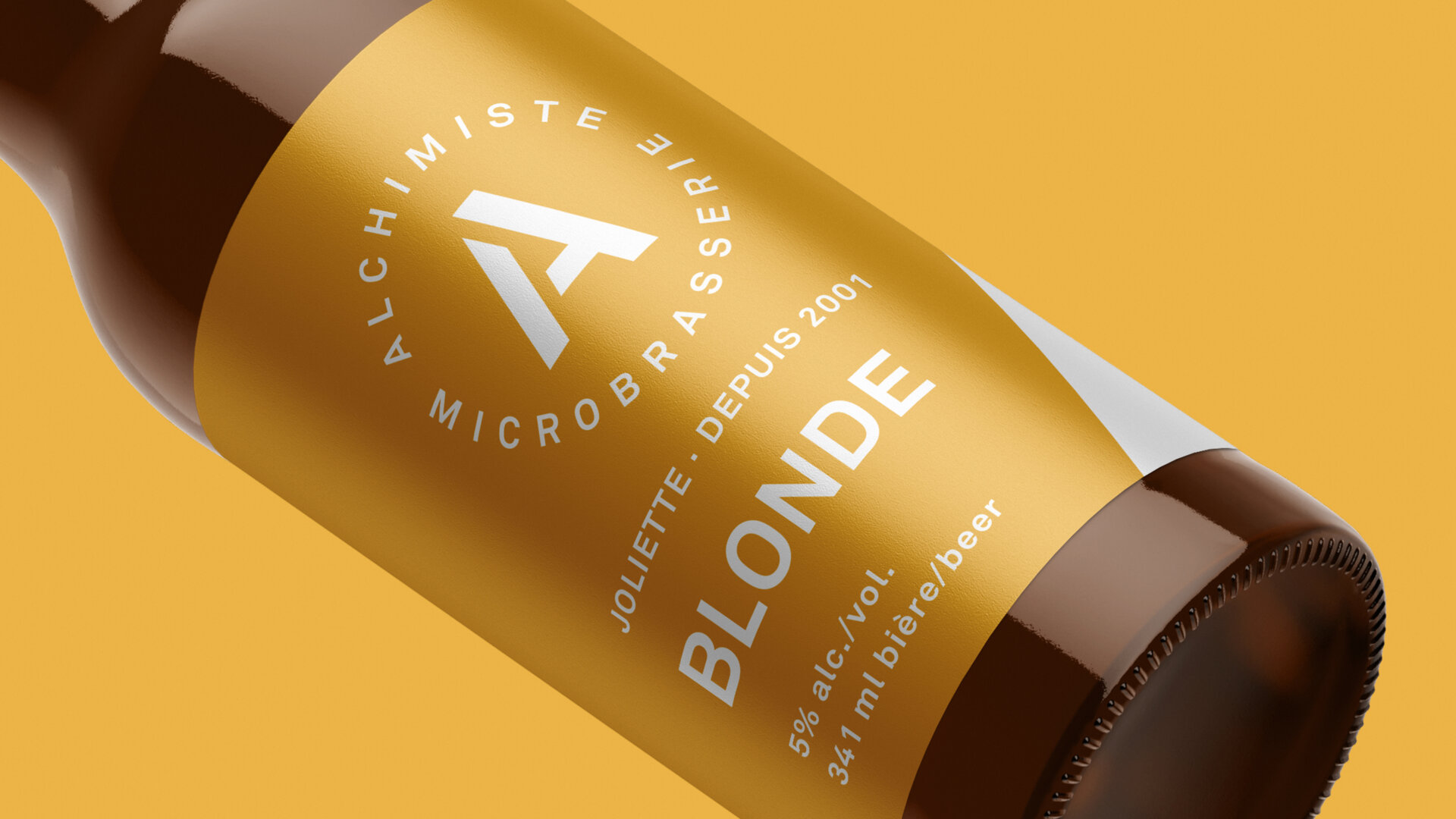
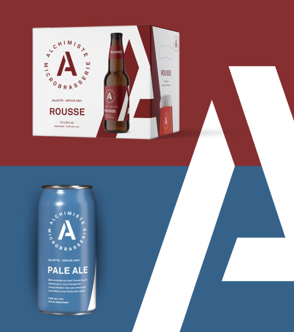
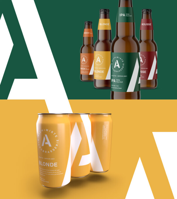
The result is a new, simple stencil logo with a monogram that is easily recognizable. The large "A" becomes the seal of trust, the hero that will allow Alchimiste to stand out and introduce more and more new drinkers to the wonderful world of microbrewing.
Collaboration


