

Share to
Agrandissement Complexe Aréna Val d’Espoir
By : TLA Architectes
GRANDS PRIX DU DESIGN – 15th edition
Discipline : Communication & Branding
Categories : Environmental Design / Signage : Bronze Certification
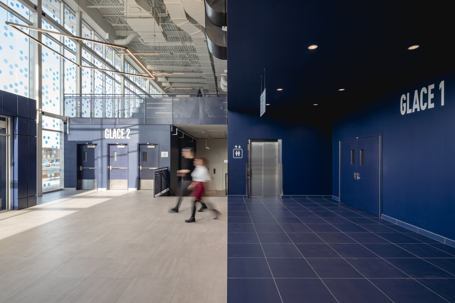
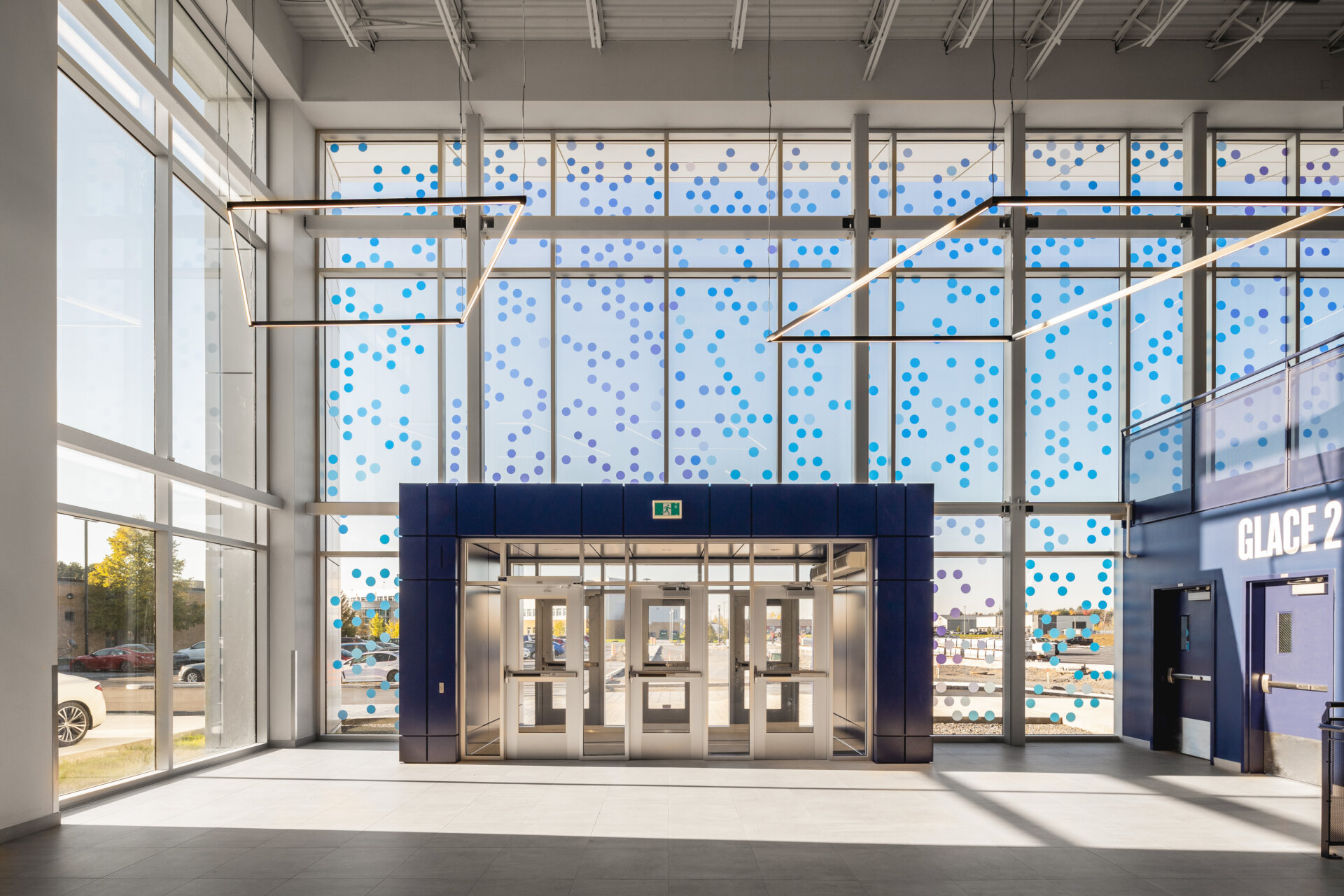
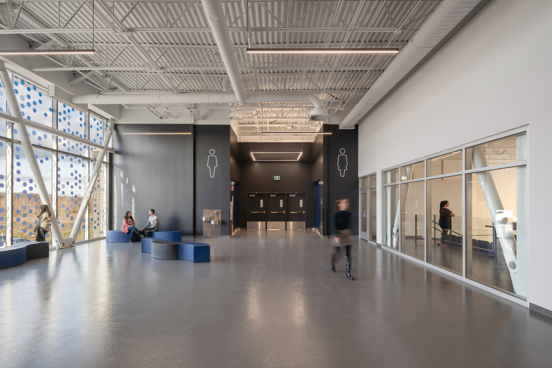
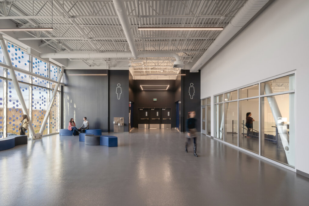
This large-scale project for the City of Mirabel involved upgrading the refrigeration system of the existing arena as well as extending the building to accommodate a new NHL-size rink. The TLA Graff team was actively involved with the architecture and interior design departments of TLA Architects for the creation of murals and signage throughout the building. On the exterior façade, a large curtain wall was energized by the integration of a cloud of multicolored dots, a nod to the winter precipitations that are intrinsically linked to the practice of ice sports. This giant mosaic is declined in a multitude of pellets in various shades of blue and purple and its cold colors recall the colors of snowy surfaces at dusk.
The mosaic of multicolored dots offers evolving shadow textures over time as the sun circles across the project. Inside, the shadows cast by this graphical intervention are skillfully reflected on various surfaces. To achieve such a result, printing and installation of this large-scale mural was carefully coordinated and every circle was fixed to the glass panels from the inside.
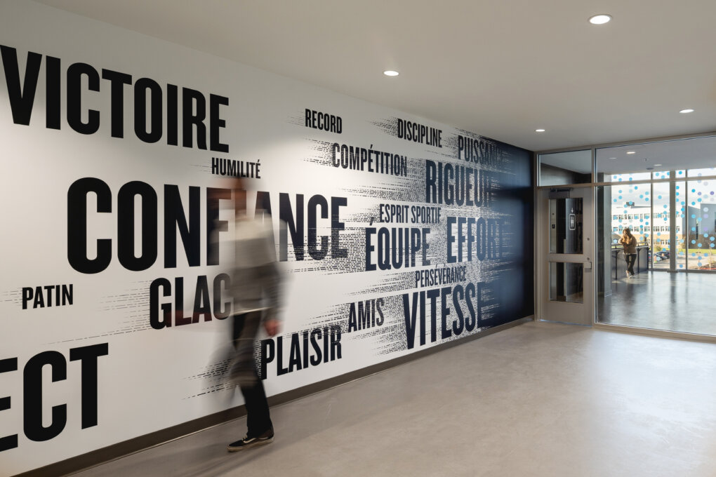
On the façade, the giant mosaic was the designers' inspirational starting point for the rest of the project. This abundance of pellets was then imagined in motion, leading to these shapes being elongated into dotted lines that fade and taper. The team wanted to express the speed associated with ice sports through a distinct graphic language. These dotted textures were used as privacy screens in office spaces, in a mural for the multi-purpose room, and in illustrations representing the different sports practiced in the facility on a mural inside the athletes' entrance.
As for the typography chosen for the signage, a bold, high-impact typeface was used throughout the graphic design. The use of a highly readable font was recommended since all types of visitors will occupy the building over time. First, a clear distinction had to be made from the outside between public and athletes’ entrances. From a spectators' point of view, it was also important to quickly identify the location of the stands for the 2 rinks.
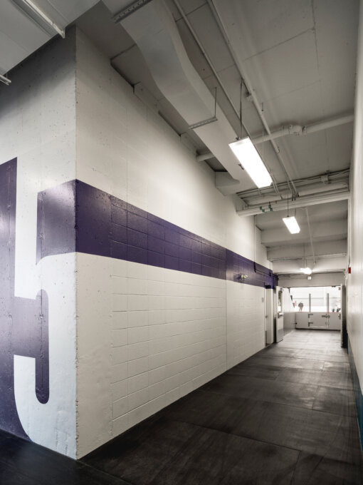
Throughout the signage concept, capital letters were used in very large formats, especially for locker rooms identification which displays oversized numbers spanning the entire height of the walls. These numbers are also positioned on corners so they can stretch across the perpendicular corridors to lead athletes towards the ice surface.
Overall, the project's signage supports its architectural concept and is inspired by winter landscapes and movements related to ice sports. In the end, it fulfills its primary function of creating effective cues throughout space.
Collaboration


