
Product / Published on September 26, 2023
Share to


COLOUR PALETTES
|
||
——–
EXPLORE
ISLAND TIME
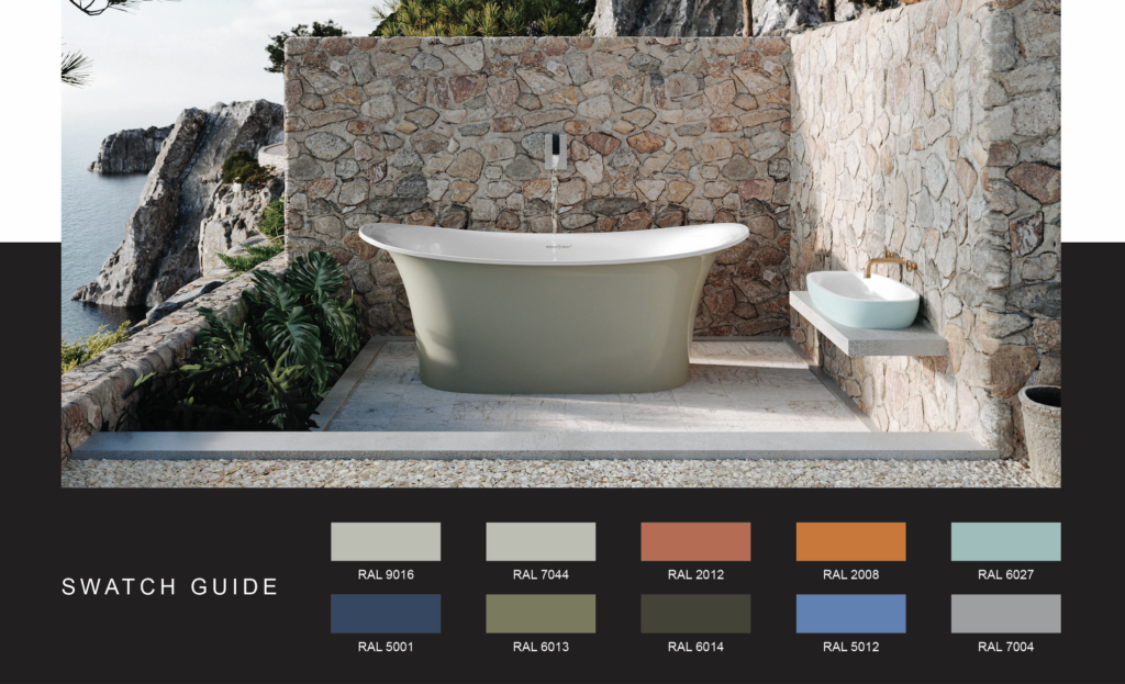
| Inspired by the landscape of Corsica off the coast of France, Island Time brings the Mediterranean to life. The whites and greys of limestone cliffs overlook the rich blue of the Mediterranean. Tangles of earthy green sage abut talc-fine beaches. Towering mountains reflect the shades of evening sky, while Medieval villages wear orange terracotta roofs that match tones of sunset. The spectrum of sea and land, from soft pale tints to deep natural hues creates a world apart for the bath, bringing the outside in for your own island oasis. | ||
——–
EXPLORE
ROYAL RITUALS
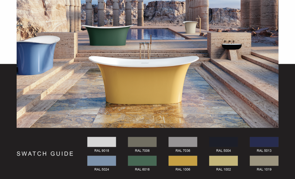
| A mystic glimpse into ancient Luxor, Egypt, Royal Rituals stirs the spirit of discovery. The inky indigo of temple wall paintings mimics the night sky. Saturated jewel tones, a hit of emerald, a pop of citrine echo the riches of the Pharaohs. Softer shades pale blues and greens, sand tones and sun-bleached neutrals-encapsulate the landscape of the Valley of Kings. All colors that infuse a bathroom with the warmth of the Egyptian sun and the lush indulgences of the past, encouraging you to sink into relaxation, and revel and rejuvenate in the present. | ||
——–
EXPLORE
GATEWAY TO SERENITY
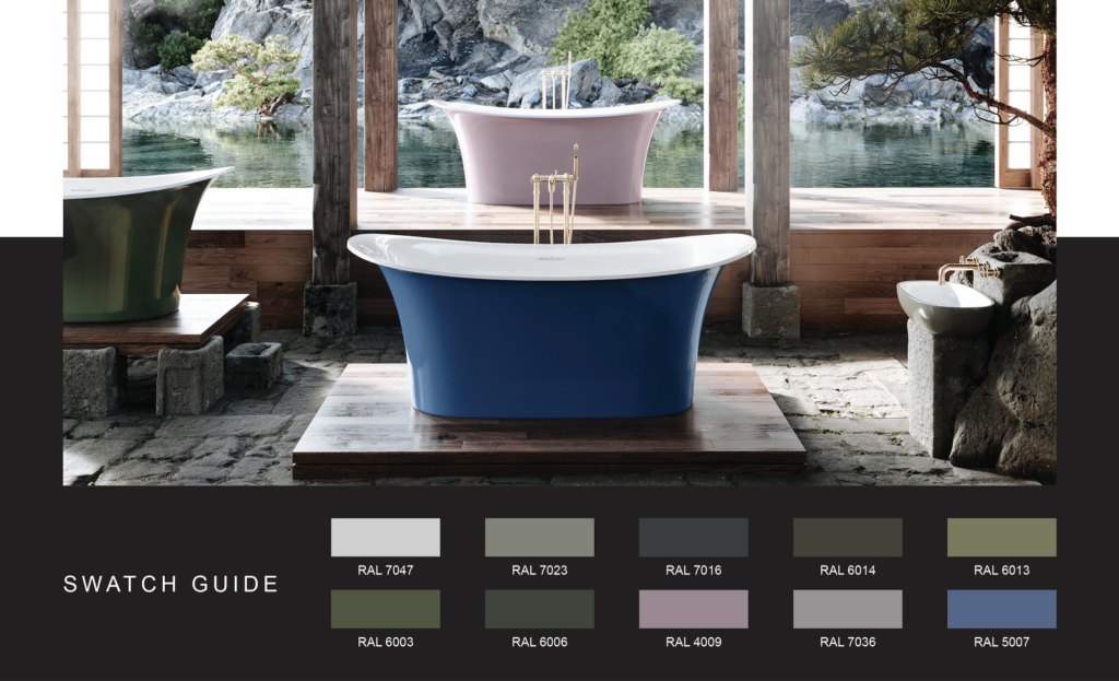
| The Gateway to Serenity palette embodies the lush isle of Kyushu, Japan and resets your senses. Kyushu, Japan’s southernmost main island, is a semi-tropical refuge where nature reigns, time slows downs, and serenity sets in. This place of old-growth forests, natural hot springs, and misty dawns is reflected in a soft-focused palette. Shades of green, from deep olive to the palest moss, are reminiscent of island foliage. Soft-purple hues evoke the color of a sky after a rainstorm. Near white greys speak to the island’s porcelain tradition. It’s a spectrum that’s a call to tranquility, giving the bath an earthy subtlety and pastoral peace, where you can sink into stillness. | ||
YOUR WANDERLUST
TRAVEL JOURNEY STARTS HERE.
| HOUSEOFROHL.CA |  |
 |
@HOUSEOFROHLCANADA |