Published on November 2, 2021
Share to
Baie-Saint-Paul City, Baie-Saint-Paul, Québec, Québec, Canada
by Oasis Communication, Québec, Québec, Canada
oasiscommunication.ca
GRANDS PRIX DU DESIGN 2021
Award of the Year – Communication & Branding
Grand Prix – Communication & Branding
Platinum Award – Brand Design, Logo Design
Gold Award – Brand Design, Rebranding
Baie-Saint-Paul. A cradle of creativity proudly preserved by Charlevoix residents… from Marc-Aurèle Fortin to the current organizers of the Festival Festif de Baie-Saint-Paul.
The Mandate?
To develop a strong territorial brand image based on the creativity of the community of Baie-Saint-Paul.

The Context?
The city of Baie-Saint-Paul has always been recognized as a cradle of creativity (the Cirque du Soleil was born there). The beauty of the place has not only inspired painters from all over the world but has allowed these citizens to highlight several aspects surrounding the environment, culture and people. It is this place of all possibilities that we wanted to evoke in our visual approach.
The Challenges?
Oasis Communication’s approach aimed to establish a territorial brand so that all stakeholders in the region can appropriate the values of the Baie-Saint-Paul BSP brand and, of course, attract new ones.
The Approach?
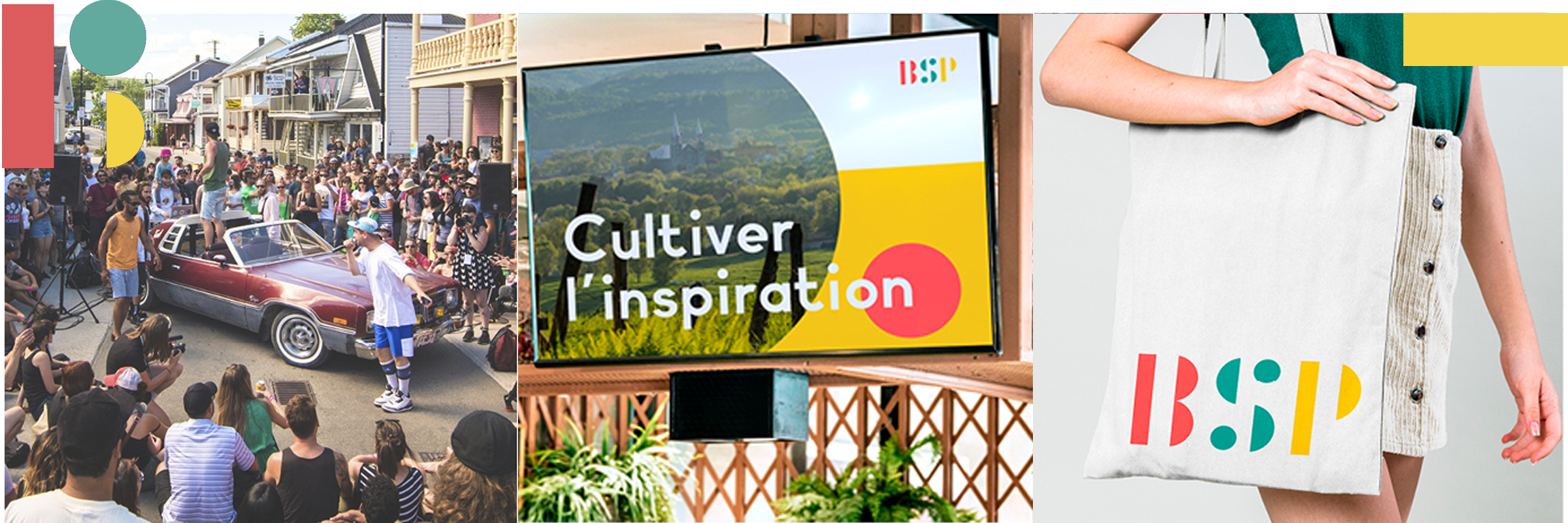
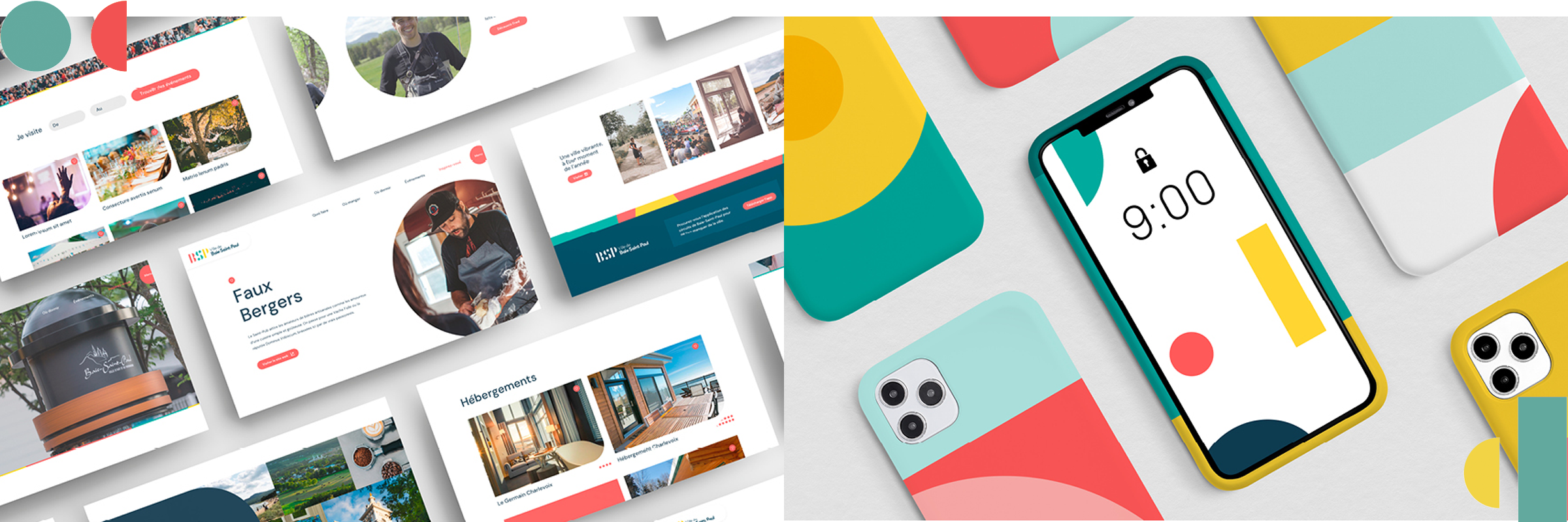
Based on simple geometric shapes (semicircle, rectangle, and round), the creative agency offered citizens a “DIY” logo. Thanks to its shapes, each citizen can express his or her own creativity and adapt blocks to suit the message. This expresses the idea we are in a place of all possibilities! This approach has given way to an expressive and playful design.
The Verdict?
Known worldwide as a cradle of creativity, the valley city of Baie-Saint-Paul in the magnificent and charming Charlevoix region wished to reassess its territorial brand image based on its community creativity.
After all, Cirque du Soleil was born in the heart of the valley… Jean-Paul Lemieux and Marc-Aurèle Fortin, as well! Baie-Saint-Paul’s beauty has not only inspired painters from all over the world, but also allowed its citizens to value and celebrate several aspects of its environment, culture and people.

The Québec City agency Oasis Communication brilliantly evokes this sense of the all-possible in their visual approach to the revised and modernized brand identity.
Based on simple geometric shapes, the semicircle, the rectangle, and the circle, the Communication and Brand Design Award of the Year agency provided citizens with a “DIY” logo that allows everyone to decline its creativity and convey the idea of endless, boundless creativity!

—————————————————————————————-
JURY’S KUDO “How better to express the identity of a creative region through simple building blocks that can be arranged and rearranged, again and again.”
“An absolutely unique identity that pays tribute to the creativity of the city and its inhabitants … and encourages it!”
“Very nice! A modern typeface.”
“A dynamic color scheme.”
“It’s always important, when creating a brand, to envision elements as part of a toolbox. This is achieved here vibrantly through the logo’s building blocks that may be arranged and ordered in countless ways.”
—————————————————————————————-

About Oasis Agency
Their expertise leads them to understand what is at stake upstream in order to anticipate what is happening downstream. With each project, it is the desire to create something as unexpected as it is effective that pushes them to constantly go beyond the standards.


