Jury-GRANDS PRIX DU DESIGN / Published on January 11, 2021
Share to

Sara Corvino
Senior Lecturer
Nottingham Trent University
Italy – Nottingham, England
PROUST QUESTIONNAIRE – PEOPLE OF DESIGN VERSION!
What are three basic rules you learned from your mentors?
To live is to choose;
If you enjoy what you are doing, others will too;
Be yourself, always!
Any music playing while you work?
Jazz music is definitely my best work companion!
Click to play Jazz music

What living designer/architect do you most admire?
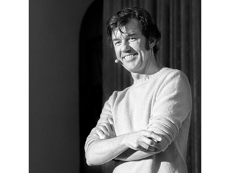
I particularly admire
Stefan Sagmeister.
He is clever, audacious, experimental, playful and reflective.
What past designer/architect inspires you the most?
This is a difficult question! How can I can choose between so many talented people.
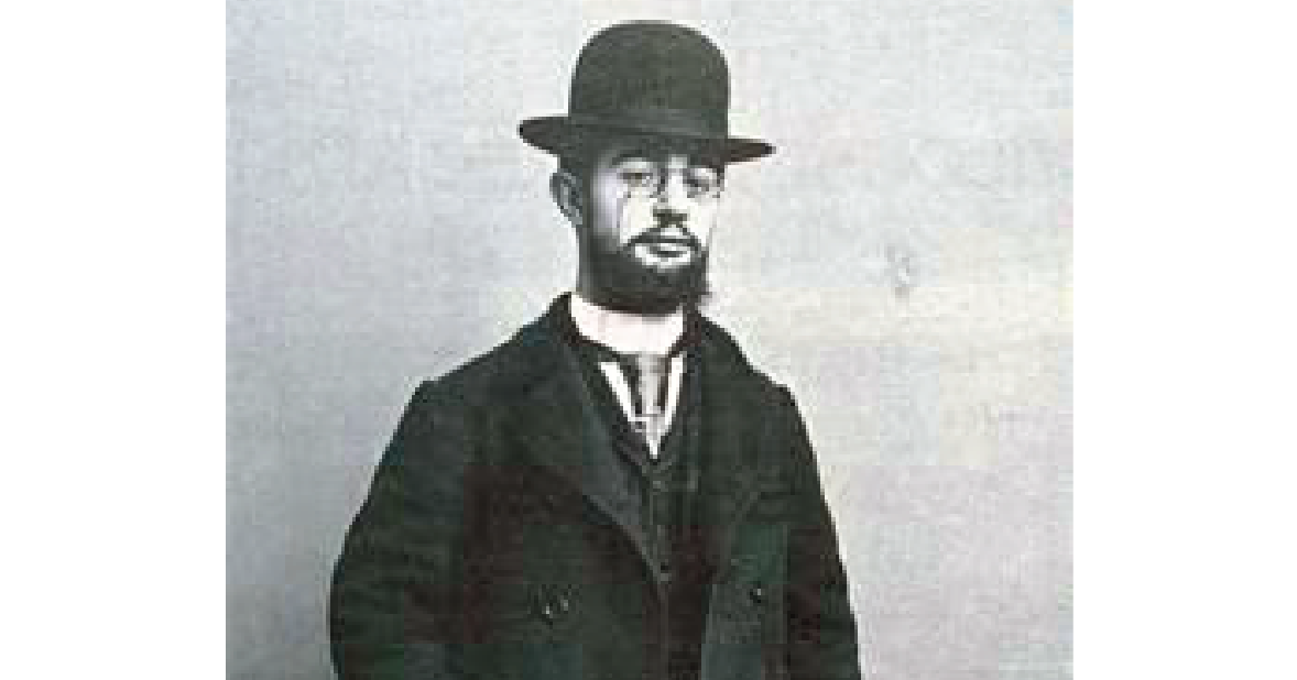
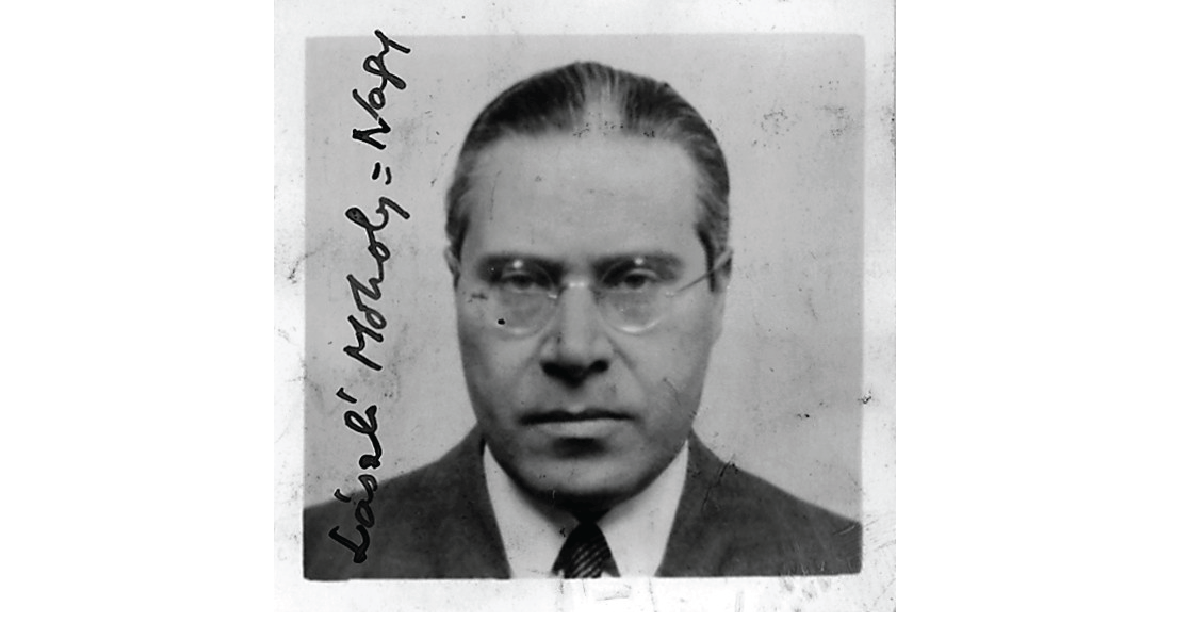
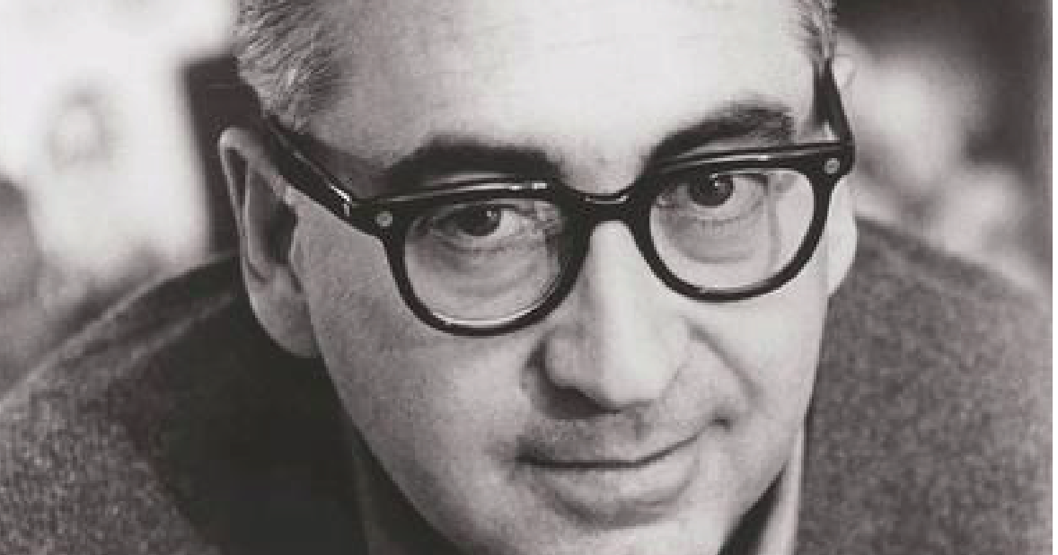
From the vibrant posters of Toulouse Lautrec to the multifaceted László Moholy-Nagy, the exciting Saul Bass and the timeless work of Joseph Müller-Brockmann or Armin Hofmann, I wouldn’t know who to pick first.
They are all absorbed and synthesized in my work!
What is your most marked design quality?
I embrace every project with total commitment and I am ready to push back the borders of my limitations to address any design challenge.
My practice covers the broad spectrum of visual communication design, making it difficult to highlight a specific ability other than an attitude!
How would you like your designs to go down in history?
I would like my designs to be remembered as engaging, playful and meaningful.
What peer quality do you most value?
Courage, playfulness and commitment.
Which project is the epitome of your work?
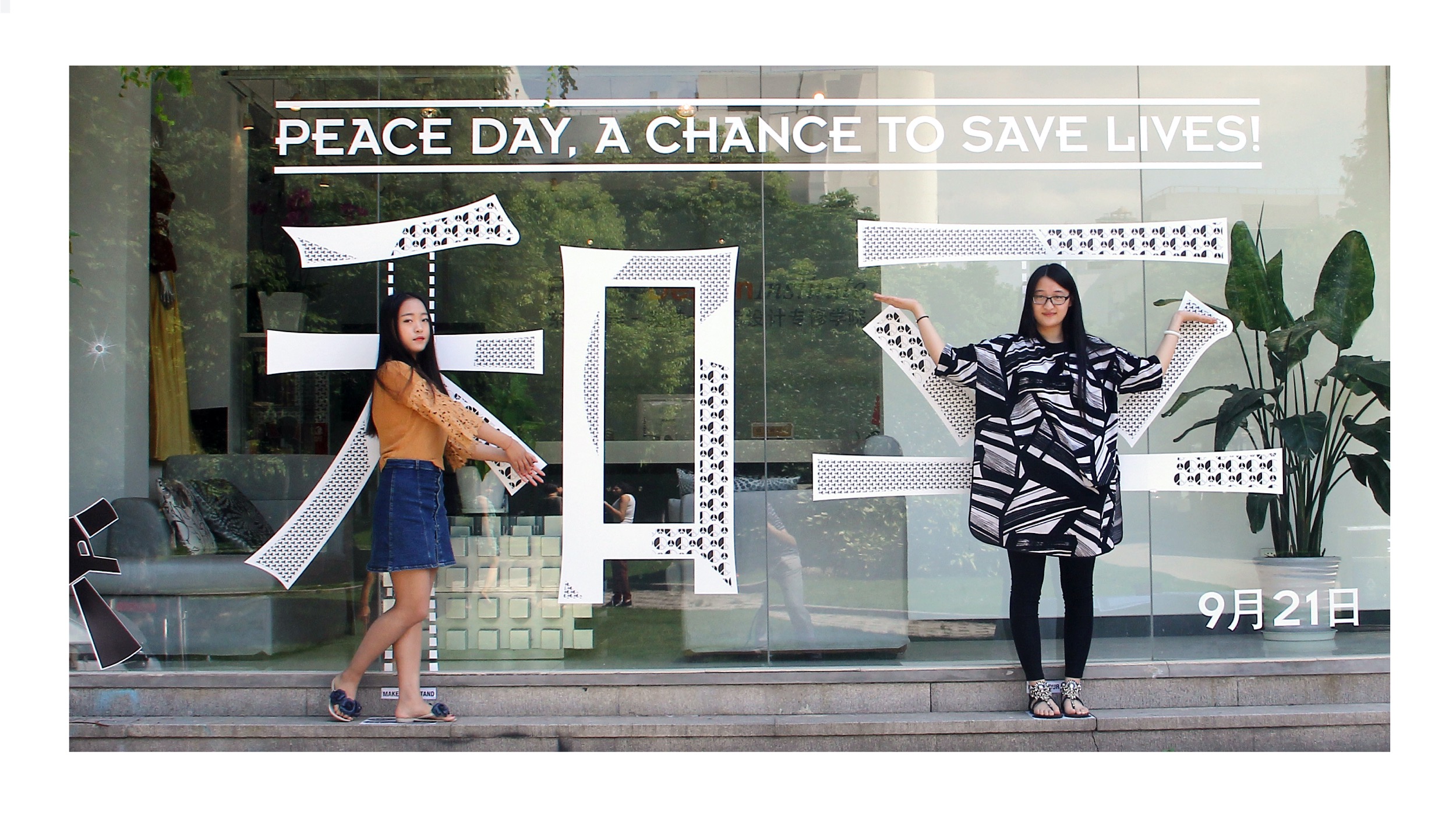
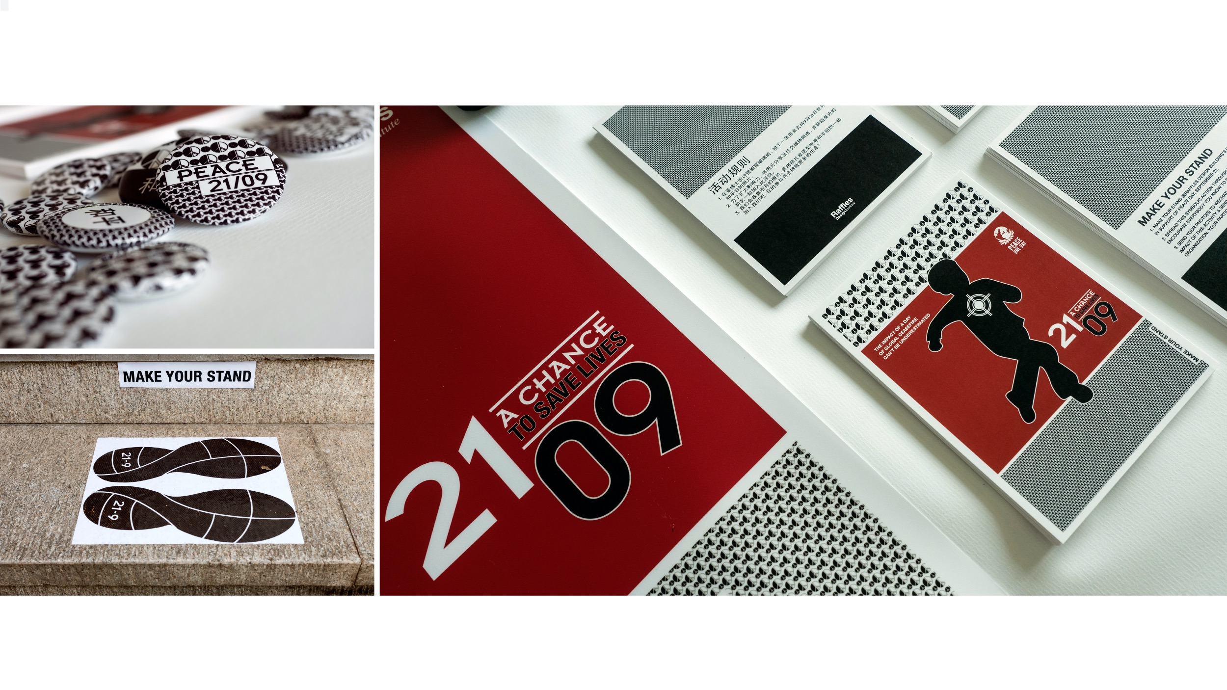
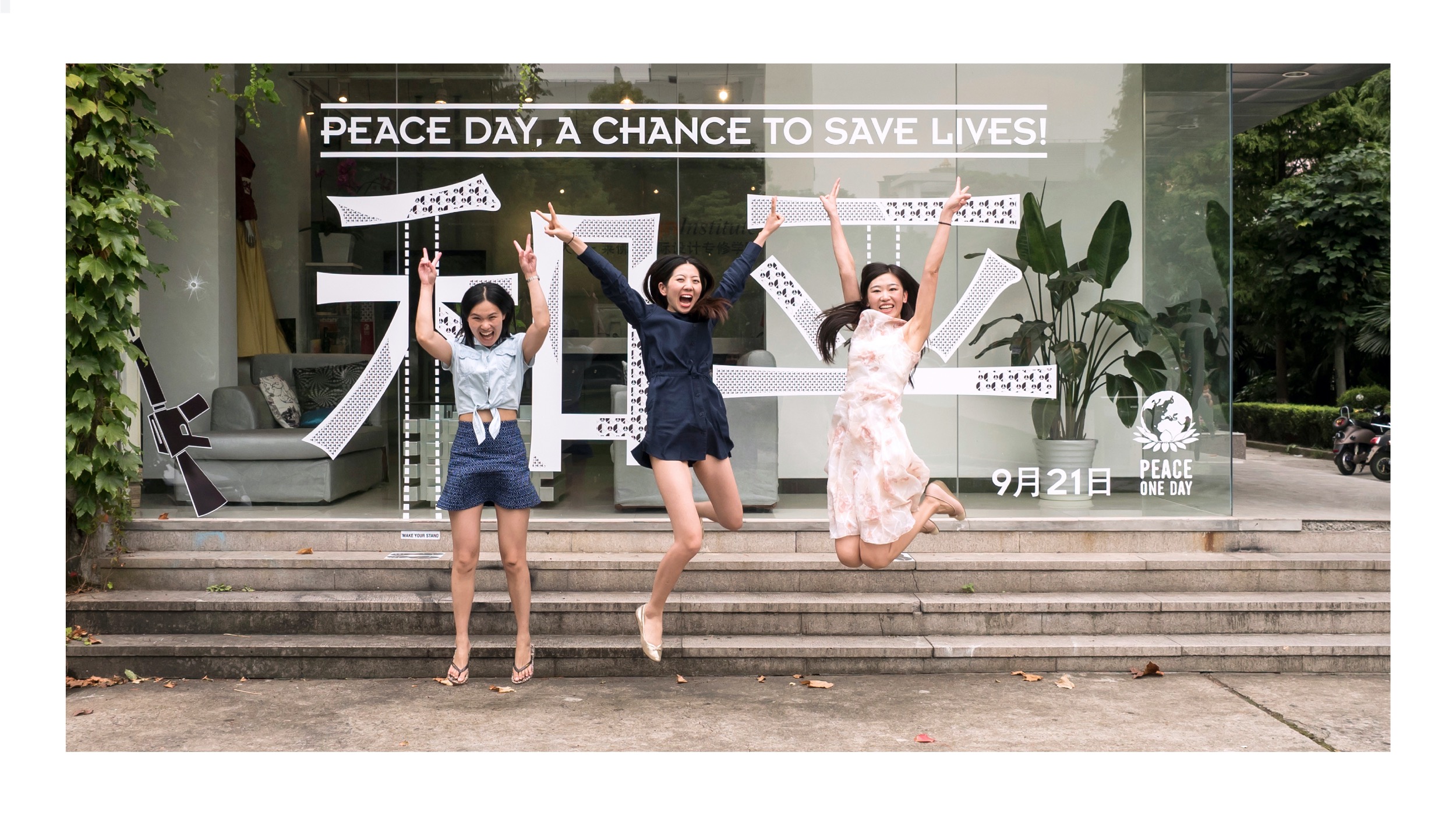
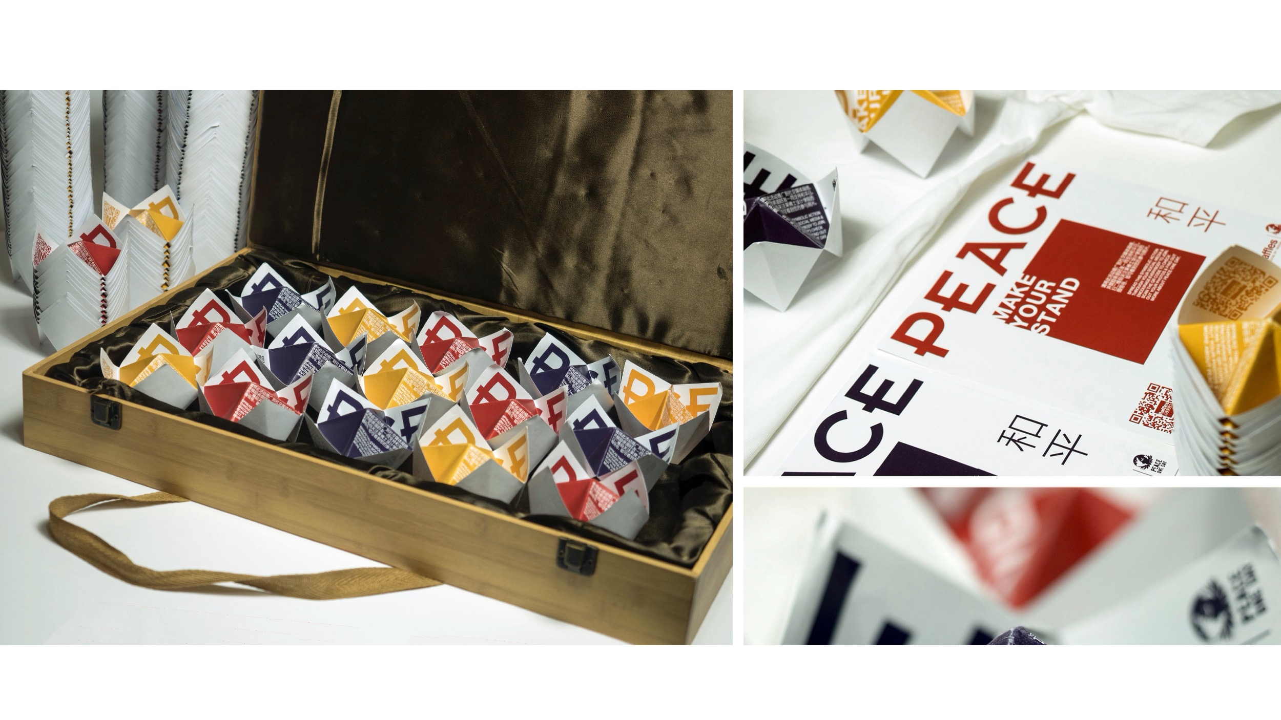
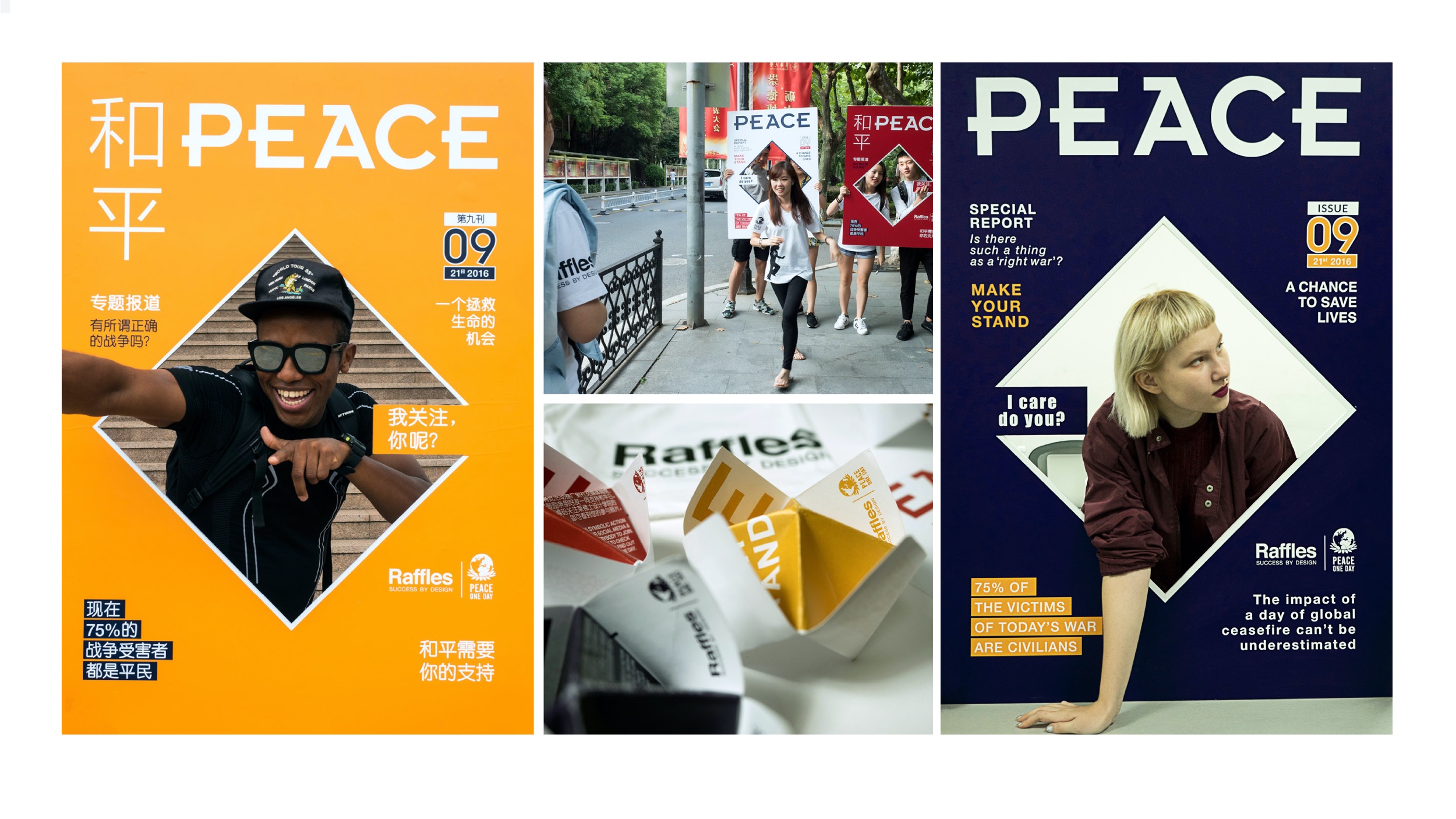
Again, a rather difficult question! I would perhaps choose “A Chance to Save Lives”, a call for action to make a symbolic and physical stand in support of Peace Day.
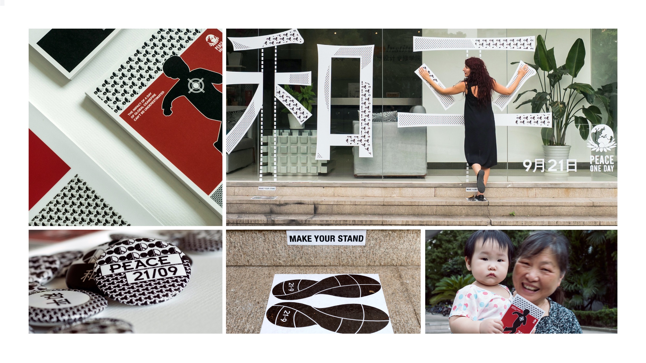
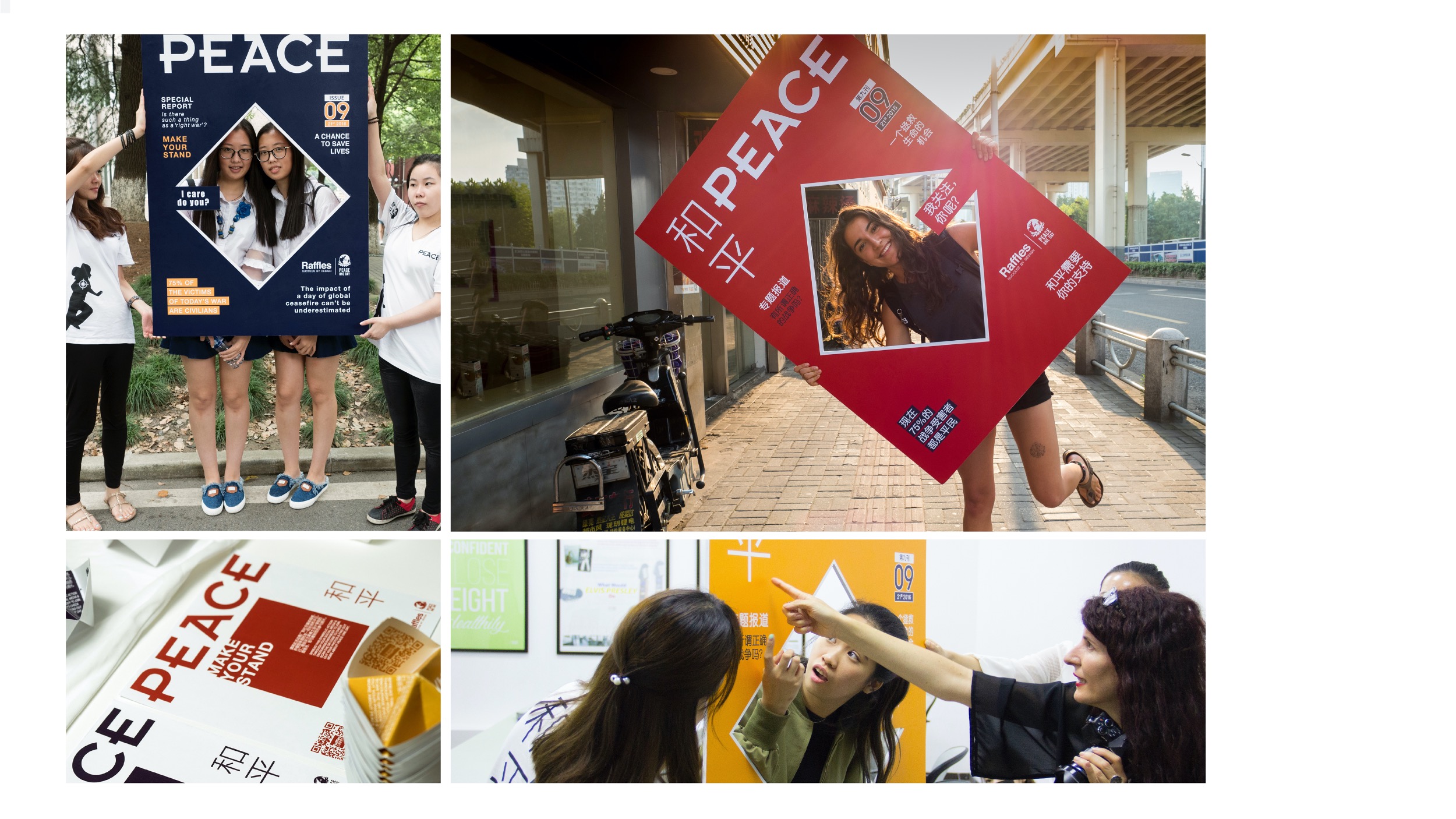
The project started in Shanghai in 2014 and ran across three years. In each event the work presented was only completed and alive when people interacted with it. People were encouraged to have their photo taken in front of proposed scene and send them through social media (Wechat, Weibo) to create awareness about the 21st of September, a crucial day for humanitarian organizations to carry out life-saving activities in areas of conflict.
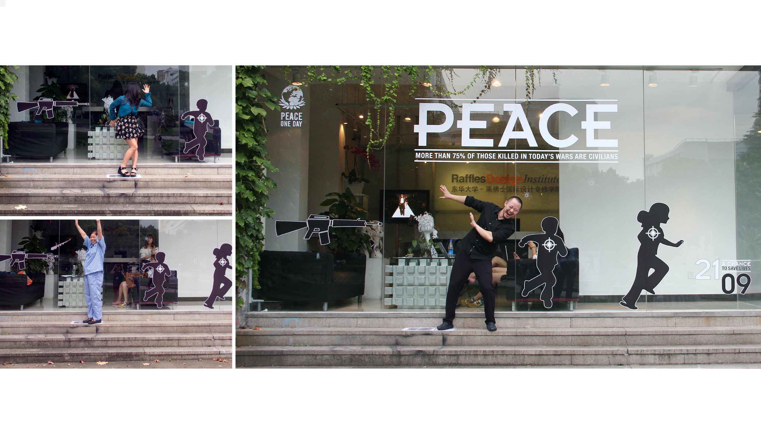
In the first appointment (2014), people were asked to make a stand in front of the silhouette of a weapon, creating an image to protect two running children, under the words “Peace, 75% of the victims of today’s wars are civilians”. In the second appointment (2015) people were asked to make their stand to complete the word peace (in Chinese). In the third appointment (2016) people were invited to become the cover’s star of the Magazine Peace.
All these activities were playful and positive; full of hope that each individual act can play a role in giving a chance to save lives. In 2016, the number of people who visited the official WeChat account of Raffles Design Institute doubled during and after the activity, reaching the record of visitors of the previous 5 years.
Peace One Day, Shanghai 2014
Project in Support of Peace Day, September 21. The impact of a day of global ceasefire and non-violence cannot be underestimated. A chance to save lives! NOTE: The…
How are your country of belonging’s values reflected in your work?
I have lived in so many countries in my life that I am not that sure that my values are made in Italy!
I would say that my ideals transcend any specific nationality and this is reflected in my work.
What always inspires you?
Passion, enjoyment and honesty!
What is your favorite place in the world?
The sea!

What is your mantra?
Design alone may not be able to save the world but it can be the catalyst to change attitude and turn apathy into action.
What is your dream? THINK BIG!
Peace one day…
Change the world!
Peace One Day, Shanghai 2015
“A chance to save lives” is a campaign in support of Peace Day, September 21st. People are asked to make their stand to complete the word peace…
I Care, Do you? Peace Day 2016 (Shanghai)
Peace Day, is an opportunity for humanitarian organizations to focus on their life-saving activities within a global context. NOTE: The original video was available through WeChat in China Music “Love and Truth” by Mother Mother
Urban Fragments Project, 2010
OBJECTIVES & RESULTS
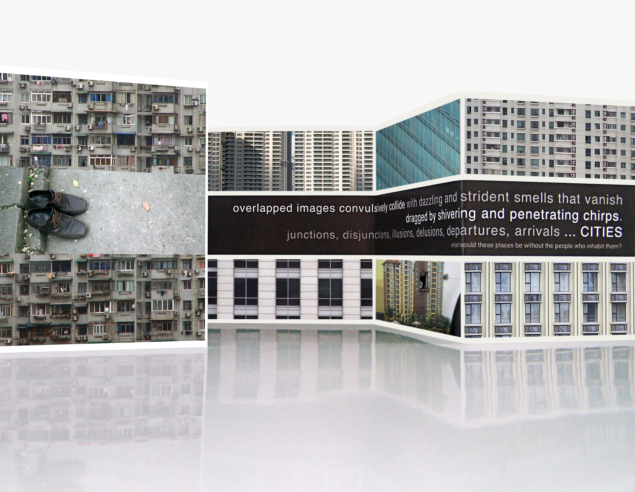
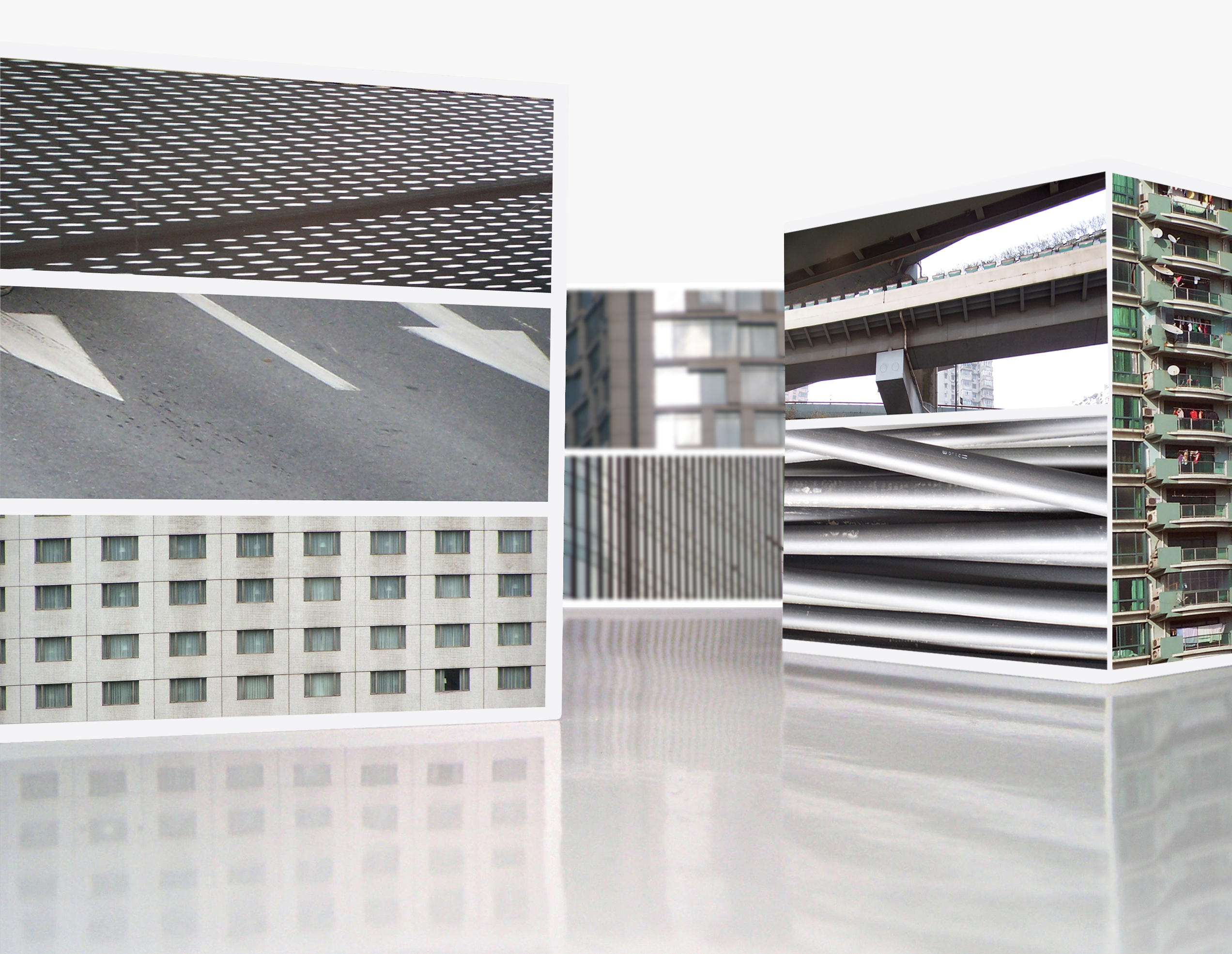
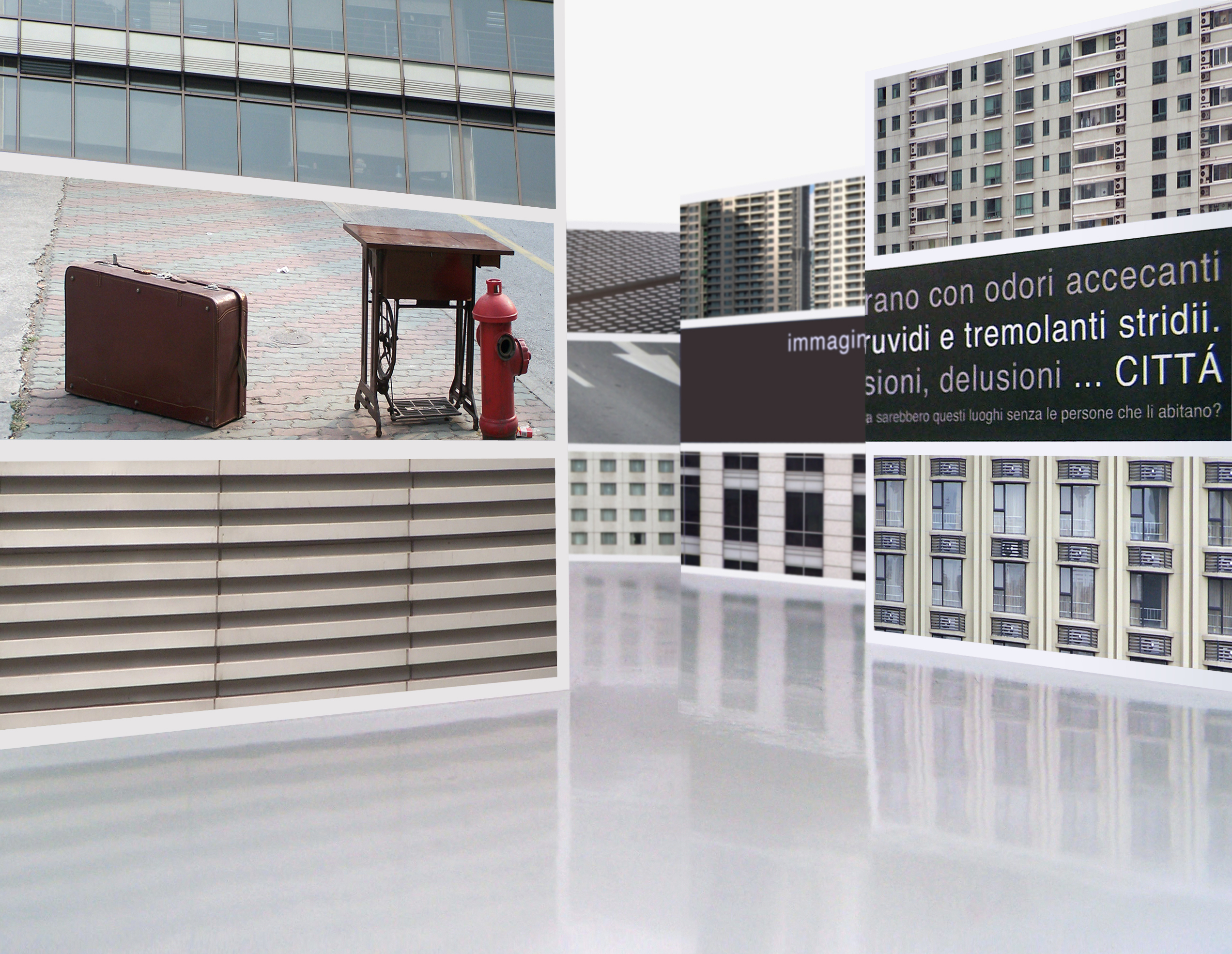
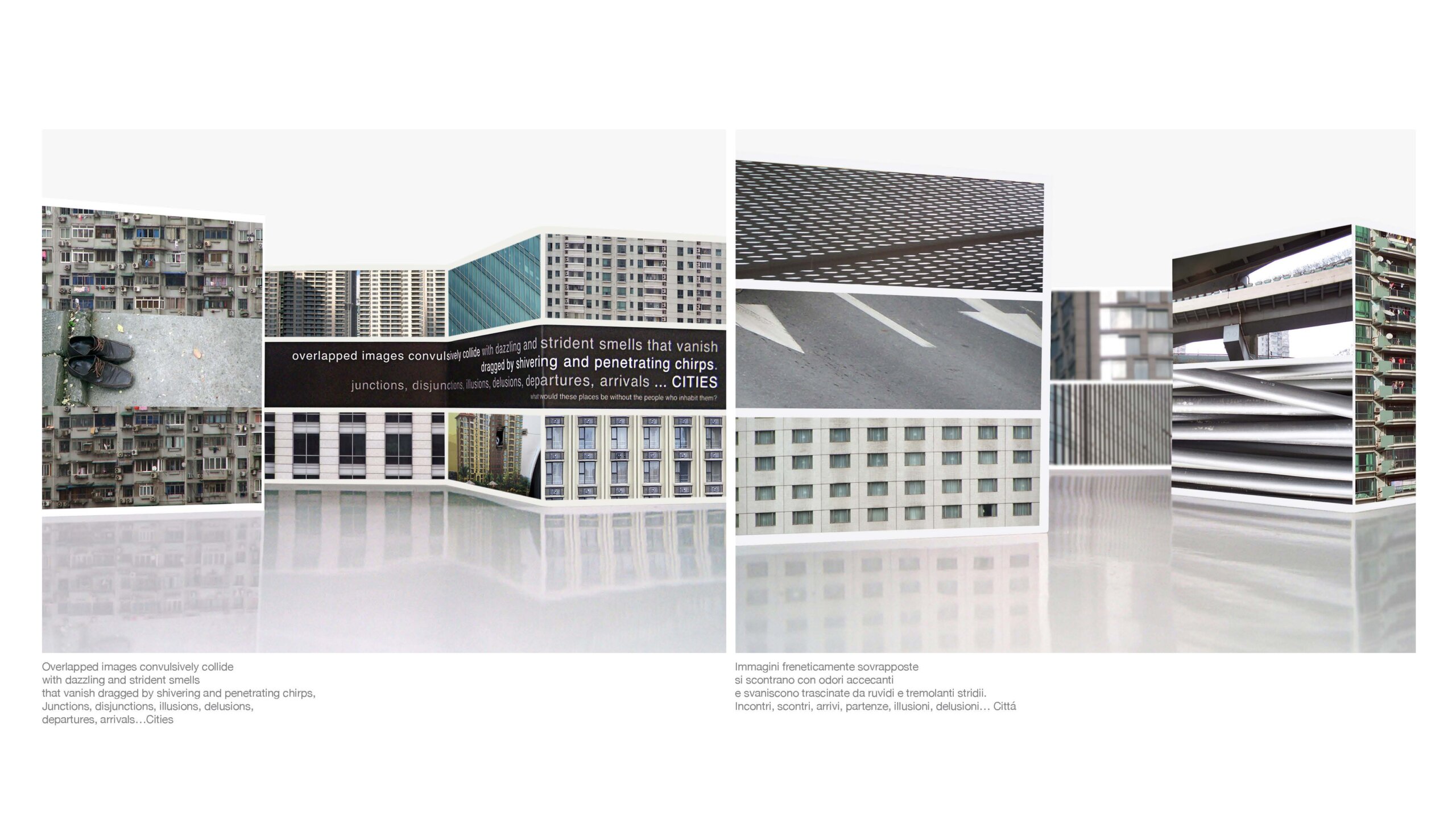
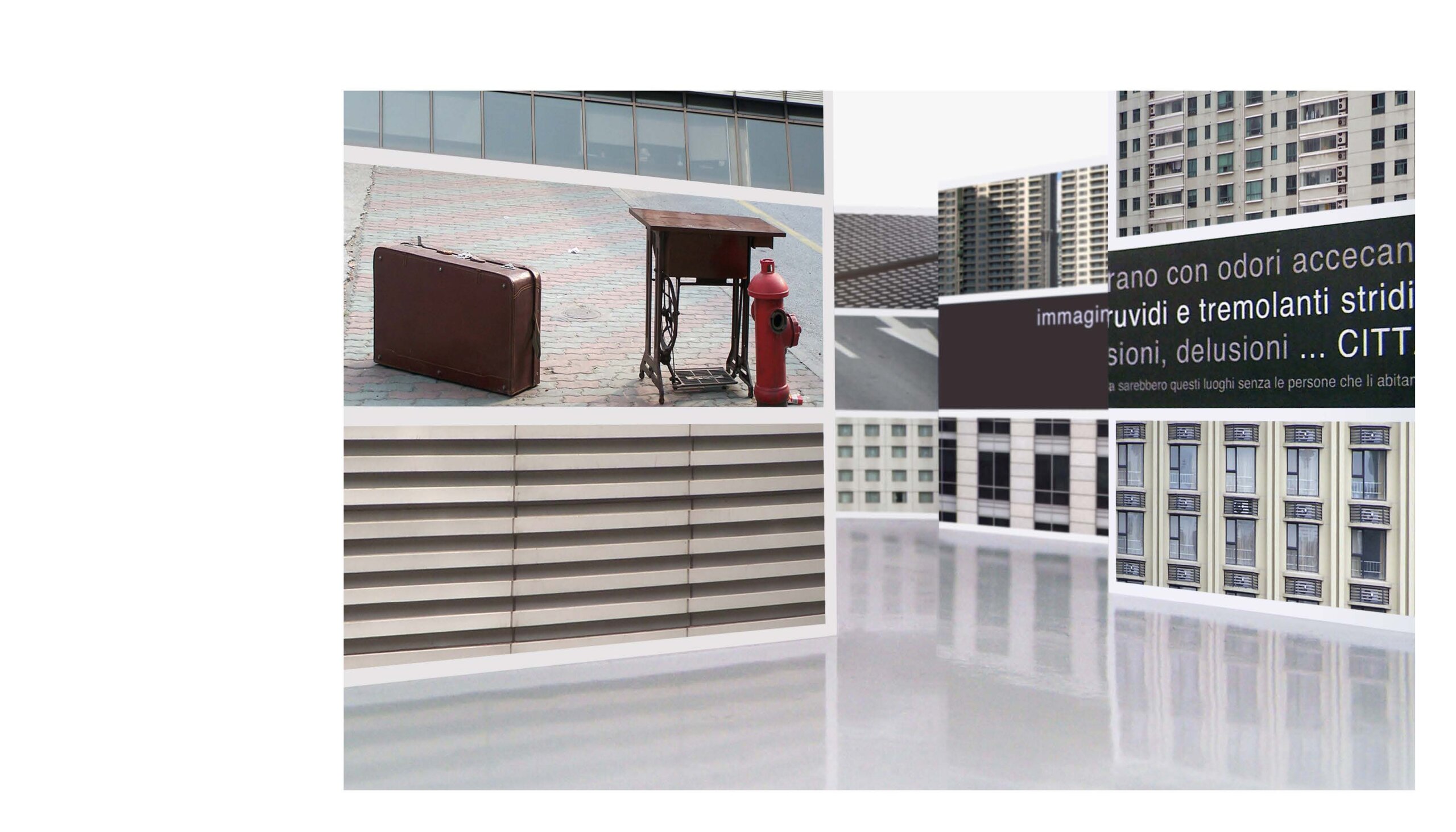
Urban Fragments aims is to evoke reflections about cities and the people who inhabit them.
The environment created is an empty and silent frame that is completed and alive only when the spectators become part of it. The relationship between the space and the visitors is a sort of metaphor of the relationship between a city and its citizens. The overall silence of the images is only broken by the convulsive printed words that recall the idiosyncrasies of an urban environment’s life.
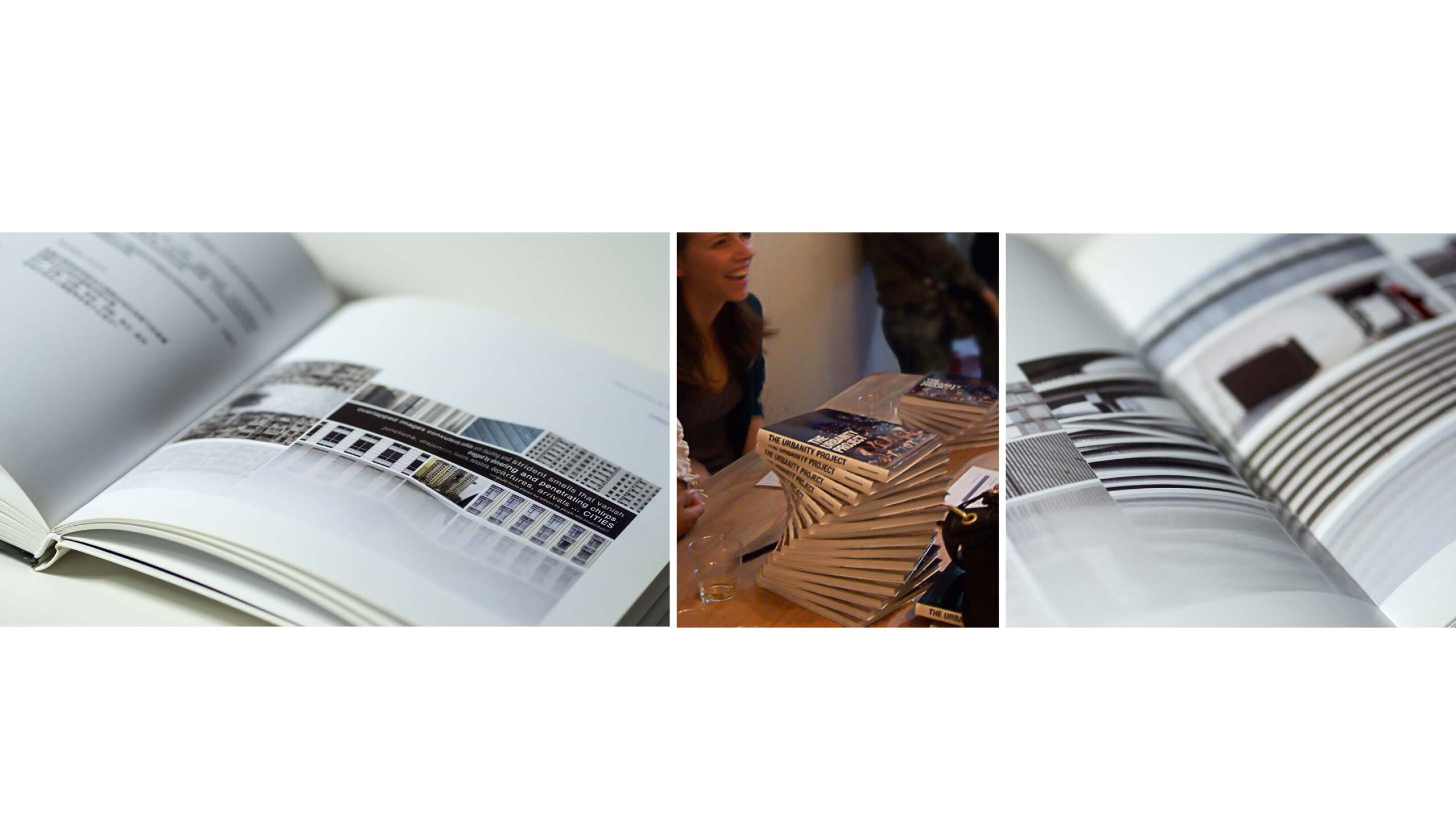
Urban Fragments was part of The Urbanity Project, a book and an exhibition of multidisciplinary artworks that not only communicates a common vision of “the city in terms of its people” but one that also values collaboration and demonstrates artistic excellence. It was first exhibited in Shanghai Art Community in 2010. Later in 2012-2013, it was exhibited as part of the show Traveling in the Luxury Socialist Times, in the prestigious Luxun Fine Arts Institute & No1 Art studio that many consider the best Art Institution in Northern China.
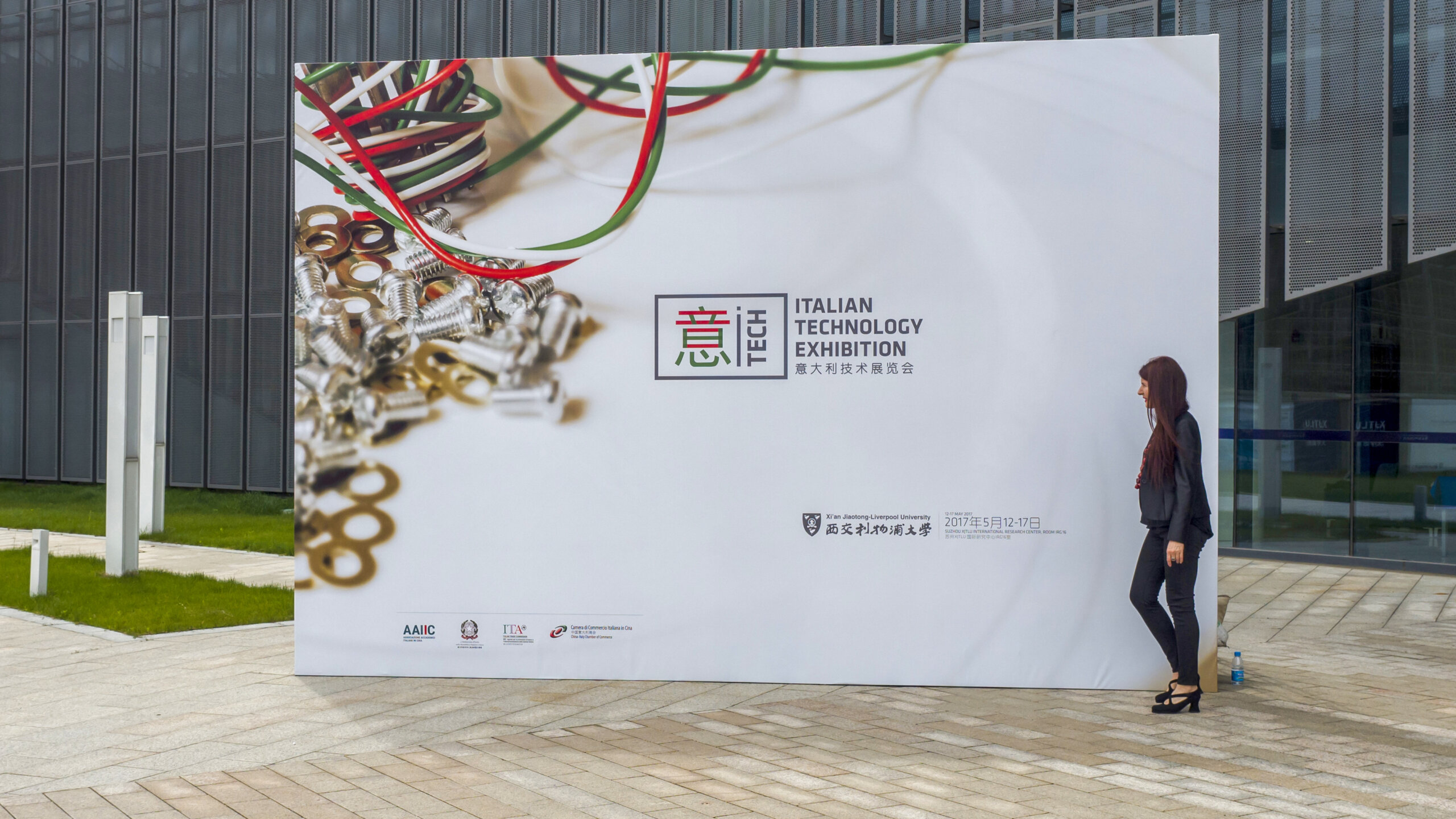
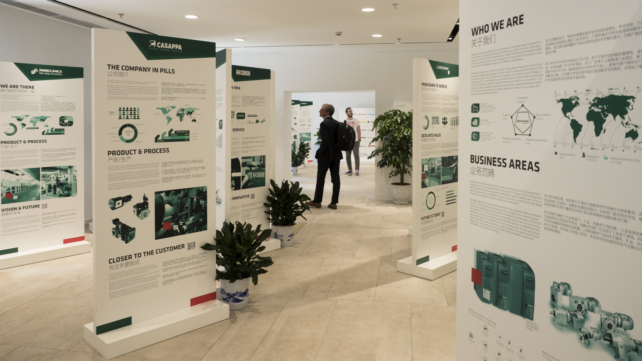
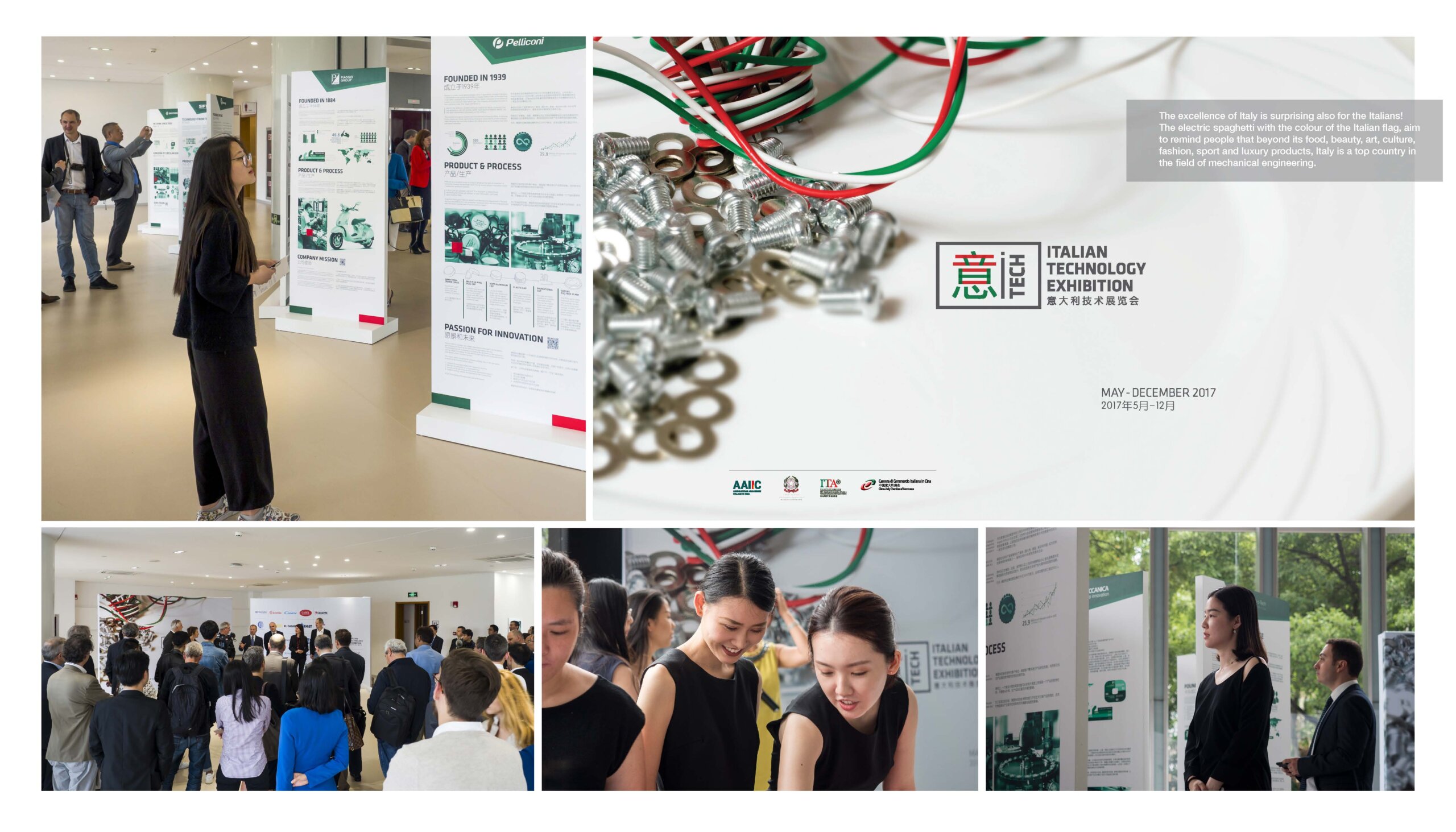
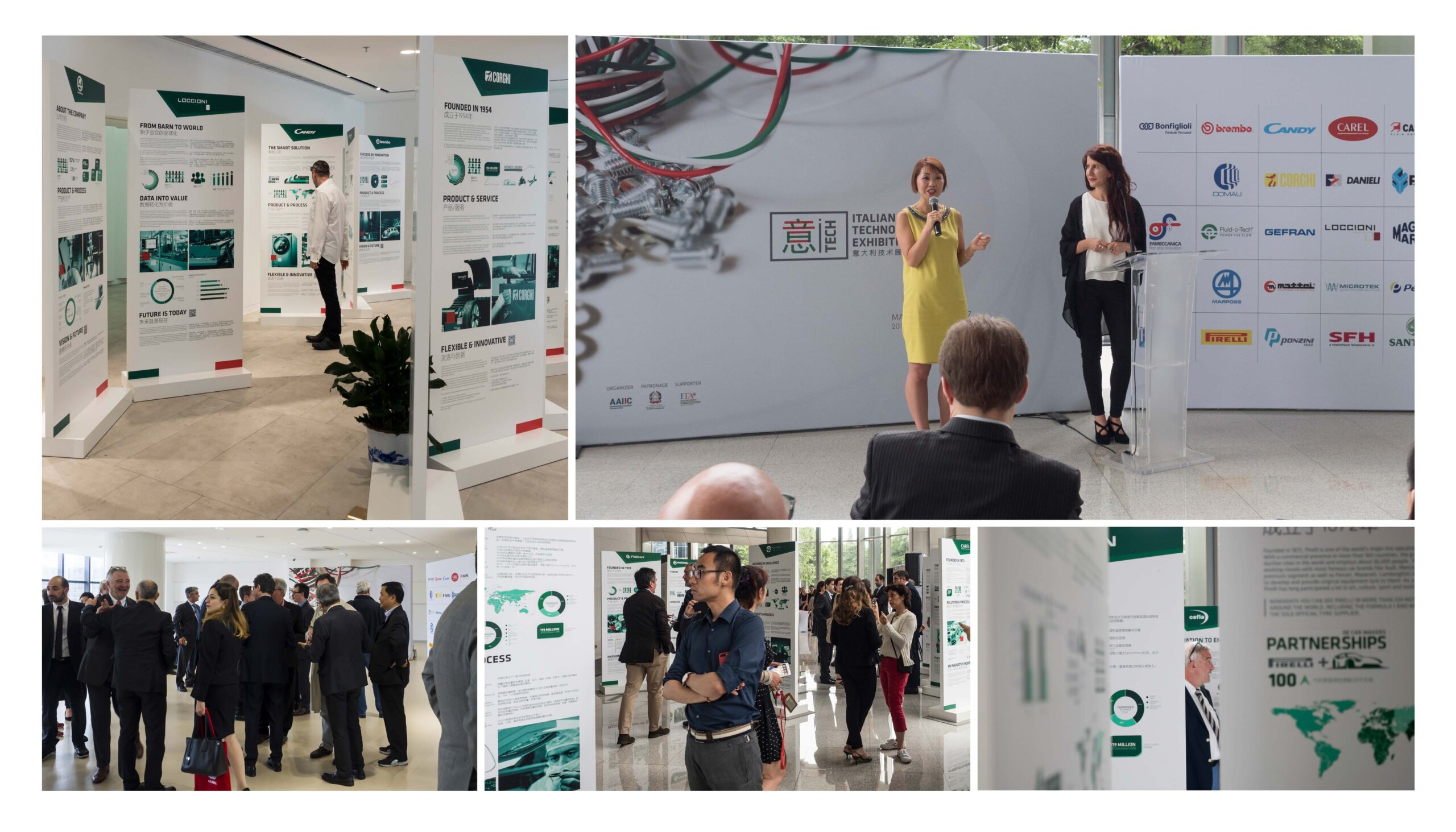
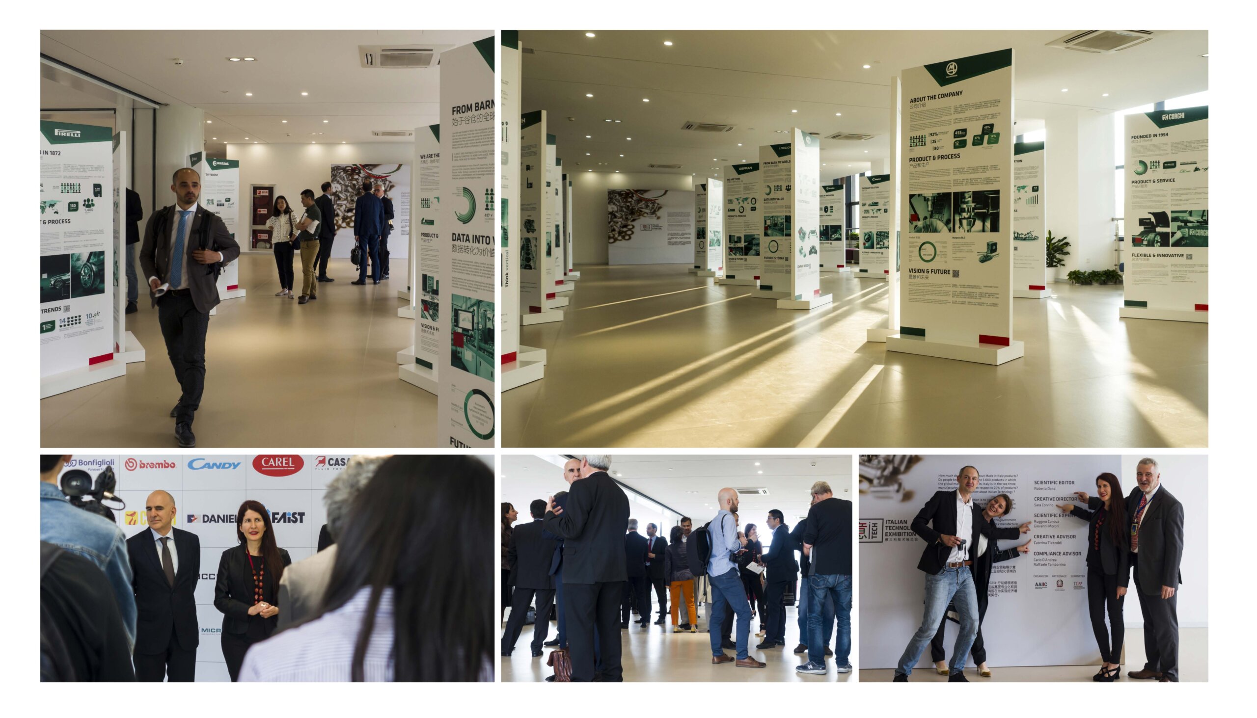
Yitech Project, Photo – Mauro Simone, 2017-2018
OBJECTIVES
How much do we know about Made in Italy products?
YiTech, the Italian Technology Exhibition, is an itinerant show, organized by AAIIC (Association of Italian scholars in China) aimed to enhance the awareness of Italy as a leading manufacæturing country. With the support of the Italian Embassy and the China-Italy Chamber of Commerce it was exhibited in 8 different venues in Suzhou, Nanjing, Beijing, Shanghai & Chongqing in the years 2017 and 2018.
APPROACH & RESULTS
Inspired by the growing engagement of the sector into more sustainable manufacturing approaches, the dominant colour of the exhibition is green.
The name of the exhibition, YiTech, was the result of an online brainstorming with several Italian and Chinese scholars. The character 意, immediately relate to Italy but also to the meaning of innovation. It can be further divided in two sections 音(sound/harmony) and 心 (heart/vitality). The upper part 音 has a clear chromatic link with the Italian flag. While the green colour of the other character 心 amplifies the semantic nuances and lead to the core message: at the heart of a harmonious future there is always sustainability and innovation.
The excellence of Italy is surprising also for the Italians! The electric spaghetti with the colour of the Italian flag, aim to remind people that beyond its food, beauty, art, culture, fashion, sport and luxury products, the country is also at the top in the field of mechanical engineering, mechatronics, manufacturing and industrial automation.


