Jury-GRANDS PRIX DU DESIGN / Published on January 13, 2021
Share to

Ginette Caron
Graphic Designer
Ginette Caron Communication Design
Québec, Canada – Milan, Italy
PROUST QUESTIONNAIRE – PEOPLE OF DESIGN VERSION!
What prescient youthful memory relates to your present career?
My grandfather had brought for each one of us 4 siblings a ball and offered to inscribe our initial in order to recognise it. Therefore he asked me if I prefered a Roman or Gothic letter… I was 5 years old and I was completely fascinated by the request.
I chose the Gothic letter because I figured the Roman one I could have done myself, but the Gothic was more complicated. And then I never played with the ball so as not to erase the letter.

What are three basic rules you learned from your mentors?
■ Never send a resumé on Friday afternoon or Monday mornings;
■ Your demeanour is your character. Your way of entering a room and presenting yourself says more about you then your portfolio.
■ “Leave the colour in your pocket”, as Picasso used to say to Matisse (meaning: first think about form and then decoration).
What project launched your career?
The coffee table book project for the jeweller BVLGARIA was subject to a competition that involved major advertising agencies in Rome and Milan.

Photo: BVLGARI / the Spirit, a coffee table book
Photo Credit: Ginette Caron
Year: 1989
Town: Milan
Country: Italie
Full Description at bottom of page
I had called it “Bulgari, the Spirit”, a book in which the text did not describe the unique and very precious jewels but recounted the unconscious inspiration that had enabled designers to realise such wonders. A tribute to Italianssurrounded and impregnated in spite of themselves with sublime beauty. It was the first book I made, in 1989.
Any music playing while you work?
No, never! I am very focused on my work.

Do you work in PJs or three-piece suits?
A colourful piece of clothing, a little lipstick, a quick hair brush and a splash of perfume!
What is your current design state of mind?
Find the essence of the theme, interpret it and translate it in the lightest and most universal way possible for the inner child in all of us!

What past designer/architect inspires you the most?
The caveman who made the first opening in the wall of a cave is quite impressive! It was a window, a thought – an architectural will, with its proportions and its arrangement filling the function.

What is your most marked design quality?
One feature that would be a flaw, if I hadn’t transformed it into a quality, is not remembering anything and having to start over every morning with a blank page.
What peer quality do you most value?
Their ability to dance with typography!
Which project is the epitome of your work?
The pavilion of the Holy See for the Milan World Expo in 2015: a white grotto covered with all-white holy scriptures, translated into 13 languages that could only be read through the rays of the sun.
The dismantling after Expo spawned the “Journey of the Word,” an operation of restauration and permanent reinstallation of the 25 sacred writings in charitable places around the world (Italy, Europe, China, Guinea-Bissau).

Photo: Vatican Pavilion at the Milan Universal Exhibition
Photo Credit: Michele Reginaldi
Year: 2015
Town: Milan
Country: Italy
Full Description at bottom of page
How are your country of belonging’s values reflected in your work?
I take for Quebec the value of not relying on history put to put myself out there overtime… to walk on a razor line.
What always inspires you?
I like challenging projects – those that aren’t really “glamorous”, like doing garbage truck livery, or doing a booth at a fair for a chipboard company. This is where you have to play with fantasy.
If a spell were to transform you into an object, by all means, what would you like to be, and why?

A small migrating bird to travel through wonderful places with my family and friends and, without any luggage.
What is your favorite place in the world?
In my Canadian woodland or its adjacent lake.


What design or architecture project do you wish you would have thought of yourself?
There are way too much! But let me say drawing one of the first neolithic inscriptions storytelling ancient lifestyles would have been grand!
If you could host any three guests, past or alive, over for dinner, who would you choose and what would you dare serving?
My mother, my father and my grandfather. I would invite them here in Milan. We’d have a drink at piazza Duomo and head back to my place where I’d serve Italian dishes I learned to cook over the years (depending on the season) and a tiramisù for dessert.
What is your mantra?
“One should be light like a bird, and not like a feather.” Paul Valéry.
What is your dream? THINK BIG!
Building a suite in my Canadian woodland!
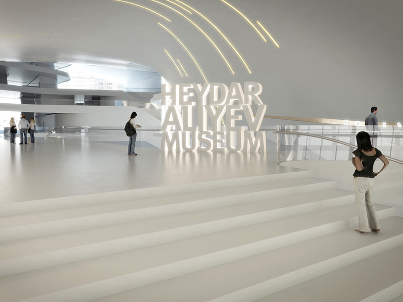
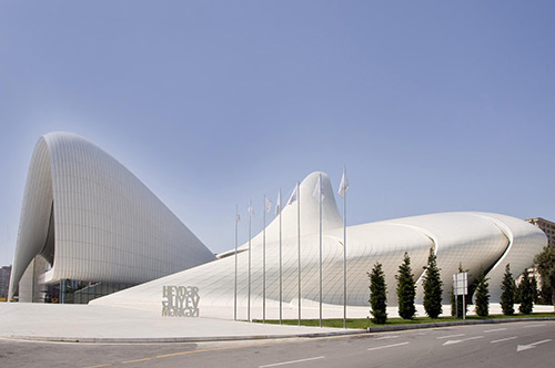
Logo for Heydar Aliyev Museum
Baku, Azerbaijan
Logo Heydar Aliyev Museum for Zaha Hadid’s edifice
The Vatican Pavilion at the 2015 Milan World Expo 2015
Photo Credit: Michele Reginaldi
2015 – Milano, Italy
Conceived as a cave where to go praying, the white compact volume of the pavilion represents the essentiality of a grotto, whose surfaces act as the supports of the message that connects the Catholic Church to the central theme of EXPO: “Not by bread alone” – “Give us today our daily bread”: food for the body and food for soul. Suspended on the external walls and covering the whole surface of the pavilion, the scriptures translated into 13 languages become poetry and recall the biblical episode of God providing manna from the sky to save his people wandering in the desert.
(designed with architects: Quattroassociati, Milan)
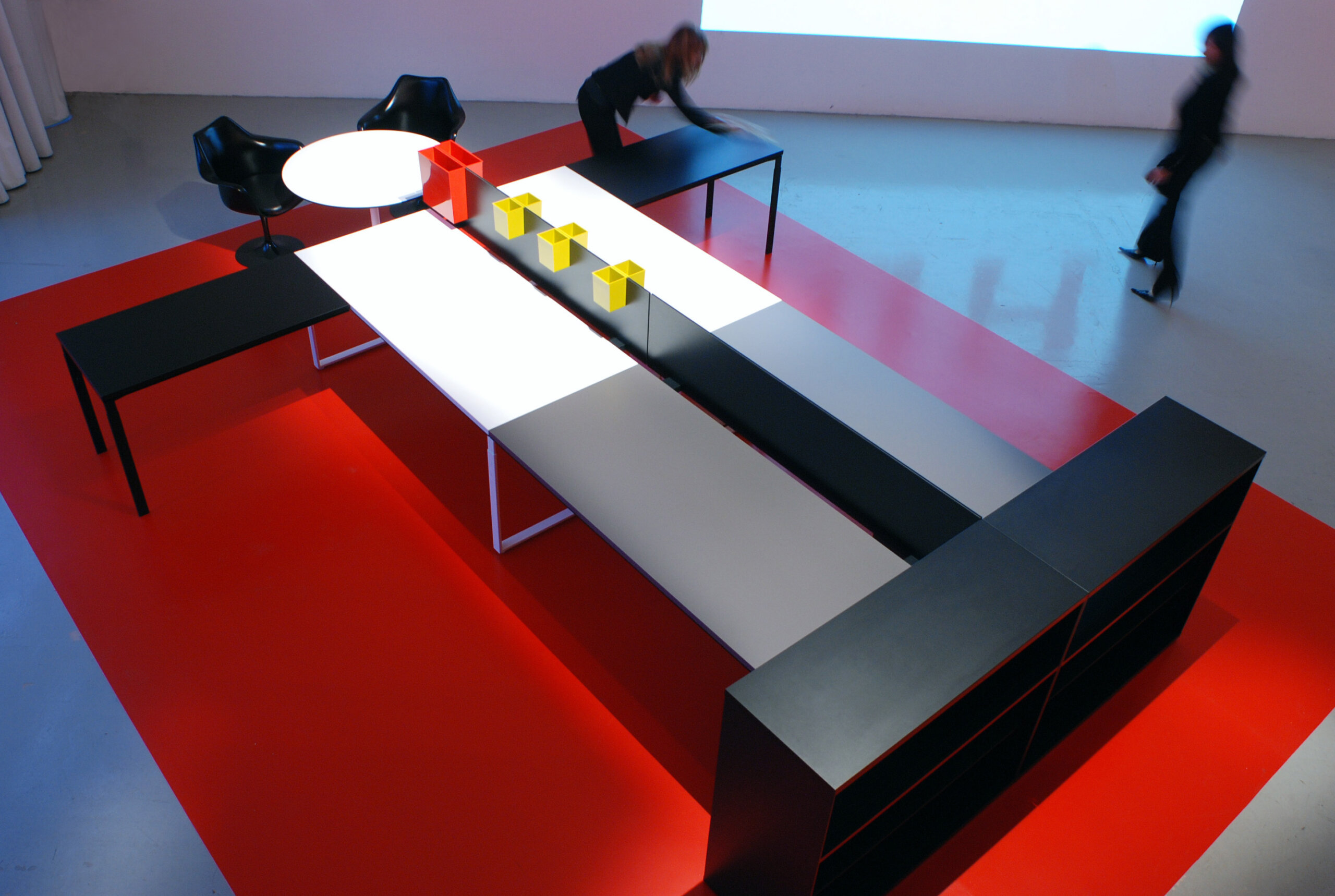
KNOLL – Identity and Exhibit Design for WA Office furniture system
Photo Credit: Ginette Caron
2007 – Milan, Italy
The characteristics of WA are represented through an office furniture system transforming itself into humanised figures.
“Simplicity of Complexity” and “Complexity of Simplicity”: simplicity of primary colours and geometric shapes; complexity for the endless permutations of the system. Two different exhibit designs were created for the international launch events in London and Milan. Tangram-like WA furniture figures were employed to communicate the unlimited potential of WA. The presskit is the “look and feel” of the system, realised with a techmesh bag from the wall dividers ecc.

GRUPPO MAURO SAVIOLA exhibit design
Photo Credit: Mario Carrieri
2002 – Milan, Italy
An abstract forest crossed by a technological aurora borealis.
Exhibit design at the Sasmil Fair in Milan for a group of 17 industries specialised in the production of chipboard panels.
By creating this “enchanted forest”, we wanted to stress the ecological sensibility of GSM Group which preserves the forests using only recycled wood. One hundred and twenty “trees” covered with different bark patterns become dynamic columns on which were exposed the actual wooden panels.
The flashes of the northern lights generate low, curved and reflecting walls, which delimit the spaces of the bar-restaurant, services, meeting rooms and create paths through the forest.

MOLESKINE notebooks
Photo Credit: Ginette Caron
2000 – Milan, Italy
Design of the internal typographic layout of the notebooks and City notebooks: micro typography, icons, color theme.

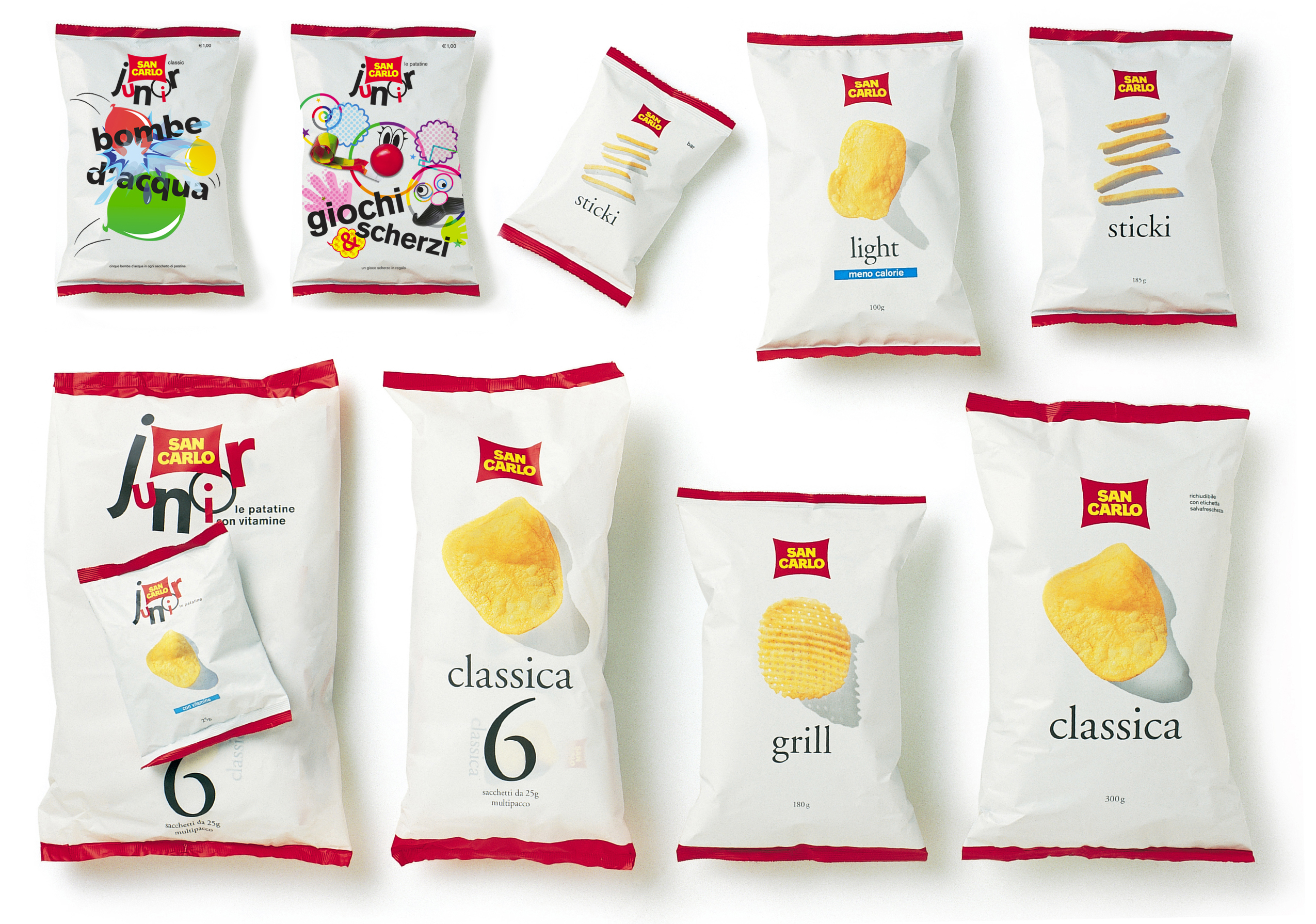
SAN CARLO Potato chips packaging
Photo Credit: Marirosa Toscani Ballo
2002 – Milan, Italy
The San Carlo white pack has been a revolution when it appeared on the shelves of the Italian supermakets in 2002.
Oliviero Toscani (then creative director at San Carlo) asked me to design a new packaging for potatoe chips following the “healthy like” brief from the client.
Up till then, “party snacks” packagings had always been glossy, very colourful and had an agressive use of typography. Every brand was trying to “shout” stronger than its competitors. Doing research for a few months in Europe, North America and Southeast Asia I collected nearly hundred potato chips packs. The day of the presentation, I laid out hundreds of packagings on the table, those of San Carlo included, and very slowly I let down on top an opaque sheet of white paper and I said “here we cannot say more, we have to start from scratch”. I presented only one proposal and the president immediately approved.

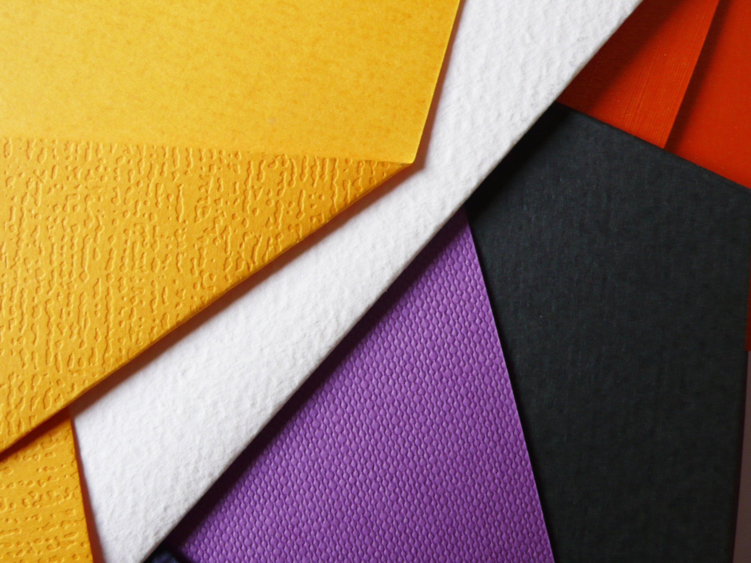
FEDRIGONI / Limited Edition sample paper book
Photo Credit: Ginette Caron
2013 – Milan, Italy
“Su Misura special papers catalog” presents a selection of bespoke papers designed to meet the demands of sophisticated clients. The richness of the collection is presented through a series of flat sculptures made out of folded of papers in a counterpoint of colours, textures, finishes and weights. An explosion of vitality and an invitation to endless possibilities.

BVLGARI / the Spirit, a coffee table book
Photo Credit: Ginette Caron
1989 – Milan, Italy
The coffee table book project for the jeweller BVLGARI had been the subject of a competition involving large advertising agencies in Rome and Milan.
I called it “Bulgari, the Spirit”, a book in which the text did not describe the unique and precious jewels, but told of the unconscious inspiration that had made it possible to create such marvels: a tribute to the Italians who are always surrounded and imbued with the sublime in spite of themselves.
It was the first book I made, in 1989.

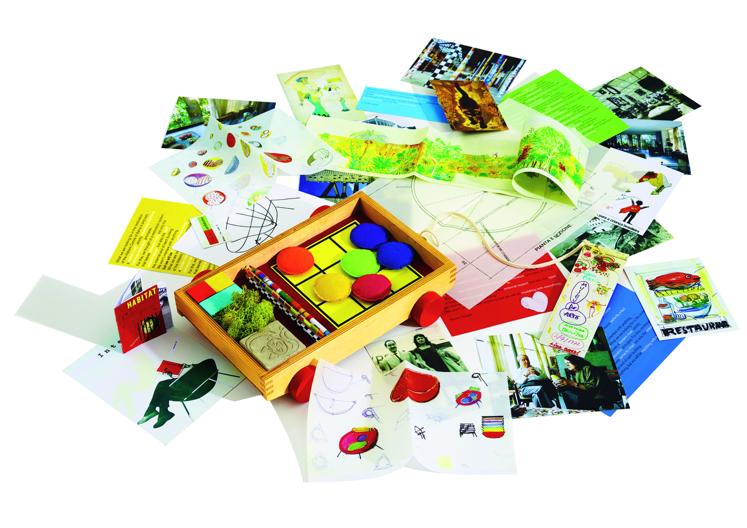
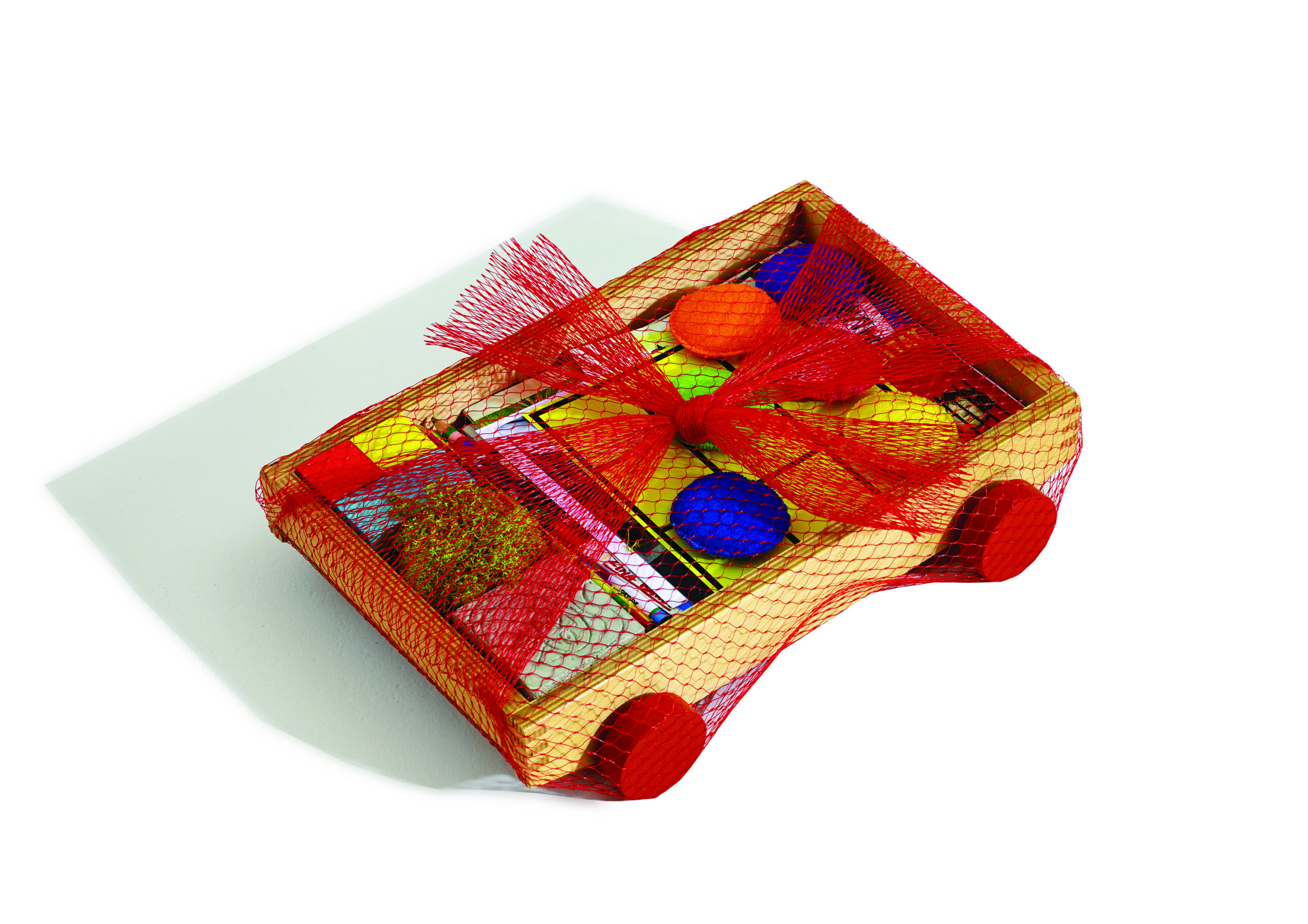
ARPER / Lina Bo Bardi Bowl Chair / Identity luxury kit
2014 – Milan, Italy
To represent the project, a very special communication tool was designed. Instead of the book the client had asked, I designed Lina’s secret drawer, a box of souvenirs in the shape of a small cart in which one could find photos of her and her projects, drawings, postcards, coloured wooded blocks, crayons, fossil moss, concrete block engraved with the image of her cat, etc. A tribute to Lina Bo Bardi, her versatility, her playful spirit and enthusiasm for collecting toys and objects of all kinds.
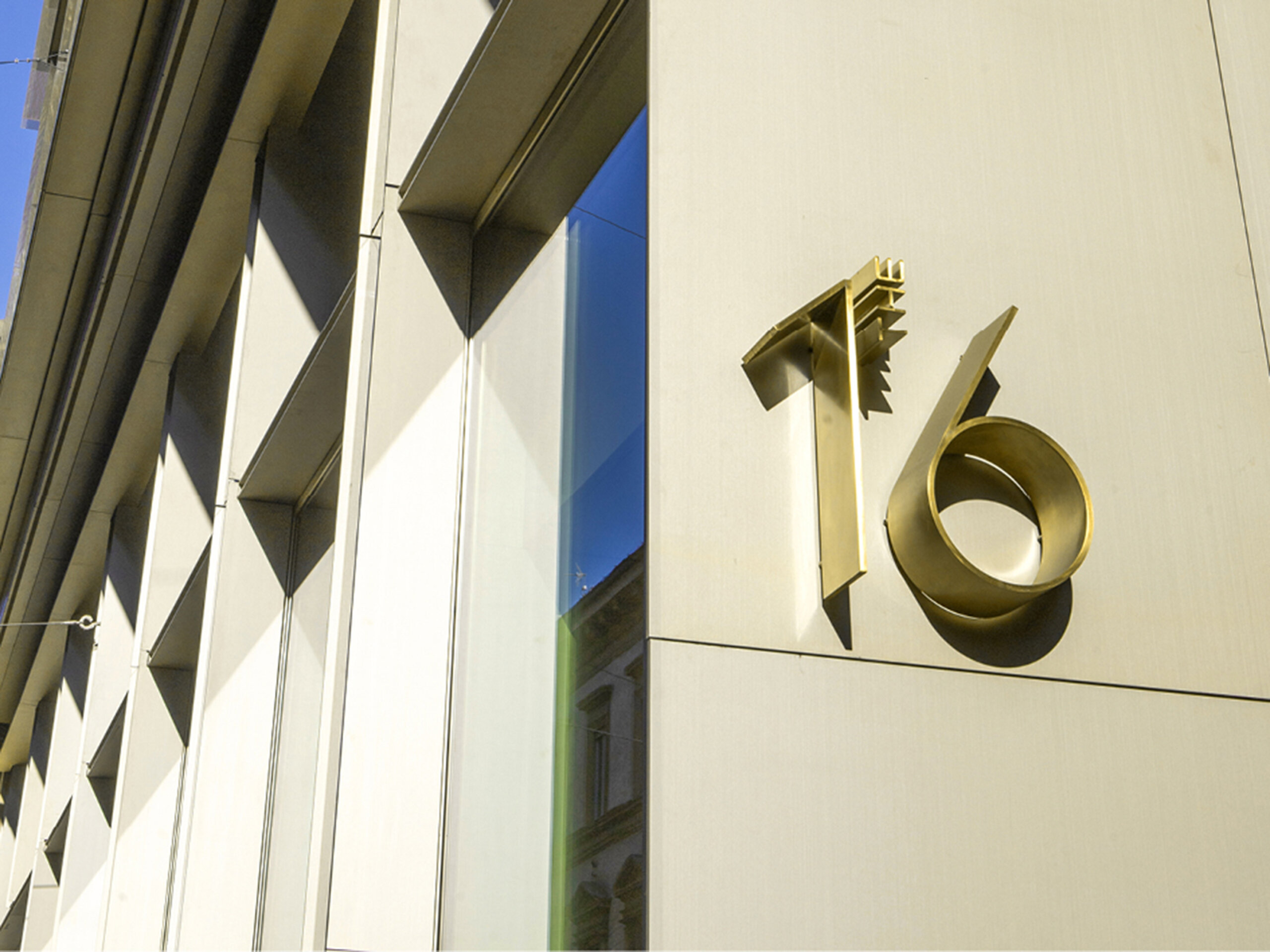
THE 16 – Office building in the center of Milan
Photo Credit: Ginette Caron
2019 – Milan, Italy
Naming, signage and way finding for an office building in the center of Milan, designed by Quattroassociati architects.

