

Share to
Image de marque du Centre de glaces Intact Assurance
By : Lemay
GRANDS PRIX DU DESIGN – 15th edition
Discipline : Communication & Branding
Categories : Brand Design / Brand Identity Creation and Update : Bronze Certification
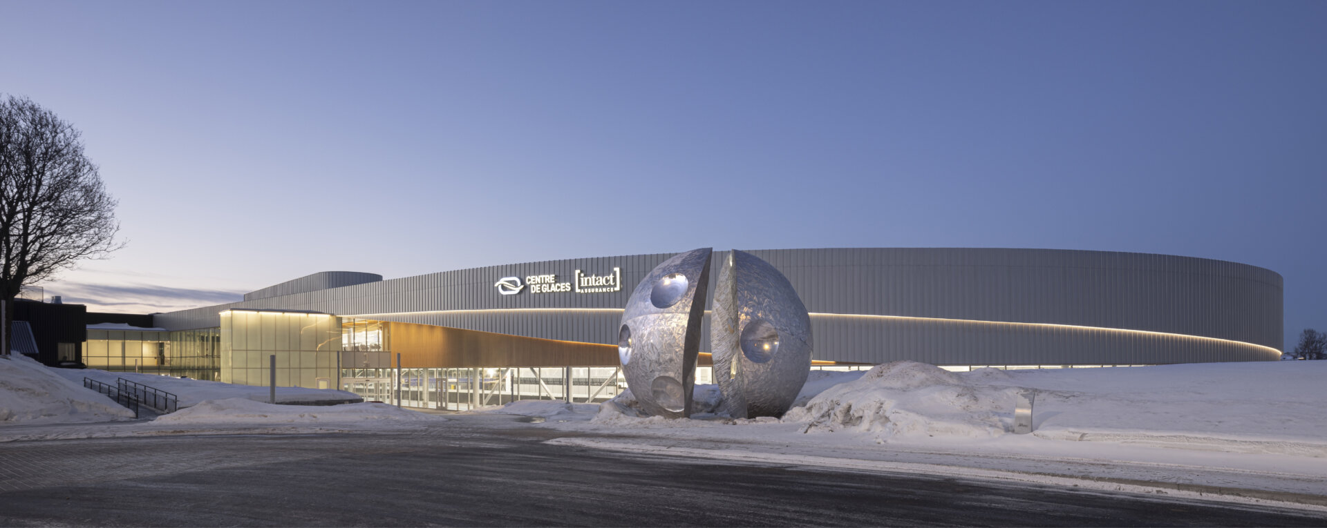
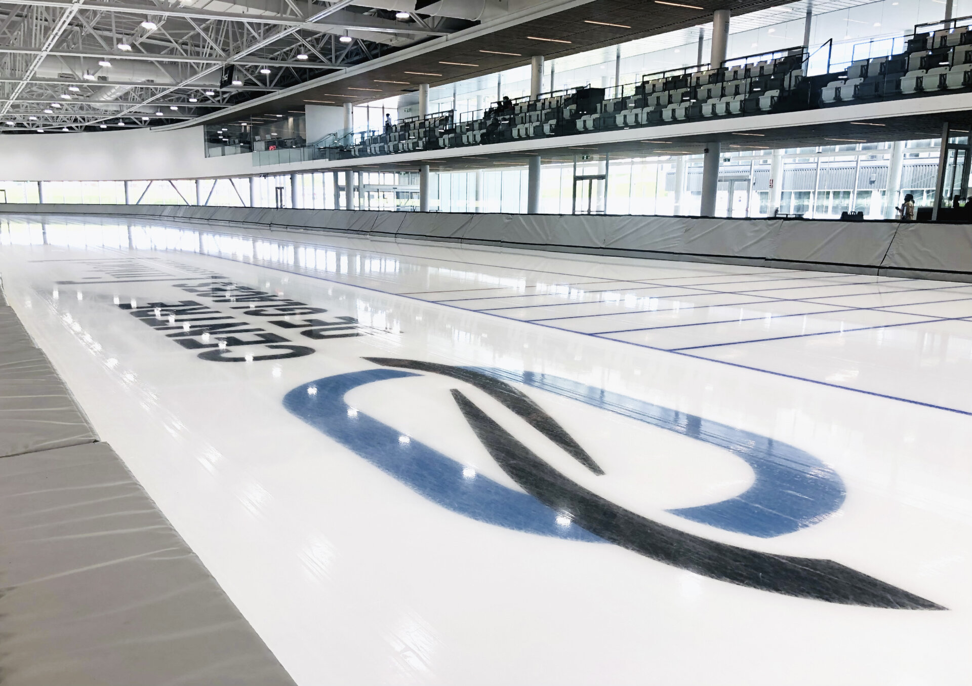
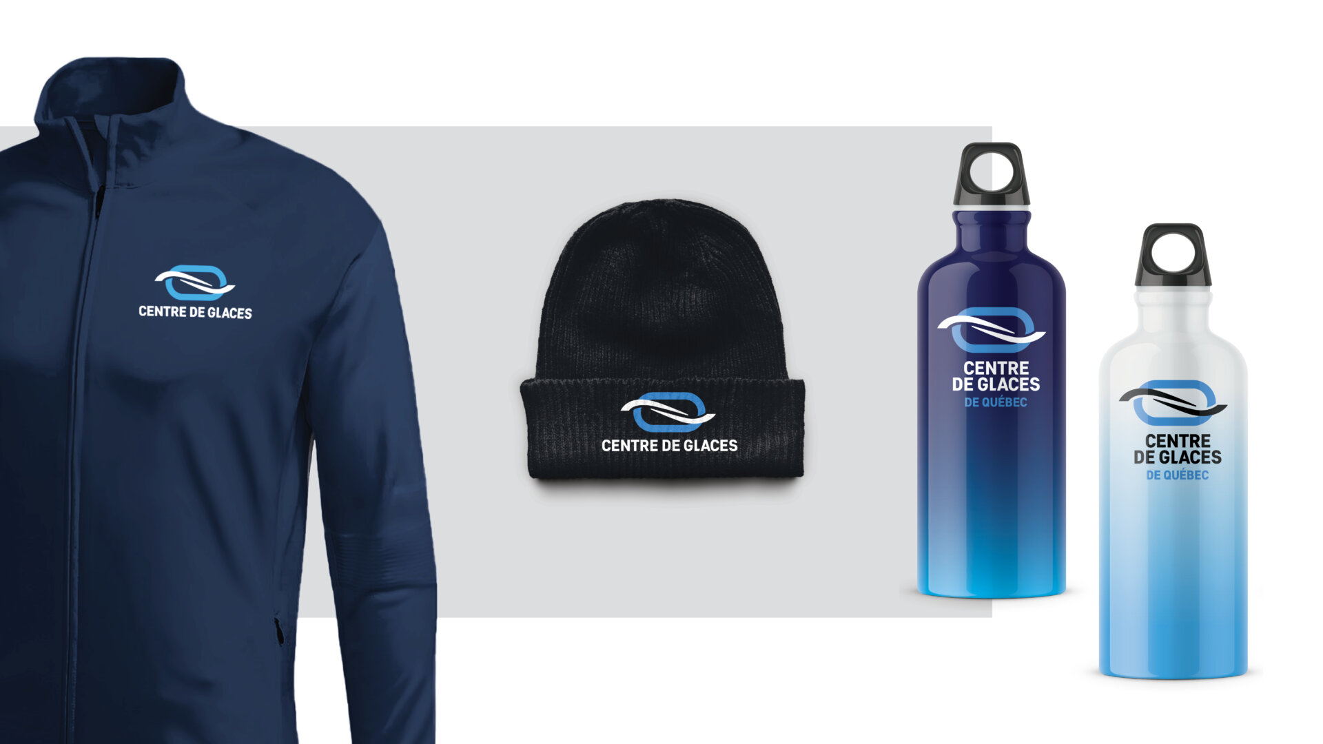
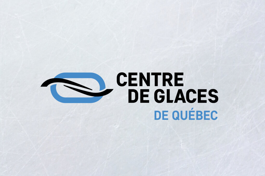
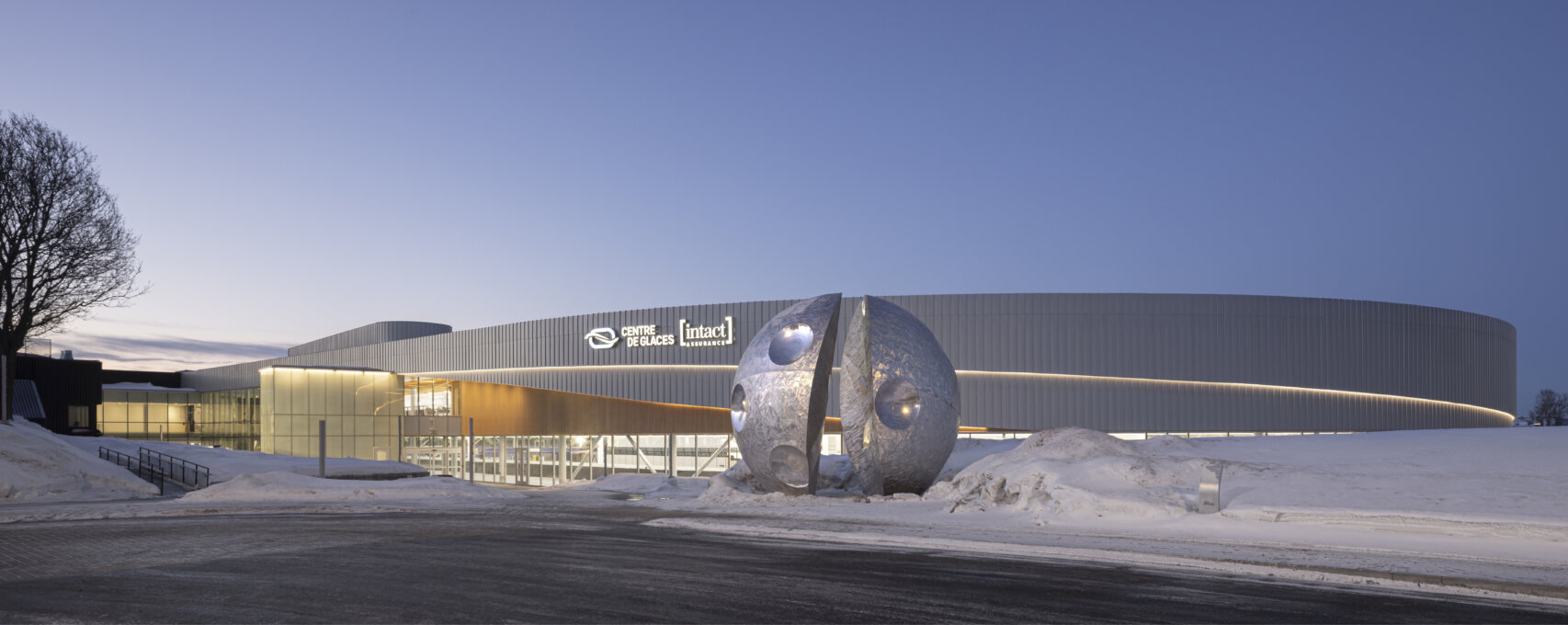
The Centre de glaces’ signature would require a strong yet minimalistic brand capable of acting as a new symbol for Québec City, one that would immediately conjure thoughts of movement on ice while placing a particular emphasis on skating. The identity of this logo would need to be balanced between acting as a lasting representation of a unique project’s architectural design, contain the ambitions to be a new central hub for ice sports, be capable of integration with the logo of current or future partners, and contain a subtle yet alluring experiential element to inspire active use of its facilities. The identity is represented by three key elements: First is memory—memory of place and of athletic achievements past and present—through an oval to recall the ice ring’s shape and the striking architectural detail of the Centre de glaces’ luminous band. This oval was coloured blue to evoke the second element season of winter and its cold temperatures, features that are characteristic of Québec City. This blue ring is then intersected by the element of movement, represented by two elliptical shapes that speak to both the momentum of a skater, and their gliding across curves of ice.
Collaboration


