


Share to
Mobilier d’accueil de la Tour Trinity
By : Cro&Co Architecture / URW
GRANDS PRIX DU DESIGN – 15th edition
Discipline : Product
Categories : Product Design in Small Series & Hand-Made / Residential, Commercial & Built-In Furniture : Platinum Winner, Gold Certification
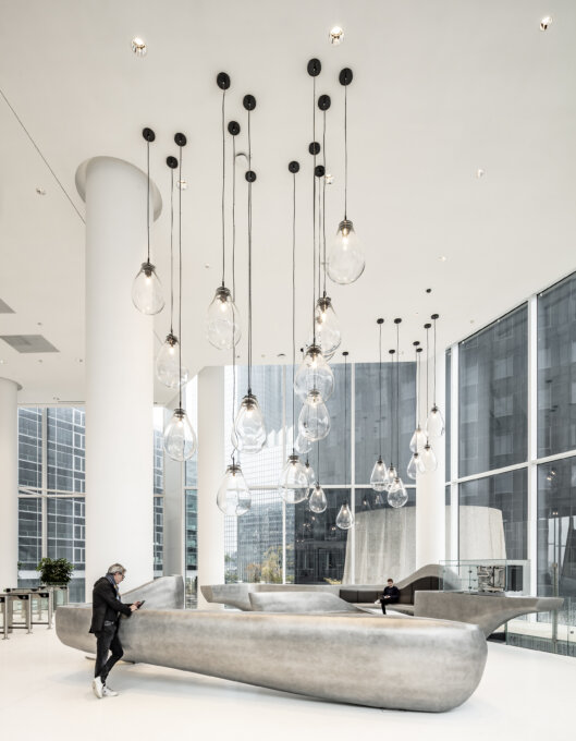
The furniture for Trinity is a project within a project.
Unibail-Rodamco-Westfield entrusted Cro&Co Architecture with the design of the Trinity Tower.
Cro&Co broke with the codes of a high-rise building, opening it up to its environment by means of terraces, access to the outside on every floor, and opening windows. Placed over a road, the structure of the tower is a technical feat. With its off-centre core, it provides users with a central area that is flooded with natural light.
From this experience came a new collaboration between client and practice; that of designing the furniture for the entrance hall, with the varied functions of reception, waiting and conviviality.
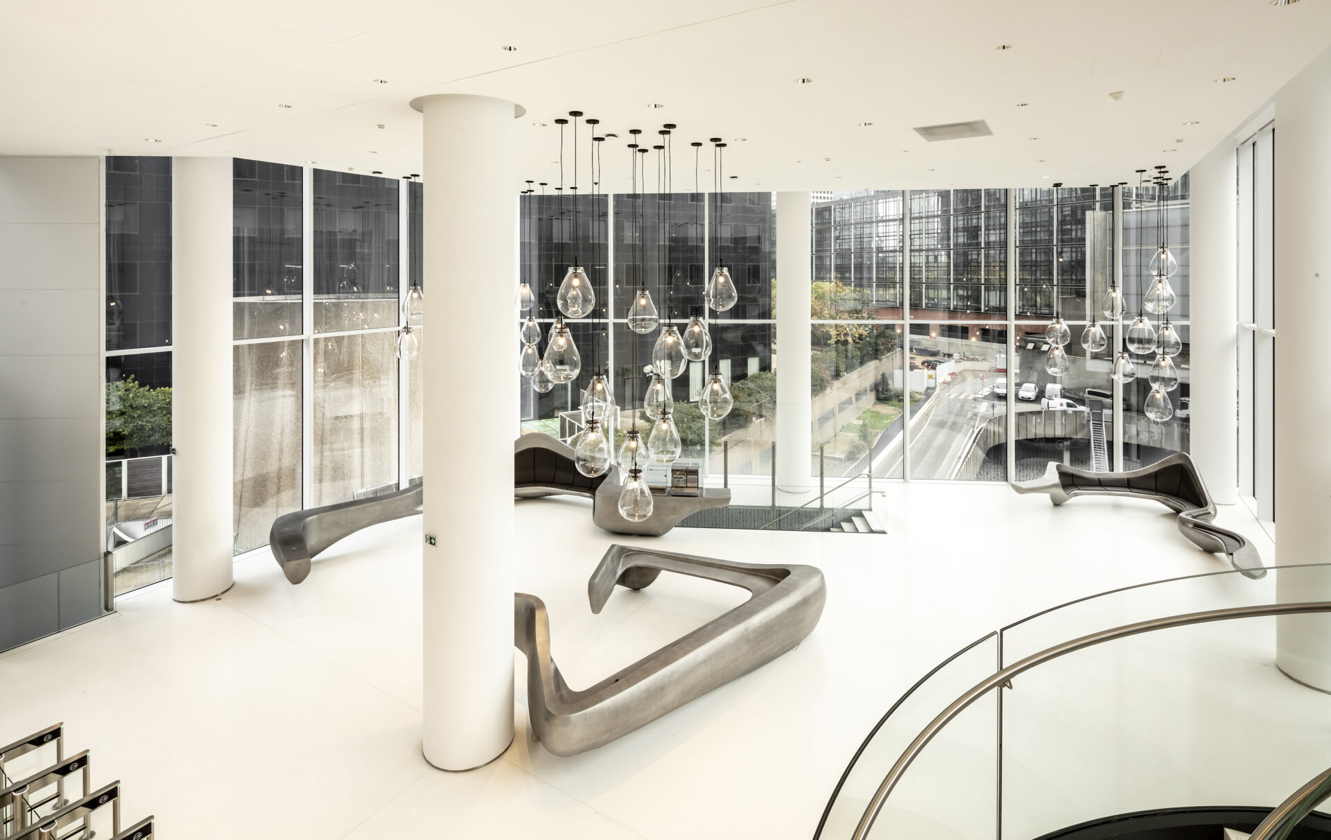
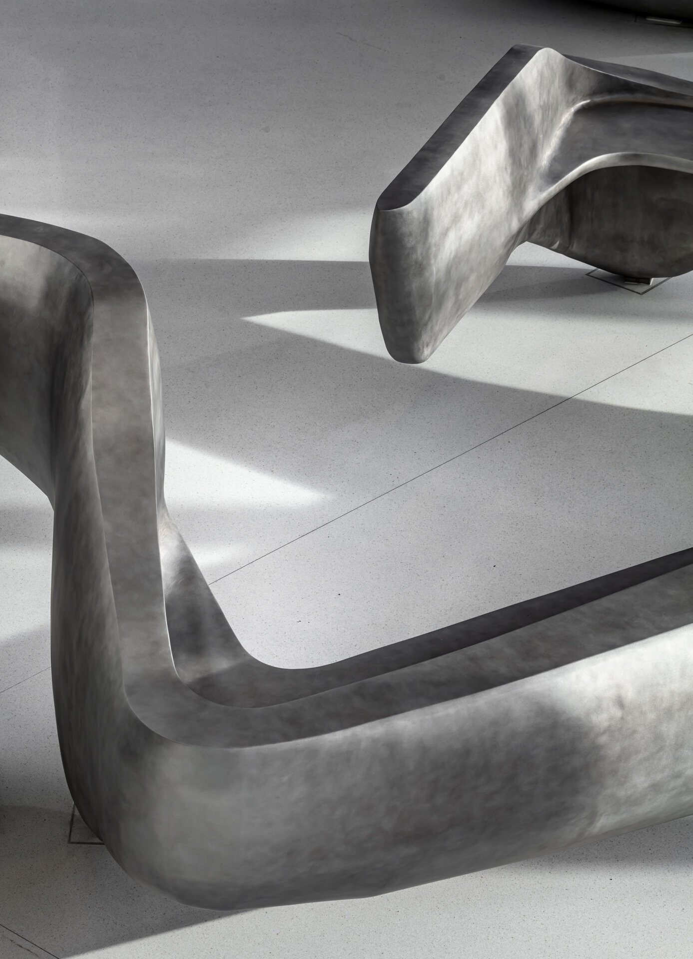
While the architecture of Trinity was designed to fit into its environment, the furniture responds to its context with a play of curves in three dimensions.
The practice chose to work on a single object, extrapolating it into a triptych in response to the three desired functions.
Reception
The reception desk incorporates three workstations with multiple storage spaces.
Its varying height allows visitors to be welcomed standing or seated.
Waiting
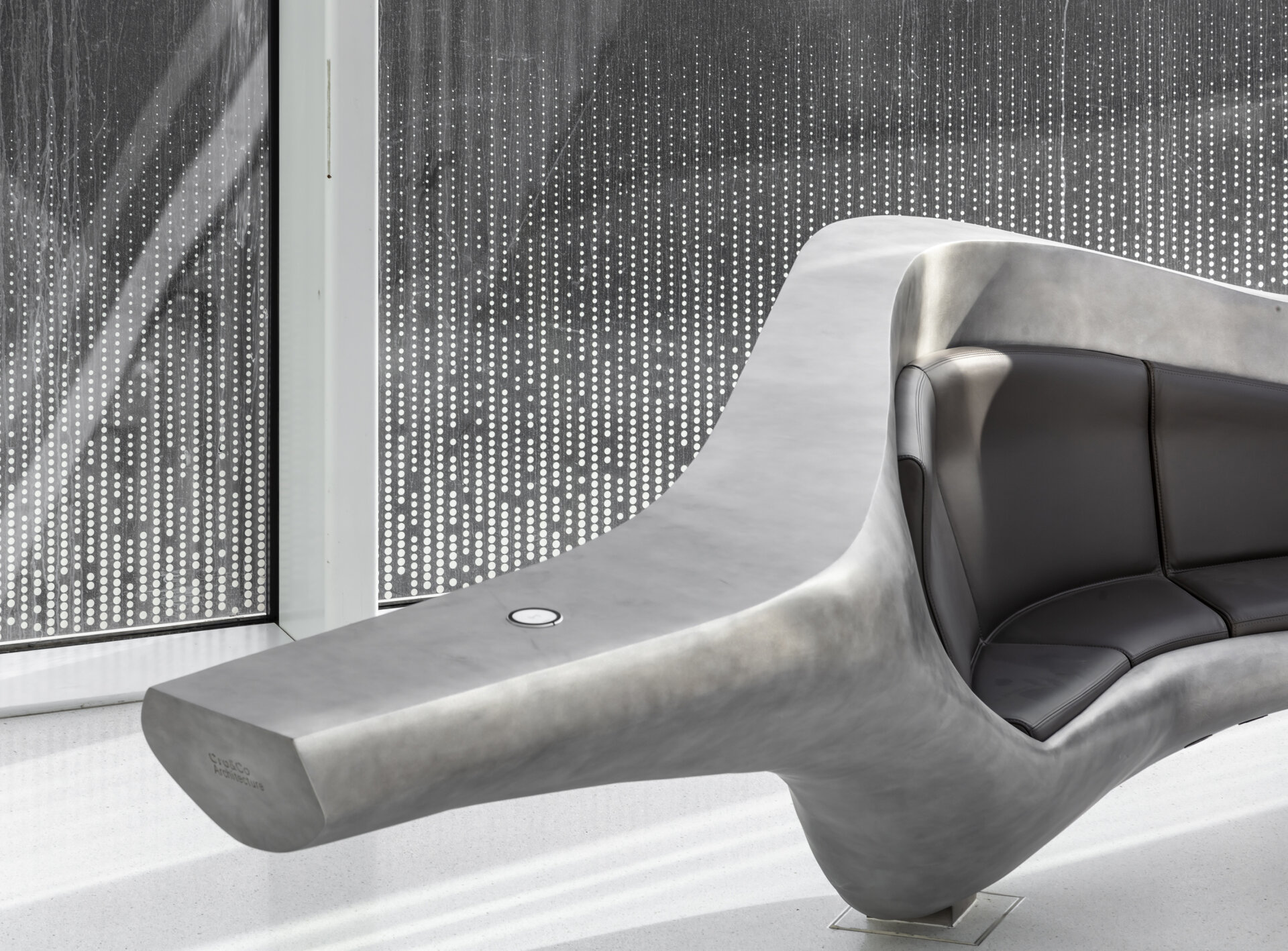
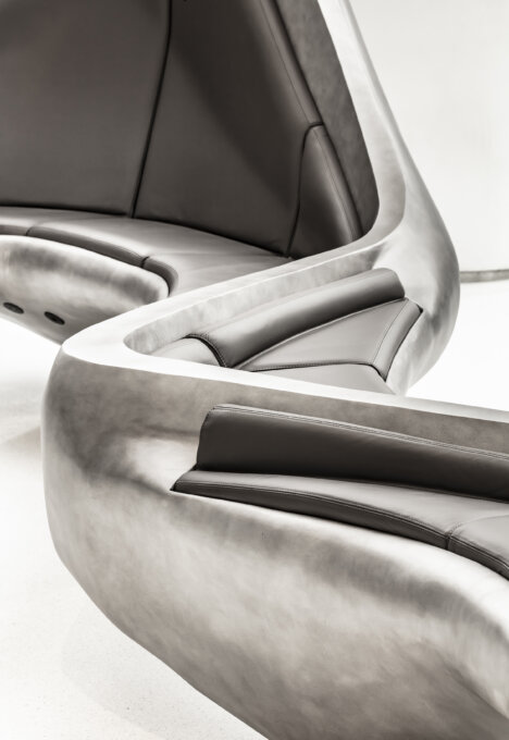
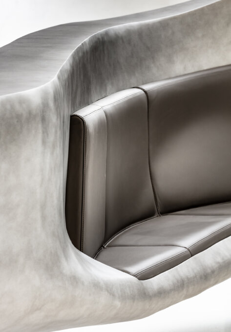
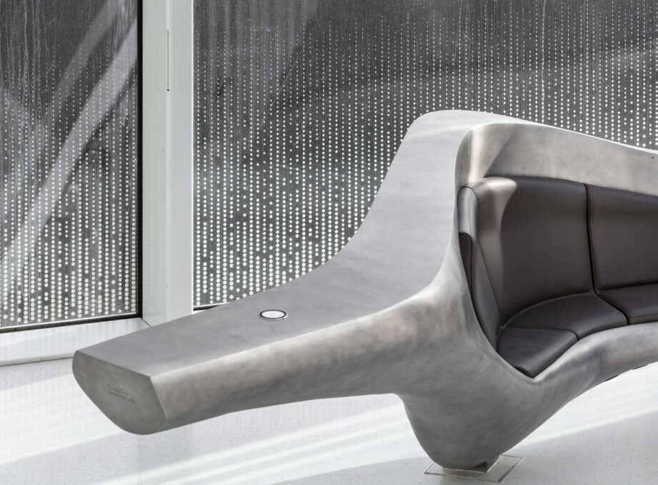
The variation with a very high back is adapted for seating, flowing out into an elegant cantilever at either end.
Conviviality
A multi-functional water bar caters for a break in the day.
All pieces are equipped with conventional or wireless charging facilities for IT devices.
This ensemble of separate pieces creates welcoming spaces on a human scale within the volume of the hall. Its curves embrace and enhance the space.
The hall has two distinct user flows, working to principles of fluid dynamics.
The direct flow takes users straight to the lifts, and the other, indirect, is for users in need of guidance. The furniture’s arrangement and curving lines is intended to envelop and reassure.
This design project was entirely conceived within the practice.
Its designs, images and models have been closely studied.
During design, a full-size model of the project was made in order to reply to all the specific constraints of the context, including energy value.
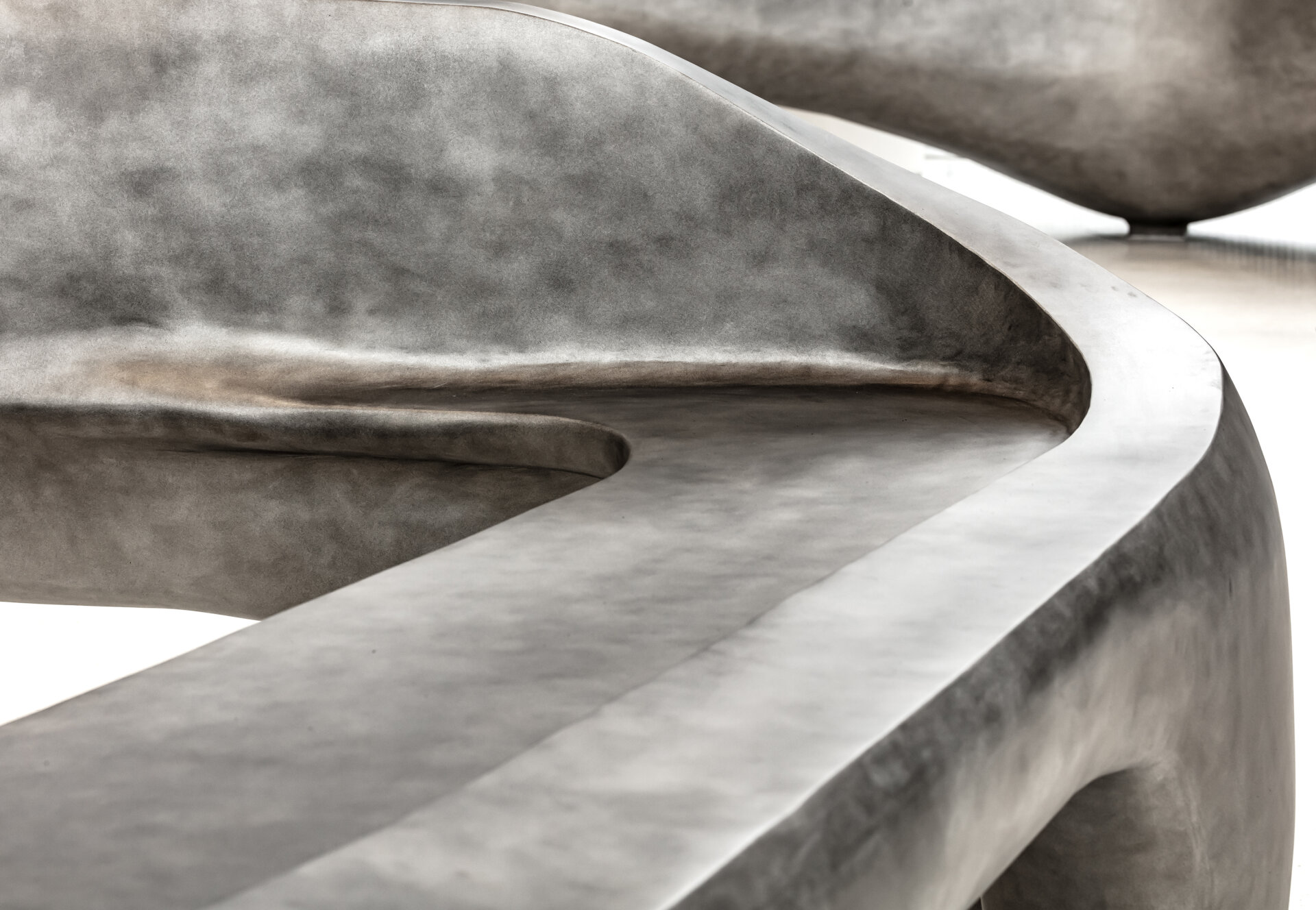
Aluminium was the clear choice for material. The practice was well aware of its qualities, having worked with it on other projects. This ensemble was designed with the help of a boat builder, taking its inspiration from a boat’s hull with its many forms depending on its contours.
Coupled and joined by a 6mm sheet of raw aluminium. Welded then sanded, the surface was then brushed and varnished in a light brown.
The upholstered elements, which also came from the world of boatbuilding, were tested by means of a polystyrene prototype to ascertain the comfort of the seating and hardness of the foam used. The ensemble was covered with a full-grain leather finish in warm tones.
The overall harmony of forms and materials creates an object that is tactile and visual, inviting users into a welcoming space.


