



Share to
XIAMEN LUCHAO KULANGSU ART PARK
By : FANCY DESIGN
GRANDS PRIX DU DESIGN – 15th edition
Discipline : Interior Design
Categories : Culture, Sport & Leisure / Community Center : Gold Certification
Luchao Kulangsu Art Park, located on the west coast of Kulangsu Island, used to be the Kulangsu Campus of Xiamen Academy of Arts and Design of Fuzhou University which was known as the "Huangpu Military Academy (previous outstanding military school in China) of Fujian Fine Arts". In July 2017, with the glory of “Historic International Settlement”, Kulangsu was exalted as World Cultural Heritage. Once known as "the cradle of modern Chinese education", the art island once again attracted the world's attention. It was the very time for Xiamen Luchao Kulangsu Art Park to shoulder the mission of "bringing culture back to Kulangsu and reshaping Kulangsu with art".
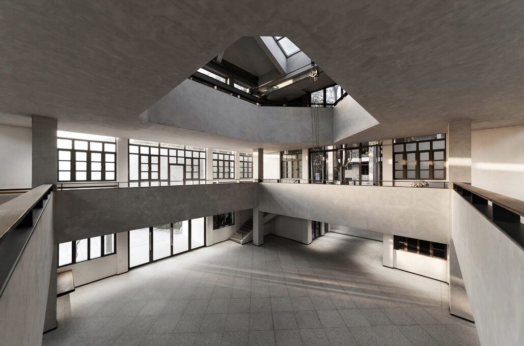
"KAP Gallery" was built in 1986, and the design team undertakes the renovation project this time. The hall used to be the sculpture studio of the Academy of Arts and Design, and after more than 30 years of accumulation, it harvests rich history. After the re-planning of the park, it will be used as an independent multifunction art space and keep operating continuously. On the premise of fully respecting the history of the building, the team reorganizes the space form. In addition to repair and transformation based on functions, the team selectively preserves and restores the historical imprints of the site to achieve a connection between history and the present, which allows new memories to grow in the "shell" of the old building.
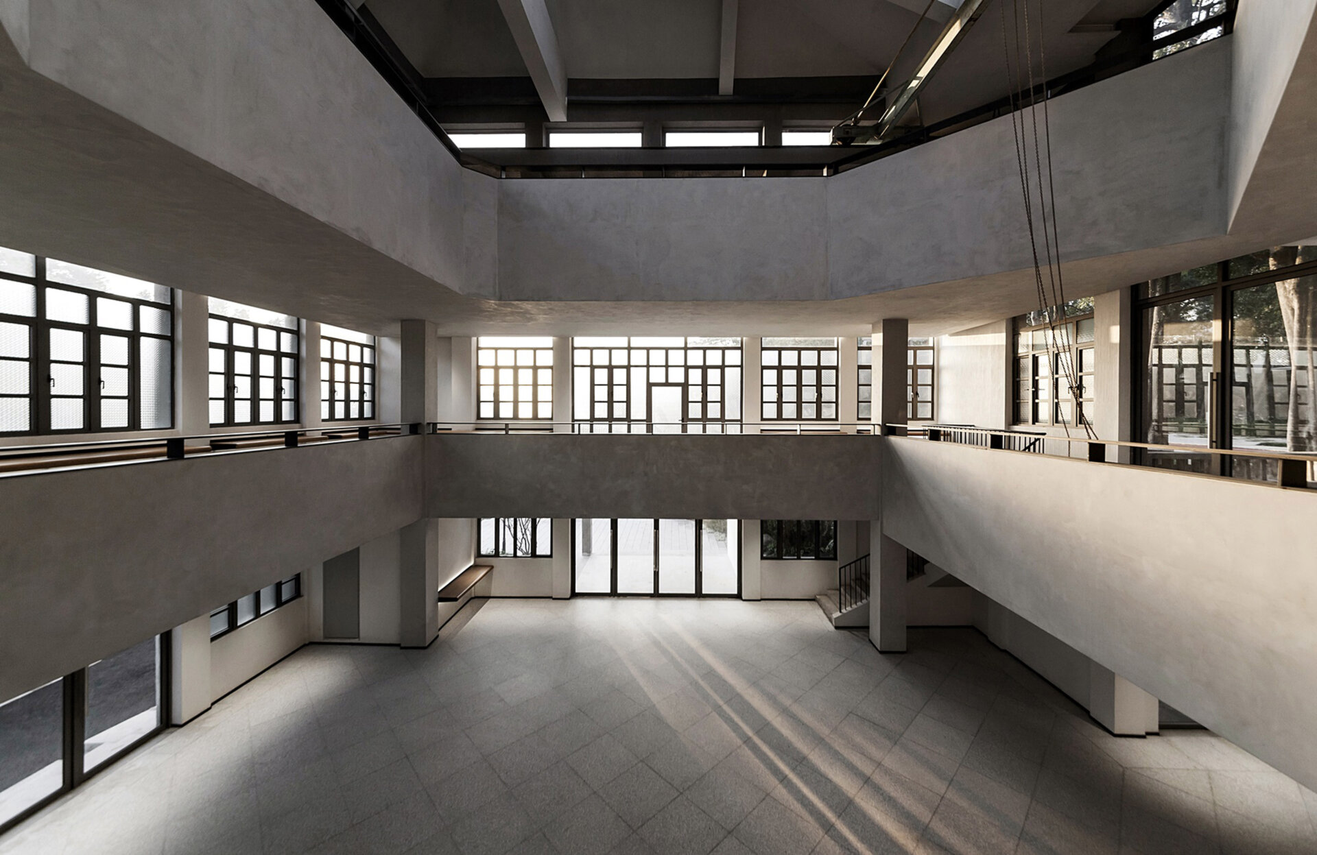
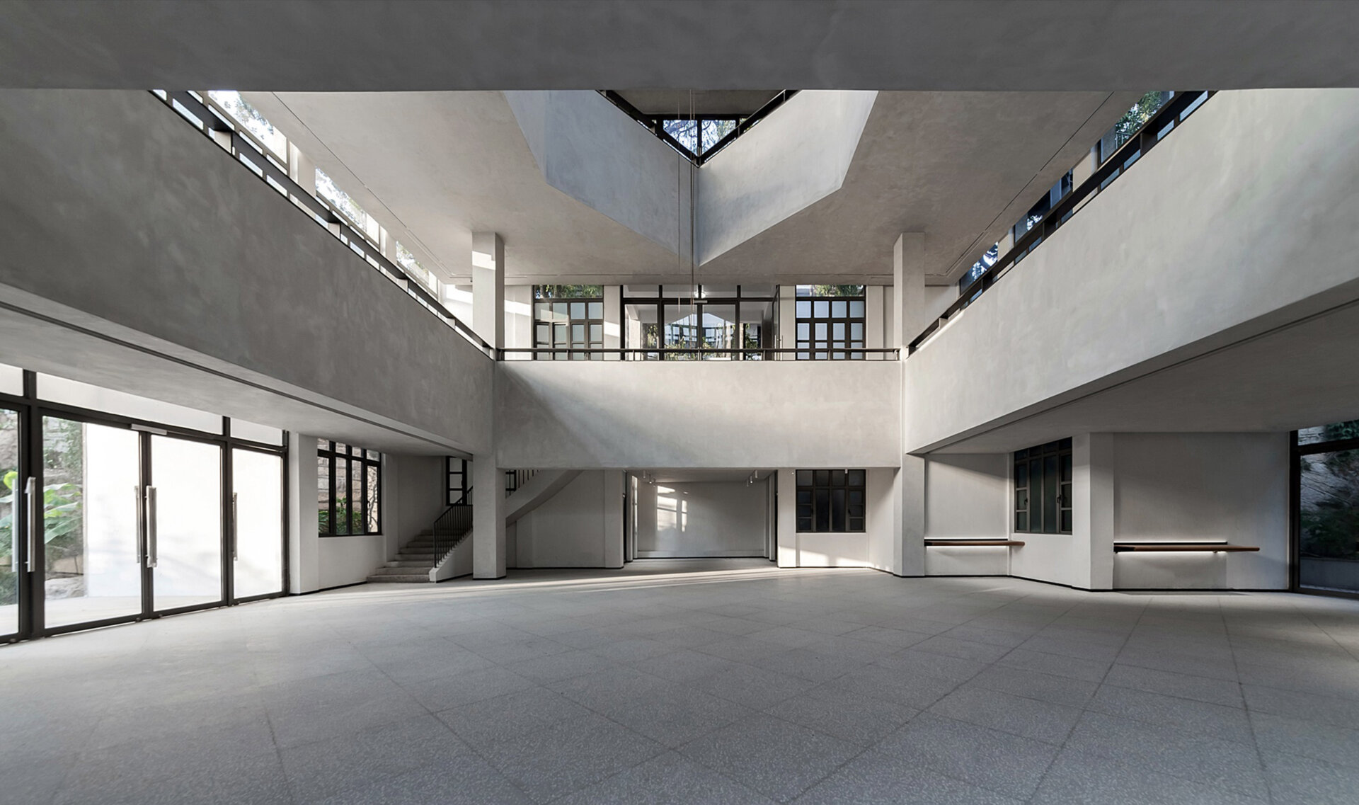
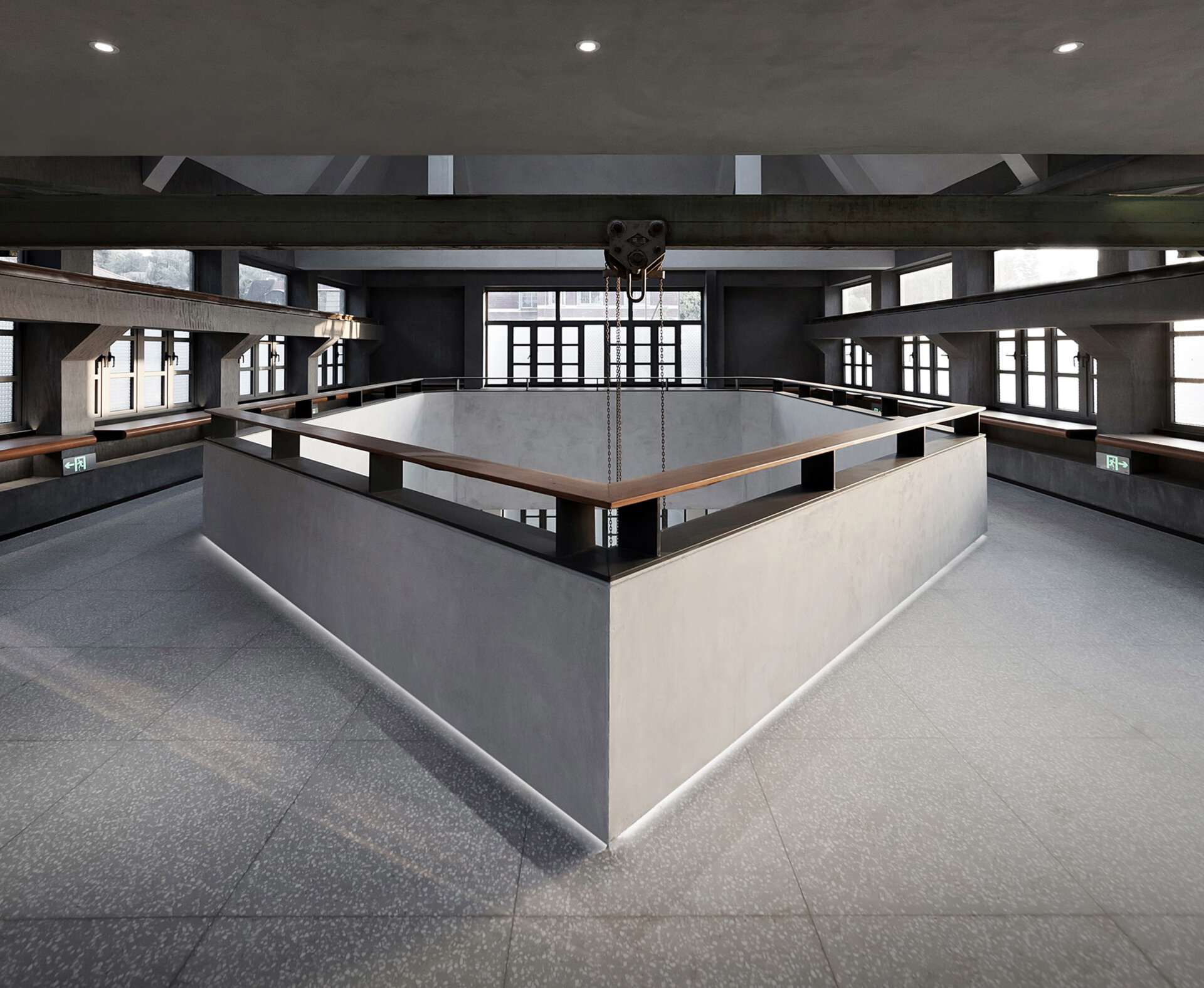
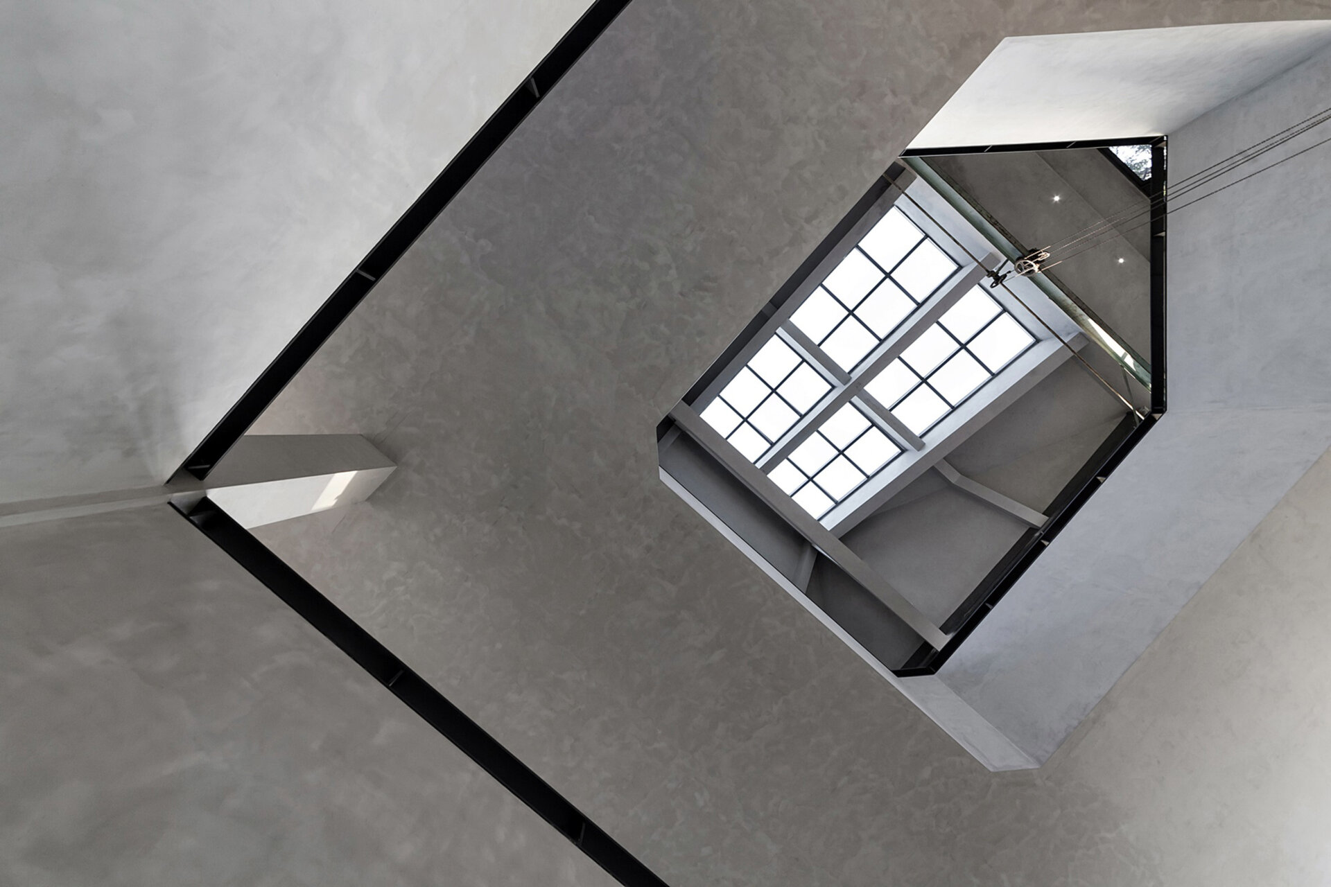
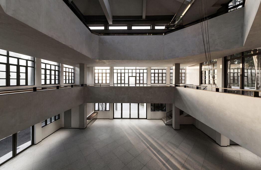
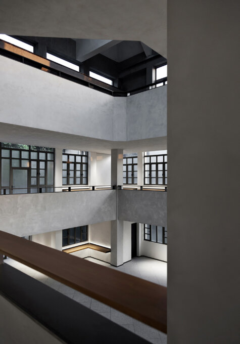
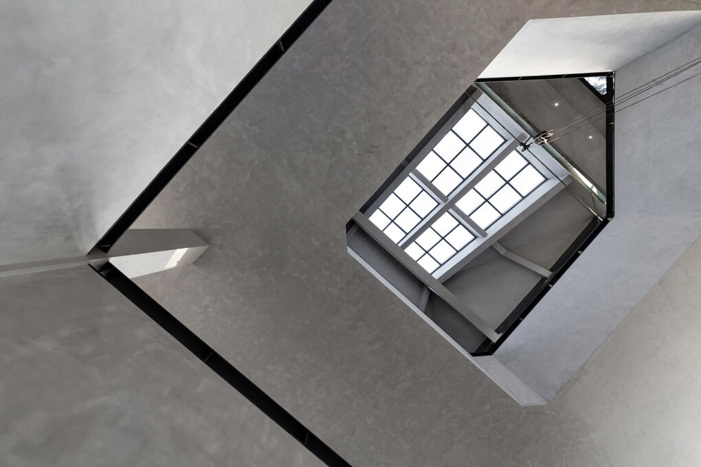
Because the original building is three-storey high, the excellent height and pane lighting bring plenty of sunlight, making the interior space more bright and inspiring. Due to the limitations of building construction techniques in the 1980s, there are many exposed structural frames and small wedges in the interior of the hall. Regarding them as precious heritage and original details that show the historical background of the site, the team retains them one by one. Only cement texture paint is used to organize and integrate the original appearance and order of the building, so that time can form tension in the scene.
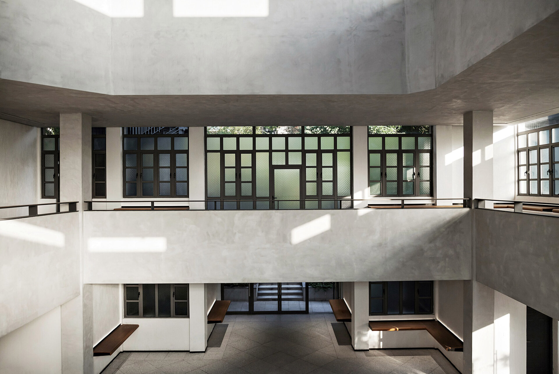
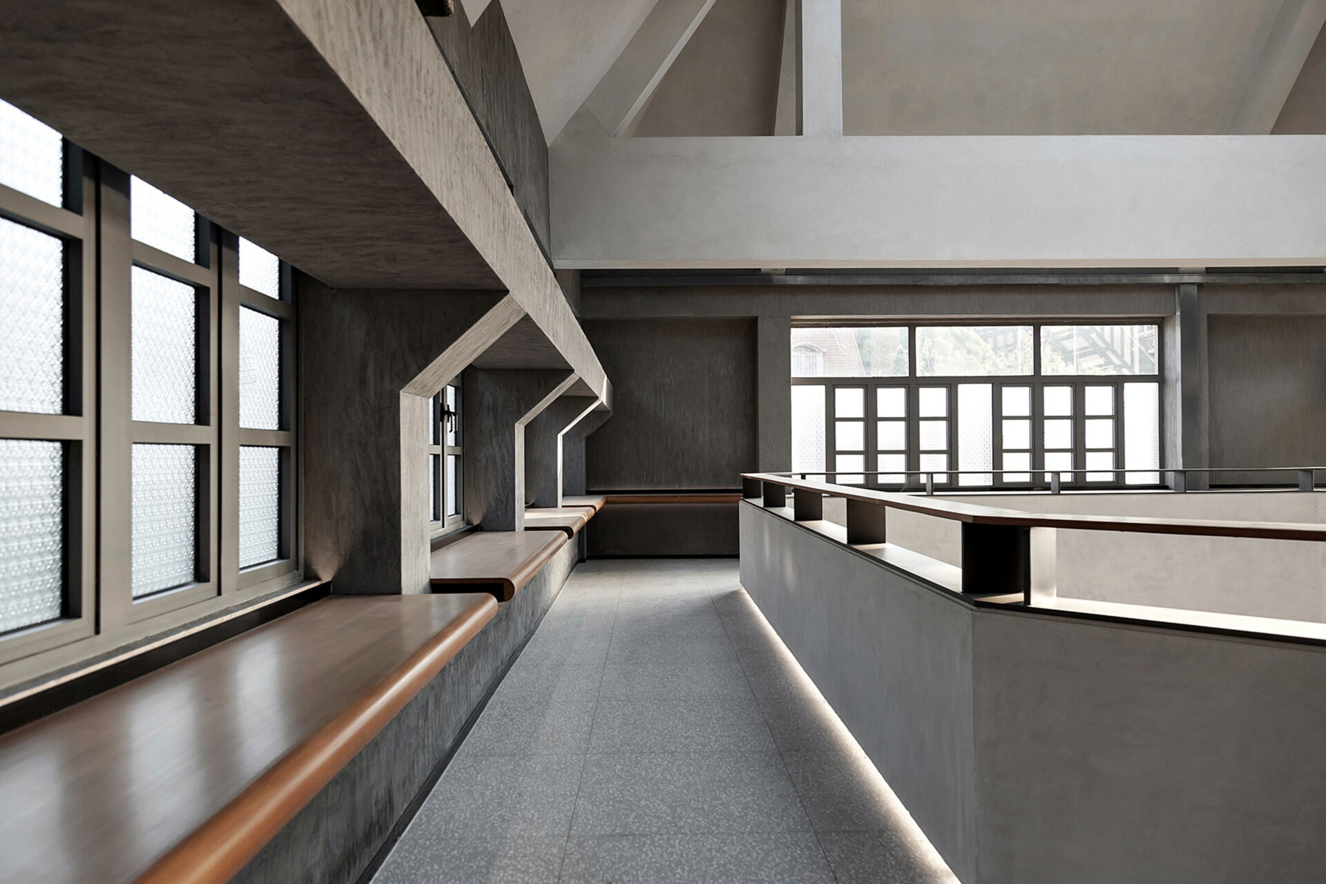
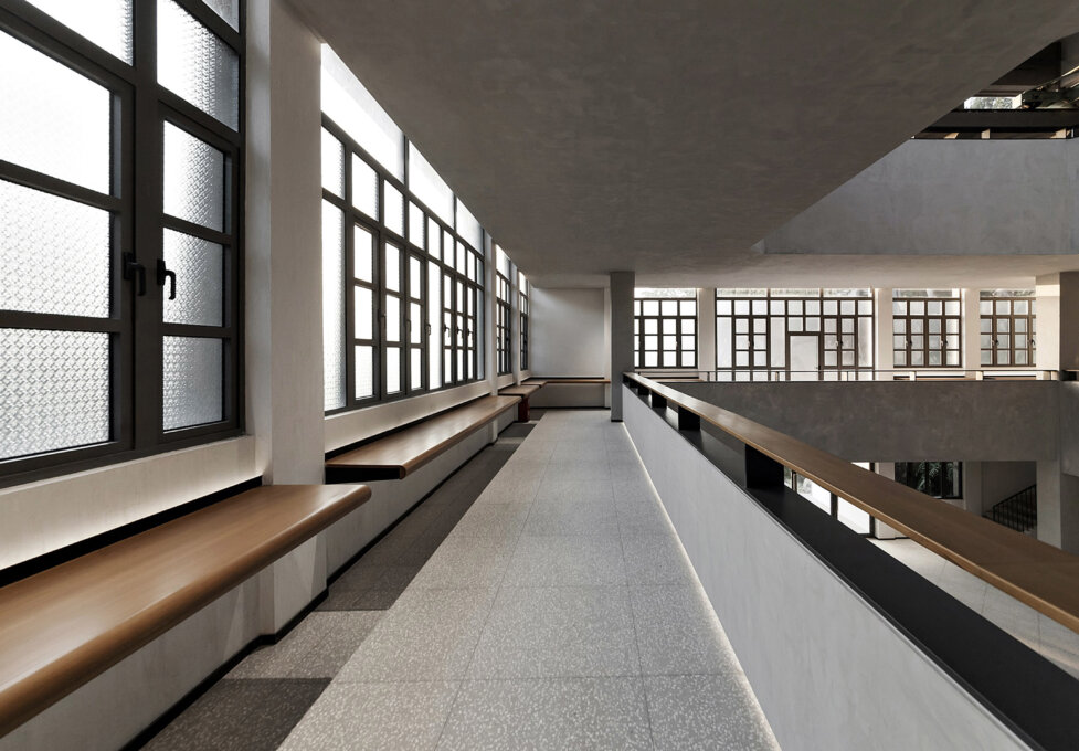
In the exhibition space on the second to the third floor, the team widens the originally narrow maintenance path to meet the traffic needs during the exhibition. Visitors can walk up around the atrium, and have a panoramic view of the exhibition hall. Wide and thick corridor handrails and display booths embedded in the structural columns are covered with warm wood. With careful and subtle intervention techniques, visitors will gain an intimate sensory experience in the process of walking, watching and resting.
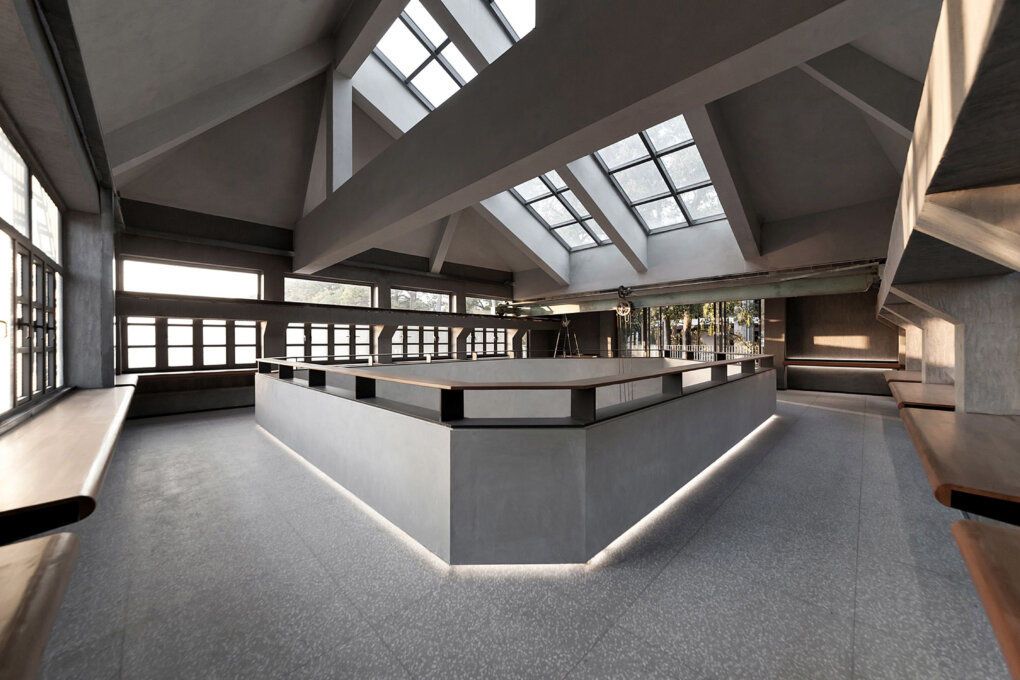
The sliding rail device at the top of the space originally used to transfer large stone sculpture is preserved for its historical value, with mottled rust to remind people of the passage of time. The crabapple grain glass windows restored as before, the terrazzo floor with a sense of age, and the plaster corner lines on the ceiling are all signs of the architectural design details following from decades ago.
The window lattice is still, and light and shadow flow. Alternating functions and aesthetics, the team draws out the origin of the building through designing. It awakens the memory between retaining and discarding, and then evolves the history and writes the present. Through restrained and rational design, the building completes its transition between old and new time and space, walking from the past to new life.
Collaboration
Interior Designer : FANCY DESIGN


