







Share to
Création marque La fabrique optique/Concept boutique optométristes et opticiens
By : Soleil communication de marque
GRANDS PRIX DU DESIGN – 15th edition
Discipline : Communication & Branding : Grand Winner
Categories : Brand Design / Brand Identity Creation and Update : Gold Certification
Categories : Environmental Design / Brand Universe : Gold Certification, Platinum Winner
La fabrique optique is an eyewear banner inspired by an artisanal approach to the production of eyeglasses along with a focus on customer service. Part of a “hipster chic” inspired vision of local business, many examples of which can be found in the restaurant, food, personal care and clothing sectors, it conjures up a connection to community and is rooted in a spirit of local service.
The artisanal notion is key to the brand’s vision. A personalized customer approach, an in-house lens production workshop, the quest for local suppliers, and the importance of using quality, environmentally friendly materials are among the features that define La fabrique optique.
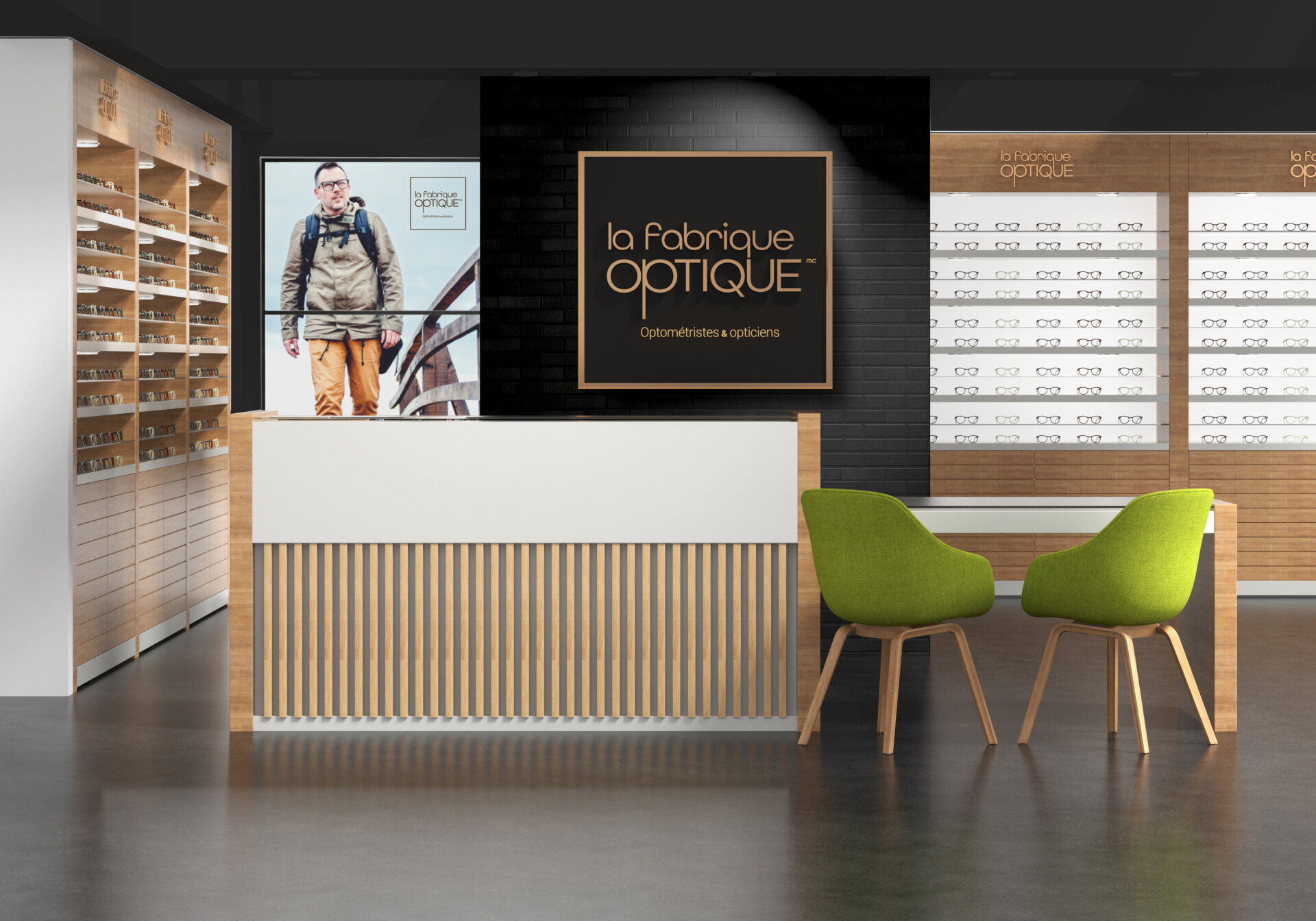
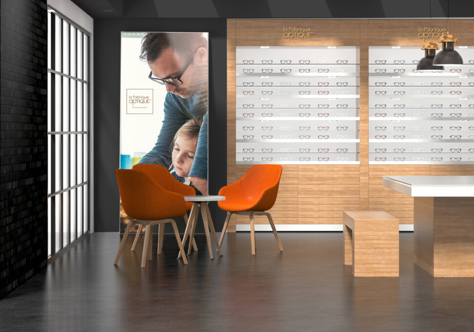
Effectively supporting this vision, its shops are designed to facilitate interpersonal exchanges and showcase the “factory” concept.
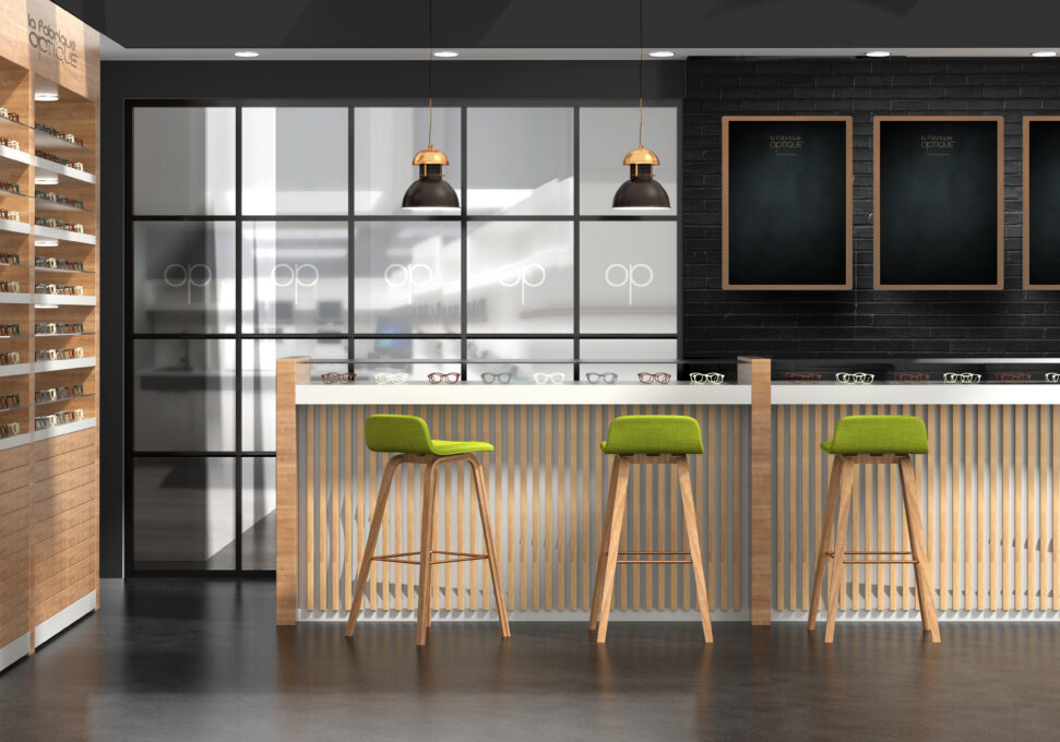
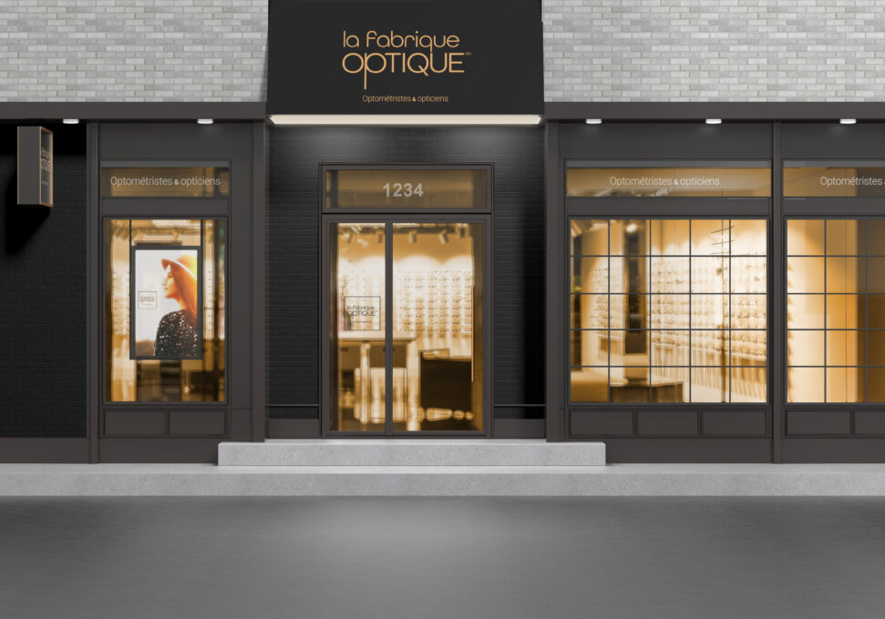
In fact, in the shop, this last feature translates into post-industrial style architectural elements such as brick, brass, raw materials and wood as well as paned windows and steel. A hybrid approach, it also includes touches of Scandinavian modernism, introduced to lighten the space and maximize the presence of displays.
At the heart of the concept is the lens production workshop (the factory), which is separated from the main area by a glass partition. The service counter is modelled after a coffee shop counter. Signage takes the form of slates as well as kraft cardboard posters where special offers can be advertised.
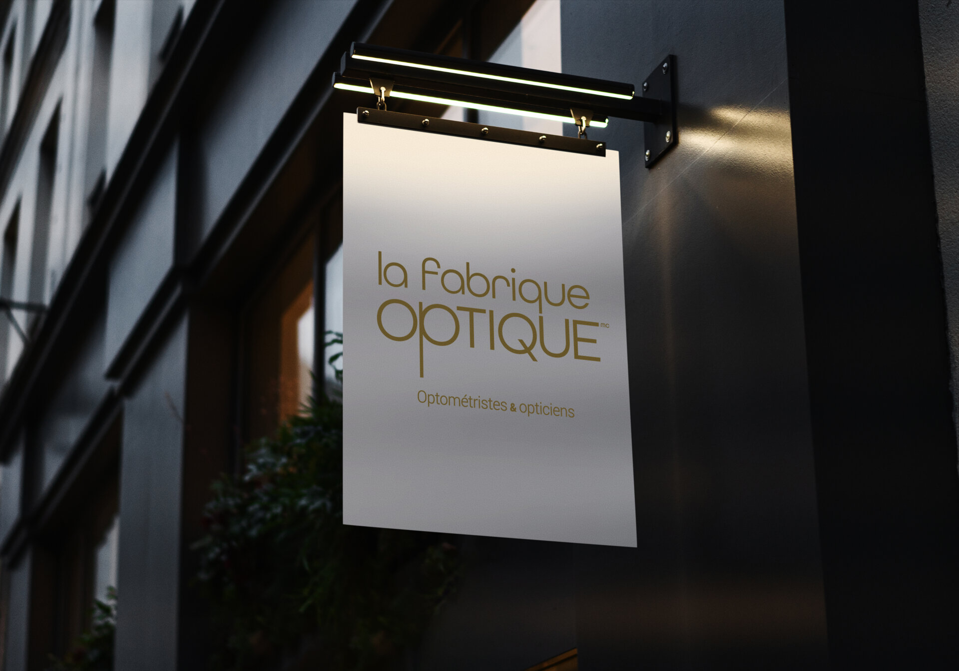
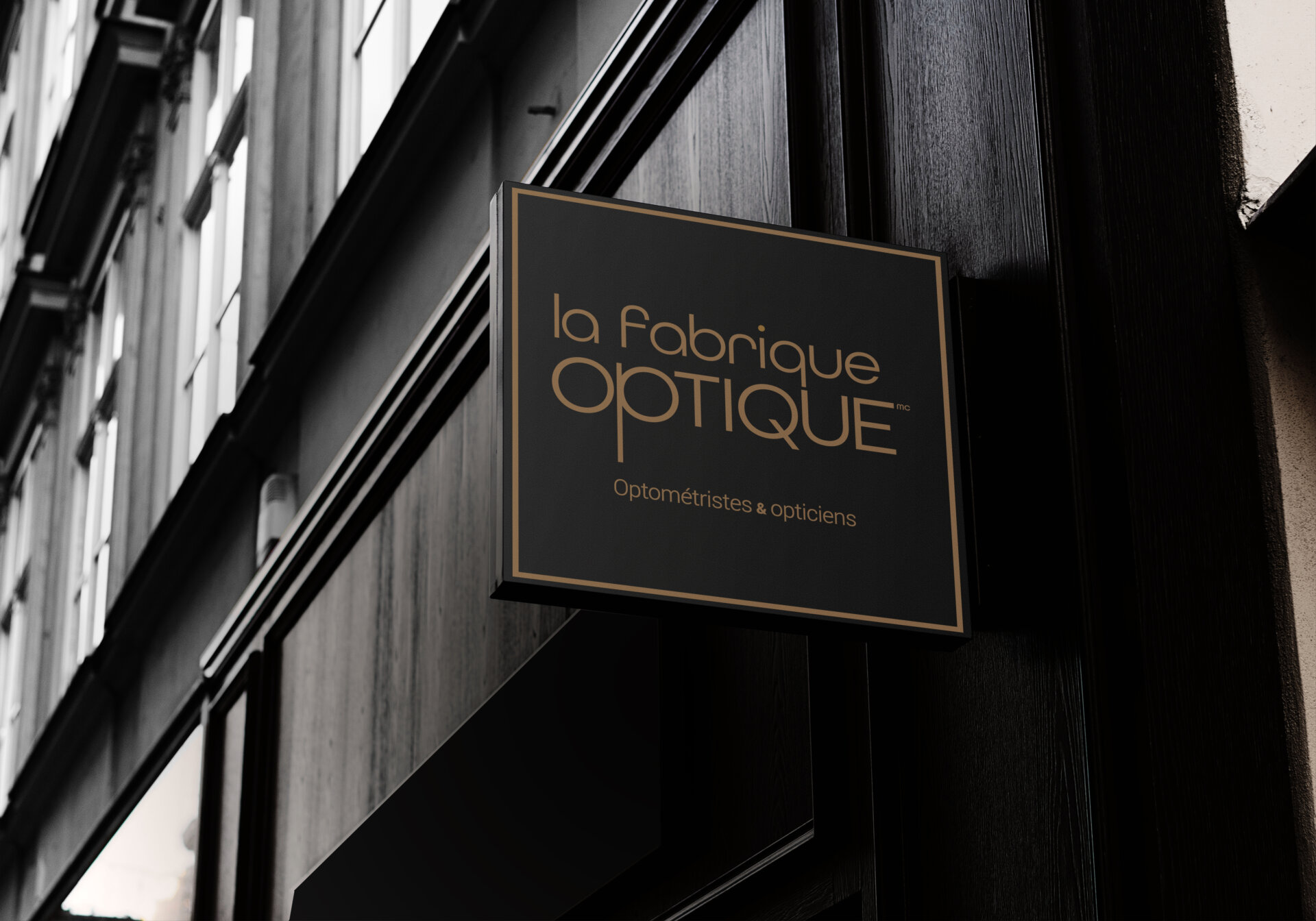
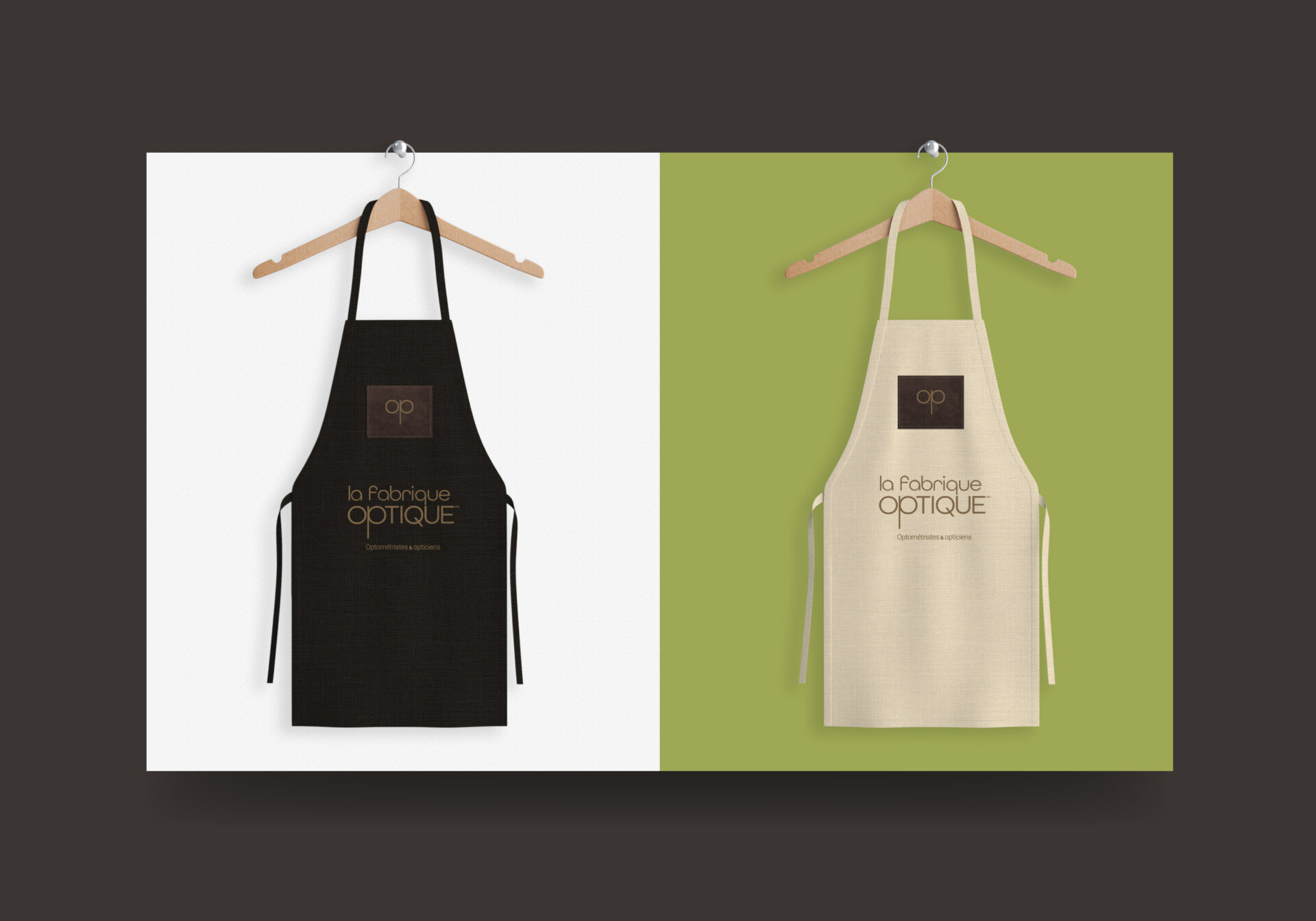
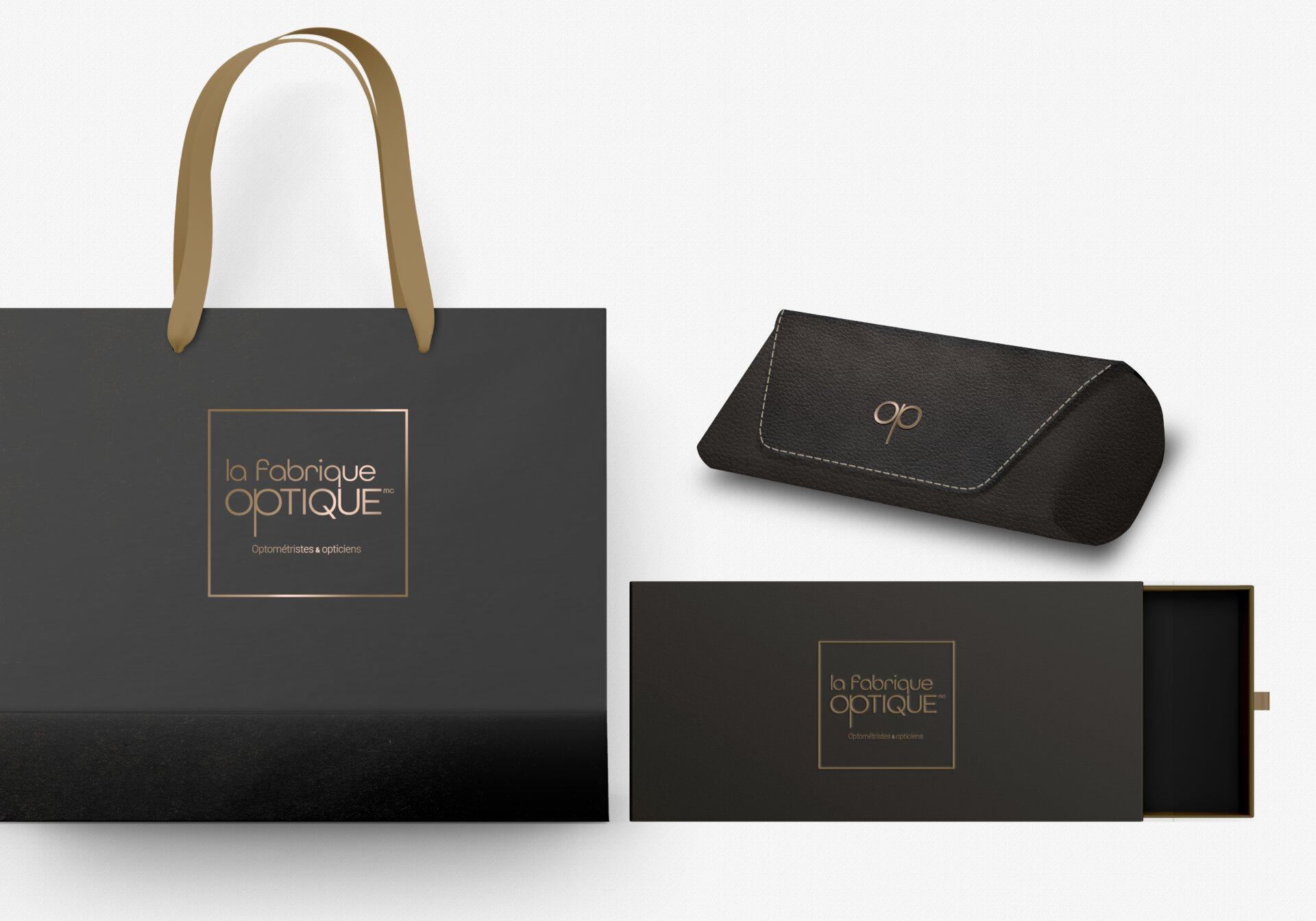
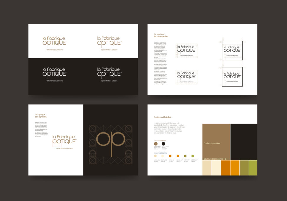
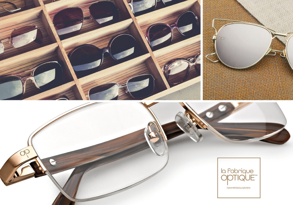
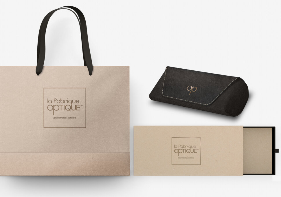
The logo was created to give a modern feel to a name that represents a tradition of craftsmanship. It uses a symbol (a stylized pince-nez) inserted in the name to form the two first letters of the word “optique”. The main colours are a shade of copper – PMS metallic 873 – and a warm black – PMS Black C. A number of accent colours are also available.
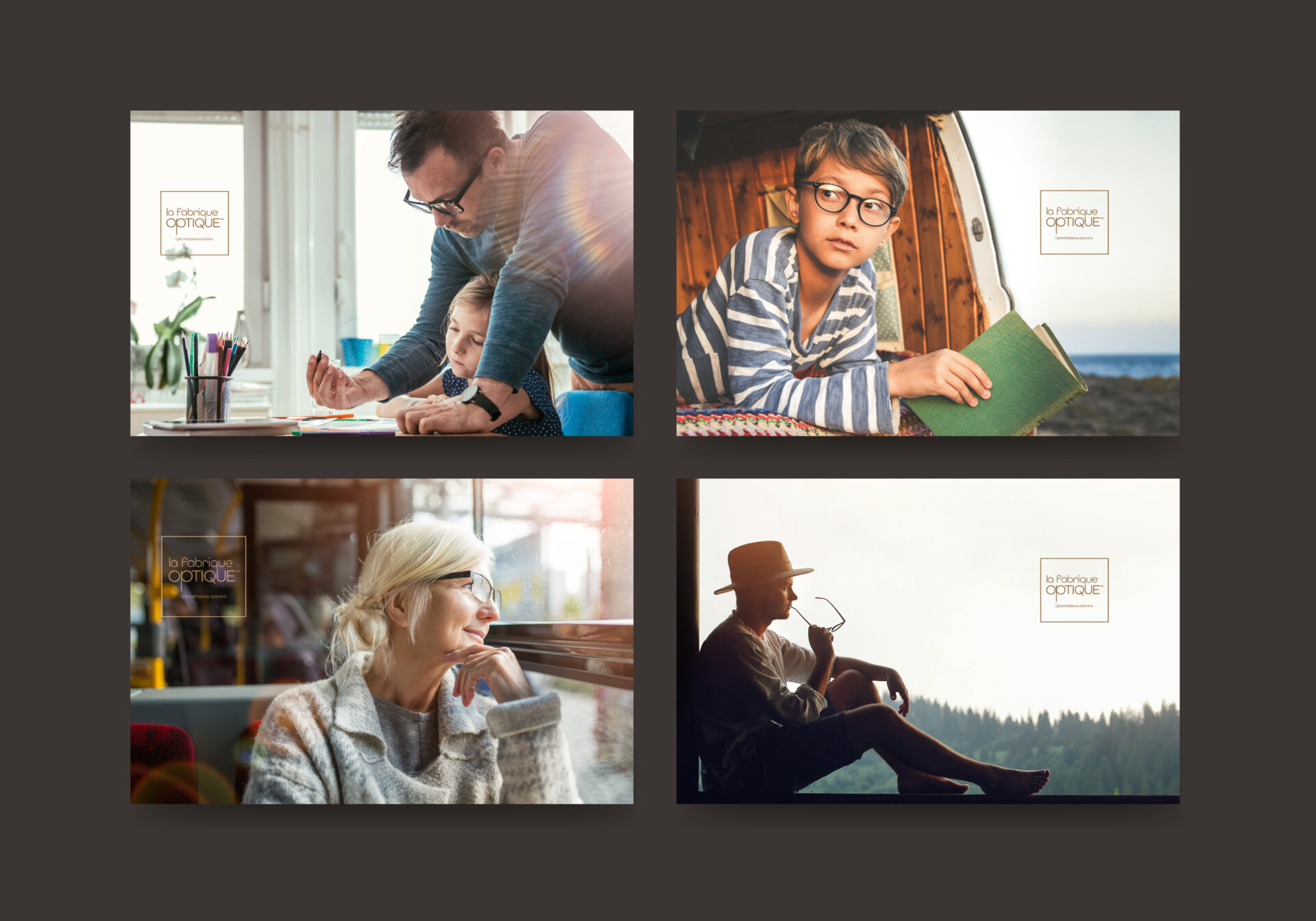
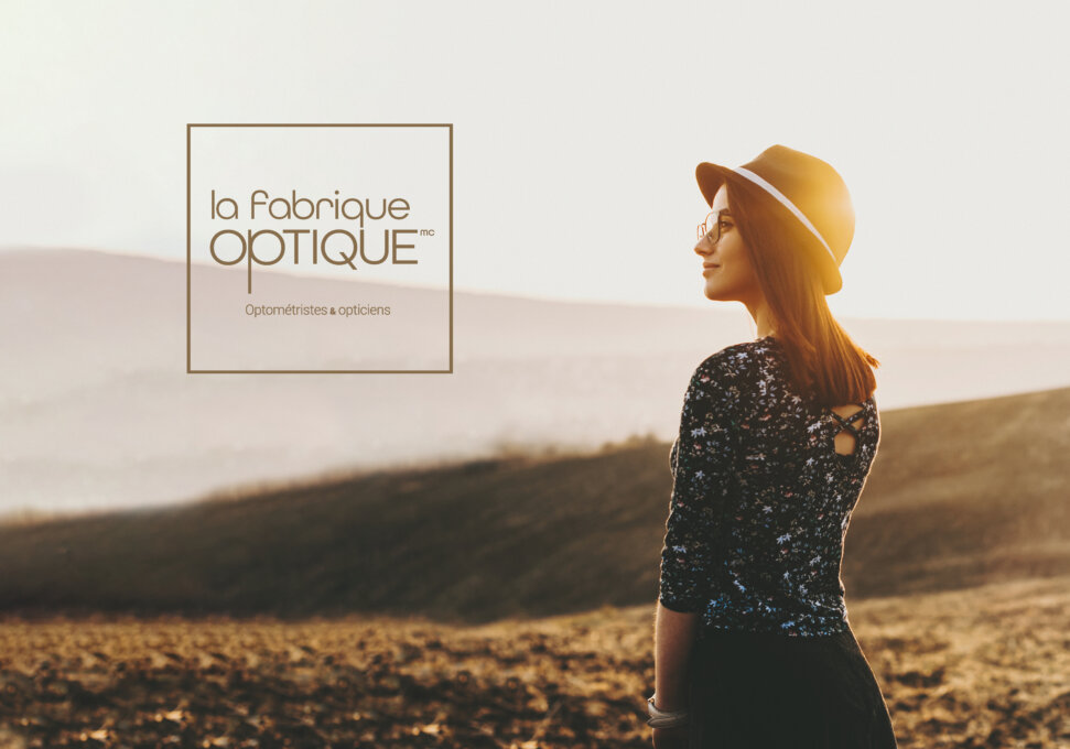
The photography features characters snapped in activities reflecting the different aspects of a balanced modern life. Both the light and the expressions are natural; there’s nothing artificial. In this regard, images associated with La fabrique optique reflect a brand that aspires to simple human values in keeping with current trends.
With these elements, La fabrique optique creates a warm and inviting ambience that is conducive to building a feeling of trust and well-being. While rooted in tradition, it is both modern and youthful.
The mandate called for coming up with name that would position the banner, develop its branding and components, and integrate it in practical elements such as packaging and a retail shopping space.
Collaboration
Other : Soleil communication de marque


