








Share to
Image de marque et positionnement marque/Association québécoise du propane/Propane Québec
By : Soleil communication de marque
GRANDS PRIX DU DESIGN – 15th edition
Discipline : Communication & Branding
Categories : Brand Design / Brand Identity Creation and Update : Bronze Certification
Categories : Brand Design / Logo Design : Bronze Certification
Categories : Communication Design / Online
The Association québécoise du propane (AQP) asked us to rethink its mandate and look into its mission and role. After several discussions, we recommended that its directors ensure the relevance of the Association, making it an organization whose primary objective is to promote propane energy. Three basic strategic pillars were defined to achieve this goal: public recognition of propane, the commitment of members, and government relations.
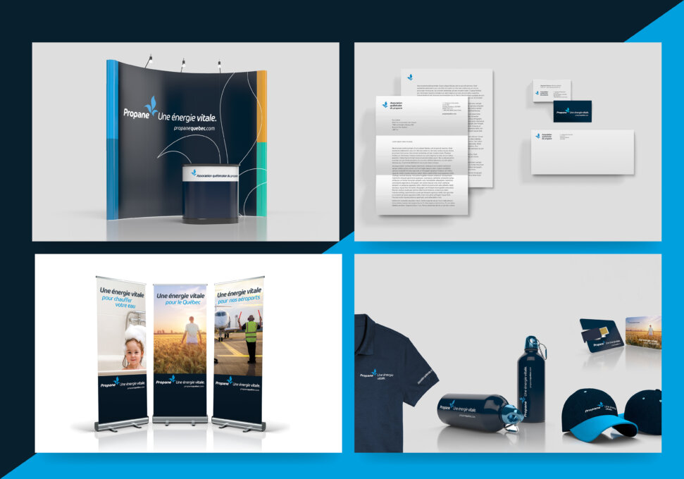
To do so, we repositioned propane in Québec, developed branding that brings it closer to the Québec market, and came up with a professional communication approach designed to increase its competitive edge.
The new image was created to transform the public perception of propane (gas used in barbecues). It positions propane as an essential form of energy that is key to the operations of a number of major Québec industries and showcases its advantages as a source of energy that can help reduce greenhouse gases.
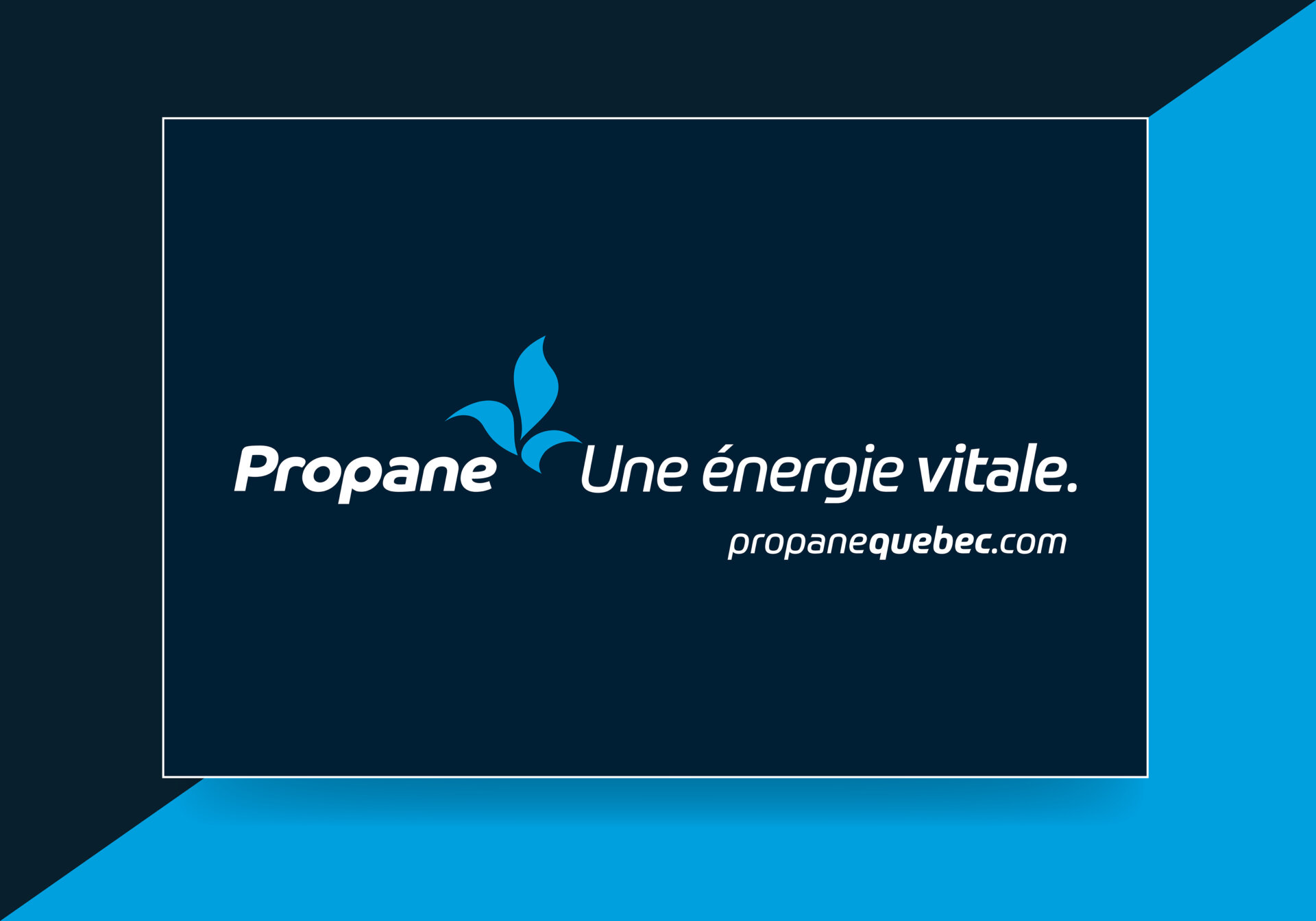
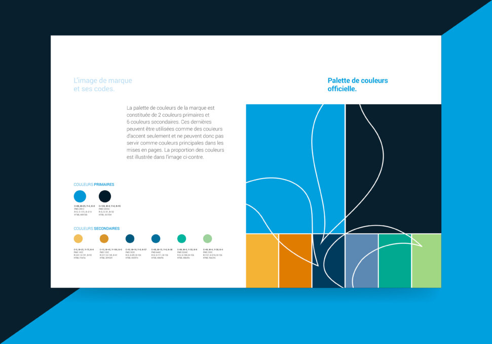
Further to this, the new logo features a blue flame in the shape of a fleur-de-lys along with the word “propane” and the positioning slogan “Une énergie vitale” (Vital Energy). Together, these elements express the industry’s ties to Québec and define propane as an essential component of our energy portfolio. Graphically, it also integrates the address of the website“propanequebec.com”.
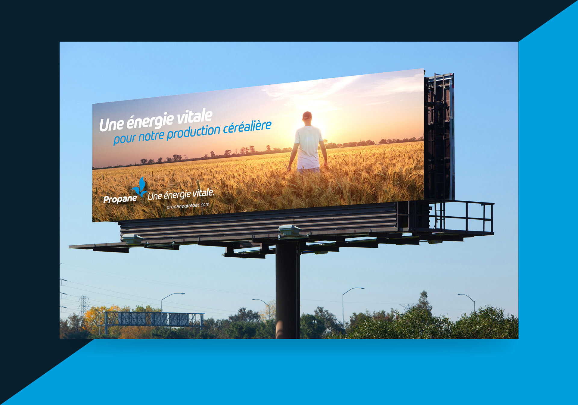
The slogan serves to present various rationales supporting the notion of vitality, using inclusive statements: “Energy vital to Québec”, “Energy vital to agriculture”, “Energy vital to the restaurant sector”, “Energy vital to our regions”, etc. Indeed, the communication approach has been developed to include propane energy and the companies that distribute it within the Québec economy.
Finally, the new positioning and the new image also serve to rally all members of the Association under a single banner, allowing them to identify with a brand of which they can be proud.
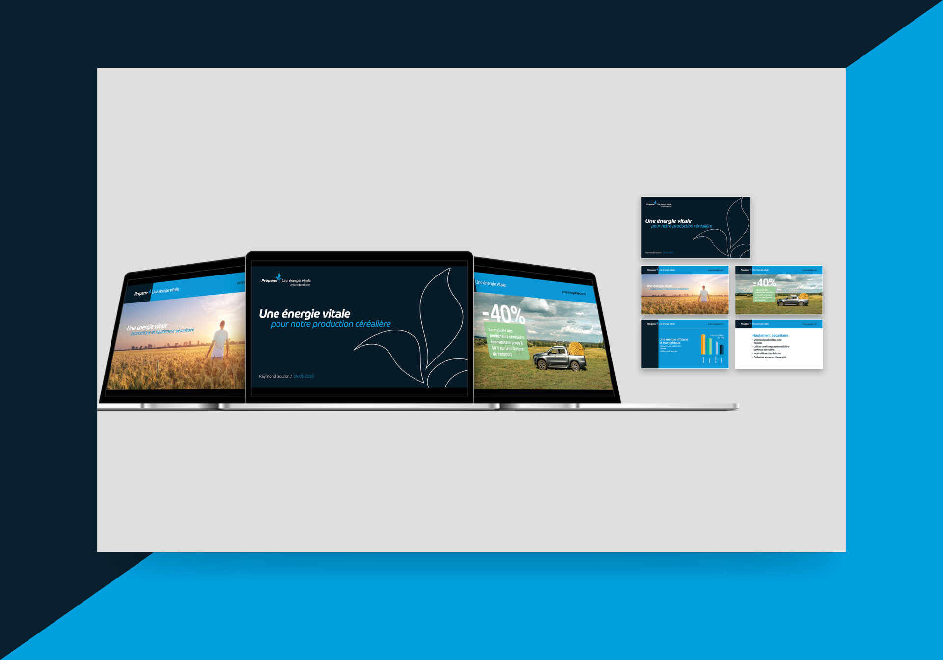
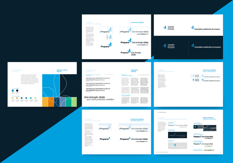
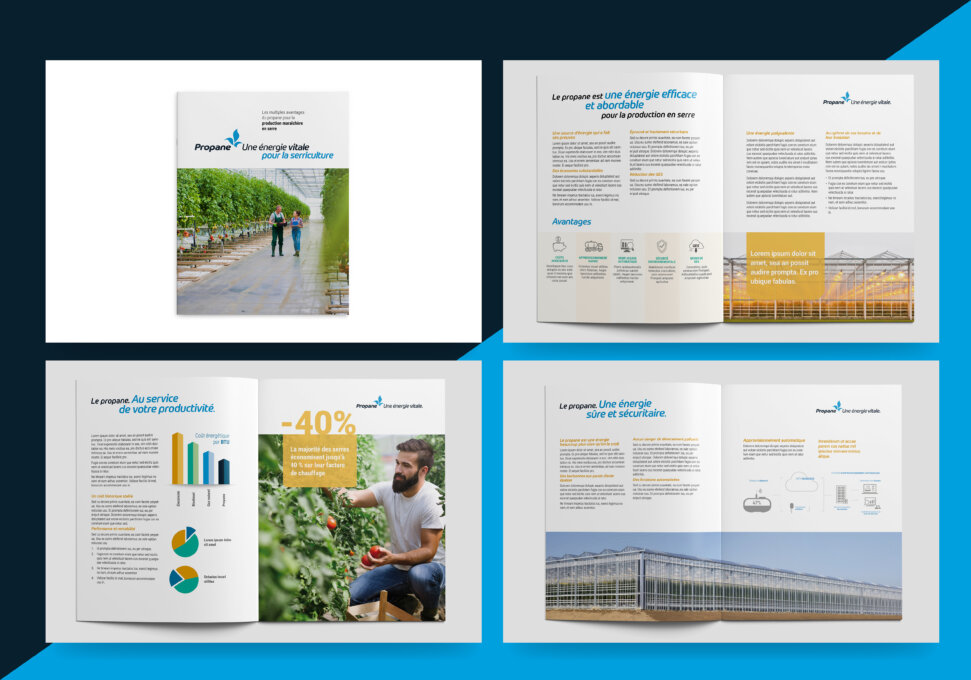
The entire approach has been developed to integrate, in a coherent manner, communication tools used in public relations, advertising, web marketing, inbound web marketing and relationship marketing. All elements have been compiled in a 130-page book that covers the brand’s strategic, creative and technical components. Documenting the brand’s vision in this manner ensures coherent communications over the coming years.
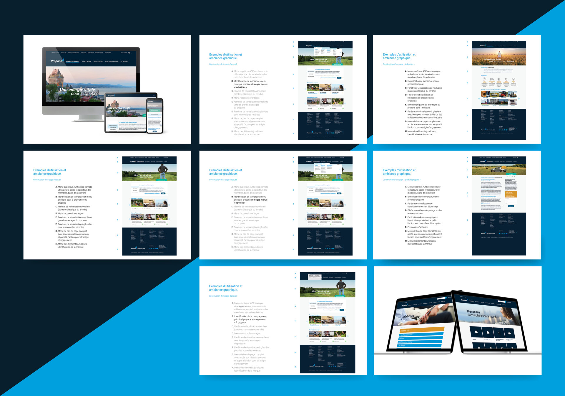
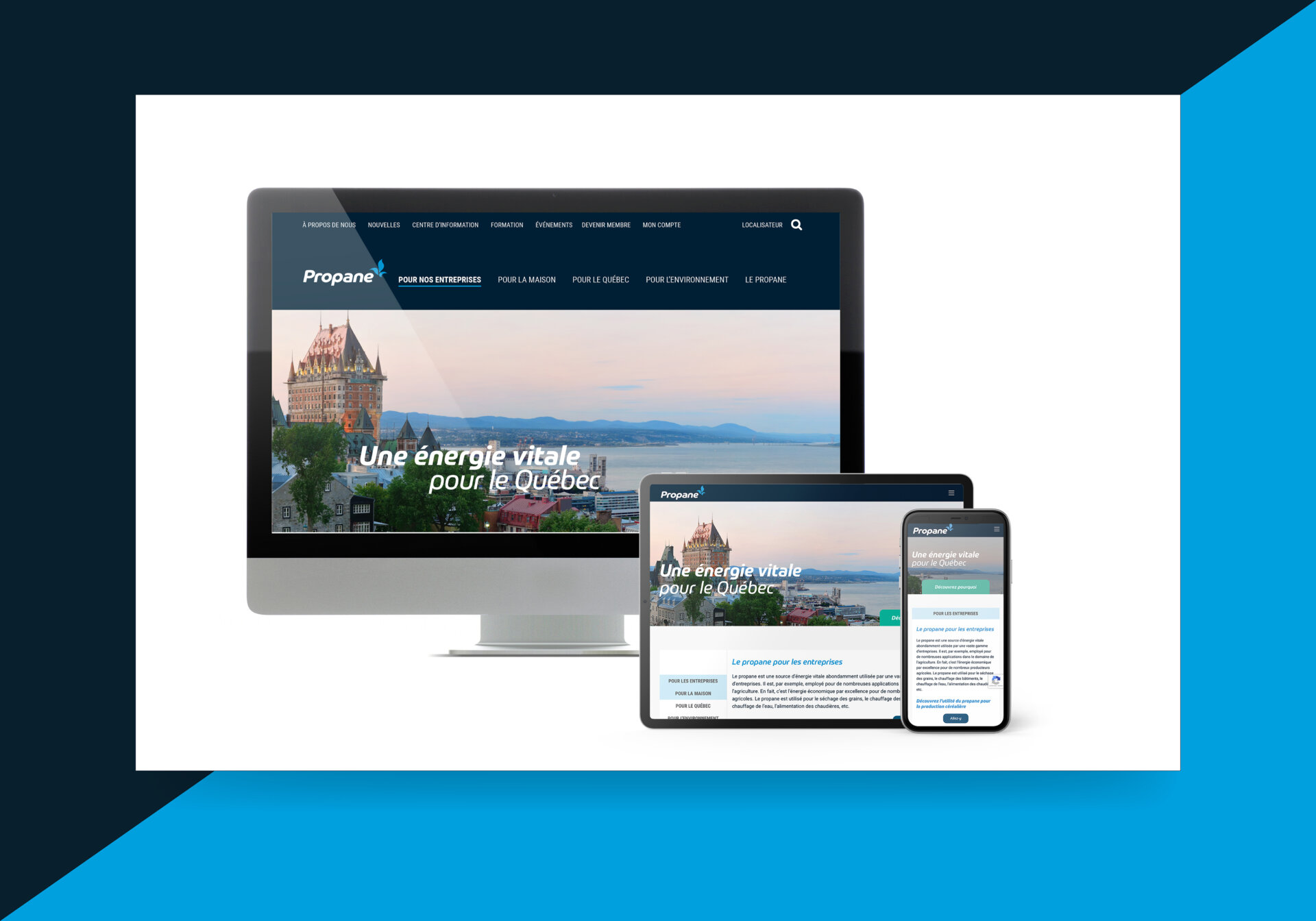
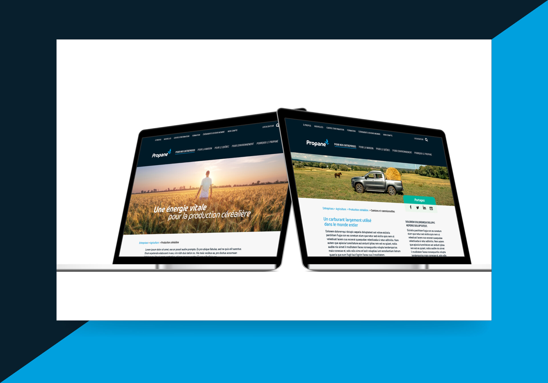
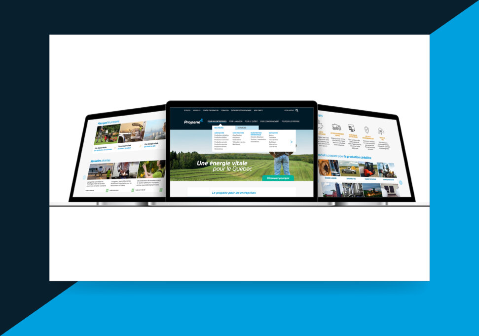
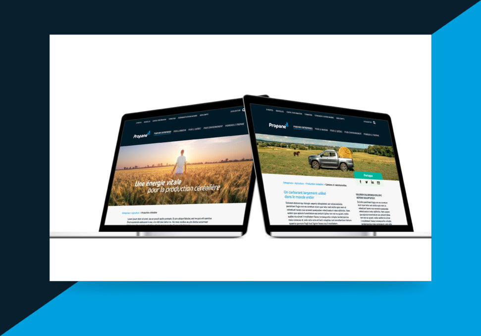
The website “propanequebec.com” was created to position and present a modern image of propane energy, explicitly state the reasons for its importance, promote its many applications, and strengthen the associative aspects of the AQP. It is the largest repository of online information in Québec on both the advantages and uses of this form of energy. Members can, in turn, share its contents in their own communications and social networks. An exhaustive intranet site has also been created for members to record and archive all information relating to the associative component of the AQP.
The entire approach has been fully integrated, allowing the Association to play a vital role in the life of its members, in the near, mid and long term.
Collaboration
Other : Soleil communication de marque


