Jury-GRANDS PRIX DU DESIGN / Published on December 26, 2020
Share to

Marco Tortoioli Ricci
President & Professor
BCPT Associati I Italian Association for Communication Design – AIAP
Perugia, Italy
PROUST QUESTIONNAIRE – PEOPLE OF DESIGN VERSION!
What prescient youthful memory relates to your present career?
I had a written test, delivered during my first class in primary school, when I was just 6 in which I asserted I wanted to be a graphic designer!
What are three basic rules you learned from your mentors?

■ Design is too important , don’t do it for anything that is not worth it and especially if cannot bring real changes.
■ Learn to Step back in your life, learn and move ahead with new consciousness.
■ Never stop Reading books about design.
What project launched your career?
An international communication design campaign for the city of TORINO as first World Design Capital, 2008 launched my career.


Any music playing while you work?
Music is a daily companion and I’m definitely a KEITH JARRETT fan.
Do you work in PJs or three-piece suits?
I hate both of them! I wear nomadic comfortable t-shirts and cargo pants.
What is your current design state of mind?
How can we help people change? How can we help people acting differently, awaken their consciousness, protecting our planet and stoping pollution?
What living designer/architect do you most admire?
Wow, there are so many.
I would stay out of mentioning the ESTABLISHED MASTERS like:
PAULA SCHER, ELLEN LUPTON, MICHAEL ROCK

I’d prefer to mention a bit less known colleagues who I think are doing a great work. I think in Italy we have now a good scene talking about communication design which is my specific field.
I have very good friends who I consider real masters like:
LEONARDO SONNOLI, MAURO BUBBICO, SERGIO MENICHELLI, GIANNI SINNI, LUCIANO PERONDI as type designer, just to drop few names among many others.
But I want to outline that are growing interesting youths with a strong social commitment in considering design a an inclusive tool out of the classic ‘problem solving’ expectations. Internationally speaking, I consider the work of ZAK KYES in London a very good one, as much as the work that my friend PATRICK LACEY is doing with ABAKE COLLECTIVE.
The same way I really love the work of the YUKIKO DESIGN STUDIO in Berlin and the work they’ve done on Flaneur magazine. I’d love to mentionthe work of R2 STUDIO in Porto, SPASSKY FISCHER in France, LAVA DESIGN in Netherland and I should go on for a while.
To discover the designers click on the names.
What past designer/architect inspires you the most?
Copyright: Paolo Monti, CC BY-SA 4.0 <https://creativecommons.org/licenses/by-sa/4.0>, via Wikimedia Commons
I consider ALBE STEINER a prominent figure for all those who do this work, whether you are talking about an established professional or an emerging designer.
His work is a kind of paradigm for our world, considering the political and social commitment of this great figure and his struggle to support the use of an experimental and avant-garde visual language even at a popular level applied to widely used communication artifacts.
Nevertheless, should be remembered his commitment to develop in Italy design schools of higher education, university level education centers where students could devote themselves to design education programs working on models of community and social applications.
What is your most marked design quality?
I’ve worked for 25 years, with my studio,
on designing identities especially regarding territorial branding. We’ve developed a design methodology which allows us to work on the specific concept that we named ‘authentity’, a neologism that combines the two terms for Authenticity and Identity.

For us, the second thing cannot exist without the first one and this require a specific way of working shoulder by shoulder with our clients. At the same time, we consider our design work as a holistic process, we involve in the design process all the aspects relevant to deliver outstanding outputs, especially regarding a consistent visual language.
How would you like your designs to go down in history?
There are many great designers today that work just to be published and awarded, but if you take a look just behind the scene you can find out that many of them are just fictional jobs. I’d like that the people in the future can look at my work as something real for real people.
We’ve never been scared to put our hands on many different fields, we just had in mind what TIBOR CALMAN said about his commitment:
‘LET’S USE THE MONEY OF OUR CLIENTS TO CHANGE THE WORLD’.
What peer quality do you most value?
The ones I mentioned earlier are all relevant to me because they continue to do research in their work with the idea that this is not just a common work, but something that will increase the cultural heritage of all.
Which project is the epitome of your work?
I would like to mention the art and design direction work I have been doing for over 20 years for the LISTONE GIORDANO brand, one of the biggest brands in the field of high quality hardwood floors.
Rarely does it happen to be able to carry on such an intense collaboration with enlightened entrepreneurs and extraordinarily sensitive to the value of design as an element of distinction in the market.
How are your country of belonging’s values reflected in your work?

It is not easy to isolate individual elements,
our way of working is the result of an always international point of view. But we have chosen to live in my small city of origin, Perugia, in the heart of Italy, in a green region where cities have small dimensions and preserve the character and urban structure that they had centuries ago.
Ours is a land that has expressed figures of great artists since the Middle Ages and the Renaissance, the sense of balance and the search for perfection of form are aspects that we carry inside.
What always inspires you?
The discover of the unexpected. Working with my students ask me to keep studying and their devotion to the matter are an endless source of questions.
If a spell were to transform you into an object, by all means, what would you like to be, and why?
Definitely a book. One of the key books of my life and then the film that was taken from it was FAHRENHEIT 451. Discover…
Through this story, we learn that books are home of memory and belonging and that preserving them means continuing to know who we are. In the story, where books are burned to have power on people, people themselves become books through memorizing their contents. They feel their future freedom depend on how much knowledge they will save.
What is your favorite place in the world?
NEW YORK CITY

What design or architecture project do you wish you would have thought of yourself?
The visual identity system that Experimental Jetset designed for Whitney Museum.
It’s super smart.
If you could host any THREE GUESTS, past or alive, over for dinner, who would you choose and what would you dare serving?
I would love to have Milton Glaser, Enzo Mari and Norman Potter for dinner. Three real changemakers not particularly inclined to compromise with what they didn’t think was right.

What is your mantra?
MAY THE FORCE BE WITH YOU (I’m a Star Wars fan)!

What is your dream? THINK BIG!
To become a JEDI KNIGHT!
Listone Giordano Arena
Photo credit: Bcpt Associati
2019 – Milan, Italy
A new experience store we designed in Milan for the Listone Giordano brand for which we developed a dedicated brand identity and all the internal infographics.


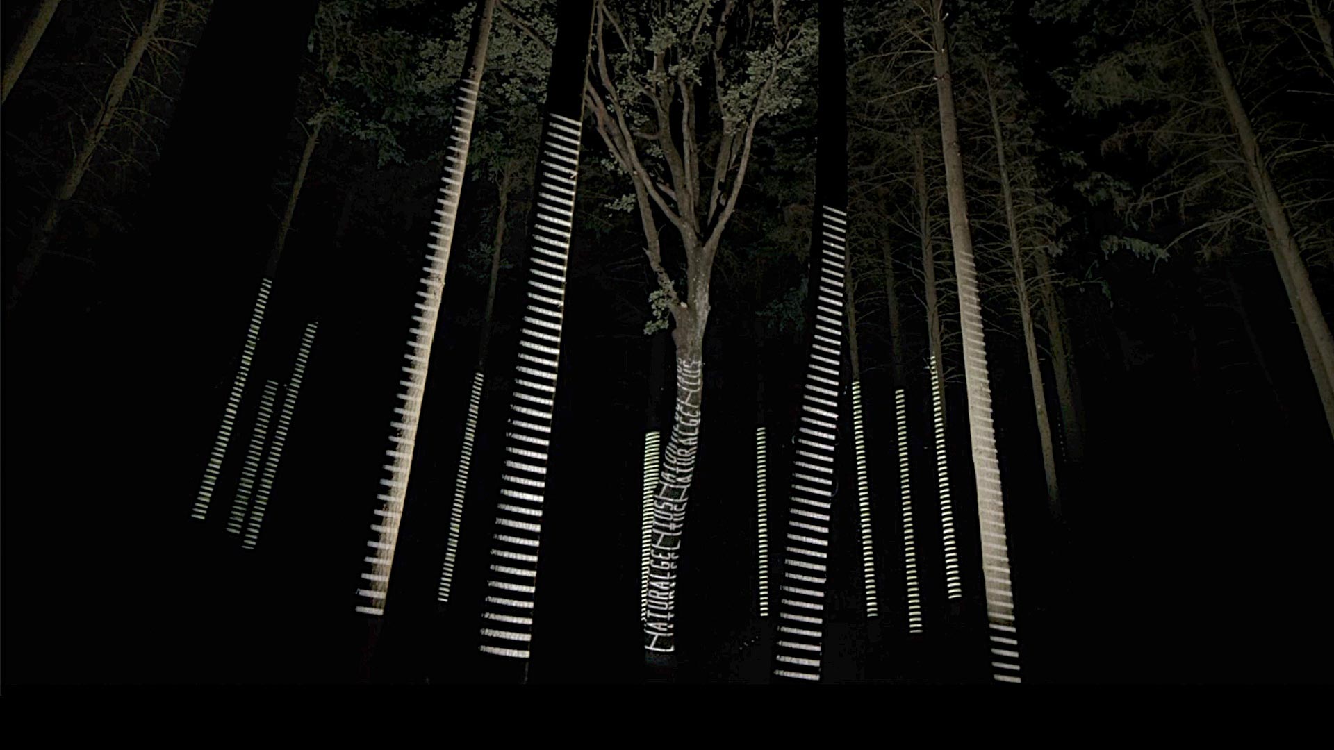
Listone Giordano Natural Genius installation
Photo credit: Bcpt Associati
2019 – Perugia, Italy
The last TV commercial for Listone Giordano has been conceived to celebrate the ‘Natural Genius’ as creative factor. The idea has been to held an art installation in a real forest where we asked a sound artist to make the trees resonating. All the scenes have been filmed on a real night event where a hundred people gathered in the wood to attend a unique event with a live sound performance.


Sardegna
Photo credit: Bcpt Associati
2007 – Sardinia Region, Italy
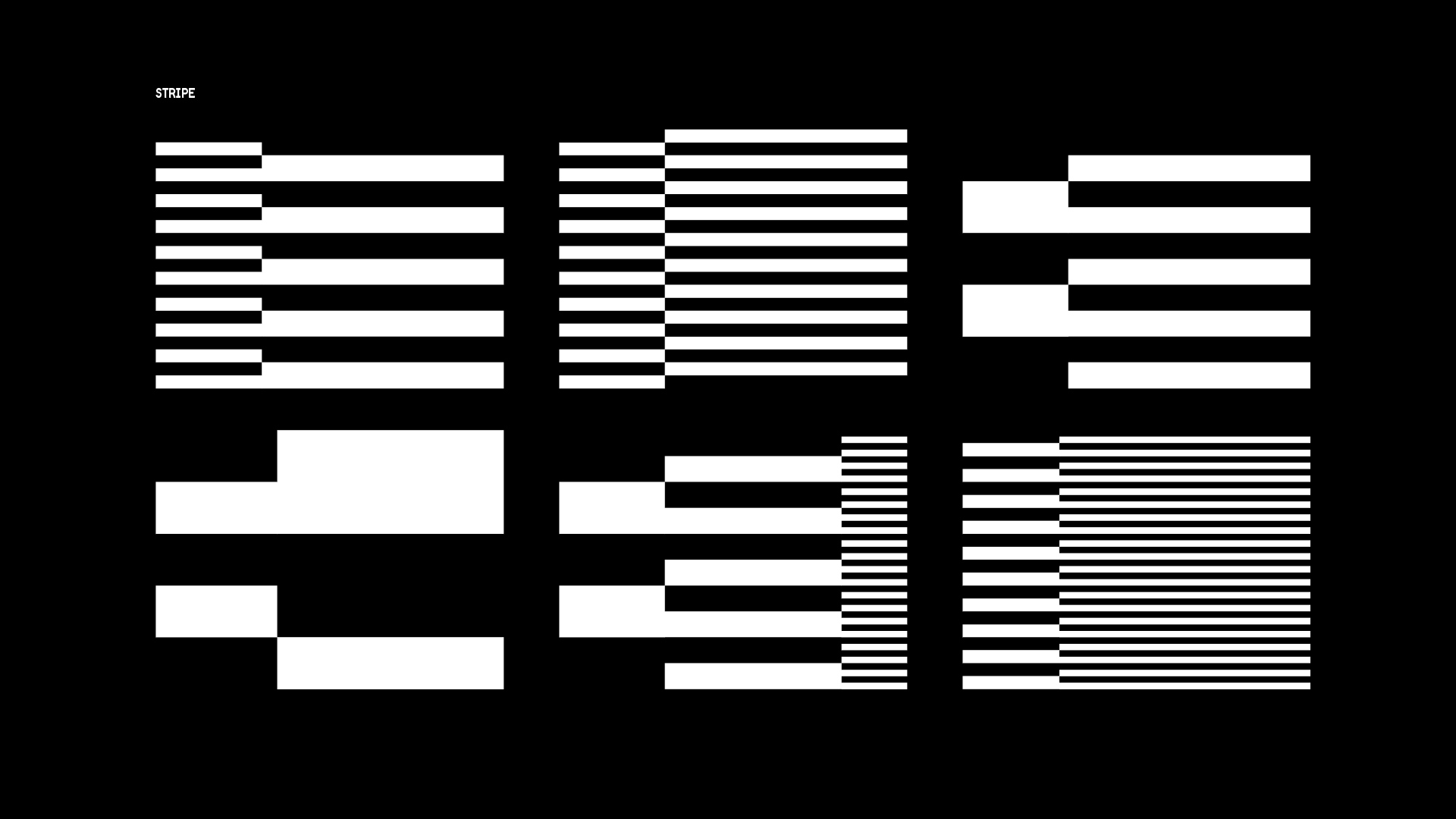
Sardinia is a land, where historical identity and modernity walk hand in hand. Its most unusual symbols are the language and the sense of belonging to the community. Bcpt designed the system of identity with this unique convergence of past and future in mind, starting from the maps of the ‘Nuraghe’, the extraordinary, ancient, stone constructions already present in the area. A perfect example of ancestral and contemporary writing, the geometry of the two main shapes of those constructions (Tholos, the circle and Corridoio, the straight line) guided our design for the letters used in the ‘Sardegna’ logo.


Casa Umbria
Photo credit: Bcpt Associati
2015 – Shanghai, China
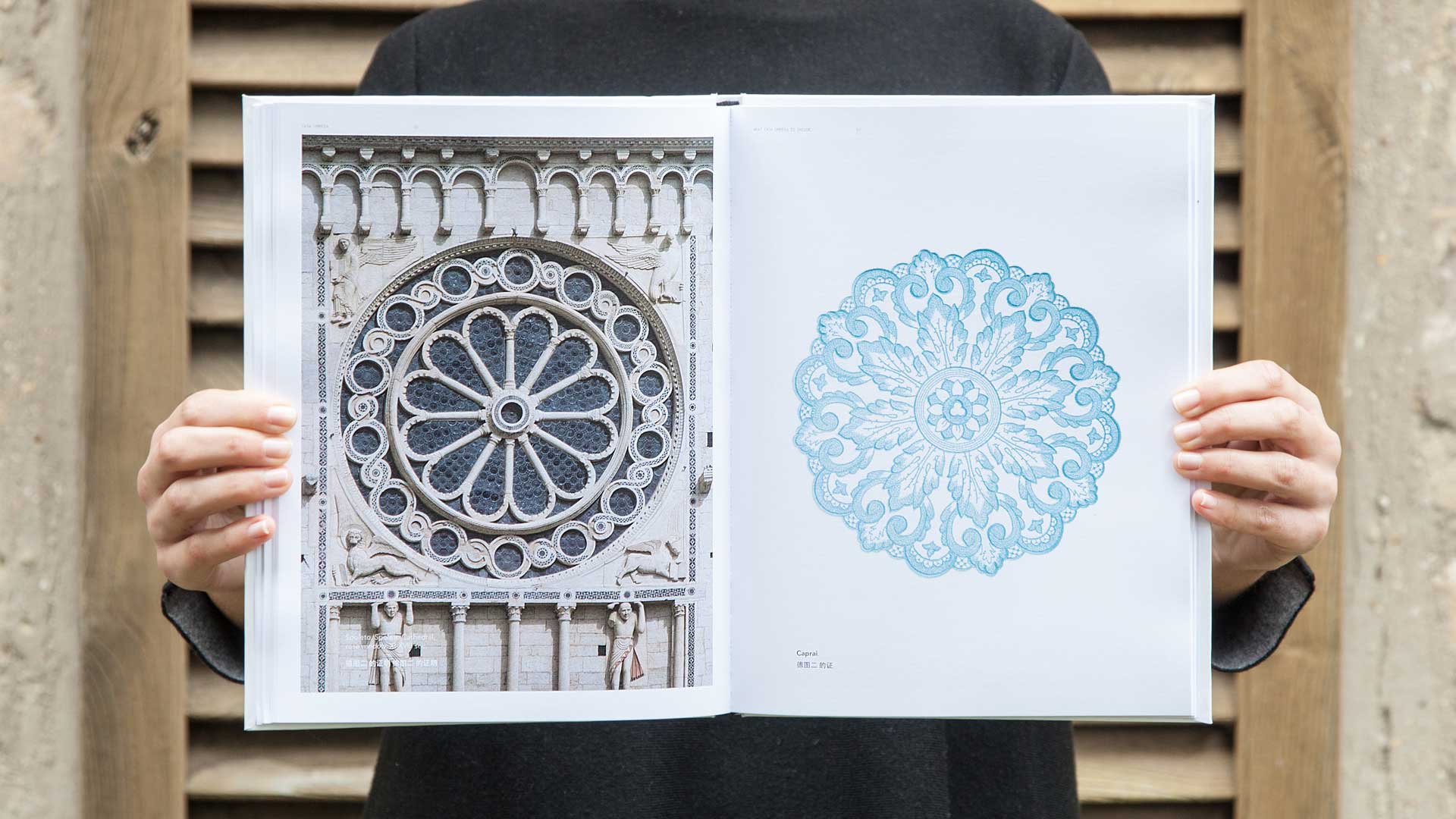
The Casa Umbria showroom is an ambitious, half public, half private project: three large companies, three major international brands in the field of interior design and decoration, united by their origins and supported by the Regional Government of Umbria and by the Centro Estero per l’Umbria [Umbria Trade Agency]. We concentrated on researching a unique graphic sign to visually interpret the diversities and complexities of Umbrian regional culture and launch their international identity. A project of total design in which our work group fully immersed itself, from the design to the contents, to the brand and retail identity, with a project line we defined as architecture within architecture.



To Design To – Torino World Design Capital
Photo credit: Bcpt Associati
2008 – Torino, Italy
The project To design To was inspired by Nicolas Bourriaud’s microtopias. The idiomatic English form (to be able to), in this case, To design To, also represents Turin designs Turin, the city which meets its double, divided as it is between consecration and innovation Not merely a promotional campaign, but rather an invitation to each visitor to become part of the process. The proposal moved along two lines of work, which involved the different relational levels of the communicative event: general, environmental, personal.


